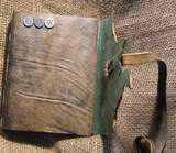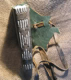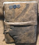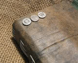

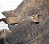

I finished this journal early on Friday. I found the cute little alphabet eyelets at Michaels and they were perfect for this journal. The lettering was perfect- classic and the metal was not too shiny, which wouldn’t have gone with the theme or style.
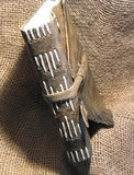
So I finished it or so I had thought. When I emailed the buyer, I found that I had accidentally substituted an R for his real middle initial M. It was very easy to remedy and the journal still looks great. I’m really happy with the spine too. I love the 5 groups of thread across the spine. I think it looks fantastic. The light thread shows up so well too. I spent a little extra time and effort on this journal and I think it shows in the details.
It’s also the first time in a long time I used ¼ inch spacing in the sewing; usually I use a half-inch. I really think the quarter inch works really well and had the proper weight in comparison to the half-inch especially for the smaller sized journals.
You’ll also notice that the pages are lined. I think I’m officially going to offer this service, some people really want it and now that I have the lines on the computer it won’t be hard for me to make them in my standard sizes, 4.25”X5.5” and 5.5”X8.5” (making a roughly 6”X9” journal) I won’t be able to do other sizes because of the limitations of my printer. It is something for me to think about when this printer dies that I should get something that handles larger sizes of paper. This printer more than does what I need it to do now that I’ve got a computer with a little more oomph.
Anyway, I’m really really happy with how this journal came out, and I think that knowing a little bit about the man receiving it really helped the design.
