Category Archives: technique

Lightfastness Testing- 2 Month Results

Apparently doing a lightfastness test is now controversial? People will really try to create clicks out of anything. No I won’t link to the guy ranting about artists doing their own lightfastness tests and calling out manufacturers for their BS. Instead I’ll like to this video by Sarah Renae Clark, who does a good job explaining the blue wool test, why it’s kind of garbage for art supplies, and how she did her tests.

I am currently using a North West facing window that gets full sun from about noon to sunset- during a Massachusetts summer. Roughly 8 to 9 hours a day from July to August. Yes that’s a lot of sun, yes it gets hot in the room and on the pane of glass. My goal isn’t to create museum or typical hanging situations, it’s to see how long a material will last when applied the way I use it. This means I’m not applying it in the way the manufacturer applied it in their tests. I’m doing washes, I’m scribbling, I’m swatching.

Anyway, I feel comfortable that my lightfastness tests give me the information I need to make art that lasts. You should conduct your own or look for results from other artists who make art like yours who share their work.

I’m also going to add here, I think lightfastness is important if you sell your work. It is less important if you are only working in a journal for yourself. I have art that I made that has been on my wall for 20 years made from who knows what kind of materials and it has probably faded more than I know. And yeah I hang my own art on the wall.

Now let’s discuss these tests I did with my current urban sketching/en plein air supplies.

I have been pleasantly surprised by the Arrtx watercolors, Beam Paints, Art of Soil, Meeden soft bodied acrylics and Stockmar Crayons. Almost all the colors showed little to now shifting except for the Arrtx Cad Red Pale and 2 of the shades of green in the Meeden soft bodied paints. None of the Beam or Art of Soil paints shifted at all. The Stockmar Crayons in bright bold primary and secondary colors are aimed at children and I expected them to respond like other brands of crayons and disappear, but they did not. Instead the colors are bright, bold, and vibrant- and the window didn’t get hot enough to melt the wax into the paper*.

Some disappointing results- Arteeza gouache. More of the colors disappeared or shifted than I expected. The “nude” colored Miya charcoal pencil shifted drastically. A number of the Aliexpress woodless charcoal pencils also disappeared or shifted drastically in color. 

The most disappointing result was the number of Prismacolor colored pencils- both regular and watercolor that changed color or disappeared. It was just really disheartening to use a supposedly professional (Premier) colored pencil and have the color just absolutely change or disappear.

I wasn’t at all surprised when the Seami watercolors completely disappeared. This was pretty much an expected result. 

*I am just going to write this here, I don’t think my window gets hot enough to cook any of the materials placed in it. The wax would have heated and melted into the paper if that were the case. There is no wax halo and the texture of the wax is still felt on the surface of the smooth Strathmore mixed media paper. So do with that what you will.

** IMO Lightfastness tests by individual artists are important because they give you information on how the material will last in the way that an artist uses it. You know I’m not the person suggesting that the only good materials are lightfast materials. I use more lightfast materials on works that I’m going to sell. I use anything I want in my sketches and art journal. You do you. That said, I do think that manufacturers should list accurate information on their tools. There have been a number of artists doing lightfastness tests on materials coming from budget friendly brands. Lightwish, Phoenix, Rubens, Mart Marie, etc… And more than a few of the items claims don’t match up with the artist tests. Here are some of the videos that offer up real world bright light tests over time:

https://youtu.be/plfnSqz67bo?si=fCQH_OxZZjvfiGgA

https://youtu.be/GlmOHZMlKus?si=Bwwq0Mc9SSQcIObs

https://youtu.be/EV_L_n61qVg?si=t8BoxVk5iZJslWRc

https://youtu.be/YCDYR3McULc?si=HP-VEi6q9kp6k86d

Lesson 1 from The Unofficial Artist in Residency- Desaturated Colors
I learned a bunch of stuff from my Unofficial Artist In Residency at Salem Willows. Today I want to focus on desaturated colors.

I mentioned this in the video I’ll link below. Colors in the distance are desaturated, also a bit hazy. You can observe this When you look out across a distance, things further and further away appear more and more faded. Colors are a bit more muted. In my area distant trees appear a bit more blue and pale. In other areas I see artists represent colors as more pink or purple the more distant they are from the viewer.  Capturing this color change is interesting.

It’s necessary to convince the viewers eye to buy that the image has depth.

The colors need to desaturate to make the foreground pop.

​With acrylics and watercolors you do this by mixing on the palette or paper. For acrylics and gouache you can add a hint of white. For watercolor, more water and a touch of the color opposite.

With oil pastels, it’s a little different. Some brands blend well others just don’t. Some people use a palette knife and mix their oil pastels on a palette and apply with a knife.

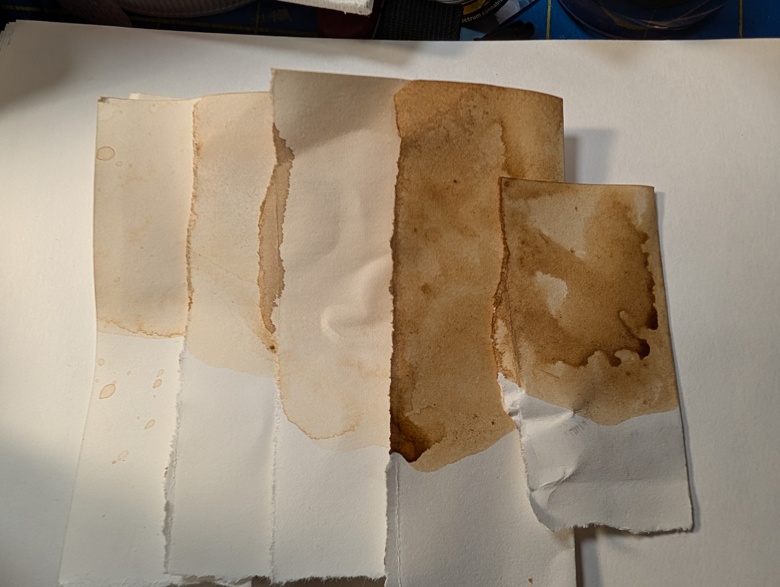
I decided to mix the colors that I’d use desaturated in a series of tests to see what colors I could get. Generally I used 2 colors- a blue and a green. On some I added white and others I didn’t.

Here are images of my tests and some images made with them.

Sticky Messy Oil Pastels

My last post was about proper storage of oil pastels.

My recommendation is that they are stored as air tight as possible- I will switch to an oversized zipper bag inside the tote at work, and I’ll keep using my nearly air tight clasping tote at home.

I decided to take some pics of what the sticky oil pastels look like in my sketchbook.

The above image is of my home set which has been stored air tight. The feel of them is still silky smooth and feels like drawing with lipstick. There are a few colors that are more transparent, particularly the greens and browns.

This image shows the work version. You can see that the application is significantly thicker. The color also seems to stick to itself and lift off the page. You can see that some colors are more opaque, this is only because there is so much MORE oil pastel on the page. (The colors are also in a different order from my package. Kids.)

It was really startling how different they 2 packages of pastels feel.

As a note, the pastels were both applied to the same paper in air conditioning. I have noticed that when I’ve take the work oil pastels outside for en plein air, they are smoother and less sticky.

Interested in reading something like this, but a month earlier? Check out my Ko-Fi page here. Consider buying me a coffee so I can continue to explore art materials and manners of storage.

Printmaking is Physical

This past Friday was an oddly satisfying day but also more physical than I had imagined. Generally when an artist sets up a screen for screen printing it’s one, maybe two or three screens at a time. With more modern screen printing equipment stretching a screen is more simple and easy than it used to be.

Old style screens were stretched in the same way as a canvas, well somewhat. The silk (polyester actually) is loosely stretch over a frame with a heavy polyester tape (more like a heavy duty ribbon) under it and another over the top of that. Staples were carefully placed through the tape the whole way around the screen. The screen was then heated with a heat gun or hair dryer to shrink it tight.

This isn’t a bad process when you are doing one or two screens. 

When you need to rip apart and put back together enough screens for a whole group of kids and then you and your coworker decide to rip the screens off all the damaged and clogged up screens together, well, that’s a HUGE endeavor.

Together my coworker and I stripped down something like 30 screens. I stretched 9 of them on my own with a less than traditional staple only method. and I have 5 more than use a spline in a groove method that I’ll stretch in the upcoming days. However I don’t need those all ready for today and  can do one a day instead of all of them at once. 

If you’ve never stretched a canvas, the method for silk screens is something like this: Cut fabric to size. Secure one edge with a staple. Opposite that, pull the screen taught but not too tight, staple. Repeat process on 2 remaining sides. Pick a side pull snug, staple 3 to 4 time, rotate screen, repeat, continue until you are at the corners, place 2 to 3 staples across the corners. If staples protrude at all, hammer them down.  After all that, run a hair dryer or heat gun over the screen until it feels tight. It should kinda make noise like a drum. A flat drum but a drum. It can take 20 minutes a screen.

Exhausting. I have spent the weekend recovering. It also highlights that I’m out of shape again and really need some quality time on my bike.

I am switching over to a PVC pipe method that uses regular 3/4 inch schedule 40 PVC pipe cut to size and then fit into regular PVC corners. Screen is fixed to the pip with hoop house clips and clamps. Screen is tightened by rotating the clips.

My goal is to never clean out a screen from either screen filler or photoemulsion ever again. I always have problems getting it all out and the screen is always ruined anyway. This way I can rip the screens off and give them to the kids when they are done with their projects. Easy.

Tetrapak and Other Plastic Lined Trash for Printmaking

Over the years I have experimented with a great deal of materials to create prints and I keep coming back to trash. I remember back in the 90s Tetrapak was held up as a future for sustainability and recyclability. At one point so many things were available in Tetrapak packaging.

And then it was revealed that it is actually really tough to recycle unless you have the RIGHT facilities. Of course they weren’t available in the US.

SIGH.

Tetrapak, and similar brands have several different variations. There is the traditional which is a layer of fiberboard with aluminum and plastic coating on the inside and a layer of plastic on the outside. There’s the newer version which has a layer of plastic on the outside, a layer of fiberboard, and a final thick layer of plastic on the inside.

The fiberboard is thick and pulpy and absorbent. This is useful for printmaking.

The plastic on the outside is thinner but very tough. Also useful for printmaking- the back of your plate is far easier to clean than other types of card.

The plastic and aluminum is nicely layered to be waterproof. As is the single thick plastic layer variety. Either can be easily scratched into and carved with simple tools like a needle, etching stylus, awl, or an exacto knife. Basically anything with a point or a sharp edge can be used on Tetrapak and similar surfaces.

A similar surface is a regular carton from frozen food or other packaging that has a plasticky coating. If it’s glossy, it can probably be printed. Check out this youtube video for ideas.

I’m working on having kids, middle school aged in particular do a layered tetrapak and other packaging project. They’ll do some sort of self portrait and hands holding something their “heart.”  We’re going deep on symbolism and meaning this year. They’ll get to use one color to pop off elements but their background will have to be black and white.

Here are some pictures of my plates and an example print.

The two pieces in the back are cartons- Wheat Thins and Melona ice cream bars. These have been manipulated with knives and scratchings and wood glue has been added to create texture. The plates have then been sealed with shellac to create a durable surface that will survive wiping and printing.

I used Cranfield Caligo safwash etching inks on these, and they are much more difficult to wipe out of the tube compared to Akua. I’ll need to modify them for students.

The colored pieces are more traditional Tetrapak, one a chicken brother container and the other a small boxed wine. (We use single serve boxed wine for cooking, since neither of us in this house drink.) I love the wrinkles and damages in the surfaces, but larger containers and if you are careful with disassembly  leave the surface pretty clean and smooth.

This print is pretty BIG- 22×30 inches, printed on Legion Stonehenge printing paper which was sprayed down and allowed to soak up the water. I’m not showing the backside of this print, but there is a GREAT emboss on here and the ink was really deeply pushing into the paper. The results are stunning. The paper will wrinkle horribly if not wet properly. A paper this thick (140lb/300gsm) needs to be quite wet for it to be flexible enough to get down into the various grooves. A lighter weight paper can be spritzed and not soaked. Some papers, like washi paper and other Japanese style papers don’t need soaking at all.

There is a spot where I didn’t get a good seal on some glued areas of the skull (near the hands) and the paper tore a bit. The pressure from the plate and the dampness of the ink adhered the glue to the paper. It wasn’t reactivated, but softened. I may attempt to use an acrylic varnish to see if that works well for the kids and if it might not adhere to the paper when printing.

I don’t usually work this large but so far I’m really enjoying it and the look of these pieces as they are layered and put together.

Mark Making Makes Interest in an Image

I vividly remember seeing a real Van Gogh in person for the first time. The marks he made in his self portrait captured my attention. After that museum visit I did a deep dive into Van Gogh’s drawings and paintings- the thing that really unifies his work in my mind is the quality and quantity of his marks. Every mark unique and partially determined by his tools- from brushes to reed pens, his marks were all really interesting.

I have made vats of walnut ink, while not the ink Van Gogh would have used it has been forcing me to play with brushes and the marks the brushes make, particularly as I have tested casein medium/binder in the ink.

I have been using some old Strathmore 400 series drawing paper (90lb I believe) that I had ordered to make myself some books and then lost interest in the project. These pages were unearthed in the great basement studio cleanout. I cut the sheets in half to get 12×18 inch pieces of paper. These sheets are roughly the same aspect ratio as the photos I took this summer while on vacation. 

I’ve been working with these papers and my homemade inks to make studies of my images. I’ve also been making some mixed media pieces with the studies in mind. The interesting thing is that after I make a few studies of the image, I’m not looking too closely at the original photo, only checking in on it here and there, and occasionally never. I more rely on the studies, which work out the composition before I make the final art piece.

Anyway, I’ve been playing around with squirrel mop brushes and a few other soft brushes to create my images, and it’s been interesting to capture the marks these brushes make with the casein and walnut ink. The brush strokes very much lend to the sketch and the study. The layers of the casein based walnut ink give a lot of depth to the sketches.

I’ve also been mixing it up with these images. I’ve added in night blue Caran D’ache Neocolor 2, some blue Inktense, and some white chalk pastel. The walnut casein based ink mixes with the blues to create a lovely shade of warm gray that I’m ink love with. I mixed up some clear casein medium and have used that to further thin out the walnut casein ink and get even lighter lights.

The casein gives the paper a nice tooth for adding in the chalk pastel. I give the pastel a spray of SpectraFix to keep it from smudging.

In these images I’m attempting to capture the smoothness of the sandy shore line, the calm-ish water, and the rocky shore as well as the darkness of the trees and rose bushes.

The casein also dries to a lovely satin finish.

Water Resistant Ink

Depending on the paper most of my ink experiments have been water soluble. They have a great lift-ability. Which is great for sketching and drawing in many cases. However my ability to layer the ink to create deeper darks is limited because the ink lifts up into itself and actually ends up lighter when the brush lifts it off the page. Annoying. I’ve learned how to work with it, but what if I didn’t have to?

Gum arabic is an additive that improve adhesion to the page and improves flow, but it doesn’t seem to reduce the amount that my ink lifts off the page. In increased amounts it seems to simply thicken the ink.

​Casein paint enters the chat.

Casein paint is water soluble until it dries then it is water resistant and in some cases waterproof. It’s about the correct blend of stuff to make it waterproof.

I’m more looking for water resistant than water proof.

From Robert Murray-Smith’s youtube I used this as a recipe:

I mixed the 5g of borax into the water and let it sit until it had fully dissolved. This took just a few minutes with agitation. That is to say, I shook the bejesus out of it. I then added in 10g of casein powder. I added in a shaker ball I have for protein shakes. Again I shook the bejesus out of it. Then I let it sit for 15 minutes.

At this point I added an equal amount, by volume, of my homemade walnut ink.

Again I shook the bejesus out of it.

The resulting ink is highly water resistant and waterproof in some spots once dry. 

Again I’d say this is more like a liquid watercolor than ink. In this case it acts much more like acrylic or gouache than it does watercolor or ink.

It dries to a matte or satin finish depending on how much of the paint is layered onto the page.

I really like the paint and I can see myself using this to tone a canvas or panel or just for this sort of layered image. It is quite a bit more thick than the original ink. The casein glue is thicker than expected. I might need to acidify my casein, but so far this looks and seems pretty decent. My tub of casein powder will make a LOT of paint binder and DIY fixative. If I wanted to make this more ink like, I would test out amounts of the casein glue to add to the ink. I did 1:1 for the paint. But I think 1 part casein glue to 5 parts ink would probably yield an ink that was ink like and water resistant.

One thing to note, the casein has a very very strong odor of sour milk. It dissipates quickly when it’s dry or brushed onto the page but it is gag inducing when the dry casein powder is mixed with water.

Acorn Cap Ink- Part 2 This Time with Iron

My first foray into acorn cap ink was a total success. It produced a lovely golden brown ink. I worked quickly and knew the caps had more tannins to leach out. I attempted a slightly longer extraction method- I put them into a jug with far more water than strictly necessary and let them sit for a few days. I then repeated a boil and steep for a couple of more days. That is to say when I arrived home from work I turned on the burner and brought the caps to a boil, then let them steep over night and repeated the process of boiling in the AM. I did this for 2 or 3 days. This was quite low effort, I set them to boil while I was making my morning coffee and evening tea.

Then I strained the caps out. Once strained I ran some boiling water over the caps to remove any tannin rich liquid clinging to them. Yes this added more water that needed to be boiled off but I think was worth the effort.

After this process I reduced the liquid by 50%. I then divided this into 2 part. One I boiled down just as I had for the first round of ink and added that to my container of plain acorn cap ink. The color is slightly more brown than golden brown. Still quite nice.

The second batch I reduced down with the addition of a large rusty nut I found while out on a walk. Pretty much anything with some rust on it will work. I added an additional cup of water to the mix to get the tannins more fully covering the nut. The tannins react with the rust to create a deeper darker ink color- in this case it is quite black when you look at it but goes on the page as a rich gray with a blueish cast. It’s quite lovely.

Again the smell of the ink as it was cooking down was pu-erh tea and the woods. Really quite lovely.

A couple of notes- I will reduce the ink far more the next time I make it. The color isn’t as intense as I’d like and the first application with a cheapie brush pen is quite thin and pale. It does layer quite well.

I suspect that there is a sugar content to the caps as there is much more of a sheen than there should be given the amount of gum arabic I added.

Gum arabic impacts how the ink clings to the pen and the brush as well as flow on the page. I use it for the cling properties. The ink does lift quite easily. Again I suspect the sugar content acting like honey or glycerin does with watercolors- increasing the water solubility of the ink.

Thus far my favorite way of using it is in a cheap brush pen. (Link to the pens I’m using.) It can clog quite easily so I have altered my brush pens by removing the thin fiber tube that slows waterflow.

Next year when I make another batch I will add in a fermentation stage to allow some of the sugar to ferment off. I believe this will reduce the lifting and water solubility on the page.“

Hectic Second Week Back at IT

This was first published on my Ko-Fi blog a month ago, if you want to read my writing in real time head over to Ko-Fi and follow me.

Routines. I have written about routines endlessly over the years. I am someone who thrives with a similar routine for each day of the week, with a few outlier days here and there. It’s how I work best and how I thrive.

I wrote previously how I had established a great summer routine that really helped me to put a focus on my own art making. My August plans and vacation destabilized that routine and now that I have returned to work I am struggling to get that routine back into place.

It’s not helped that the first 2 weeks back at work are not regular weeks back at work. The first week was a lot of running around, catching up on emails, and cleaning the studio. This week is all trainings and weird scheduling. Next week will be the first week I am back where I have a set schedule. Even that week is a bit more flexible than I’d like.

I have not been able to work on my new routine for this fall.

ARGH.

I have been making art and a little bit more acorn cap ink. I’ll write a full post about the ink- because I made more of the brown but I also did an iron version that is a wonderful shade of gray.

I’ve been trying to use the acorn cap ink on it’s own and in conjunction with other tools I have in my on the go kit. It’s been really truly wonderful. The shade of brown is golden and warm and works really well with all the colors I generally have in my on the go tool kit. From sepia to black to shade of blue and purple it mixes well and creates wonderful darks and shades of gray.

It’s also really nice on it’s own but is too light to create deep darks.

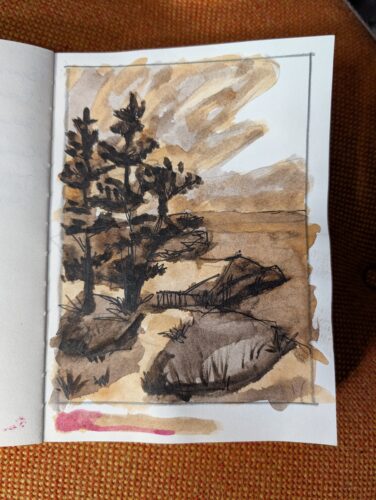
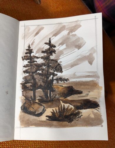
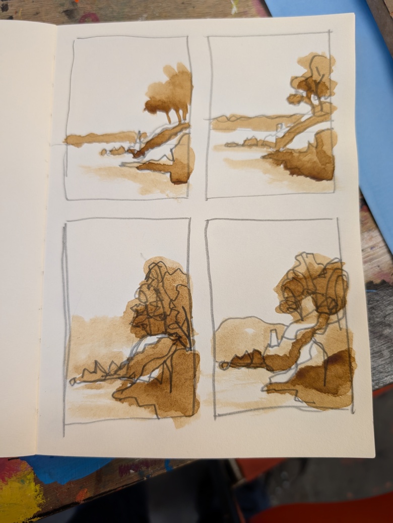
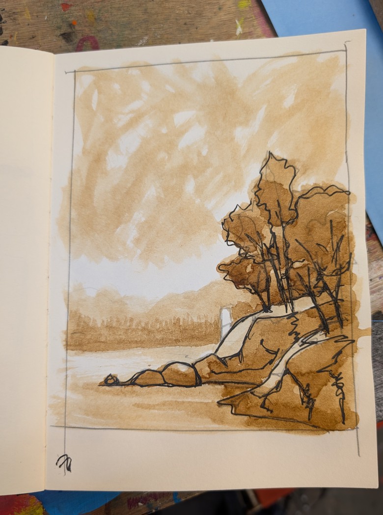
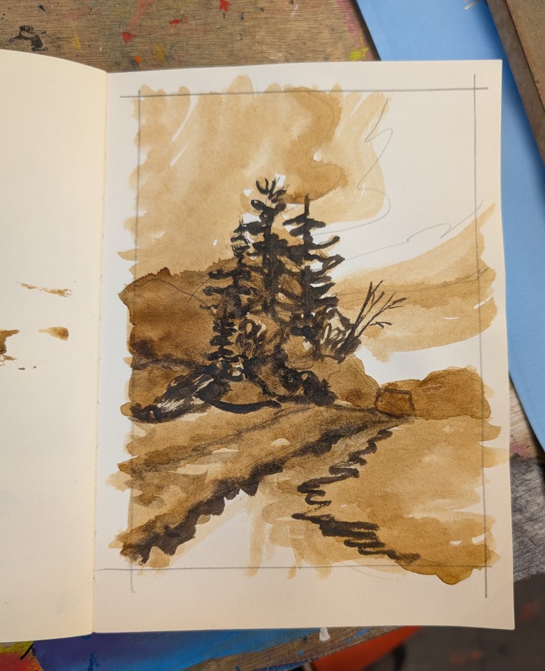
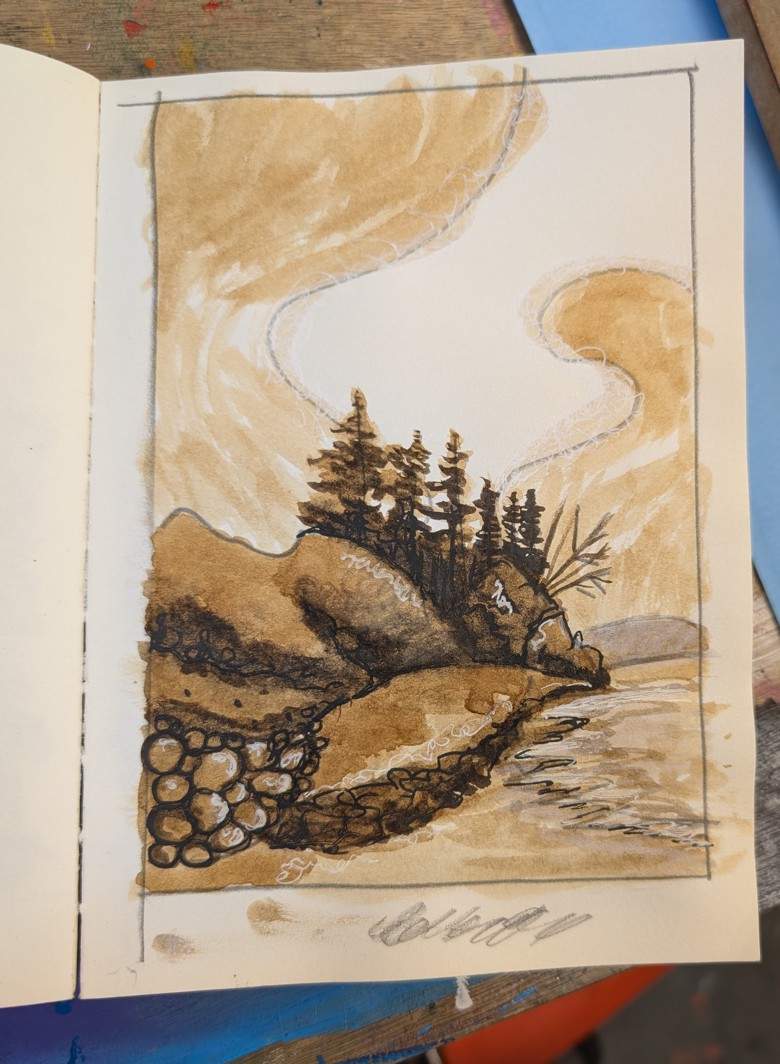
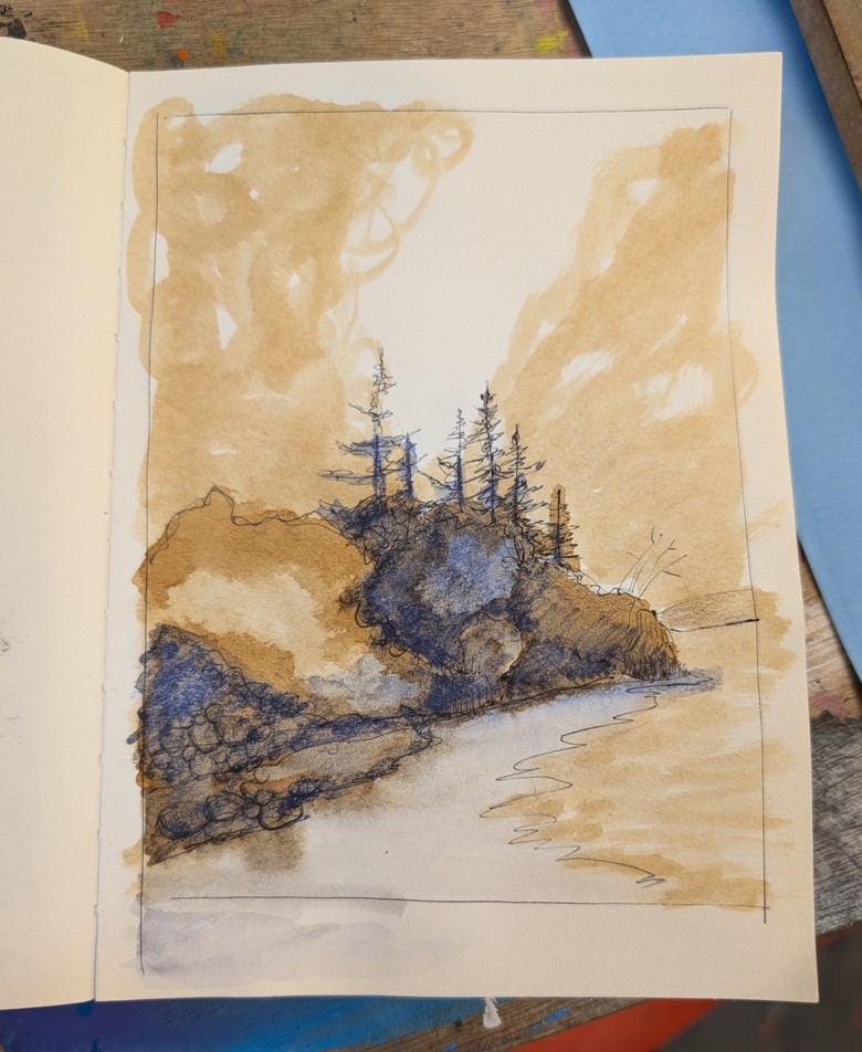
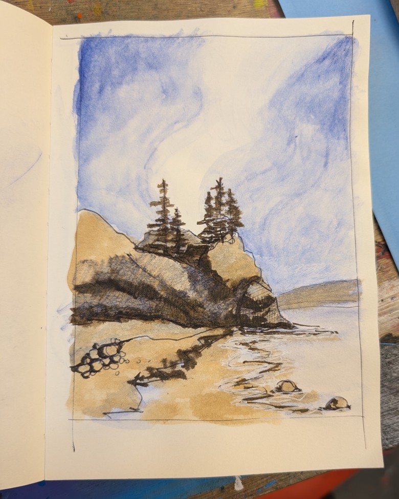
Here are some examples: I’ve been working on sketches from the photos I took at West Quoddy Head and Roque Bluffs. These images are studies from the photos and are really looking at patterns of light and dark and how they impact the final image. I’m adding and cutting out trees in the tree line and looking at how that impacts the image as a whole. I might try to do a few images in this warm brown and blue color way- it’s really striking.

I think the last image is my favorite, it’s definitely not true to the scene itself but it gets the vibe. The lightness of the sky works well with the shadows in the trees. The trees are a bit too tall so they’ll come down a bit, but the over all feel of this is right where I want it.

Acorn Cap Ink- A First Round

While I was at Zea Mays Printmaking for professional development I went camping. Specifically at the DAR Campground. My camp spot was ringed by a whole variety of trees but mainly by several tall straight oaks. During my third night there I could hear acorns dropping. I had looked for interesting rocks but neither my camp site or any of the trails I visited had anything that would work for making paint.

I decided to get acorn caps. Acorn caps hold a lot of tannins and have been using for dying and ink making for a very long time. They are often used as a source of tannins for gall based inks.

In my case I want to make a jug of acorn cap ink with and without iron.

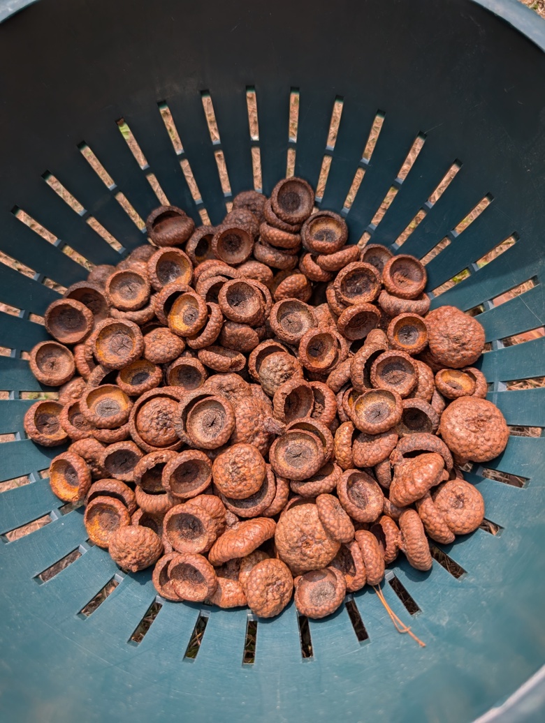
I gathered roughly a pound of acorn caps- just the caps and no nuts. I put these into a black doggie doo bag and tied it shut. This stayed in my car for a few days. My thinking around this is that the heat would kill off any insects in the caps. I then left it in my studio for another few weeks.

The first step is to wash all dirt and insects away from the caps. This is easily done in a colander. It is important to NOT soak the caps lest some of the tannins soak away. I used cool water and agitation to remove all dirt and debris. I then spread my caps out in the sun to allow them to dry. 

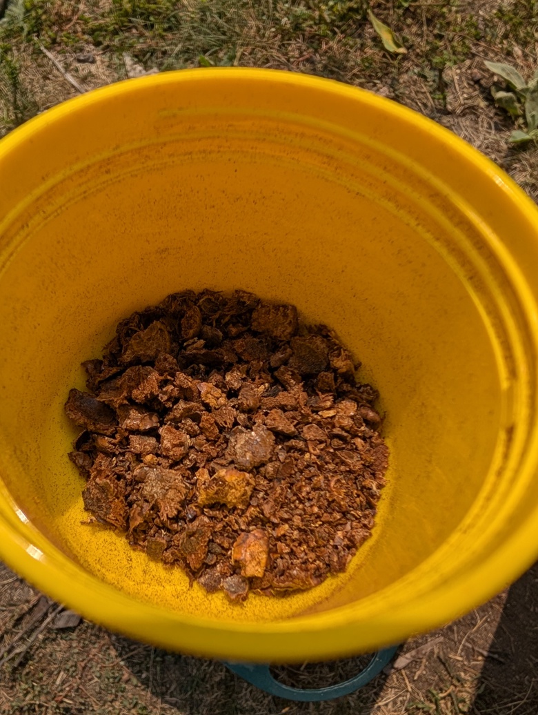
After my caps were dry I started to break them up by hand. Many caps were very hard. I ended up putting the caps into a zipper bag and stomping on them to get more of the caps broken up. Once the caps were broken into smaller pieces I put some of them through am old hand crank coffee grinder. This worked well except for when it got jammed. I probably ground a third of my caps.

If I decide to make this again I will grind more of the caps. The ground caps leeched out the tannins substantially faster and more easily than the whole or just crushed caps. The coffee grinder was set to French Press grind size. In this instance a whirly grinder might be a better choice.

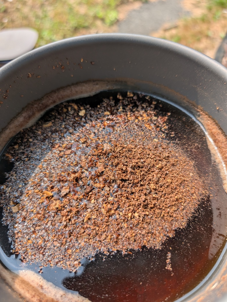
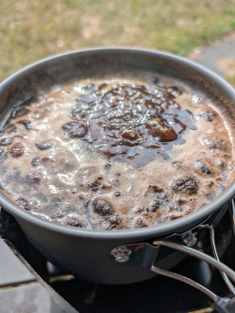
I used about 1.5l (6 ish cups of water) to cover the caps. I used a pan that will not be used with anything but ink making supplies. I brought this to a boil and then let it cool off then a boil again. I probably boiled and cooled the caps 4 times. 

When cool enough to handle I strained the caps through a kitchen towel. The caps held at least half of the water in them. I squeezed them out the best I could but not much additional squeezed out.

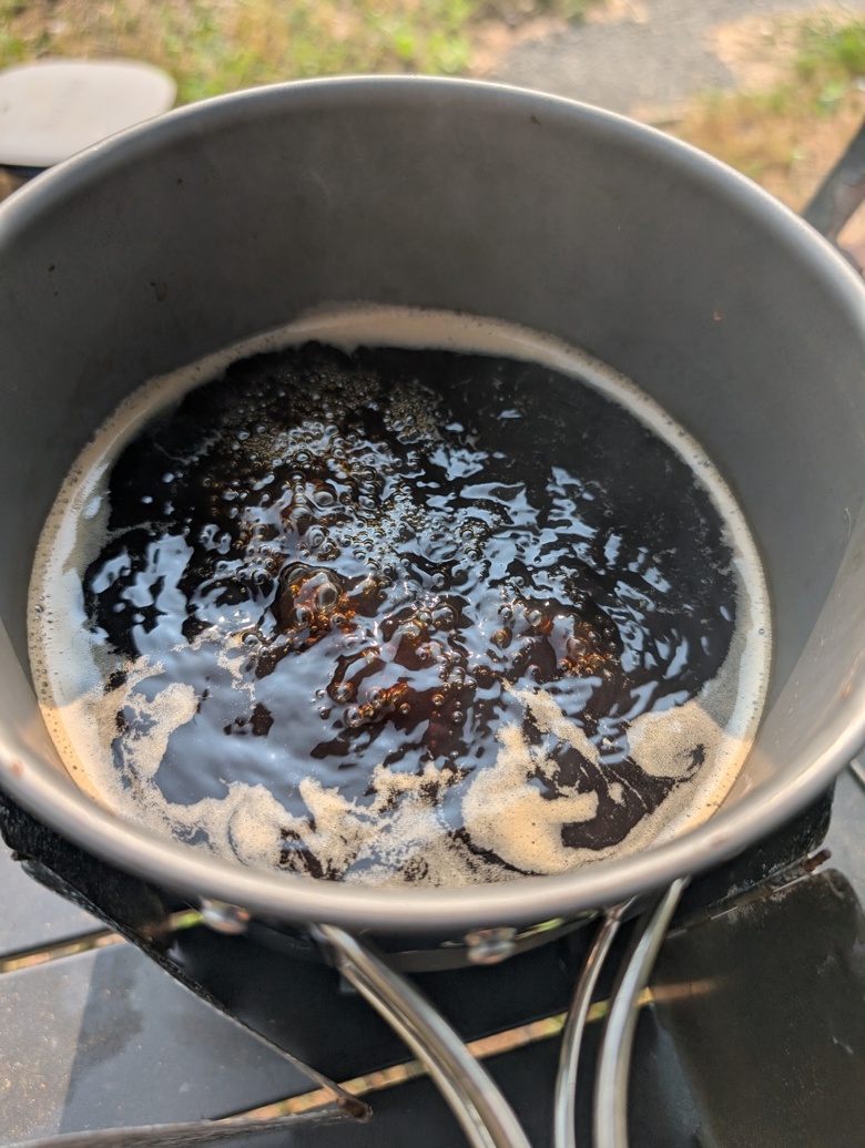
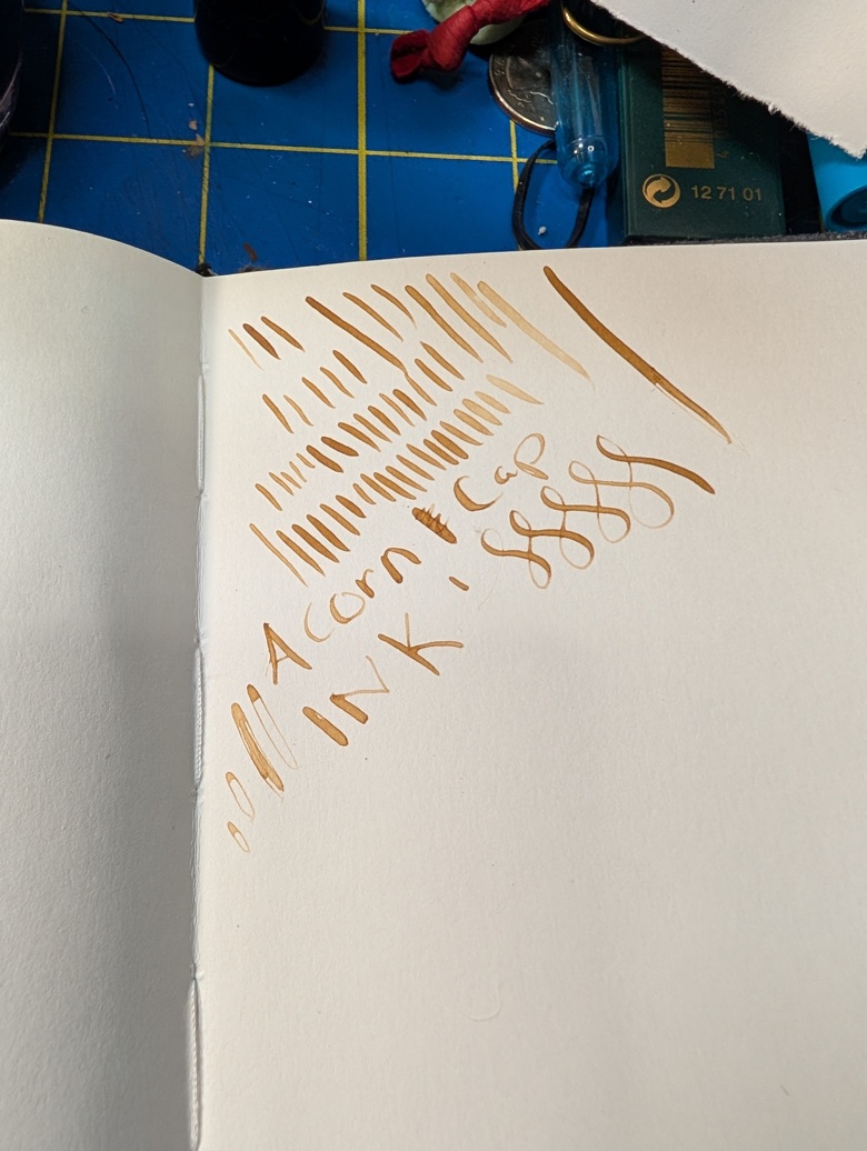
This was returned to a cleaned out pot and brought to a boil and then simmered until it was reduced to about 1/3rd of a cup. Through out the boil there are visual changes in viscosity- the mix goes from very thin to thicker and at the end it is not thick but it coats the bottom of the pan. This initial steeping resulted in a lovely warm golden tan that I am in love with. 

I added a small amount of gum arabic to help bind it to the page when used for sketching. I suspect one could also use some casein based binder. There are a lot of binders out there but I had gum arabic. It would be super traditional if I harvested some peach or plum gum and used it in the same way. I added maybe a teaspoon, I should have measured better. The amount of gum is enough that after 24 hours the ink coats the sides of the jar I’m using for storage.

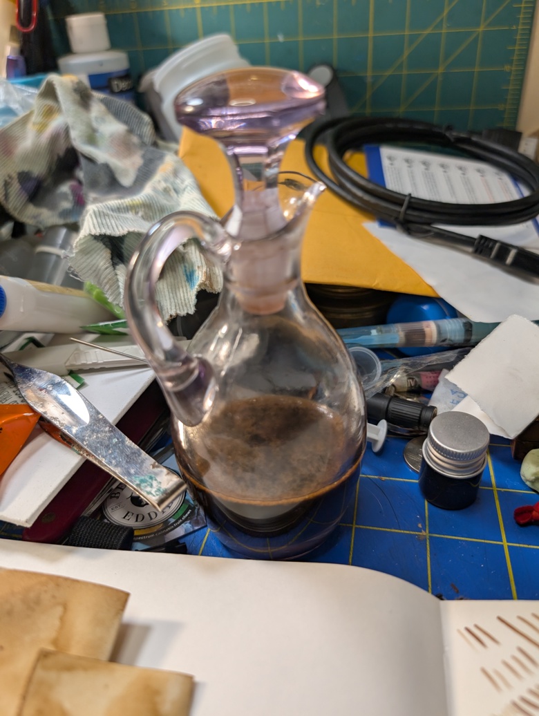
For storage you want an airtight jar or bottle. I’m using a vinegar cruet I inherited from my grandma, she’d hate that I’m using it for a practical purpose and not for decoration. That said I wrapped the stopped with some paraffin film used for sealing bottles in the lab. This creates a really nice air and watertight seal. I wish I could remember who I learned this from- it was during an ink exchange a long time ago!

The ink does darken on the page with time. I read one account that claims it darkens more over a month, but I suspect that is for the iron blended version. 

Some things I noticed, after the initial strain I didn’t notice all that much in particulates, I’m wondering if the tannins gather together in heat? Did I extract some starches? Did I scorch it?

This smells amazing. The odor reminds me of walking through the woods on a hot August day and of a strong cup of tea. It’s got a vague hint of the Caran d’Ache SwissWood pencils but pleasant.* Sadly this odor is covered up by the essential oils I use for preservation.

I’m really glad I did this project outside, I got distracted once and boiled the batch over quite a bit. I lost a good amount of the extract. I’m a little annoyed by this.

​I have noticed that many people do a very long and hands off extraction technique- boil the water once and then let it steep for a month or more. At that point you strain and boil it down. I don’t have the attention span to do that and not let it dry out or get moldy so I’m using relatively fast extraction methods.

I’ll have more observations after the next batch.

Next up is gathering some black walnuts and making some walnut ink.

I would not using this in a fountain pen or nice brush pen, I’m going to put a few milliliters into a cheapie brush pen and see how it does, but I expect clogging. We’ll see.

*I hate the smell of the swisswood pencil.