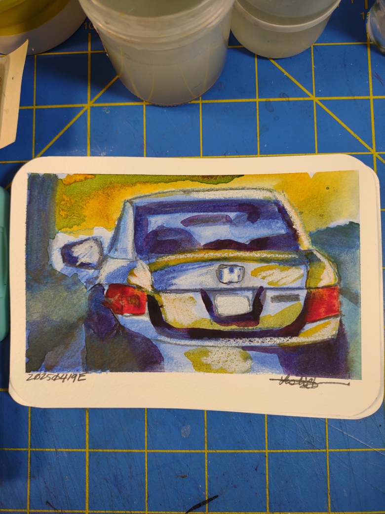
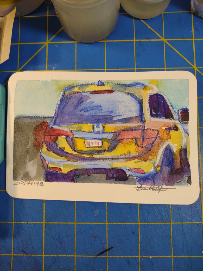
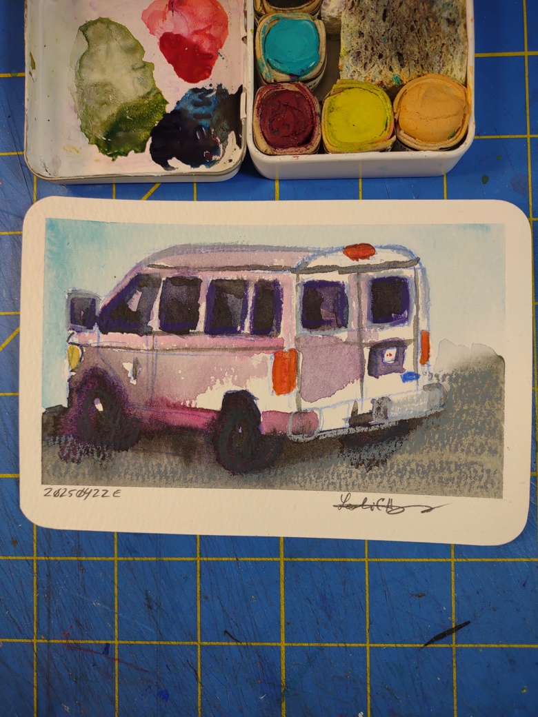
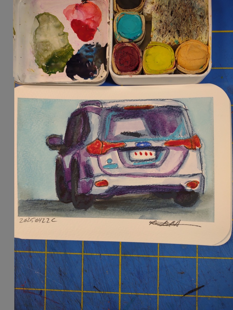
The last few mornings I’ve been granting (AKA forcing) myself to spend time in the studio. It’s a simple process I have suggested to many over the years- when you don’t know what to do with your art, sling some paint.
I’m doing a few things in the studio. First off I’m experimenting with DIY.Eli’s screen printing PVC frames. Yeah I hate plastic but in this case… Plastic makes enormous sense. Anyway, I’ll take some pictures, BUT I have 2 BIG screens stretched and no ideas on what to do with them so there’s that. The other things is I stretched some cheap Harbor Freight drop cloth canvas on one and put MANY coats of gesso on it and DAMN! It’s awesome. I don’t even like painting on canvas but this is amazing.
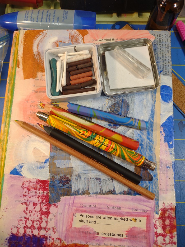
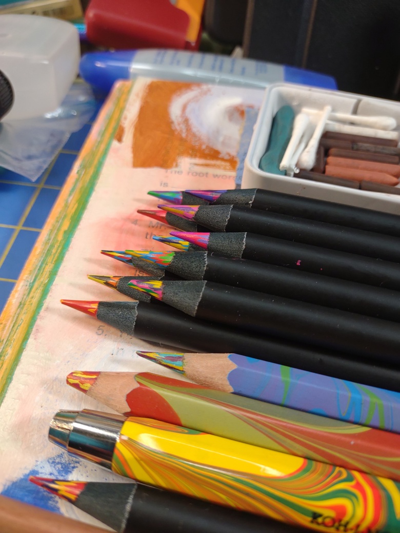
The second thing is I’m working on the process for adding pastels to screen prints on paper. I want to add some sketchy loose feeling to some really flat portraits that I’m working on. The chalk pastels are great for this feeling. The trick is to use silk screen base or medium to print the chalk through the screen. Pretty killer. The chalk pastel gets really dark with the ink.
Then I’m just scraping some paint around. Like many things screen printing ink is very much use it or lose it. Once it is open, you’ve got to use it. I’ve got some OLD quart sized tins of Hunt (what is now Speedball, and changed names back in the 90s!) ink. Some of it has a bit of an odor so I know we need to do some stuff with it. The great thing about it is that it is artist grade, so it mixes into other colors well and can be mixed with regular acrylic paint for a FULL range of colors. Very nice.
The paint scraping is really taking these sheets of paper and just elevating them, making them more interesting and thick.