I want to tell you about mixing darks. For years I lived under the impression that a “real artist” doesn’t use black paint, even though it’s a part of many colors, like one of my favorites Payne’s Gray. In school mixing black with anything was definitely frowned upon. Instead we were expected to mix colors together to create deep dark shades. One of my professors taught me a dark that I really like and still use. It’s useful with a variety of colors because it can be mixed warm or cool.
It uses the following 3 colors:
- Pthalo Blue
- Alizarin Crimson
- Pthalo Green
For the standard deep dark color, mix all 3 in equal proportions. If you’d like it warmer add more aliz crim.
This recipe can be changed up by mixing in various proportions:
- alizarin crimson
- Pthalo Blue
- Cadmium Yellow Med or Cad Orange
Again start with equal amounts of each and adjust the colors to get the shade you want and need.
The various art professors who had issues with black said it “muddied” your colors. To a point that’s true, if you add a TON of black to a mix of colors it can turn to mud and not be clear. That being said, adding a touch of black to a color will dull it and darken it.
One professor that I had suggested that we use it as a base color for shadows. Where another suggested that we use thalo blue for shadows and another suggested that we use thalo green for shadows.
I’ve found that the truth lies somewhere within the maze of contradictory and fuzzy advice these knowledgeable ladies and gents shared with me oh so many years ago. The core of this whole discussion is that you need to stare at a shadow and decide for yourself what color does it lean towards? Red Blue Green? Depending on what you see you should lean that way.
For me, my shadows lean toward the blue purple side of the spectrum so I start with a touch of pthalo blue and a tough of alizarin crimson hue or quid magenta.
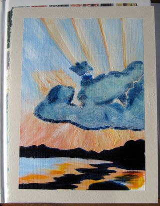
Even though I feel okay using black now, I still tend to make my darks from blends of colors. In the image below that dark dark color is the second blend I wrote about AND I had it lean toward blue.
