Vibes not realism is a mantra I take very seriously with my art. I want to capture the feel and the essence of a place. A ting I have realized is that part of that capture is moving bits and pieces around so that the feel of the image is right for how I felt in that place.
I stopped at Collin’s Cover and painted two pieces. I’ve been planning to stop and paint here for awhile, but the times I was getting out of work and low tide didn’t line up until yesterday. So I finally stopped.
I think this spot will be more interesting in morning light so I’m going to attempt it another time in the morning. The changing light really alters the vibe.
Collins Cove is an interesting spot. It’s a calm little cove where a conservation group is attempting to reclaim some of the beach grass area. It’s a gravely muddy beach that locals like and often is quite packed with people. It’s a common launching spot for kayaks and paddle boards. I’ve been told that there have been horseshoe crab sightings here in the past. Neat.
Anyway, what draws me to it is that on week nights it’s pretty chill and doesn’t have a ton of people. The color of the retaining wall feels like it’s straight out of the 80s industrial paint bucket. When you are there it’s clear that a great deal of the infrastructure around the cove is old and has been somewhat maintained. But the color of the cement retaining wall is a warm tan that leans pinkish gold in the right light. A pale salmon-y peachy pinky tan. That sits atop a wall built of cool colored stones. It’s this contrast that drew me in.
At sunset the wall is in shadow and the areas where the light hits it glow warmly.
Did I perfectly capture the scene? Nope. Do I care that it’s not perfect? Nope.
I started out with a pencil drawing in both my sketchbook and on a piece of that kraft cardstock I wrote about here. I then added in Inktense pencils. I really like these because they let me REALLY layer in the color and on most paper they do not reactivate. I activate them with a large sized waterbrush. I then layer in watercolors and more Inktense. I add in some water soluble colored pencils and Neocolor2.
I’m not aiming for perfection here. I only have so many colors in my travel kit and while I can mix almost any color with my watercolors I often chose to keep it as simple as possible and not mix colors all that much.
I did two versions of this spot and I like both of them, but I’m also thinking about how I can tweak this composition in a more finished piece.
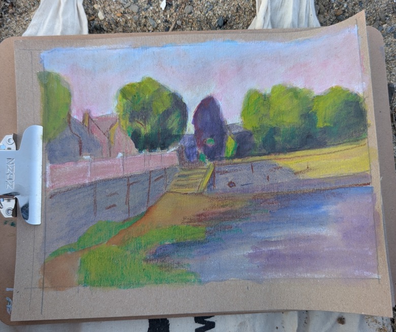
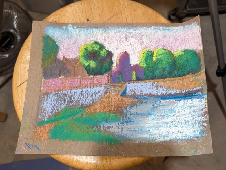
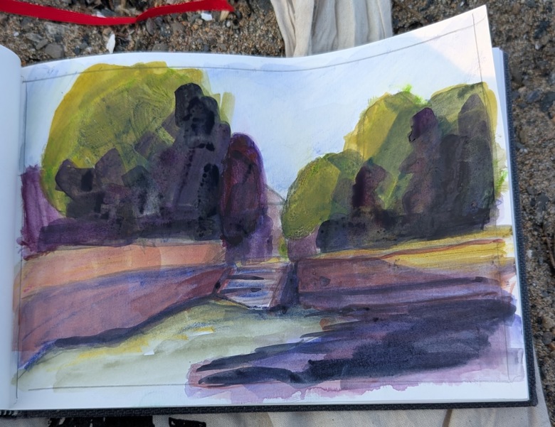
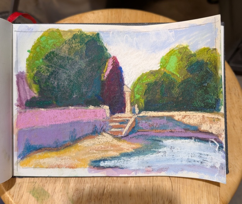
Each image works in it’s own right, however I like the composition of the second image in my sketchbook more than the first on the brown loose card. As for the composition itself? It’s far too centered for my liking. I used a tunnel style composition that is intended to draw the eye into the focal area, however it is dead center on both of these images.
to take these from sketch to finished image, I would extend the sky a lot. It’s nearing sunset here, so I can REALLY amp up the drama of the sky with warm shades and haze. I would also move the stairs out of the center line, I’d probably crop this so the stairs are more to the right of the image and reduce the contrast in that bottom right area.
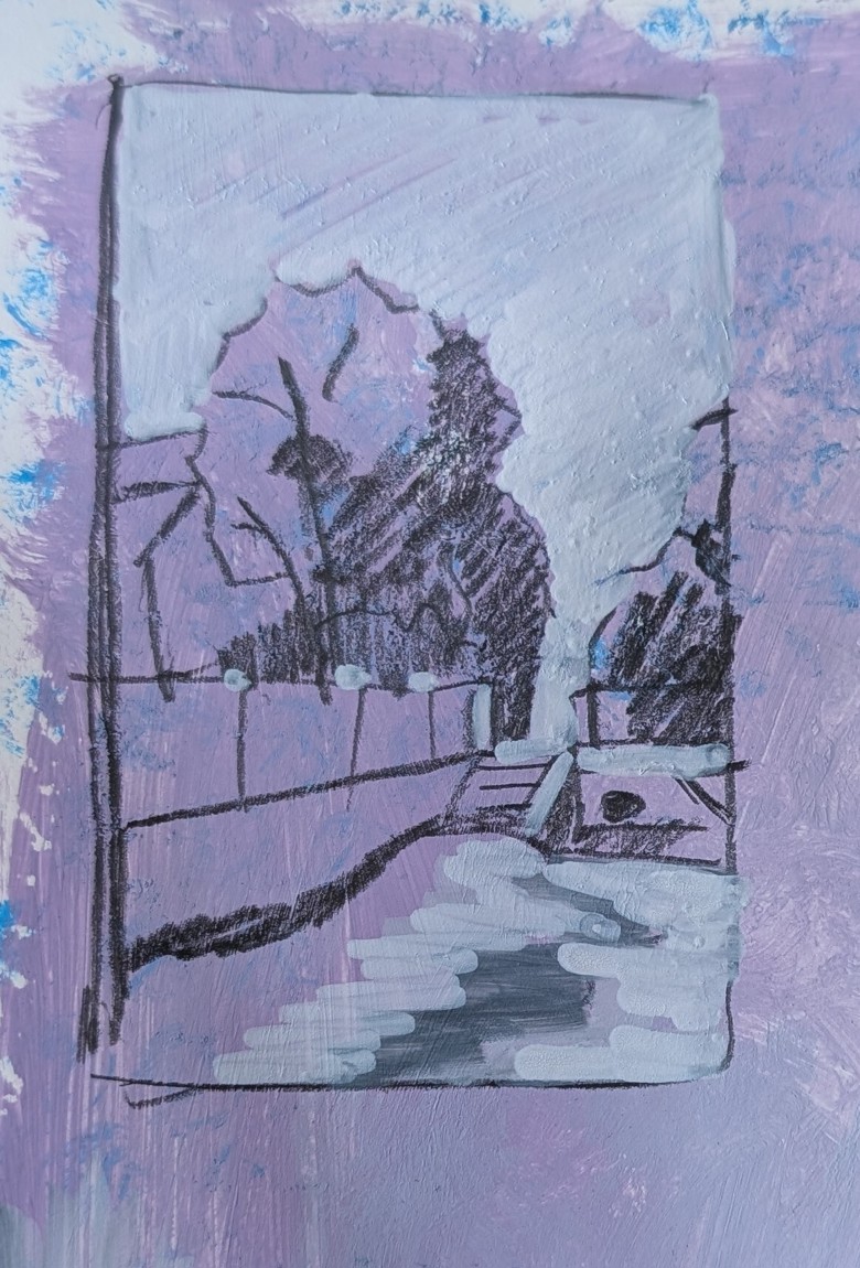
Here’s a quick Notan sketch on pale purple toned paper. Notan made with pencil and white paint marker. On my screen it’s about life size- about 1.5×2 inches.