When I first started my health and wellness journey, I walked. I walked around my city. I walked around parks. I walked at the mall. But pretty often I stopped at Salem Willows. Frequently just called “The Willows” around here. I’d stop there and walk from the free parking lot around the Willows and sometimes around Winter Island. It’s beautiful and the history is pretty nifty.
As I work to rebuild my knee strength I need those easy walks again. So I decided to head back to the start. The Willows features some really beautiful scenery and safe paved walking paths. So I walk a bit and look for a spot to make some en plein air images.
I’ve been a bit obsessed with Dead Horse Beach for years. It’s the name but when I first visited the beach there were pieces of old stuff from around The Willows. That stuff- mostly weird poured concrete with rebar embedded in it has greatly worn down over the last 25 years.* But the interesting scenery remains.
The process for these images is pretty simple- walk, find a spot to draw and paint, look through the viewfinder, sketch with pencil, add watercolor, let it dry a bit, add pastels, colored pencils, etc…
The above images were the first in this series. I realized that I was pretty focused on realism here and not my usual vibes. I was getting frustrated that my watercolor travel palette has only 9 colors and that I only carry a handful of colored pencils. 
Again realistic colors, but a bit of a push for myself to use purple and dark blue in the shadows. I had to push myself to ignore watercolor advice I’d gotten over the years to build up layers. I leaned into adding in some teal colored pencil and white paint marker.
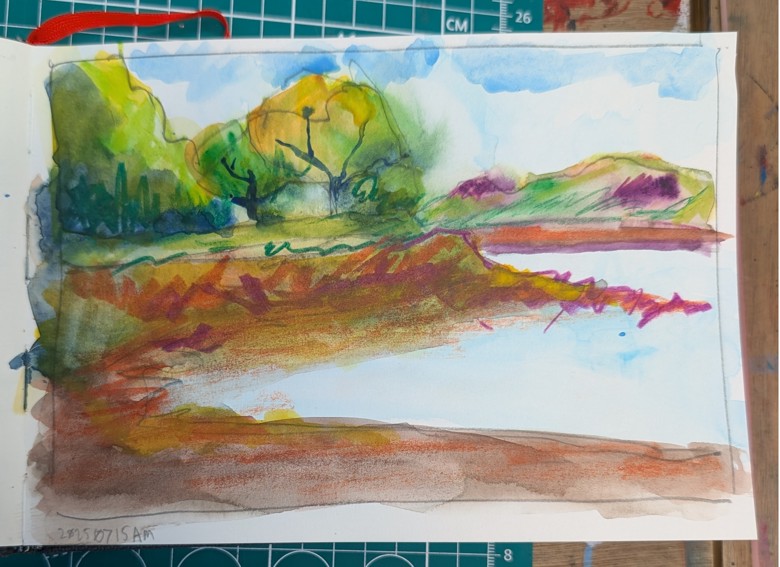
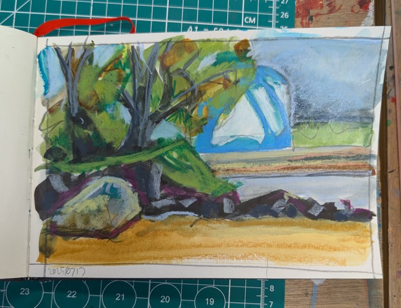
In this image I pushed myself more. The retaining wall (the curved piece that spans the page) is yellow ochre in real life, but I didn’t have yellow ochre on my palette. I did have yellow and blue and red oxide. I used what I had to get the value and shadows. It’s cool and shadowed and the tide line is darker. The trees have deep darks and bright yellow highlights. I used some pastels to add in some of the real colors. This one feels like I’m getting there, even if the sketch isn’t great.
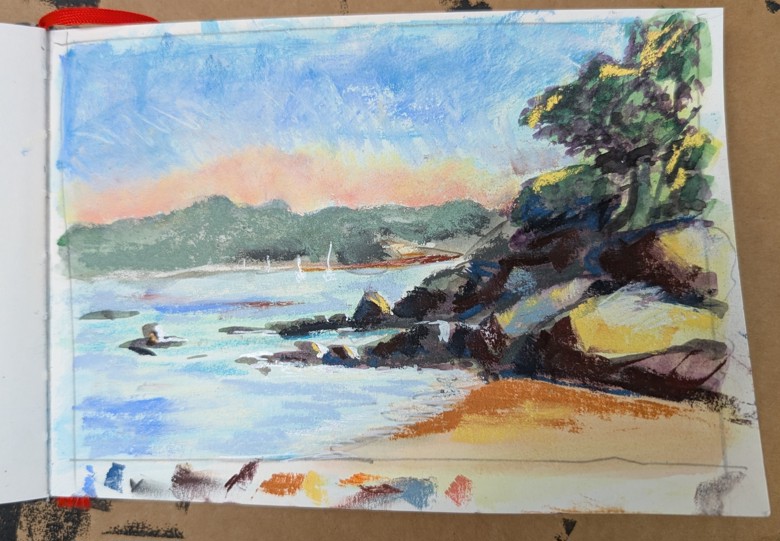
This one I really pushed the colors of the watercolor sketch and then added in more soft pastel than I have previously. I’m really trying to get the vibes. More purple for the shadows and I like the layered sky. It feels the way the sky did that day- hazy with distant clouds.
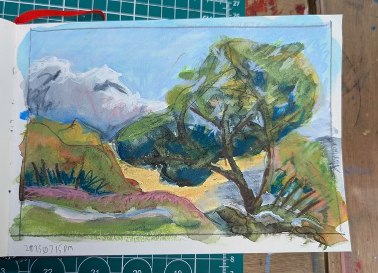
This one feels more like vibes not realism. Yes it’s based in the reality of what is there, but I definitely mashed up what I saw into something that feels like the view. I’m not sure that makes total sense, but in this image I was really pushing the colors and the shadows. More purples in the shadows and more lighter lights. It took me a bit to get the correct colors for the distant tree line, but I feel like the green gray color is a good one to get that distant hazy look.
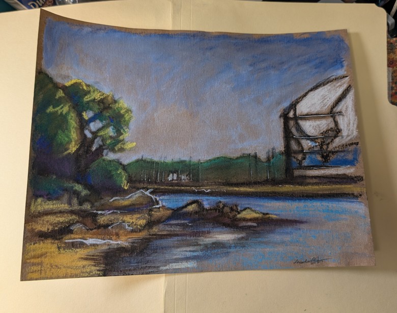
Up until this image all the images have been 6x9inches this one is 8.5×11 inches. FOr this one I didn’t intend to add pastel I meant to leave it just black and white. I started off with a black water soluble gel crayon and a water brush. I added in white with chalk. Simple. Pretty effective. Then I wanted to add in some blue for the sky so I added in Neocolor 2s and used water to blend them. I liked how the color worked with the brown paper** so I decided to add in pastels. I REALLY like this one.
Each morning when I go out to walk and make art I feel like I’m hitting a new milestone with how I’m capturing the scene.
*I just realized it’s been 25 years.
** I’ve got to do a whole post on this paper.