Routines. I have written about routines endlessly over the years. I am someone who thrives with a similar routine for each day of the week, with a few outlier days here and there. It’s how I work best and how I thrive.
I wrote previously how I had established a great summer routine that really helped me to put a focus on my own art making. My August plans and vacation destabilized that routine and now that I have returned to work I am struggling to get that routine back into place.
It’s not helped that the first 2 weeks back at work are not regular weeks back at work. The first week was a lot of running around, catching up on emails, and cleaning the studio. This week is all trainings and weird scheduling. Next week will be the first week I am back where I have a set schedule. Even that week is a bit more flexible than I’d like.
I have not been able to work on my new routine for this fall.
ARGH.
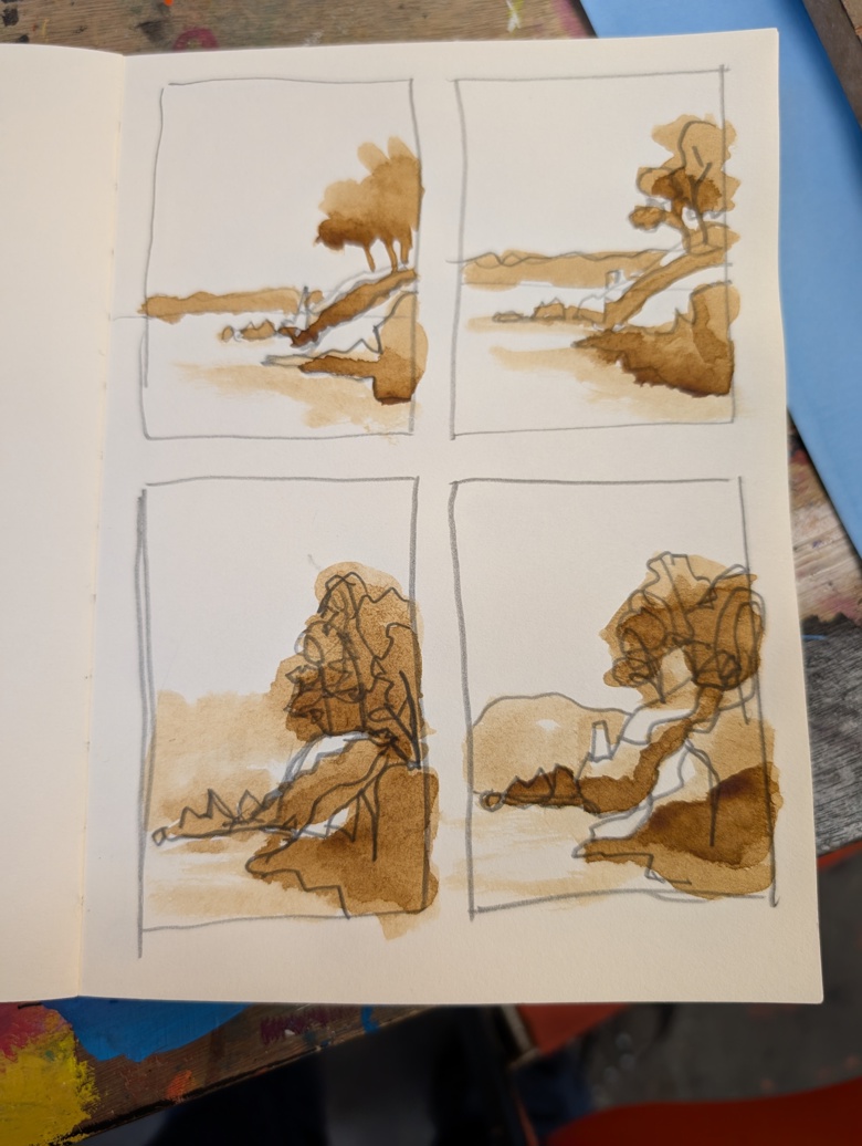
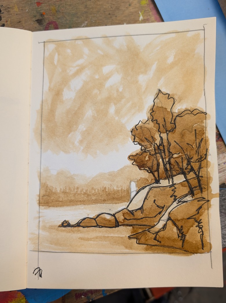
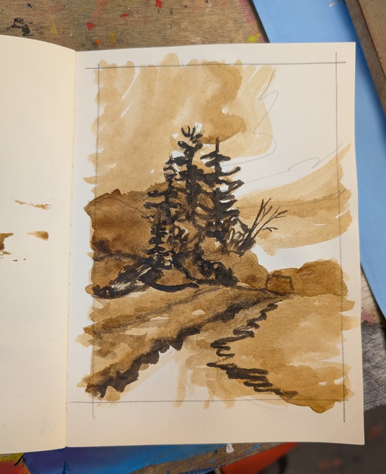
I have been making art and a little bit more acorn cap ink. I’ll write a full post about the ink- because I made more of the brown but I also did an iron version that is a wonderful shade of gray.
I’ve been trying to use the acorn cap ink on it’s own and in conjunction with other tools I have in my on the go kit. It’s been really truly wonderful. The shade of brown is golden and warm and works really well with all the colors I generally have in my on the go tool kit. From sepia to black to shade of blue and purple it mixes well and creates wonderful darks and shades of gray.
It’s also really nice on it’s own but is too light to create deep darks.
Here are some examples: I’ve been working on sketches from the photos I took at West Quoddy Head and Roque Bluffs. These images are studies from the photos and are really looking at patterns of light and dark and how they impact the final image. I’m adding and cutting out trees in the tree line and looking at how that impacts the image as a whole. I might try to do a few images in this warm brown and blue color way- it’s really striking.
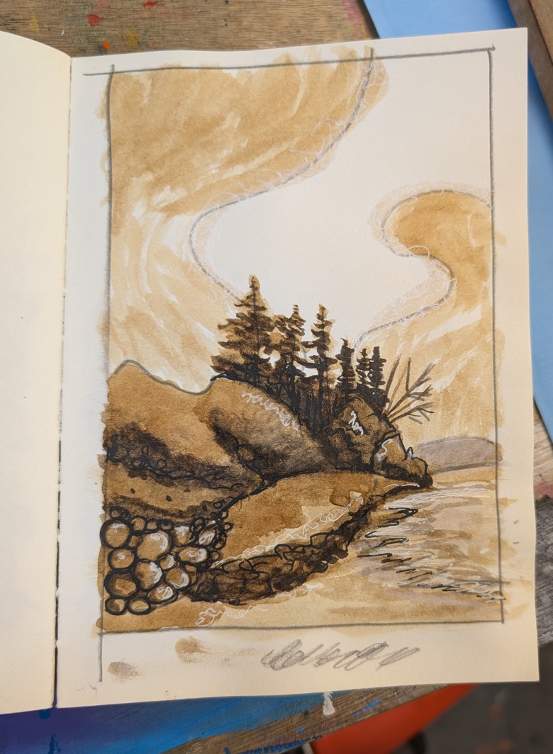
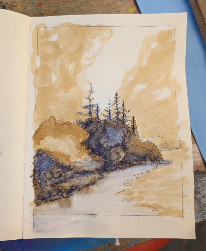
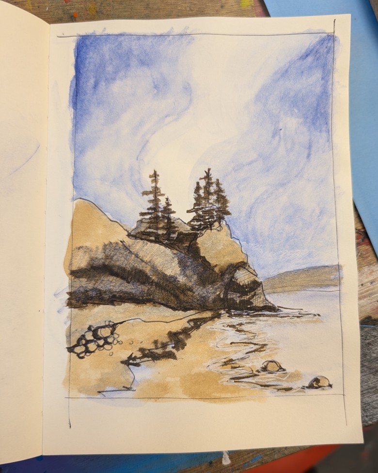
I think the last image is my favorite, it’s definitely not true to the scene itself but it gets the vibe. The lightness of the sky works well with the shadows in the trees. The trees are a bit too tall so they’ll come down a bit, but the over all feel of this is right where I want it.