One of my goals for my vacation this past week* was to complete several finished art works. Which I’m happy to say I achieved**. I’m currently working to complete another but I thought I’d go deep on the process for this here blog. This is the first few steps in detail.
The process for this piece started with a hike at West Quoddy Head. Here I took a few pictures of the scenery. The image below struck me as having potential.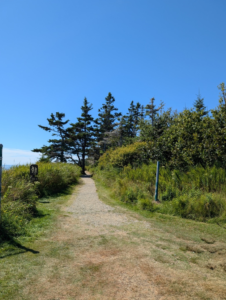
The path leading to the rest of the trail with the lighthouse behind me. The grouping of spruce and pines seemingly block the rail but just there in the midst of them, the bend in the trail.
The sun is bright with clear skies. We’ll make the sky more interesting later.
The next step is to make thumbnails. I went through my various pictures and made thumbnail in roughly the same aspect ratio as the photos- 4:3, 9×12, 12×16 etc… These are kept small in my sketchbook and made with lines and pencil then brush marker in a somewhat Notan style.
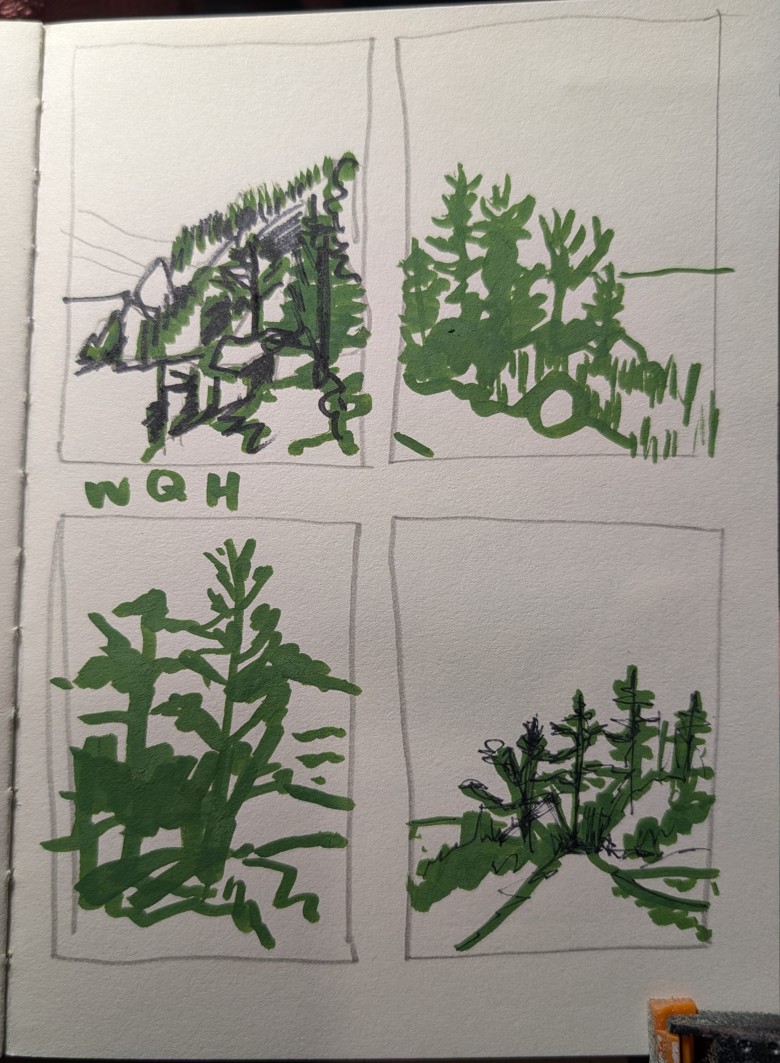
These aren’t detailed. They are made to just capture the essence of a scene and help me figure out composition. The next step is a larger study. In this case I’d spent a lot of time thinking about the image. It can be done pretty boring.
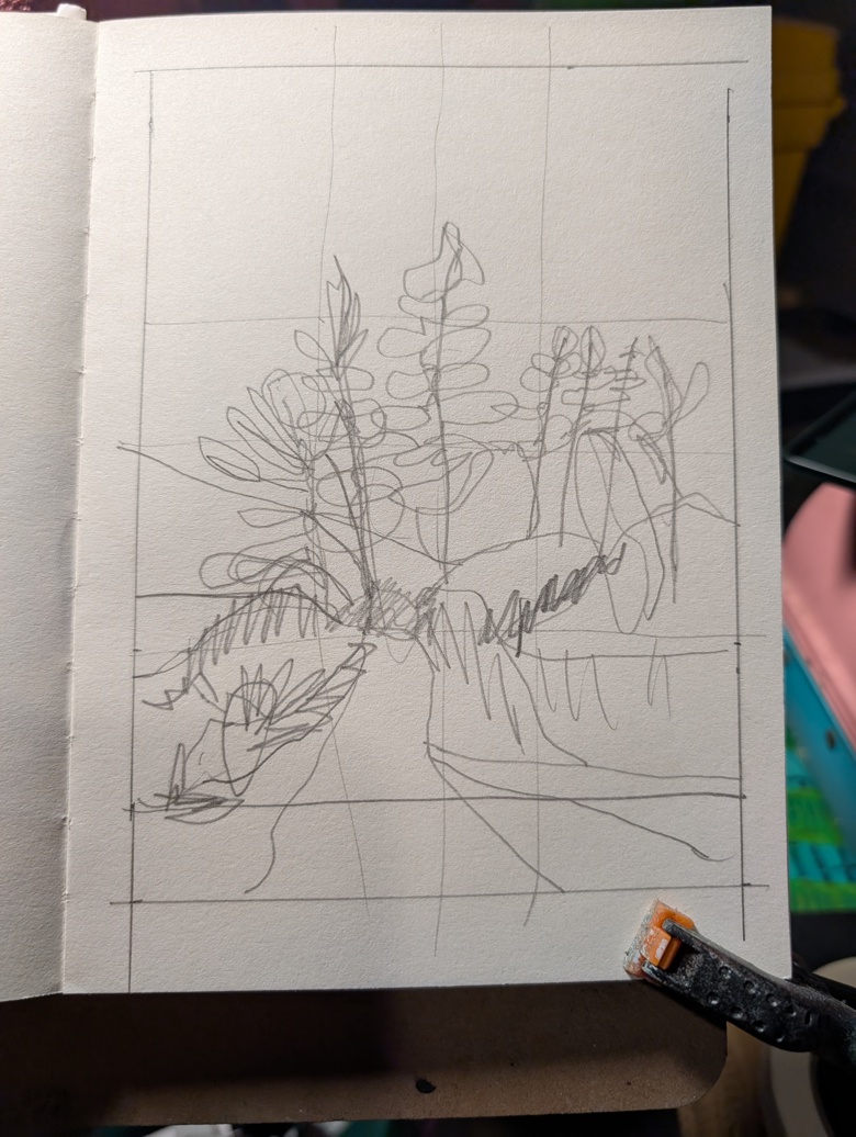
In this case I realized that the space at the bottom of the page pushes the central part of the image up and into the very center of the image. This can be combated with value and color later in the image, but in this case it’s a fine line for the image. If I start out with everything centered on the page I have a lot more work to do later with color to pull the composition out of boringness.
Instead I make a line roughly an inch up from the bottom of the image, cutting off a lot of the open space and directionality of the trail. The plan is to extend the sky up for the rest of the image.
It is important to note here that this larger sketch or study is done in the same size ratio as the final piece will be. This sketch is 5×7 inches while the final work will be on 10×14 inch paper.
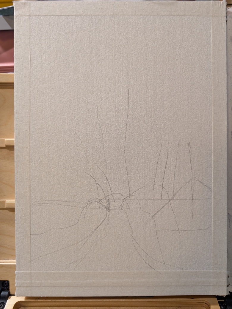
I then use a soft pencils*** to transfer my sketch to the watercolor paper. I’m using an OLD Cheap Joe’s 100% cotton 10×14 block with about 3/4 of an inch taped off on each side.
The next step is to start layering on watercolors. I start with a VERY pale wash to block in the sky, water, and trail.
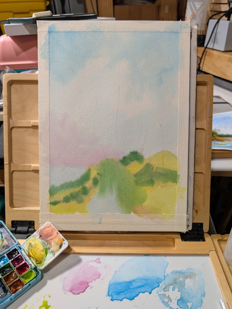
These are the lightest areas and darker colors will be built up. I come back in and add in another layer with additional colors.
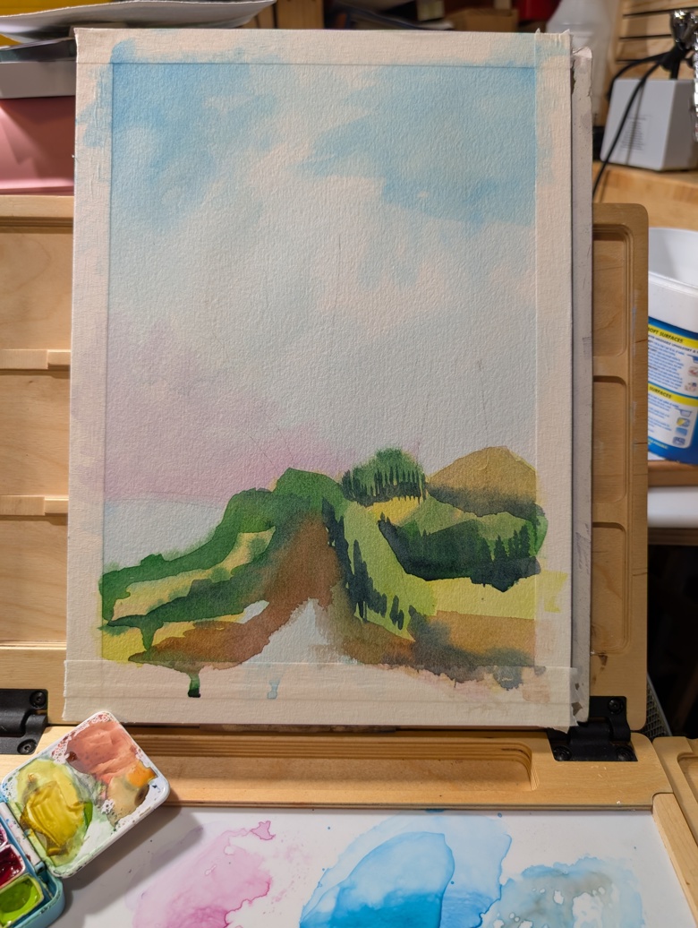
I want to add in the next layer of darks and the clusters of trees. You will note that I’m not being too controlled by the initial photo, rather I’m letting the image guide me, as I build up the layers of this image. At this point I’m adding in my darkest darks in the trees- a blend of Hooker’s Green and Indigo a hint of sepia and red oxide.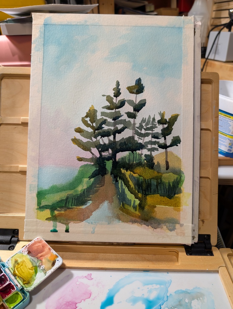
The trees have come to life. Here they are still partially damp, so I’ll come back with a another layer of darks to really deepen the dark areas and show how dark these trees are in person. I also want to keep them looking dark green not black. That’s something the photo doesn’t capture- that the darkest darks here are actually still very green with a hint of deep blue.
The next step is that final layer of watercolors. then I’ll start layering on chalk pastels. I also see in these image where I want to change things- the ocean and grass on the left side of the image aren’t quite where I want them. I need to increate the volume of the grasses and bring up the angle of the row of grass, which will hide more of the ocean view.
The pastels usually go on in 2 or 3 layers.
*I am not ready to return to work yet.
** Though fewer than I had hoped.
***I use a soft pencil because I have heavy hands and ANYTIME I use a hard light pencil I leave indents in my paper which can be seen in the final image.