Category Archives: technique

Acorn Cap Ink- Part 2 This Time with Iron

My first foray into acorn cap ink was a total success. It produced a lovely golden brown ink. I worked quickly and knew the caps had more tannins to leach out. I attempted a slightly longer extraction method- I put them into a jug with far more water than strictly necessary and let them sit for a few days. I then repeated a boil and steep for a couple of more days. That is to say when I arrived home from work I turned on the burner and brought the caps to a boil, then let them steep over night and repeated the process of boiling in the AM. I did this for 2 or 3 days. This was quite low effort, I set them to boil while I was making my morning coffee and evening tea.

Then I strained the caps out. Once strained I ran some boiling water over the caps to remove any tannin rich liquid clinging to them. Yes this added more water that needed to be boiled off but I think was worth the effort.

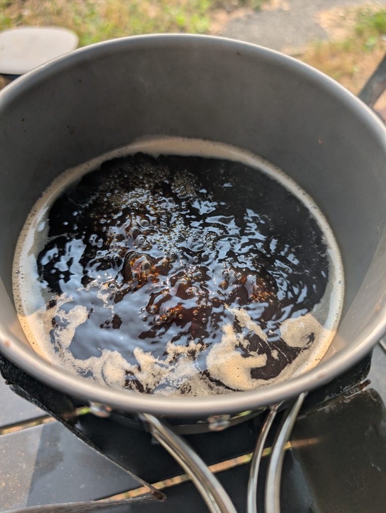
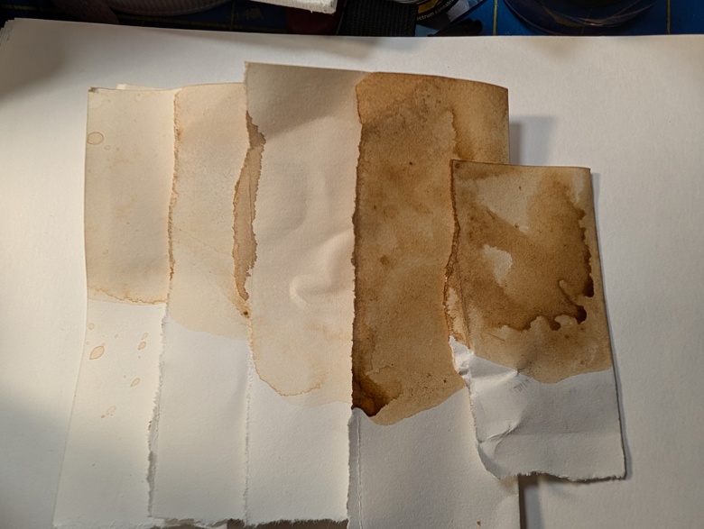
After this process I reduced the liquid by 50%. I then divided this into 2 part. One I boiled down just as I had for the first round of ink and added that to my container of plain acorn cap ink. The color is slightly more brown than golden brown. Still quite nice.

The second batch I reduced down with the addition of a large rusty nut I found while out on a walk. Pretty much anything with some rust on it will work. I added an additional cup of water to the mix to get the tannins more fully covering the nut. The tannins react with the rust to create a deeper darker ink color- in this case it is quite black when you look at it but goes on the page as a rich gray with a blueish cast. It’s quite lovely.

Again the smell of the ink as it was cooking down was pu-erh tea and the woods. Really quite lovely.

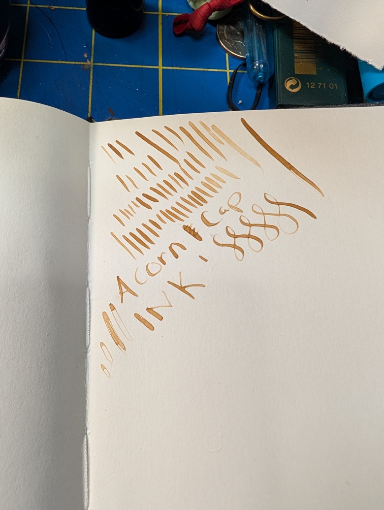
A couple of notes- I will reduce the ink far more the next time I make it. The color isn’t as intense as I’d like and the first application with a cheapie brush pen is quite thin and pale. It does layer quite well.

I suspect that there is a sugar content to the caps as there is much more of a sheen than there should be given the amount of gum arabic I added.

Gum arabic impacts how the ink clings to the pen and the brush as well as flow on the page. I use it for the cling properties. The ink does lift quite easily. Again I suspect the sugar content acting like honey or glycerin does with watercolors- increasing the water solubility of the ink.

Thus far my favorite way of using it is in a cheap brush pen. (Link to the pens I’m using.) It can clog quite easily so I have altered my brush pens by removing the thin fiber tube that slows waterflow.

Next year when I make another batch I will add in a fermentation stage to allow some of the sugar to ferment off. I believe this will reduce the lifting and water solubility on the page.“

Hectic Second Week Back at IT

This was first published on my Ko-Fi blog a month ago, if you want to read my writing in real time head over to Ko-Fi and follow me.

Routines. I have written about routines endlessly over the years. I am someone who thrives with a similar routine for each day of the week, with a few outlier days here and there. It’s how I work best and how I thrive.

I wrote previously how I had established a great summer routine that really helped me to put a focus on my own art making. My August plans and vacation destabilized that routine and now that I have returned to work I am struggling to get that routine back into place.

It’s not helped that the first 2 weeks back at work are not regular weeks back at work. The first week was a lot of running around, catching up on emails, and cleaning the studio. This week is all trainings and weird scheduling. Next week will be the first week I am back where I have a set schedule. Even that week is a bit more flexible than I’d like.

I have not been able to work on my new routine for this fall.

ARGH.

I have been making art and a little bit more acorn cap ink. I’ll write a full post about the ink- because I made more of the brown but I also did an iron version that is a wonderful shade of gray.

I’ve been trying to use the acorn cap ink on it’s own and in conjunction with other tools I have in my on the go kit. It’s been really truly wonderful. The shade of brown is golden and warm and works really well with all the colors I generally have in my on the go tool kit. From sepia to black to shade of blue and purple it mixes well and creates wonderful darks and shades of gray.

It’s also really nice on it’s own but is too light to create deep darks.

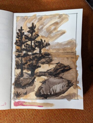
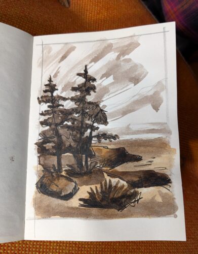
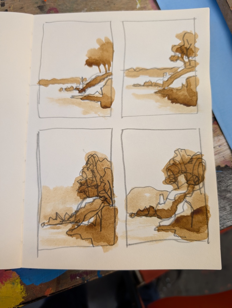
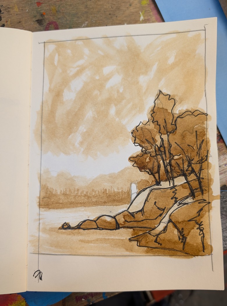
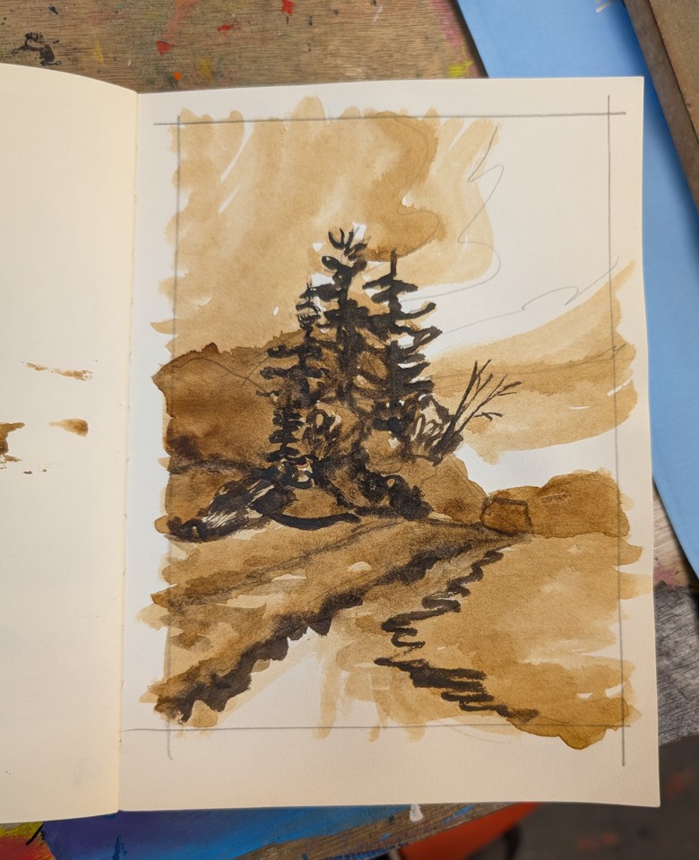
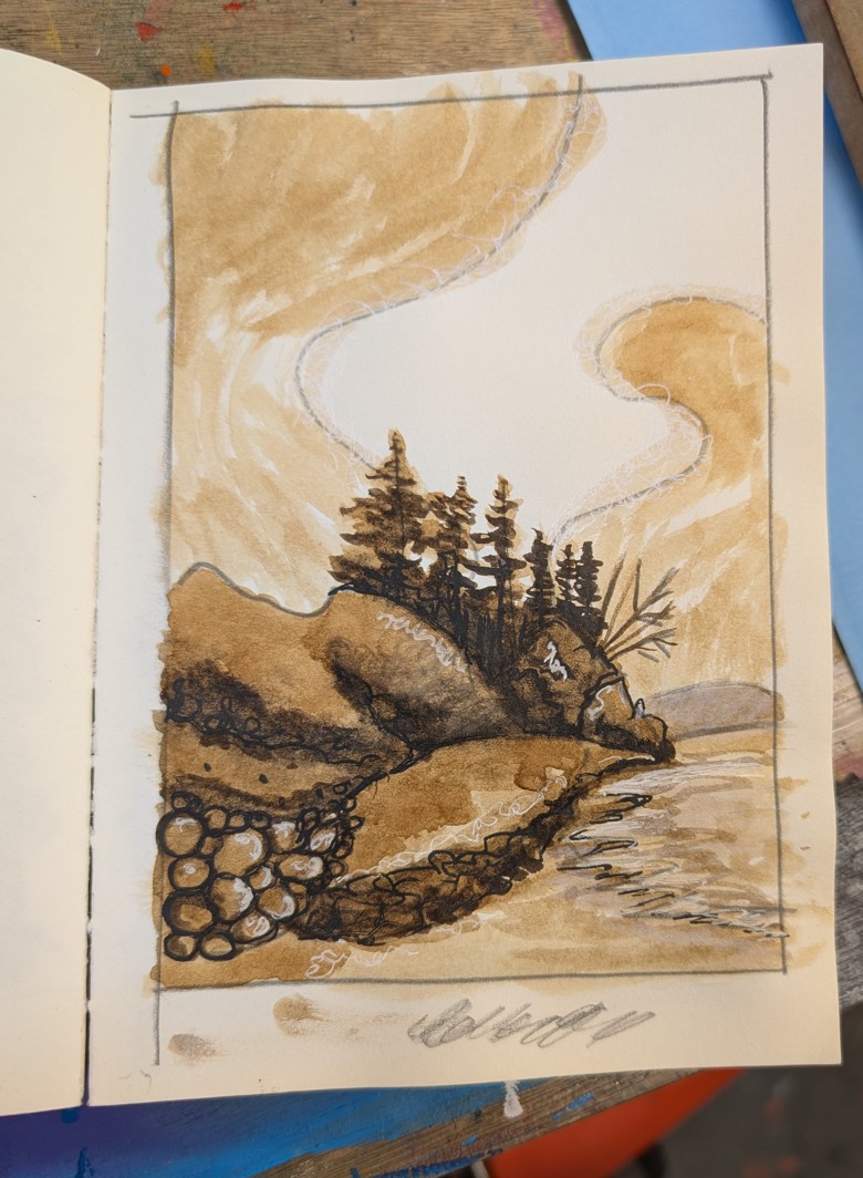
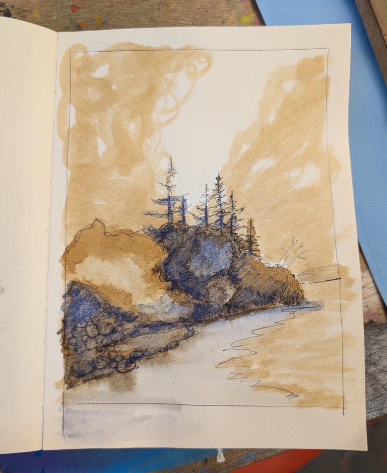
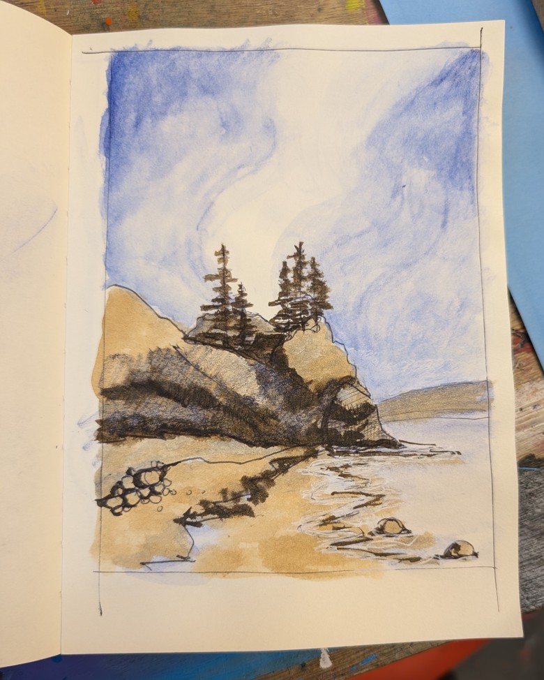
Here are some examples: I’ve been working on sketches from the photos I took at West Quoddy Head and Roque Bluffs. These images are studies from the photos and are really looking at patterns of light and dark and how they impact the final image. I’m adding and cutting out trees in the tree line and looking at how that impacts the image as a whole. I might try to do a few images in this warm brown and blue color way- it’s really striking.

I think the last image is my favorite, it’s definitely not true to the scene itself but it gets the vibe. The lightness of the sky works well with the shadows in the trees. The trees are a bit too tall so they’ll come down a bit, but the over all feel of this is right where I want it.

Acorn Cap Ink- A First Round

While I was at Zea Mays Printmaking for professional development I went camping. Specifically at the DAR Campground. My camp spot was ringed by a whole variety of trees but mainly by several tall straight oaks. During my third night there I could hear acorns dropping. I had looked for interesting rocks but neither my camp site or any of the trails I visited had anything that would work for making paint.

I decided to get acorn caps. Acorn caps hold a lot of tannins and have been using for dying and ink making for a very long time. They are often used as a source of tannins for gall based inks.

In my case I want to make a jug of acorn cap ink with and without iron.

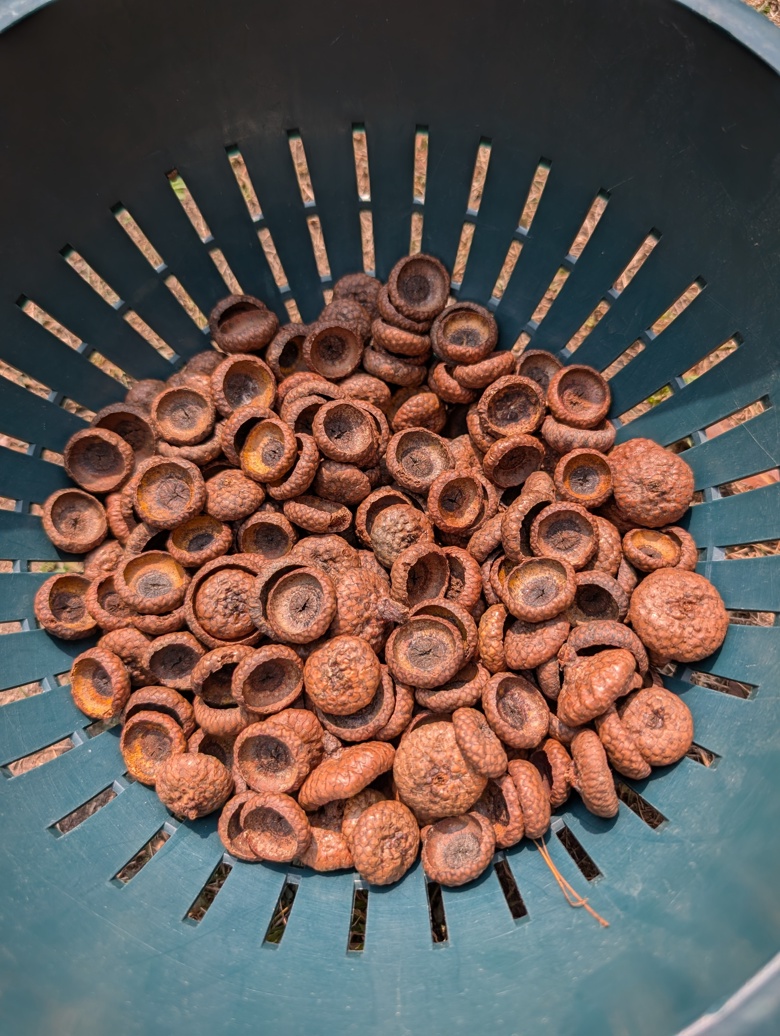
I gathered roughly a pound of acorn caps- just the caps and no nuts. I put these into a black doggie doo bag and tied it shut. This stayed in my car for a few days. My thinking around this is that the heat would kill off any insects in the caps. I then left it in my studio for another few weeks.

The first step is to wash all dirt and insects away from the caps. This is easily done in a colander. It is important to NOT soak the caps lest some of the tannins soak away. I used cool water and agitation to remove all dirt and debris. I then spread my caps out in the sun to allow them to dry. 

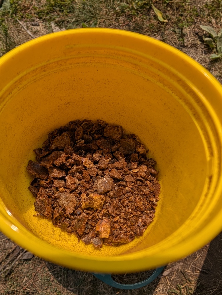
After my caps were dry I started to break them up by hand. Many caps were very hard. I ended up putting the caps into a zipper bag and stomping on them to get more of the caps broken up. Once the caps were broken into smaller pieces I put some of them through am old hand crank coffee grinder. This worked well except for when it got jammed. I probably ground a third of my caps.

If I decide to make this again I will grind more of the caps. The ground caps leeched out the tannins substantially faster and more easily than the whole or just crushed caps. The coffee grinder was set to French Press grind size. In this instance a whirly grinder might be a better choice.

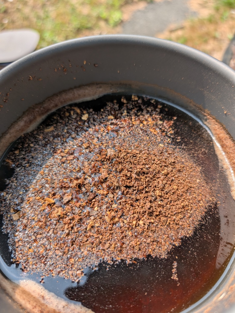
I used about 1.5l (6 ish cups of water) to cover the caps. I used a pan that will not be used with anything but ink making supplies. I brought this to a boil and then let it cool off then a boil again. I probably boiled and cooled the caps 4 times. 

When cool enough to handle I strained the caps through a kitchen towel. The caps held at least half of the water in them. I squeezed them out the best I could but not much additional squeezed out.

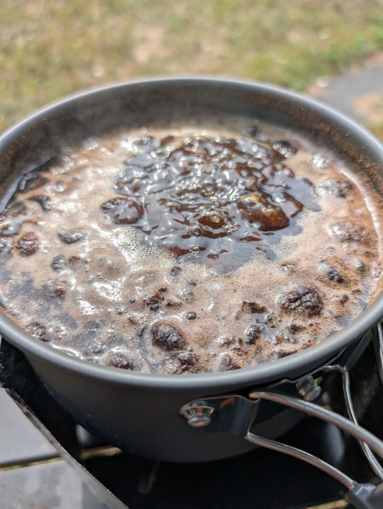
This was returned to a cleaned out pot and brought to a boil and then simmered until it was reduced to about 1/3rd of a cup. Through out the boil there are visual changes in viscosity- the mix goes from very thin to thicker and at the end it is not thick but it coats the bottom of the pan. This initial steeping resulted in a lovely warm golden tan that I am in love with. 

I added a small amount of gum arabic to help bind it to the page when used for sketching. I suspect one could also use some casein based binder. There are a lot of binders out there but I had gum arabic. It would be super traditional if I harvested some peach or plum gum and used it in the same way. I added maybe a teaspoon, I should have measured better. The amount of gum is enough that after 24 hours the ink coats the sides of the jar I’m using for storage.

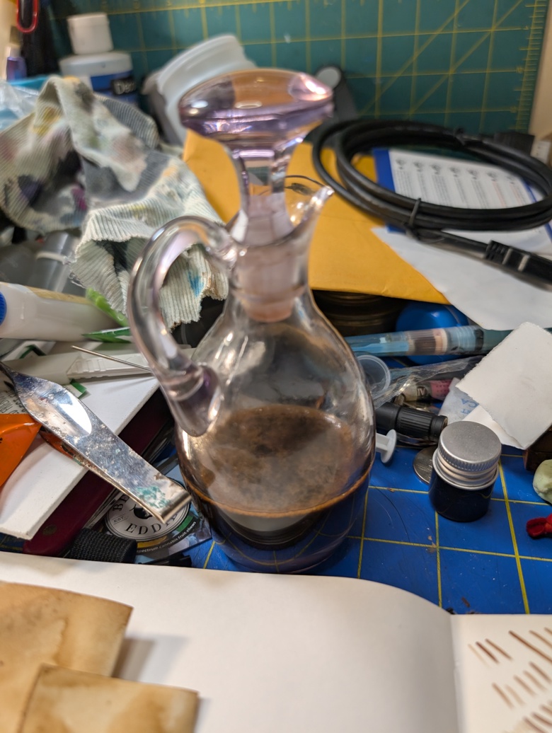
For storage you want an airtight jar or bottle. I’m using a vinegar cruet I inherited from my grandma, she’d hate that I’m using it for a practical purpose and not for decoration. That said I wrapped the stopped with some paraffin film used for sealing bottles in the lab. This creates a really nice air and watertight seal. I wish I could remember who I learned this from- it was during an ink exchange a long time ago!

The ink does darken on the page with time. I read one account that claims it darkens more over a month, but I suspect that is for the iron blended version. 

Some things I noticed, after the initial strain I didn’t notice all that much in particulates, I’m wondering if the tannins gather together in heat? Did I extract some starches? Did I scorch it?

This smells amazing. The odor reminds me of walking through the woods on a hot August day and of a strong cup of tea. It’s got a vague hint of the Caran d’Ache SwissWood pencils but pleasant.* Sadly this odor is covered up by the essential oils I use for preservation.

I’m really glad I did this project outside, I got distracted once and boiled the batch over quite a bit. I lost a good amount of the extract. I’m a little annoyed by this.

​I have noticed that many people do a very long and hands off extraction technique- boil the water once and then let it steep for a month or more. At that point you strain and boil it down. I don’t have the attention span to do that and not let it dry out or get moldy so I’m using relatively fast extraction methods.

I’ll have more observations after the next batch.

Next up is gathering some black walnuts and making some walnut ink.

I would not using this in a fountain pen or nice brush pen, I’m going to put a few milliliters into a cheapie brush pen and see how it does, but I expect clogging. We’ll see.

*I hate the smell of the swisswood pencil.

Car Portraits?

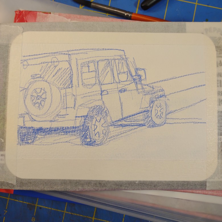
I’ve been doing these car* drawings for a few months now. It started out as a way to get better at drawing cars in my urban sketches. I hated drawing them and realized because I hate drawing cars I was leaving them out of my urban sketches. It made a lot of the images seem surreal and a little off. There are times when I want surreal and sometimes I just want the vibe to match.

Anyway, I did a challenge and looked to draw 100 cars/trucks/suvs/boats/etc…

And I did it!

But now I keep drawing them. Sometimes I hcallenge myself- I sit at the stop light near my house, it’s a pretty long light and try to sketch a car as it waits for the light to change. I should time it to see how long it takes. When I’m riding my bike or walking it seems like it takes forever for me to get the crosswalk sign. When I’m in my car I always hit the red light, and then it seems like it’s forever.

When I’m sketching, it feels like I’ve got to get the car in 30 seconds.

Anyway, I’ve jokingly started to call these images “Car Portraiture.”

For my sketching lately I’ve been using watercolor postcards. I snagged a stack of the cards, and by stack I mean over 300 of them. I start the whole process by taping them down to cardboard from soda 12 pack holders.

The process is pretty simple- I sketch in colored pencil. Either my Koh-i-noor magic FX or most recently a mechanical pencil with blue colored lead. It is of course, Uni NanoDia blue. It’s a nice dark blue and it erases cleanly. It’s quite nice and soft and I can get nice darks and lights if I layer and vary my pressure. Also, it doesn’t lift all that much into my watercolors and muddy them.

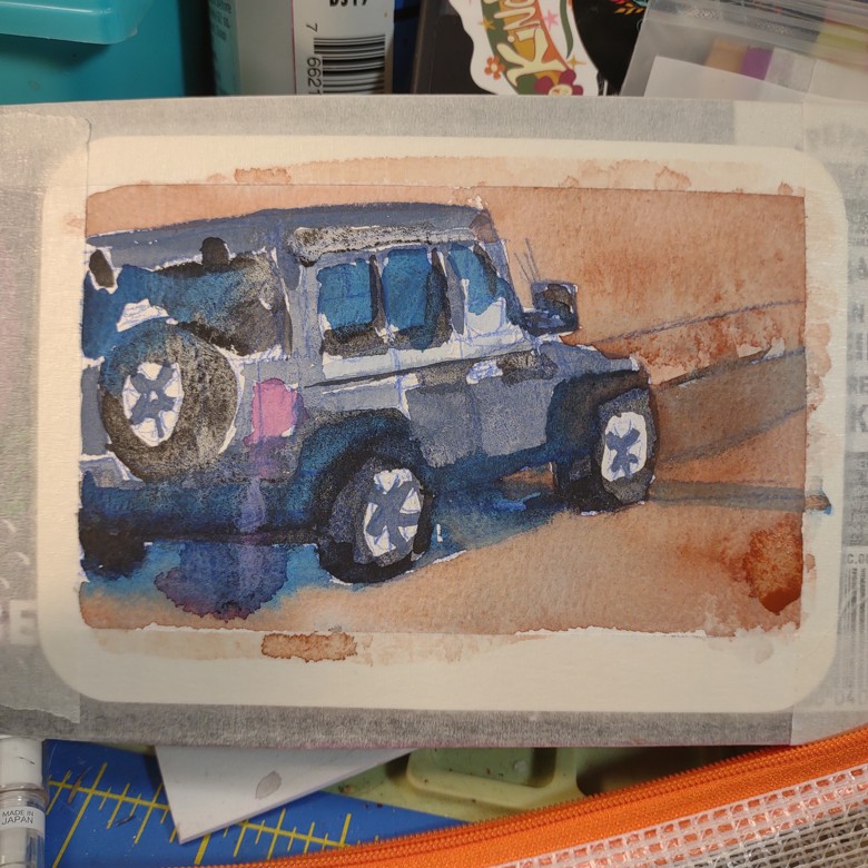
Which is the next step- watercolor. I layer on a bunch of color, often in vibrant pinks or blue. Sometimes I try to capture the boringness of the car color with mixed shades of gray. Cars are available in a huge range of colors but most of them in my area are- black, white, gray, champagne/gold, with an occasional burgundy and even more occasional blue. Rarely I see a burnt orange color or green or something else. 

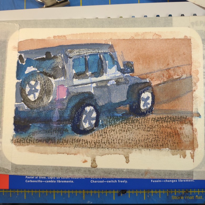
Anyway, watercolors go on. Next step I might layer on some NeoColor2. Sometimes I use my extra fine paint markers to add in black lines or white highlights.

Lately I’ve been really into adding in white highlights with a china marker.

I’ve been itching to get out my fude nib pen, so I probably will soon.

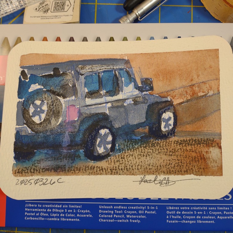
After I let the paint and everything dry I peel off the tape. I have come to really enjoy the really clean edges and clean look this gives the sketch. It feels finished.

The very final step it so sign and title the piece. With these they are titled by the date and a letter. I try to letter them in the order they were drawn that day but I’m sure I mix some of them up.

*I’m going to use the word car for all the vehicles unless I’m discussing something specific.

New Videos On a Mini Watercolor Palette Live on Youtube

I’ve recently posted a few new videos about the mini watercolor palettes that you can find on Amazon and Aliexpress for not too much money.

My first video was a rather harsh critique-

At this point I’d kind of fallen for the little palette and found another that came bundled with a sketchbook and a few brushes. So I discuss some tips tricks and hacks for making the palette better.

After a few weeks I answered the pressing question: What colors would I fill the palette with?

Then I dove deep into DIY mode and raided my recycle bin to see how I could make a water cup that slides onto the palette!

Mini travel palette affiliate links here:

Amazon:
Same as mine: https://amzn.to/4jO52wT
Better price: https://amzn.to/4aFIie3
AliExpress: These are similar products but will work the same: https://s.click.aliexpress.com/e/_opzyma9

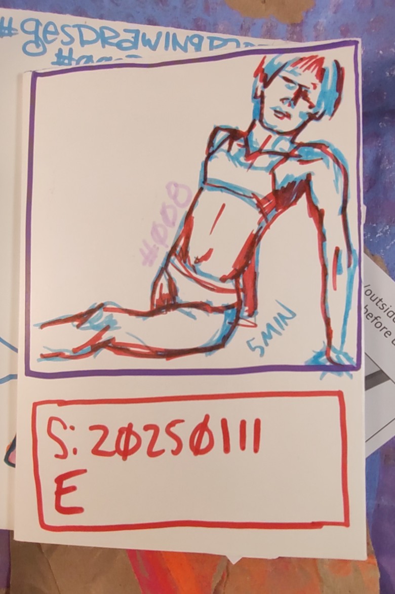
Love a Gesture Drawing

I love gesture drawing. I also love thumbnails.

As an artist these are areas where the rules of art are all about the vibes. The whole point of gesture drawing is to capture the feeling, weight, movement, value, and idea of a a person.

Now granted a gesture drawing is meant to be a means to an end- capture a moving human body in motion. The rules are that they aren’t meant to be finished works. Continue reading

Messy Materials

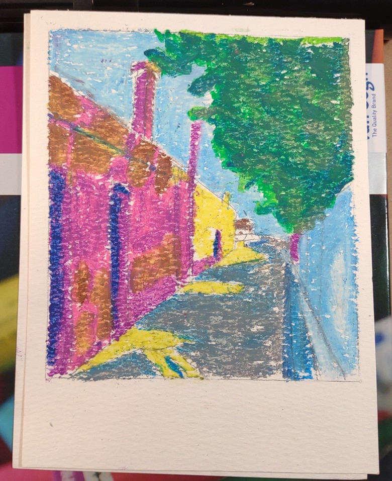
When I was young I loved chalk and oil pastels. There was something about the dusty blend of chalk that I loved working with. Oil pastels left chunky lumps on the pages but smoothed out with a finger into lovely layers.

I didn’t use them often in college but when I was teaching I used them a lot. I also stained a rug in a rental with chalk pastels. It cost me some money.

I started to avoid really messy materials like chalk and oil pastels. Chalk also started to dry out my skin.

When I picked up the kid’s tempera sticks I was reminded of oil pastels. More than once I felt like the tempera sticks felt like chapstick or lipstick smoothing onto a page. Good oil pastels are often referred to in the same way.

I went out and bought a 12-pack of Faber Castell oil pastels. Pretty chunky, smooth but chunky.

I’ve been thinking of doing the tempera sticks with the kids for their big project but they are not lightfast and we only use artist grade materials with the kids for these projects. So I went back to oil pastels.

I made my way out to my local (truly local a small local chain Artist and Craftsman Supply) art supply store and picked up 2 brands of student grade oil pastels and a handful of artist grade pastels.

The first brand of student grade oil pastels I picked up was Panda by Talens. They were smoother than the Faber Castell but not by much. The 24 pack of colors is a good choice.

The next step up was Van Gogh brand by Royal Talens. Smoother still but not that chapstick like consistency was looking for. Continue reading

Values Studies and Ink Wash

I recently took part in Ohn Mar Win’s Patreon hangout. She puts up photos and everyone draws and paints. Really kind of fun and something I want to challenge myself to do more of in the new year. But I need to find balance*.

Anyway, it made me realize that my landscapes are stiff and don’t feel as good as those i made years ago. I don’t know that I’ve shared here that in the early 2000s when I lived in VERY rural Maine I used to drive around Washington County and draw and paint local landmarks and scenic images. I’d then load them up to eBay starting at 1 cent or 10 cents. eBay had some sort of promo if you started your listing for 1 cent it was cheaper. I did a LOT OF that. I have very few images left over from that time period because I sold most of them for a few bucks. You might think that’s a shame but I literally paid my rent that summer** by selling landscape drawing and paintings of West Quoddy Head and Roques Bluff State Park to people all over the world.

Honestly, as an artist paying rent by selling art is a good feeling. Also, if I’m totally honest I lived in a tiny apartment and I needed to get it gone. Continue reading

Values Journaling Series

My Values Journaling series of videos is currently finished and loaded to YouTube. I might try to edit them down for the TikTokers out there, but for now I see value (ahem) in keeping them long. This way you see the process.

Here they are:

Setting Up a New Journal

When I’m about 1/3rd to 1/2 way through a sketchbook or journal I start to set up my next one. This gives me time to think about decorations and what journal type I want to use. Do I want blank or ruled pages? Dot grid? Hard or flexy covers? I grab a journal and start to make it mine. I add ribbons, elastic, a pocket and remove a few pages so I can collage. I number the pages.

Then I decorate the cover and set it aside to finish the one I’m currently using.

Lately I’ve been really into these sketchbooks from 5 Below. At $5 they have acceptable paper and are sturdy. They require all the prep I listed above.

These are some videos I have made of the process.