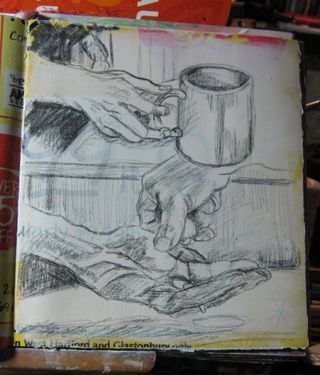
Well folks it's been a bit of a crazy week here in Comfortable Shoes land. It's been 95 degrees with 80% humidity and I pretty much melt in that kind of heat. All I want to do is sleep in a room with AC. Iv'e been sketching a lot but I haven't had a chance to post any of the pics. I've got some plans to, man the plans.
I'll start with the rough news. I have a lot of family spread out around the north east. Part of my family comes from Buffalo and part comes from DownEast Maine, where I grew up. I live in Massachusetts which makes a good stopping point when family goes out to visit in either direction. It's kind of a nice thing. So I got a call Wednesday night, after I worked for a 10 hour day and got stuck in traffic for 3 hours, that my father and my grand mother were coming to visit. Now we keep our house clean but not… GrandMother clean. I was unsure of when they would arrive exactly so I left work early that day and rushed home.
It was 95 degrees that day and about 85% humidity. I blitz cleaned the house in a couple of hours. Have you ever scrubbed toilets and vacuumed in that kind of heat? Neither had i, and I'll never repeat it. I swear I lost 20 pounds in sweat. By the end of it I was a sweaty stinking mess. Anyway. I clean ed and cooked dinner,then stayed up until 10pm catching up with the folks. Then got up at 3 AM to see them off the next day.
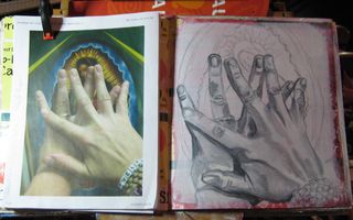
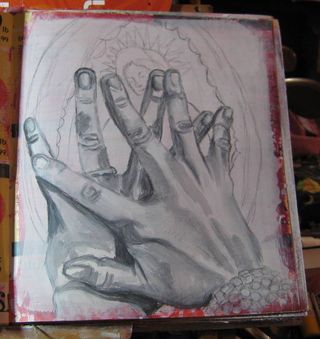
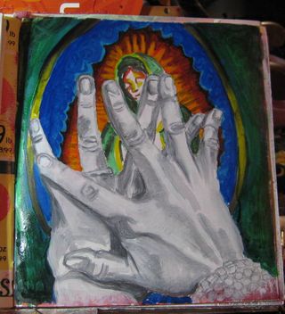
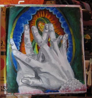
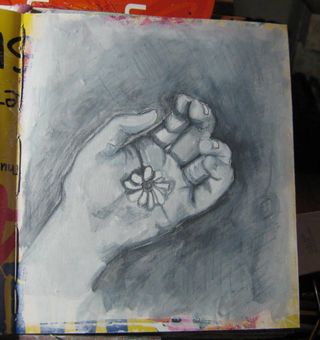
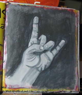
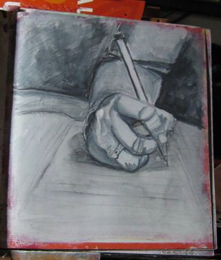
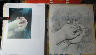
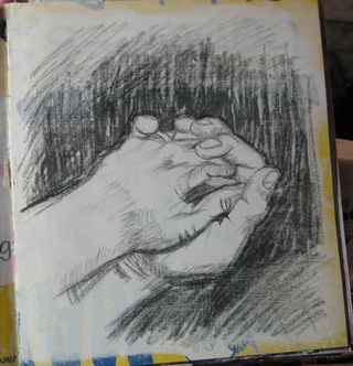
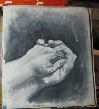
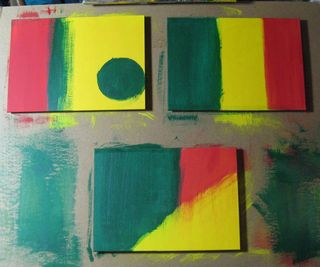
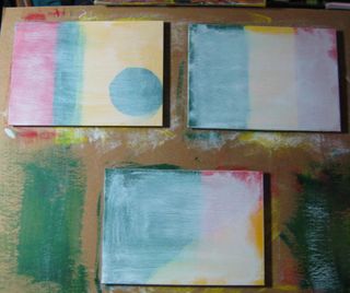
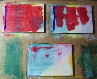
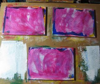
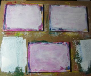
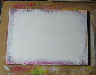
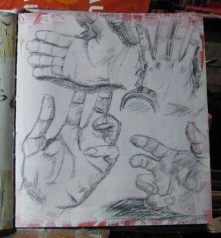
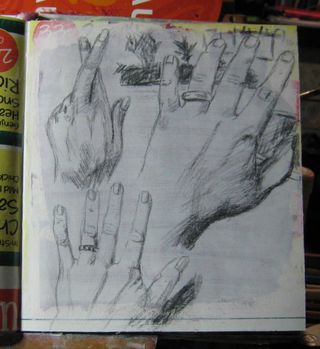
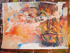
So I didn't get much work or art done until later tonight. I came home from work crashed and then started drawing and painting. I'm in an art groove today. My pieces are coming out in a way I like. I feel good and I feel confident in them. I've been painting and drawing almost everyday for 2 months now. You can see the difference in my work, I can feel the difference in my brush strokes. I can feel the control of my brush. I'm getting there.
I picked up 2 wooden panels, on hard board and one 3/8th birch plywood. Tomorrow I'm cutting them into 1×1 foot squares to start painting on. I'm also going to show you how to make a cradle for wood panels. It's pretty easy with a few basic tools. I'll get into in a video later this weekend.
Anyway, lots of work going on, I'll get lots of pics and video this weekend.


