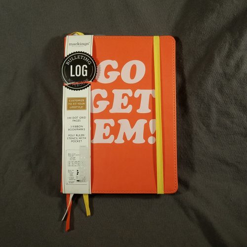
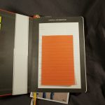
Markings Bulleting Log Notebooks with an orange cover
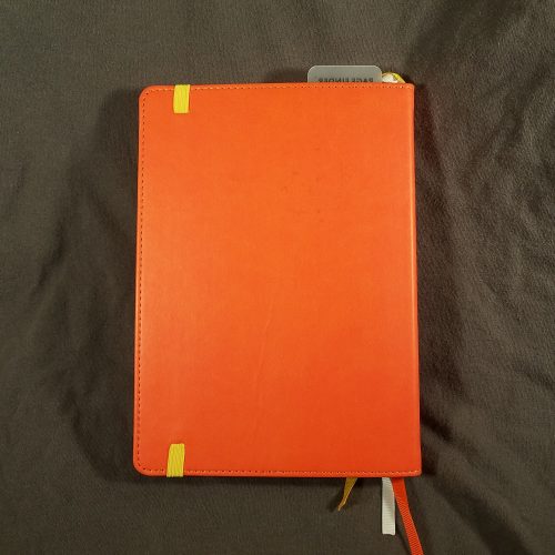
My first interaction with Markings journals was that the covers were sturdy black or dark brown vinyl with stitching around the edges. Classy and ready for the boardroom. The covers in Walgreens range from plain vinyl to mine- bright orange with a printed slogan, mine says, “Go get ’em!” Luckily I have a bunch of stickers to slap over that. It still has that classic edge stitching. The cover is sturdy with a hint of flex. It works well enough for writing in hand and opens flat for writing on a desk.
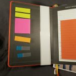
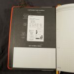
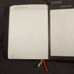
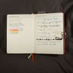
Inside are off white creamy colored pages with pale grey printing. You know how I love grey ruling, well this one isn’t super pale but stands out a bit. Better for low-level light writing than a few of my old journals.

I have to admit that in all the years I saw Markings at Staples I never purchased one. The paper always felt okay, but back when they would have appealed to me, I was firmly entrenched in Moleskine sketchbooks, with their thicker paper for my journaling. The Markings seemed too… parental and stuffy to me. Not this one, with it’s bright orange cover and cheesetastic slogan.
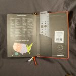
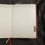
So how is the paper? Good. It’s smooth with a bit of tooth. Pencil is great on this paper and looks good on it’s warm creamy surface. Gel ink sings across the page. Highlighters don’t soak through, even with multiple passes across the same area! And fountain pen? Well, fountain pens perform really well. The page isn’t thin, but you can see darker colors in wide nibs through the page, but it doesn’t interfere with use of the reverse of the page. At 240 pages this is a chonky journal.