It’s been a few years since I did a proper round up of composition book reviews. I had a bunch of readers smash my Ko-Fi button and buy me a few coffees which means, REVIEWS. I have the best readers! Y’all rock.
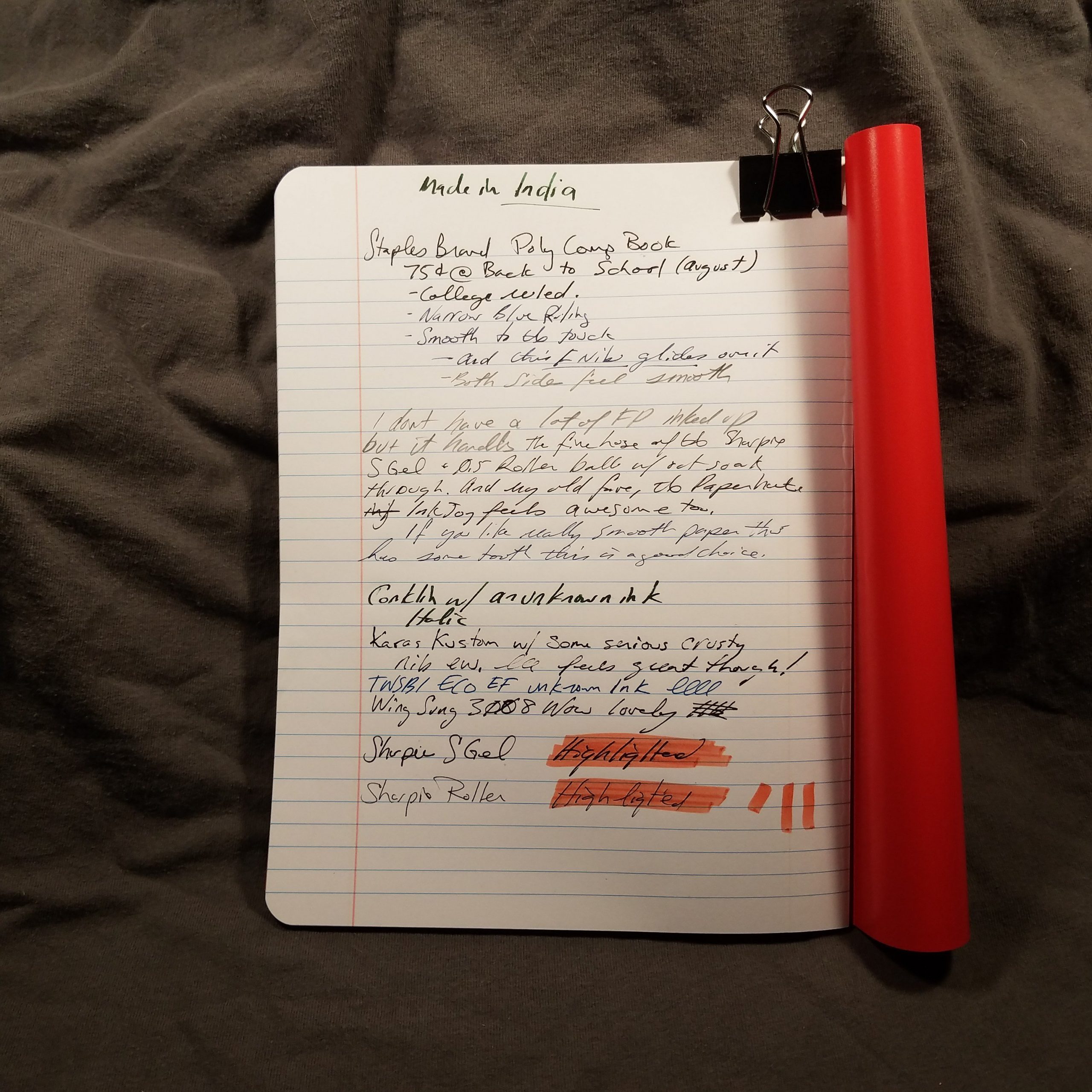
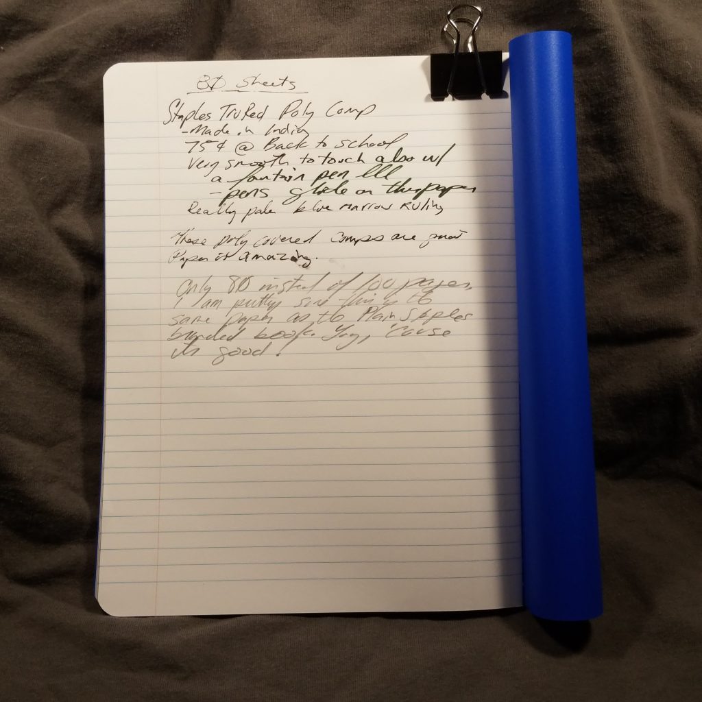
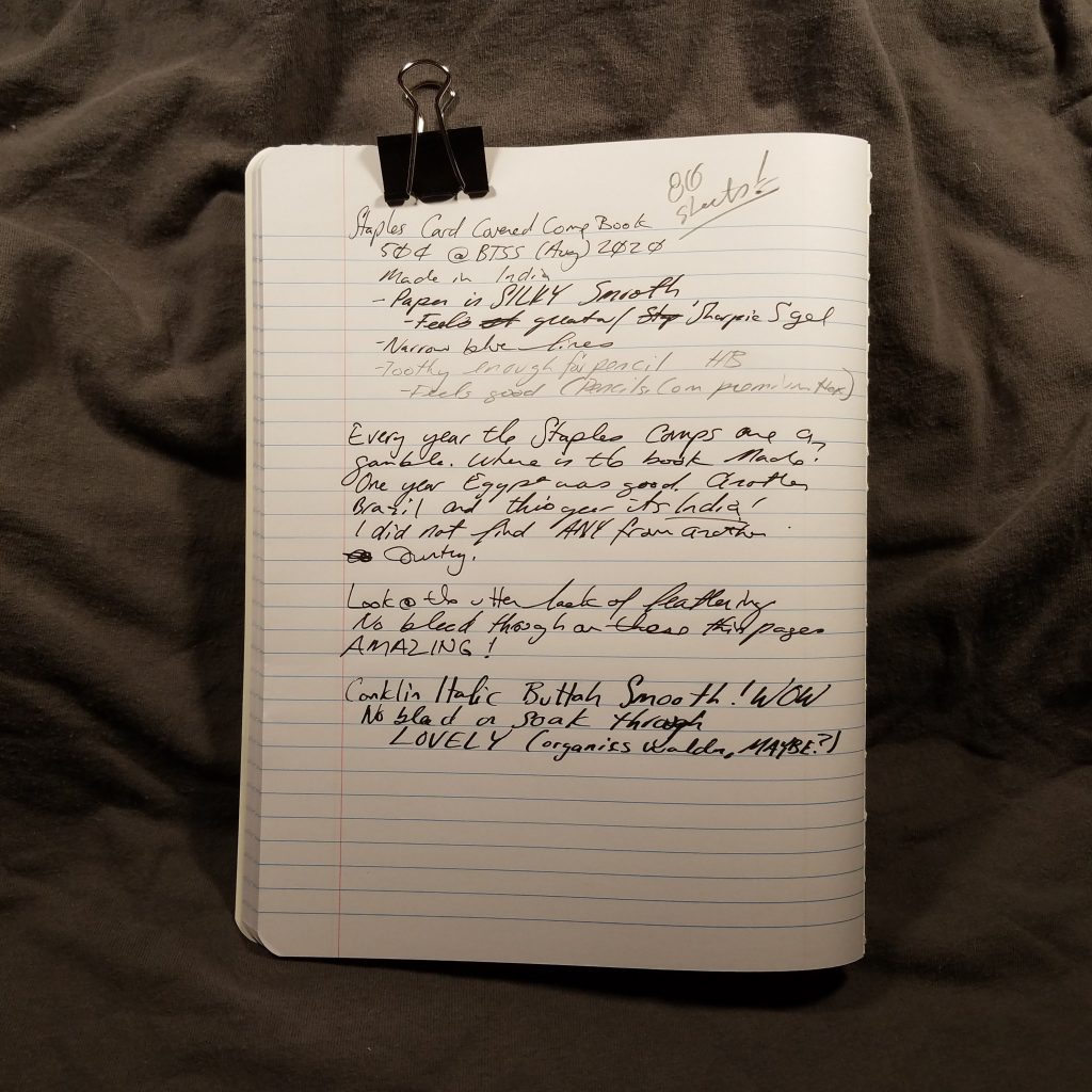
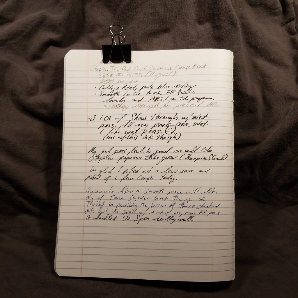
This year Staples has 4 standard offerings when it comes to composition books- TruRed and Staples unbranded both poly and card covered.
All 4 offerings are made in India and feature solid tight stitching and a black paper tape along the spine. All but the Tru Red card covered book have 80 pages, with the TruRed card covered having 100 pages.
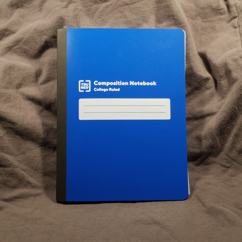
I have harped and griped about poly covered composition notebooks in the past, and my loathing remains consistent. These poly covers are not scored for easy bending nor are they particularly stiff to support writing out of hand. They are the worst of all things poly covered.
Both the new Staples and TruRed card covered books are covered in what I consider to be a disturbing trend of flimsy card covers. The covers are barely thicker than the flimsy paper inside and the card bends and folds in hand. Ugh these flimsy covers are so gross. They do protect the inner pages from harm well enough and even survive in my bag for the week or so it takes me to fill a comp book. To me, the flimsy card covers are inherently dissatisfying. Yes they do the job but they just feel… cheap.
Cheap is the name of the game when it comes to comp books, I mean it is a 50 to 75 cent notebook. But there is quality within the game as well. After all, we’re on the hunt for a book with great paper aren’t we?
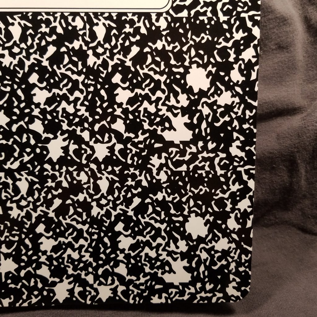
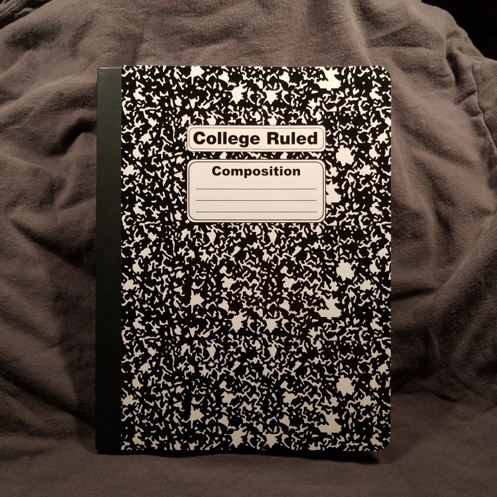
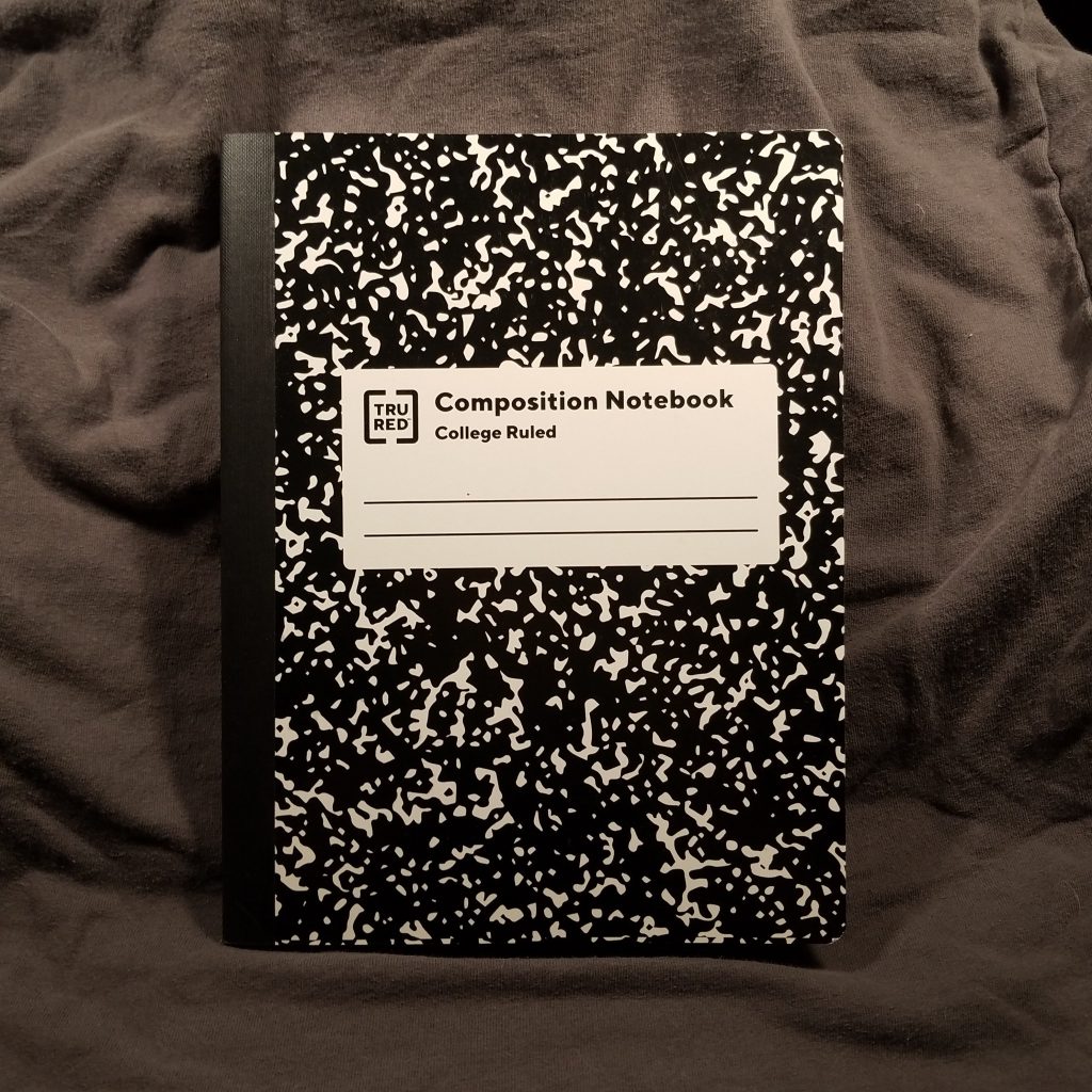
Staples books are often plagued with design issues. The new TruRed cover label on both the poly and card covers is ugly. While it harkens to the old style of composition book cover labels, it simplifies it and slaps on a widely kerned label and the TruRed logo and 2 badly spaced lines. I can barely stand to look at it.* Look away, it is hideous. The TruRed card cover has the marbling blown up to bold proportions, it’s rather large. Probably the better design choice over the atrocity that is the Staples book. Here you can see where they just copy and pasted the pattern but didn’t bother to create or buy a pattern with edges that allowed it to repeat smoothly. Oh no, Staples has the equivalent of a 1990s Angelfire background with visible edges and NO ONE BOTHERED to fix this before they made 900billion of these notebooks.
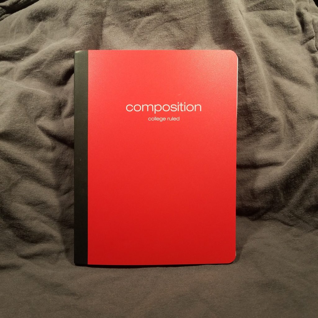
The covers are available in a wide range of bold primary and neon colors for the poly notebooks. The marbled card covers were available in primary and secondary colors.
So all around the Staples notebooks are ugly, but what about the paper? In 3 of the 4 books it is identical. The outlier is the TruRed card covered book.
The first 3 have silky smooth paper with college ruling and blue lines. The lines are neither pale or dark. They are printed tight without any spreading. The paper has a bit of tooth, but not a whole lot. Even with pencil these feel silky smooth. Surprisingly the paper handles even wet italic nibs with ease. I had tweaked a Wing Sung 3008 to write wet for sketching purposes and this silky smooth paper handled the intense amount of ink well. There is no feathering or bleed through. Since most comp books have 15lb paper, there is some show through but this paper is lovely. I was pleasantly surprised at the quality of the paper. The lines left behind are true to the nib size, so no feathering or ink spread.
The TruRed card covered paper has roughly all the same qualities as above with slightly more tooth for pencils. It feels great with everything. There was a bit of bleed in some areas with my very wet pens with some inks. Largely the paper is great.
Overall the bar has been set relatively high for paper quality by all the contenders from Staples. All four of these books are a decent value for the paper inside. Sure the covers are a mess of shoddy design and plastic and thin card but if we think that the paper is the important aspect, well, these have you covered at 50 cents each for a card cover or 75 cents for the poly covered.
