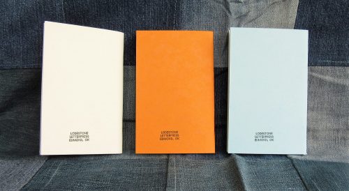
As you can see from the pictures the designs printed onto the covers are simple and clean. I particularly enjoy that they hearken back to the Oklahoma state song with a few words from the song with simple images. The wheat stalk on orange is particularly nice. The light blue with a windmill is also a nice touch. Fans of Field Notes will recognize the 3 shades as the classic butcher colors of paper used in the original colors of Field Notes. The cover stock is sturdy and feels great. The combination of spare text, simplified imagery, and card covers is very nice. The back cover sports a simple company label.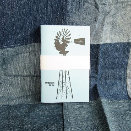
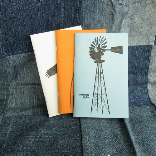
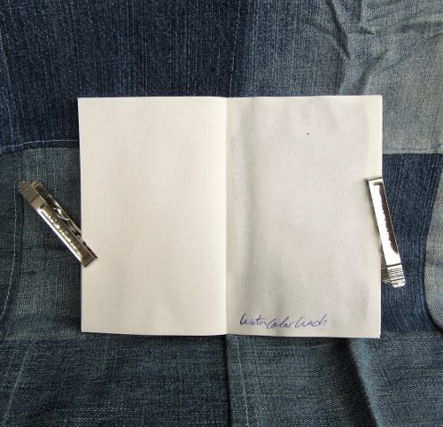
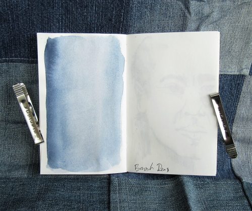
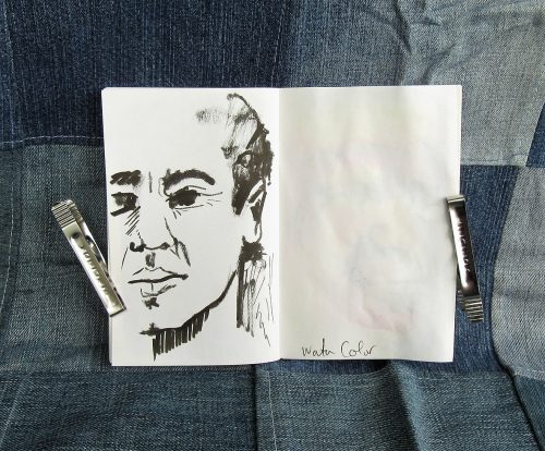
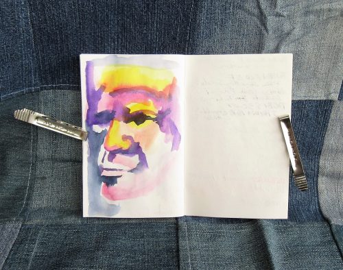
Inside the sturdy covers are 48 unruled pages of white drawing paper. I’ve tested it out with pens, pencils, watercolor, brush pens, and light watercolor washes. With the wetter applications of watercolor the paper cockled a tad, but overall the paper responds well to everything. My wettest M nibs showed some signs of soak through but most FP inks did okay, with show through here and there, but not so much as to make the verso unusable. Mostly I really liked this toothy paper with pencils and brush pens. I responded the best to these tools.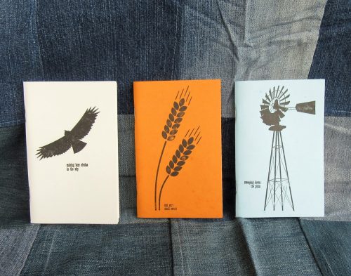
The whole thing is held together with 2 sturdy silver staples. The corners are square. I’ve been carting mine around as a general sketchbook for the last few weeks and It’s very sturdy and capable. I like it and Spencer deserves some support for his cute sturdy notebooks.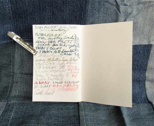
Spencer provided these notebooks for review but I feel I’ve given them a fair unbiased review.