Welcome to the first in a series about every novelist and editor’s necessary evil- bicolor and checking pencils. In the past I’ve relied mainly upon red ink in a fountain pen to edit my own work. I chose the bloodiest looking red. I wanted the ink to pop off the page or to be fun to use, like J.Herbin 1670 Rouge Hematite. Often I’d just use whatever fountain pen was at hand. Most of the ink in my fountain pens seemed to be fine for the task of editing.
I understand that many students have an aversion to red ink on their page, associating it with negativity, for myself I always saw the use of red ink on my work as a method of getting better. That said, most of my professors in grad school used purple or blue ink for corrections- if they even saw the work on paper. Most corrected and graded in blue or purple on the computer.
Now that I’ve graduated and I’m beginning to make the first pass in editing my written work I find my needs are different. The first draft of my novel is written in graphite and I have to be able to find the edits as I move through the notebooks. For this color is important, much more so than when editing typed pages. There is something about the reflective nature of graphite, and perhaps, my horrible handwriting that makes it difficult to find black, blue, and green ink on the pages.
I digress, the entries:
Entry 1: General’s Red & Blue Crayon Pencil
I picked this monstrosity up at Bob Slate in Cambridge, MA. I admit that perhaps I was swayed by it’s bright reflective metallic coating. I thought it would be easy to find in my pencil case. I sharpened it up with my handy brass bullet only to find the core crumble away. I was able to edit only a few pages of my paper before it was a useless nubbin.
The red was pale and faded into my writing and into text. The blue was slightly more pigmented, but still weak and pale. The wax core caught and gripped the page rather than sliding across as I wrote. I tested it on a variety of papers- from my composition notebooks to cheap Staples recycled paper in warm and cool environments. Nothing made this pencil worth using.
I can’t get a picture of it because I hated it so much and there was so little left that I tossed it. Do you know how much I have to HATE a pencil to throw it away? A lot.
Entry 2: Musgrave Hermitage Old Version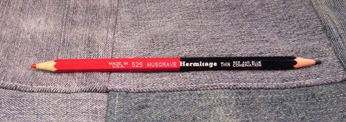
Musgrave recently updated the core and coloration of their bicolor pencil, I have a new version on the way and will add that to my next round up. See this article for more info on how to tell the old from the new.
The red core is pale and lacks punch against graphite and ink. It is slightly better for making notes on printed pages but only slightly. The blue isn’t bad in terms of pigmentation. It is fine for making notes. These cores grab the paper in a way I find most unpleasant. Instead of gliding across the page it sticks. Thus I’m forced to use excessive pressure to get the pencil across the page. The color is good, the texture is lacking.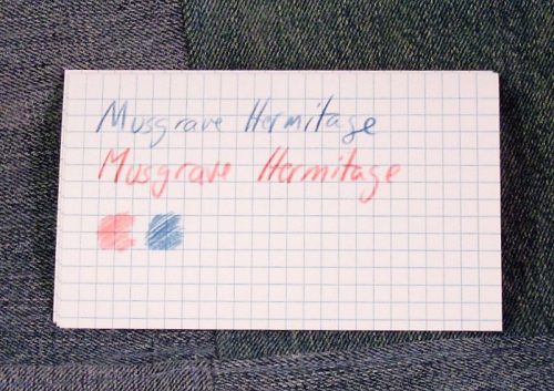
I suffer to use this pencil because they are dirt cheap, around $3.50 on pencil(dot)com.
Entry 3: CW Pencil Enterprise The Editor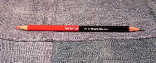
A relatively new pencil by the pencil women at CWPE, The Editor has graphite on one side and red on the other. I really like this combination and I’d like to see more offerings like this. The pencil is made for CWPE by Caran D’Ache, so you know it is of great quality.
The red side is nearly perfect. The core is deeply pigmented and doesn’t shatter in use or sharpening. It doesn’t holds a point well. The core glides across every paper I’ve put it to. The color stands out against graphite, ink, and printed text. It feels great.
The graphite is quite hard and holds a point forever. I’d place it around an H or F. I wish CWPE had cone with a CdA B or 2B. I find the lead to be a tad too faint to use for regular editing. This is one of those cases where having only 1/3rd of the pencil as graphite would make sense.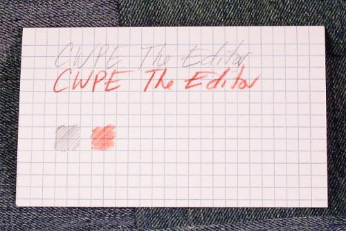
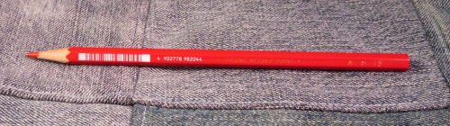
Entry 4: Nataraj Red Checking Pencil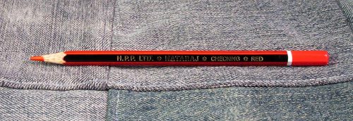
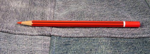
These pencils only have one color- red in the pencil. They are available in blue and green. The exterior is red with black stripes with a gold imprint. The end is dipped in red. The wood appears to be jelutong. A dozen is roughly $5 on Amazon.
The core is decently pigmented and stands out well enough against graphite, ink, and printed text. It is among the harder of the cores, it isn’t as smooth as the Editor, but it does okay. It grabs the page a bit but not so much to be unpleasant. I find that it is best on rough crappy paper and my composition notebooks. On nicer paper, like Kokuyo it is more grabby of the page.
Despite these being less pleasant than a few of the others I’ve listed, I find myself reaching for them again and again. Perhaps it is the combination of cheap and acceptability in my composition notebooks that makes them oh so useful for me.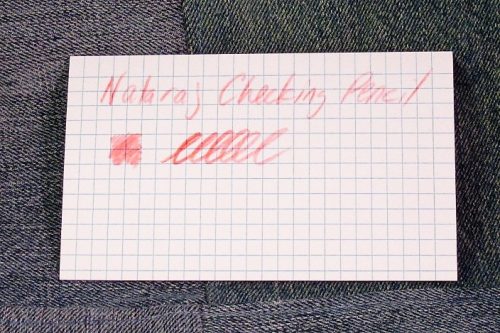
Entry 5: Eagle Verithin Carmine Red Vintage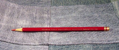
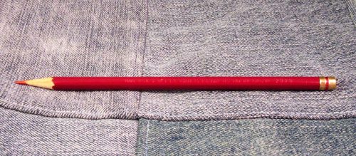
Despite my general rule of NOT reviewing vintage items, I’m including a vintage pencil in this round up. These damn fine pencils can be found on eBay and are in the $9 to $20 range.
you’ll note that there are current Verithin pencils available. these are garbage and should be avoided. With this pencil, vintage is the ONLY way to go. You can go with Eagle or Eberhard Faber and get a decent lovely pencil, but once you get into the eraser capped version, they become junk. Once they hit Prismacolor years they’ll make you cry.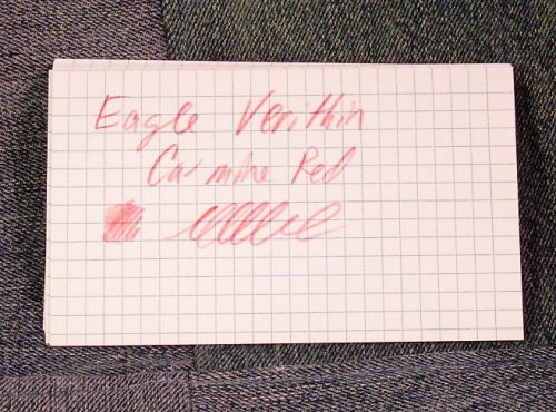
The vintage version is what all checking pencils must measure up to. The core is deeply pigmented, stands out stunningly on the page. It doesn’t matter what it’s editing- graphite, ink, or printed text, this red stands out. The verithin lead sharpens up to a needle fine point and holds it without shattering the minute it’s touched to the page. It then holds that point for ages and ages. It glides across nice paper and rough paper alike. This pencil just works well. I hold all other checking pencils up to it’s depth of color and feel on the page.
Entry 6: Mitsu-Bishi 7700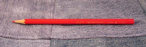
The core of this pencil is hard and holds a point well. The core is pigmented well but is so hard that getting a dark enough mark is difficult. It works best on toothy cheap paper with a good support behind the page. Paper that is thick and soft, or in a stack causes the pencil to make a pale mark. A good writing board between the sheets helps significantly. I also find that it works best when it isn’t sharpened to a needle point.
Though this pencil is pretty nice on firm toothy paper, I’m not a fan of this pencil. Largely because I can’t edit while the paper is in a stack.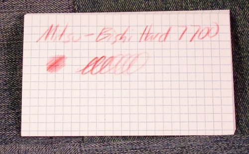
Final verdict for this round:
Though the Verithin is the superior pencil, I find myself reaching for the Nataraj over it again and again. If the Editor had a better graphite I’d find that to be the superior pencil. I do balk at it’s $3 price tag. If I were editing like I was with my thesis the $3 price tag would cause me to pause as well. Let’s face it, the superior pencil is going to be a combination of usability and decent price. IN the heat of editing a novel one doesn’t really want to worry about how much editing one’s own work will cost.
Some links are affiliate links and I get a small amount of pennies should you chose to make a purchase following the links. It’s not a lot but it does help me to fund the hosting for the blog and buy new things to test and review. I bought the goods in this review with my own cash money and no one influenced my review.