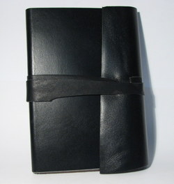
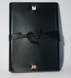
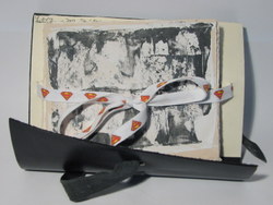
After finishing my old journal I decided I wanted to shift gears and try something new with my journal, so I made a folio and tore sheets of stonehenge to 5.5×7 inch sheets. I’m going to journal on loose sheets to see how i like it. It’s not as portable as say a journal, but it does have the folio so it is contained. So far I like that I don’t have to deal with or work around the crease in the page, I’m treating the pages as if they were spreads though, which is weird i have this option to work as if the journal is just sheets of paper but I’m choosing to work the sheets as if they were spreads instead of single sheets. I think for me it’s a design option as well as simply how I’ve worked over the last few months with a journal.
I really do like stonehenge paper for just about everything, it’s thick, it’s mostly smooth with just enough tooth, I can use colored pencils on it, acrylic, and gouache and it responds well to all of it. Not to mention that it comes in a nice array of colors. It also doesn’t buckle or warp much when it’s wet down with a ton of paint.
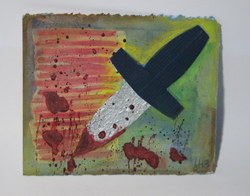
I did this pic as a redo of an image I did in my last journal. It was still pertinent to my life so A little reworking and a difference in colors a change in text, and a big difference in the "blood" the good thing about working loose is that I can do things on these "spreads" that I wasn’t able to do in the journal, in that there is no way I could have made this image work well across a spread so when I did the other one in the book I made the knife up and down on the page, I think it works better at an angle.
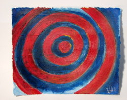
You can see a hint of the text under the target. I was testing out how different inks work under the paint. I’ll write about my tests in a later post. It’s pretty specific though, about how the inks work under gesso.
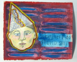
Self explanatory, sometimes I do stupid shit. Sometimes I just forget about things and do stuff without thinking. Especially when things are going well I tend to foul the whole works up. There is text under the lines of blue and purple. Its also a bad self portrait, it doesn’t look quite like me but I got the essence. Also a dunce cap- after I was just making fun of pointy hats in other peoples art. Here though, I’m using to point out I’m a dunce sometimes and I do stupid shit.