I've been workingon the automatic drawings, and one of the directions I've wanted to take them is to use a very fine pen with a nice gray ink as the first layer of the drawing. I considered using pencil but really don't want to be able to erase the lines. Part of the automatic process is that the lines stay from start to finish. I wanted to use the gray ink with my extra fine RapidoCraft pen to get a fine hairline that fades into the background when a darker color is put of the top.
I searched the network's archives to see if I could find a gray ink that fulfilled my needs. I found a few reviews, but gray inks don't seem to be too popular. I then went to Gouletpens.com and checked out their swab shop tool to see the colors of the grays they had in stock. Still nothing definitive. Instead I ordered 5 samples of gray colors. Each was from a different brand and most I'd seen mentioned at some point on the network.
The 5 colors I ordered were:
Omas New Gray
Private Reserve Gray Flannel
Diamine Grey
Noodler's Lexinton Grey
Iroshizuku Fuyu-syogun
And my 4 needs are:
That it survive being wet and not bleed too profusely. A distinct line must remain.
It not foul pale watercolors like yellow.
It not foul shades of blue, turning them muddy or green
It recede to the background when black is put over the top in a drawing.
I performed a test on each of these criteria with each ink on 3 types of paper:
Clairefontaine Graf It
Canson Universal Sketch 65lb
Exacompta Plain Journal
The results were the same across all papers, though with the Graf It there was additional lifting across the inks when lifting was noted.
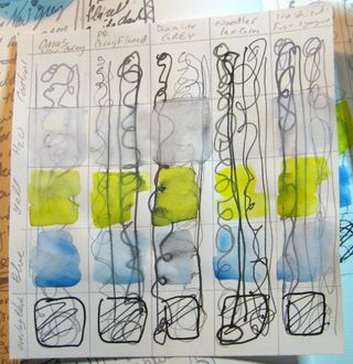
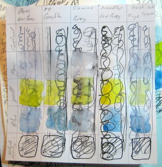
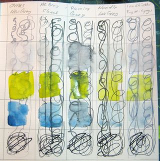
Diamine Grey was too dark to be a grey I would use for my drawings and it lifted the worst of all the inks.
Private Reserve Gray Flannel was also too dark for my use. I can't say that I actually like this color either. It has a green cast to it that I do not enjoy. It was also the second worst for fouling the pale watercolors. It was also barely discernible from black.
Noodler's Grey was the only ink that did not lift at all. Thus colors floated over it's surface and were not fouled nor muddied. However, it is very dark when in a pen running wet. It might be a contender if it were in a dry pen. I will be loading this into my freshly cleaned RapidoCraft XF to see if it will work. I'm not convinced. It does hands down win on every other test.
Iroshizuku Fuyu-syogun was a good shade that is easily discernible from an overlay of black. It did lift, though not badly. It slightly muddied the pale colors, though not too badly. I really like the color. It does not fit the bill because it is too blue. It's also REALLY expensive.
The perfect shade of gray is the Omas New Gray. It perfectly matches the pale silvery line of pencil. It's clearly gray without a green tinge or looking like I added a bunch of water to my black ink. It's just a cool clear gray. It's pale on the page and black ink pops on top of it. It does however lift. It muddies the pale yellow but mixes well with the pale blue. Even when it does lift it leaves behind a discernible line.
I have one last test. It will require me to leave the inks on the page over night to see if time will allow them to bond with the paper more. Given how I work the more immediate test is the better indicator of how the ink will respond to me and my methods of working but the additional information will be useful. Click any of the images to see these tests in hi-res glory.
 The above images is the Canson Universal Sketch paper.
 This is the Clairefontaine Graft It pad.
 This is the Exactompta plain journal.(review on this to come.)
I purchased all the ink samples in this experiment from GouletPens.com, no affiliation just a happy customer.