I'm organizing a "Sketch Up" in my city. It's like a SketchCrawl but without the trademark and rigmarole of getting permission to use the name. Anyway, I created one poster already with a hawker type dude announcing the Sketch UP via speech bubble. I wanted to make these a really graphic type image, eye catching in their simplicity. Also made old school, these were sketched onto paper and then inked with a sharpie, it doesn't get more old school poster design (crappy) than sharpie and paper.
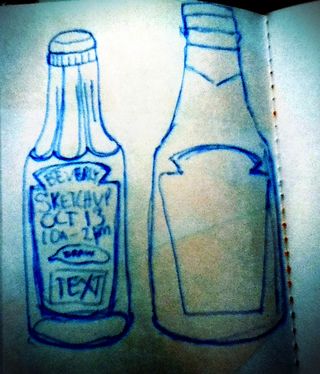
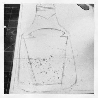
The ketchup bottle idea came to me when I was just thinking over the idea at the cafe after hanging the hawker dude poster. Ketchup Sketch Up. Heh. It's funny in my head. I started out by sketching a quick old school round glass bottle of ketchup. I realized that maybe the kids in the area might not associate the round glass bottle with ketchup. Since the only ketchup in our house is heinz I went with a knock-off of their label and the shape of their plastic bottle. I sketched it onto a piece of cardstock with pencil. Erasing the extra lines.
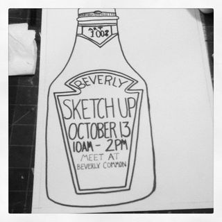
 Inked up those lines and added the text. My writing stinks but who cares, I didn't want anything computer generated on this bad boy. (Until I add the QR code, which I will later.)
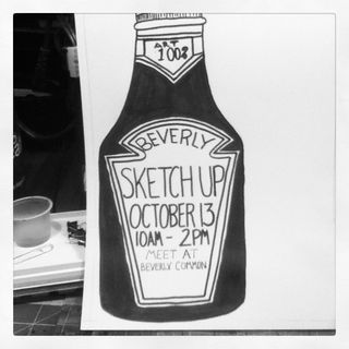
 I filled in the ketchup with black ink. Though you can see some overlap the scanner will read this as all black and it will print as such. I've still not added in the QR code but it will go right below the phrase "Beverly Common."
This brings me back to my days of wheat pasting posters around my University. i've written about my single handed causing damage to my former Uni after I was graduated, but let's not bring that up again.