I think it’s important to share both my success and my failures on my blog, so that readers can see that everything doesn’t turn out as expected all of the time.
I was really excited about this plate. It’s a bit bigger than some of my others and it’s a subject that I enjoy exploring- the Super Chicken building in my neighborhood. When I first moved here is was… Something else. The owner had painted the lower half of the old brick building bright glossy red. To say it was ugly is an understatement. It was garish and a lot. Recently* they did some renovations and painted the lower half a sedate cream and gray color scheme and installed new gray awnings. Classy.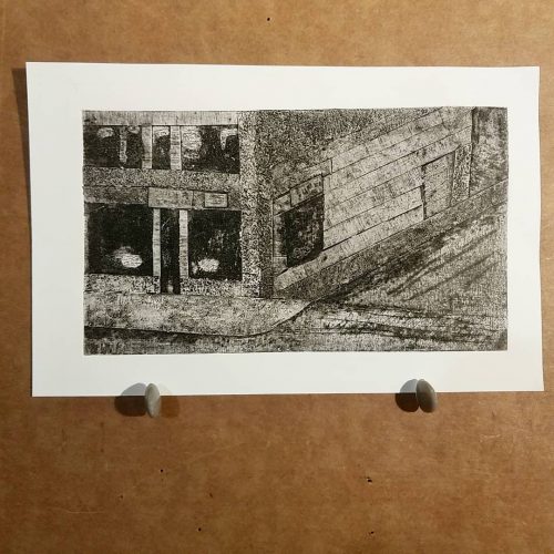
This image is from a photo I took of the building in it’s old garish glory.
I had hopes of using textured cardstock to create the feeling of the rough painted over bricks and then the brick above that, plus the old concrete of the sidewalk and the beaten up street.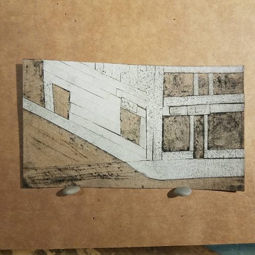
The reality is that I didn’t leave enough room between sections of the cardstock to create the lines I needed to make the darker areas. I had too much of the textured card in some areas and not enough in other areas.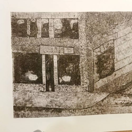
I wiped back the front of the building more to create a lighter area, and left the shadowed section darker, but it all comes out as a similar gray. Largely because the areas that should show lines, aren’t because they are too close together. The result is an image with too little dark, too much gray even tone, and not enough light area.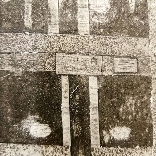
Anyway. It’s a failure as a finished image but I learned a lot- I need a certain distance between collaged on elements and that the texture doesn’t need to be pronounced to be seen in the final print. Also, when I apply glue to torn out areas, the application must be thick enough to coat all the fibers and rise above them. I’m also noticing that any white glue that I apply becomes crackled when I put the acrylic varnish on. Which this is a good effect for some applications, it’s not the best for everything. Here I really wanted a pure white area in the windows. I might need to switch over to shellac or use the waterbased poly I have instead of the craft varnish.
I keep cataloging things I learned from this process. I really dig the texture sheets I made with modeling paste for this image. I’ll definitely be using them again in the future. While I don’t like to work directly into modeling paste to create an image, this was both fun but also looks great. It is an area to explore in the future.
Every art piece disaster is a learning experience.
*When I say recently, they updated the building in 2015 when the city gave out grants for beautifying the downtown area.