As an artist and art therapist I’m keenly aware of my own use of art as a tool for processing and working through my emotions. The death of bell hooks has left me deeply saddened. I first read her work in my undergrad, likely introduced to me by my ex. I continued to read her work on and off through out my life. Outlaw Culture was mind blowing.
Honestly if you’ve never read her work, you should pick up anything, but Outlaw Culture is a personal favorite. The final chapter on Love as the Practice of Freedom is fantastic. It is also where I pulled the quote for my print.
I started this with a simple gelli print- stencils in ranges of red on a thick beefy white sheet of cardstock. Initially I attempted a toner resist with other colors but sadly that did not work as I’d hoped. SO I switched up and used a toner transfer technique. The printed paint and paper are note smooth so the toner is rough and uneven. I rather like this look. It quite matches my feelings about her death- sad and a little rough. I had intended to use a golden paint for the base color, but the toner resist, resisted working.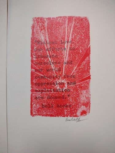
These prints feel a tad too cheerful, or the shades of red with the rays feels cheerful. Perhaps it can be interpreted as hopeful or loving, and fits the tone of the quote: “Without love, our efforts to liberate ourselves and our community from oppression and exploitation are doomed.”
I dig printing with found objects.
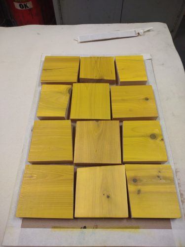
I decided to explore the concept of processing emotion through art with some of my students. I decided to create a larger print using a slightly different hooks quote. With this print I created a matrix of found cedar blocks printed in bright yellow. The ink used is a rubber based printing ink, rolled on thin. I then printed this with an etching press, though I could have fiddled with the Vandercook and printed it with the machines.
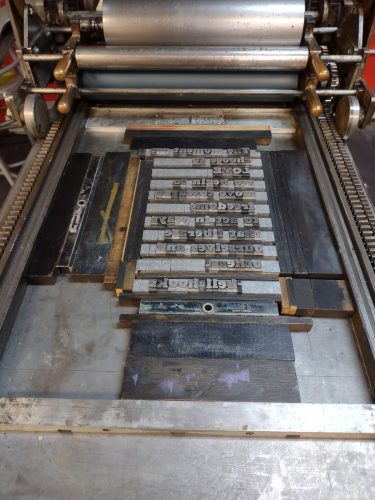
IS there anything as pretty as type set and ready for printing?
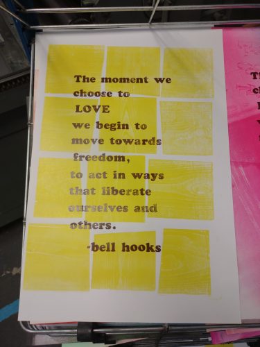
After the background was printed, I set up the quote in Ultra Bodoni 60pt. I considered going with a found letter but it didn’t fit the poster, nor did it fit the tone of the poster. Ultra Bodoni is a big impressive typeface and it leans a bit cheerful, but then the quote is full of hope.
make ready- note that the base print is off kilter This will go into my stack of stuff for testing other prints
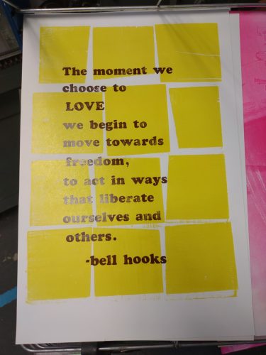
The color here is *chef’s kiss* perfect. Better in person.
I decided to use a 70s color palette and use brown over the yellow. I also chose to let the printing be a little soft and uneven, it matches the tone of the print and the reasoning for the print- I’m feeling a little soft and uneven.
Over all I really like the combination of the yellow woodgrain printing and the brown letters. It is perfect. I’ll have a few of them available on my ko-fi, after the holidays. It’ll take that long for everything to dry. I made 10 or 11 copies of the print. Which is a very short run, and barely worth turning the Vandercook on.
As a method of running through the last of the ink on the press, I’ve been running a stack of old prints through the machine. It clears out a bit of the ink, which means I’ve got less of it to clear out. Some of these overlay prints and images make lovely prints on their own, case in point- this brown over pale pinks and blues with a blind embossing of the word REFLECT. 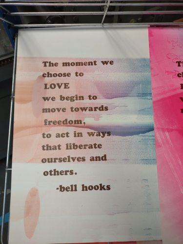
I linked to the ‘zon and it is an affiliate link, but you can find her work in pdf form all over the internet. You can also go a more legal route and get it from your local library, most will have her work. Mostly my work here is subsidized by folx like you supporting me through ko-fi. Ko-fi lets me explore art and send that art out to supporters on a regular schedule.