Category Archives: Journaling

Budget Art Journaling Series

I’ve been working on my creative YouTube channel, attempting, seemingly in vain to remonetize it. One of the thing that was asked of me repeatedly and often before I stopped making videos, was, “How do I get started with art journaling without spending a lot?” I always answered this with the idea of buying one or two of a material instead of a giant set of them.

But I considered that there might be another option.

I thought about what I need to work in my art journal and I came up with these items:

  • A journal of some sort, a composition book works a sketchbook works
  • a black ink pen. I need black ink for sketching.
  • Something to add color- doesn’t matter what, this can vary
  • An adhesive for adding in ephemera and other collage elements.

I then decided to visit a few shops to see what I could get for $10, $20, and $25. Not big budgets but enough where you can get the basics if you shop carefully.

I visited Dollar Tree, Walmart, Target and 5 Below. The videos document what I chose to get with my money and then there are follow up videos using the materials in an art journal so you can see that I’m not just blowing smoke.

Here are the videos of the shops:

Link

link

link

The 5Below video is upcoming and in the rendering queue.

Like I Thought I was Going to be a Famous Artist

A friend of the blog wrote a few things to me awhile back. She wanted to divest herself of some supplies and I always accept supplies for myself or work. If they are supplies I’ll use, I use them, but I always let people know that anything I can’t or don’t use I will then take to work. (You can also donate directly to my workplace if you are so inclined, this person wanted to specifically give ME supplies.) This started years ago when I packed up some of my excess supplies and took them to a local middle school and did a post and video about it. I was never going to use them, and we all know that some supplies dry out or go bad. In my case I had some acrylic paint I hated, notebooks, and hundreds of pencils left over from reviews.

Anyway, this triggered a series of correspondence. In one of her letters she wrote, (I’m paraphrasing) “I don’t know what I was thinking, buying all these art supplies. Like I thought I was going to be a famous artist or something. I’m not and never was gonna be. What a waste of money.”

Friends that is a loaded statement.

As someone who has spent thousands of dollars on art supplies and other “useless” things, I feel that statement a lot.

I know I’ll never be a “famous” artist. Hell I’ll likely never be a well known local artist.

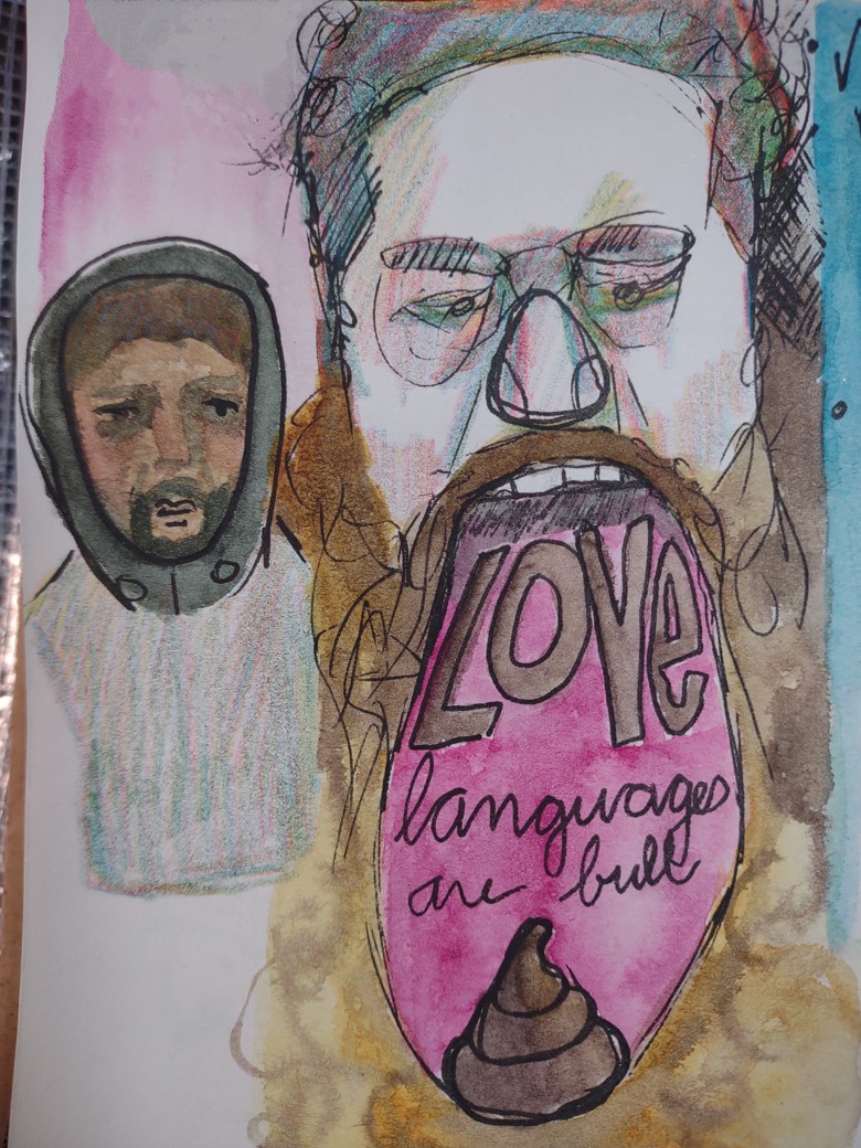
But I don’t know that I ever really wanted that. That’s a judgement from others. A toxic little tidbit I absorbed over the years- that to be a successful artist I needed to be in big galleries, have shows, get on the covers of magazines, and sell all my art. Be famous and jet set around the world, making and selling art. Drinking wine in galleries full of my art.

I think that is all mostly bull shit.

I think for those of us who are GenX/ Millennials and older that we were fed a line of garbage about what it means to be an artist. At the very basic core- we make art. But growing up, artists were portrayed as that list of stuff I wrote about above. Movies showed artists as rich guys who did all sorts of interesting things. Women swanned around gallery spaces with a flute of champagne chatting up people to make sales.

The hard work of making art wasn’t portrayed.

The often messy, ink and paint covered fingers… and most of my clothes. Walking around with my left hand stained in blue ink because I cleaned my ink pens and spilled ink on my hands… Or the tedious cleaning of the studio space. Or having to stop making art and move all the shit in my studio around so National Grid can come in and replace the meter and then my studio smelling like rotten eggs for a week.

None of the real part of making art gets shown.

But what of those of us who never want to sell their art?

What about the satisfaction of making art in a journal just for you? Just for a little peace of mind and self expression?

“Who do you think you are?”

The kids I work with repeat this, and I know it’s a thing their parents said to them. It’s a thing I heard on occasion growing up*. I’ve had friends tell me their partners have said this to them.

It’s one of the most toxic and low key abusive things a person can say to someone who is testing something out. There are so many ways a person can ask “What are you doing? Why are you doing this?” Without it bringing shame and humiliation?

When we repeat these thing to ourselves, we replicate the harm again and again. It sucks.

I wish I could remember the article where the researchers showed that when we talk badly to ourselves or repeat negative phrases- engage in negative self talk, that it’s more harmful than someone ELSE saying the exact same thing. It’s easy to discount someone else’s bullshit, but it’s much harder to discount your OWN bullshit.

I started practicing reframing my own negative self talk when I started therapy. It was a large part of my initial focus. Learning how to be nicer to myself was truly life changing.

Art journaling and journaling isn’t done to share it on the internet or to become a famous artist. It’s done to self soothe, calm your brain, expand on ideas, explore thinking and thoughts, and solidify thinking.

FWIW If a partner asks you, “Who do you think you are?” That’s a big ole red flag.

Continue reading

Composite Images with the Thermal Instant Print Camera

I have written here on multiple occasions about my love for David Hockney’s work. I’ve been fortunately to see a couple of his shows when they’ve come to the east coast. One that stands out was when my friend Jane and I met up in Portland, Maine for an artist’s date and decided on a whim to go to the Portland Museum of Art. I don’t know if Jane knew there was an exhibit of Hockney’s work there or not but I was delighted to go into a relatively small room and see a number of his works, including a favorite, Pearblossom Hwy.

Done in 1986 he used a point and shoot 35mm camera to take multiple shots of the same scene. Which he then pieced together into a 48×64 inch collage. He’s also got a series of works done with a Polaroid arranged in a grid.

really interesting stuff.

My friend Erik went to a recent Hockney show and snapped a picture of Pearblossom Hwy and sent it to me said he wondered what I could do with one of the thermal printing cameras.

And hot damn, I set out to test out the idea. I wanted something more interesting than just a landscape. I headed to the Willows for one of my morning constitutional walks and thought I’d do something with one of the benches or buildings.

Instead I was presented with a ripe opportunity- someone had discarded a Little Tykes Cozy Coupe, in faded red and blue; at the recycle and trash bins. It was backed into the bin like it had been parked there purposefully and not illegally dumped. I decided this was weird enough to be my subject. So I set about snapping a whole range of photos, 5 up and 6 across. A total of 30+ images.

I learned a lot with those 30 images. First off, space my images out a lot more. And don’t move my feet, much. To keep things in the same perspective I tried to keep my hands at the same level and played with just tipping the camera.

Obviously I need to test this out some more. but what a really cool little range of images I got from one set of 25 images.


Later That Week: Further Explorations

I headed back out to the Willows to see if the Little Tykes Cozy Coupe was still next to the trash, and it was. What luck. I moved it back to the same spot where it had been. (It had been moved around.) I then set about to take more photos of the scene. I took what I learned- move the camera more between images and move to the sides and above more.

IN this image you can see I took many more images, probably close to 50 or 60. I did not use them all, but having more was better than too few. I also used this as an example and working piece to figure out some more stuff. More on that.

I also tried another scene, this one of a do not enter sign, and another of the parking area for Blue Bikes.


I think this telephone pole and fire hydrant is super cool and really shows how the camera can distort and tweak the image.

With this one I focused my attention on the do not enter sign and getting a clear image of that leads to distortions around it. There’s a metaphor there.

For the notes:

  • Take more pictures than you think you need or want.
  • Print some of the images, then print more as needed.
  • Use a glue runner or other film style glue instead of glue stick- glue stick tends to curl paper and not stick to the plasticky coating of the paper.
  • If you pick a focus point you’ll get distortions as you move the camera around, this can be very cool.
  • Use a heavy weight paper or put it in your journal.
  • The time stamp  can be very distracting in some areas of the image. I like it in most of the image so I work around it.

With this last image. I shot maybe 100 pictures but only printed 50 of them to start and printed more as I needed to fill in areas, but I REALLY wanted to play with the idea of perspective and distortion around the edges. So I really worked with keep my feet planted and moving my upper torso around to take the shots. I then realized I could keep one foot planted and ROTATE my other foot around it. I chose to keep my left foot planted and rotate around on the ball of that foot. This worked REALLY well at creating the warped perspective I was looking for. I think I could go back and fill in the empty areas with some more shots. Either way this piece is much larger than the others. The others are about 6″ square while this one is about a foot and a half high.

Anyway I really dig this.


This is the camera I have been using for this exploration. It prints a little more slowly but it’s black and doesn’t draw attention despite being pretty large when compared to the other cameras I have.

Links are affiliate to amazon. Bezos tosses me a few coins should you buy anything via my links. It’s not much but it helps to keep me in coffee. If you are interested in buying me a coffee and helping this blog stay up and running hit up my Ko-Fi page. I post there regularly and you get all of the posts here a week in advance. I also post some members only content for supporters. thanks for reading.

New Video on Thermal Instant Print Cameras

In this video I explore some of the cameras in my collection. I look at the different body types, different operating systems and how they print. I’ll be shooting another episode going deeper into print settings and why I like using them.

Here are links to all the cameras in the video, these are affiliate links.

Amazon affiliate links.

All prices listed are from the time I wrote/posted.

These two cameras are the same except one has a silicone case to protect it. The silicone case is in the shape of a pink unicorn.

Pink Unicorn (Instax style) Camera ($40): https://amzn.to/46Pf9KS Another pink unicorn cam ($40) https://amzn.to/3MELE6i

Blue Plain (Instax style)  Camera ($39): https://amzn.to/3Q8vxPe

This is another pink unicorn camera, the print quality is somewhat better and it takes slightly better photos ($40): https://amzn.to/46PbpsK

Another pink unicorn cam: https://amzn.to/47CVrSs

 This case will fit all of the above cameras and 3 rolls of paper plus some pens and stuff: https://amzn.to/3MhyagL

This camera prints similarly to the 2nd pink unicorn but is purple and yellow in color and has a shape clearly inspired by old Polaroid cameras ($15): https://amzn.to/3sdNhkA

Black Polaroid inspired camera ($40) https://amzn.to/47b7VAP

I do not recommend these:

This camera is yellow and orange and is also shaped like an old Polaroid. It prints out at 4:3 which I like, but when it saves the images it stretches them to 16:9, so the images are distorted. If, like me, you hope to use the images on your thermal printer this is a no go. This one also has a flippy lens for selfies. ($36): https://amzn.to/3FzCHr2

Bulbous pink unicorn cam: https://amzn.to/3unVMKq This has the same issue as the one above.

Green dino cam: https://amzn.to/40Nzs9g This uploads fine but has a forced wait before it will print.

This case fits the purple or orange cams plus a few rolls of paper and a cord: https://amzn.to/3QABndP

This is the paper that I use. It’s cheap and is nice and glossy and has good contrast when printed on. It’s also thicker than some of the other papers I’ve used and doesn’t have a plastic core. ($14)  https://amzn.to/3SdGWA8

This is the paper I bought for work, it’s much thicker and very glossy. https://amzn.to/3SzTp14

Colored sticker paper I use. https://amzn.to/47eQHTu

Alcohol Inks on Thermal Prints

Alcohol fades and somewhat whites out any images on a thermal print. I found that this happened on many papers, but not all and not on thermal print sticker papers.

So let’s dig into this.

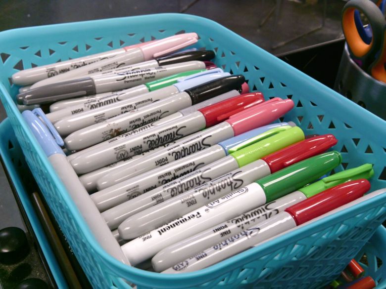
Some examples of fading AND darkening. This paper came with the camera and had some intense reactions to the inks. This is all Sharpies.

Some examples of fading AND darkening. This paper came with the camera and had some intense reactions to the inks. This is all Sharpies.

You might think, as I did, that Sharpies and other alcohol inks would be the perfect tool for adding color to your thermal prints. We’d both be sorta right, and a whole lotta wrong. It turns out that alcohol and other solvents in alcohol based pens fade thermal prints. It can also lift the finish and blur the dark areas around. In other cases the solvents can blacken the paper.

This can be used to manipulate the images in a fun way.

These images were done with Artist Loft Artist Brush tip alcohol markers. Lots of smudging and fading and blurring of the background- what I particularly like about the effect.

These images were done with Artist Loft Artist Brush tip alcohol markers. Lots of smudging and fading and blurring of the background- what I particularly like about the effect.

Here we have Sharpies on thicker glossier paper. Notice that for most of the images that the darks didn't fade much at all. Only on one image- the one with green, do we have fading.

Here we have Sharpies on thicker glossier paper. Notice that for most of the images that the darks didn’t fade much at all. Only on one image- the one with green, do we have fading.

Letraset and Prismacolor markers are much more intensely alcohol and other solvent based, but wow do they manipulate the image in a different way. I used 2 very pale grey markers- I think 10 or 20% gray. Both cool greys. You can see the ghosting effect here. Also the tree images used the narrow point side of these markers to pretty good effect. It lifted and smudged the darks. Neat.

Letraset and Prismacolor markers are much more intensely alcohol and other solvent based, but wow do they manipulate the image in a different way. I used 2 very pale grey markers- I think 10 or 20% gray. Both cool greys. You can see the ghosting effect here. Also the tree images used the narrow point side of these markers to pretty good effect. It lifted and smudged the darks. Neat.


This is a close up of one of the images where I used the very pale grey Prismacaolor marker to fade out and ghost part of the image- in this case the cars in this parking lot. Creepy and very cool.

This is a close up of one of the images where I used the very pale grey Prismacaolor marker to fade out and ghost part of the image- in this case the cars in this parking lot. Creepy and very cool.

But on some papers the alcohol doesn’t fade or alter the darks at all, so you can add a flood of lighter color.

I tested Sharpies, one pale LetraSet, one light gray Prismacolor, and a set of artist loft alcohol ink markers. I tested them on a couple of different papers and images. I also tested coloring the paper and then printing. 

The cheapo paper I favor will fade with all of the above but less so with sharpies. With Sharpies it fades and seems to come back a bit.

sharpies


With the slightly heavier and more coated paper that I bought for work it doesn’t fade at all.

Tests of all the alc pens on heavier glossier papers

With sticker paper nothing alters or shifts either.

I also tested some Sharpies that were at least 10 years old, if not significantly older. Shockingly they worked. They also seemed to alter things more so than the newer Sharpies. 

I also sprayed some images with plain old isopropyl alcohol, and it faded things significantly even on the heavier glossier paper.

Important to note, color the paper the night before and let it dry overnight. the alcohol can make the coating sticky and it can bind up on the print head, it will eventually print but it will be warped. I like the randomness of this. Do this at your own risk.

Important to note, color the paper the night before and let it dry overnight. the alcohol can make the coating sticky and it can bind up on the print head, it will eventually print but it will be warped. I like the randomness of this. Do this at your own risk.

Another test was to color the paper with alcohol markers then print on it. The tests were fantastic and very cool.

Alcohol ink markers aren’t archival but neither are these photos. Part of the joy is that they are so disposable and temporary, they are the very definition of ephemera.

Note: I have provided affiliate links to the ‘zon items I have ordered in the past. With the ‘zon you may not get the exact same item I ordered. I’ve had this happen on more than one occasion. I order something I reorder it only to get a similar but ever so slightly different item. It is best to test whatever you get with the materials you hope to use to be sure it will react in the way you wish.

List of links:
This is the paper that I use. It’s cheap and is nice and glossy and has good contrast when printed on. It’s also thicker than some of the other papers I’ve used and doesn’t have a plastic core. ($14)  https://amzn.to/3SdGWA8
This is the paper I bought for work, it’s much thicker and very glossy. https://amzn.to/3SzTp14
Colored sticker paper I use. https://amzn.to/47eQHTu
Mystic Gem Sharpie https://amzn.to/3MAsPBl

This has been repubbed from my Ko-Fi page, if you have found this helpful or useful please head over and consider buying me a coffee so I can keep this blog useful. Want to buy art supplies and support me through affiliate links? It’s a great way to spend what you are going to spend anyway and have Bezos pay out a few coins. Click any of the links in my posts and buy through there. It doesn’t cost you anything and Amazon tosses me a few coins for providing you with a link. 🙂

Dry and Semi-Dry Media for adding Color to Thermal Prints from Instant Print Cameras and Thermal Printerss

One of the things I knew I wanted to do immediately with these cameras and prints was add spot color and colorize the entire image. To do this, I tried several things. Let’s start with the dry and semi dry media. Like colored pencils, markers, pens and highlighters.

I started with a range of prints and adhered them into my journal. In this case I’m using a Yoobi Composition book. I used my favorite fat Staples glue stick, which may not be available anymore. (sad face) Once I had the image glued down I let the glue stick dry for about 15 minutes. I want to avoid shifting as I work.

I then hit the image with a gel highlighter. I did the background of the image. The gel highlighter went on smoothly and easily. It also dried over night.

The next media I used was colored pencils. I used Prismacolors in transparent and bright colors. I used several layers of the pencils to get the color I wanted. I did notice that the color did obscure some of the darker areas of the image. Especially when I layered the color. I will note that the paper is very slick and doesn’t have a lot of tooth so colored pencils took some finessing to get to stick to the page.

I wanted to add back some white areas that grayed out in the image when I printed. I used a GellyRoll pen to do this. It worked great. In some areas of an image I wanted them darker, so I used my favorite UniBall 207 in bold but the medium point would work well too.

This led me to wondering what would happen if I used regular colored gel pen on these images?

Currently the only colored gel pens that I own (at home) are the Uniball Signo DX extra fine 0.38 set I bought at Staples at the start of lockdown. This set is not ideal. While I like the extra fine point size for sketching in small pocket notebooks, it doesn’t have enough flow to lay down enough ink to grab on the super slick glossy paper of these prints. Also they tended to dry out on the coating which then caused them to dig into the damp areas of inky goodness. The coating would then chip in small amounts and leave pristine white blobs. No good.

I do have a few other colors of gel pen- red, orange, and green. I had similar problems with the pen not getting enough traction on the page, though once it got going it laid down enough ink for coloring the image. Nice. The downside is the creation of larger ink blobs.

This paper coating is not absorbent. The ink really sits on the surface and takes a long time to dry. I know you are thinking about a heat gun… But uh, it’s thermal paper, it’ll turn black. It takes at least 15 minutes for a light coat of gel ink to dry, and I really found that thicker coats smudged hours later.

A pen that did much better was my Pigma Micron FN- the pen style fiber tipped version of the old Pigma Micron. The tip is quite small so it takes some time to add in the color but it does dry, eventually.

A pen that I hadn’t thought about, mostly because I forgot I had it on hand, is the Staedtler TriPlus Fineliner.  It lays down an impressive amount of ink for a fineliner, but it would take forever to color an image with a thick layer of ink, so I think this is best suited toward scribbling in shading and cross hatching.

Most of the inks were still tacky after an hour. Though those that lay on the lightest coating were the least tacky- so the UniBall DX was the least tacky as was the Micron.

Some tips:

  • Try to get the smallest amount of ink on the image to create the coloration and tone you are looking for and stop there. The less ink on the page the better.
  • Keep an absorbent piece of scrap paper nearby. This will help you get the pen rolling again and clear off the tip of blobs and coating pieces.
  • Use the absorbent paper to blot the image when you are done coloring.
  • Use the absorbent paper as a shield to keep your hand off the images as you add color.
  • Try a test image before committing. Each paper works differently. Some papers have less coating and are more absorbent. Receipts are great for coloring!

Next I’ve got to try alcohol markers- Sharpies and other brands.

This has been repubbed from my Ko-Fi page, if you have found this helpful or useful please head over and consider buying me a coffee so I can keep this blog useful. Want to buy art supplies and support me through affiliate links? It’s a great way to spend what you are going to spend anyway.

Adding Color with Gel Plates

I wanted to see if my two favorites could be combined. Can I combine thermal prints with a gel plate? Will acrylic paint react with the thermal coating and turn my images black? Or will this work?Short answer is: yes, it will work, but you need to finesse it.

  • Use transparent colors.
  • Use thin coats.
  • Use a small plate.
  • Use images with a lot of contrast.

Those tips produced my best results.Too much paint and it obscured the image. Too light an image and details were obscured too much. To opaque a paint and you can’t see the image at all. Too much paint of a transparent color- image is obscured. I started with an excessively thin coating of paint. This produced a very washed out color. I did layer on a second coat of paint and the paper did okay but felt weaker. This paper is pretty weak compared to sketchbook or even regular printer paper. Let it dry completely between coats from the gel plate otherwise you risk tears.I found this really let me get a nice lovely layer of complete color over the image. I’m thinking of the usual ways I use a gel plate to create images- masking and stencils…. I’ll get more into that in another post.I’d suggest the 3×5 gel plate for this, but I think you could charge up a larger size and layout multiple images to get matching images for spreads in a journal. I think you could  also get a neat effect with the shaped set that includes the hexagon and rectangle.I didn’t spend much more than 15 minutes on testing this idea out  and I think it adds a lot to these images. There’s something about a pop of color that can really bring out an image. I can’t wait to play with stencils and masks with these.

This has been repubbed from my Ko-Fi page, if you have found this inspirational please head over and consider buying me a coffee so I can keep the inspiration happening on this blog. Want to buy art supplies and support me through affiliate links? It’s a great way to spend what you are going to spend anyway and have Bezos pay out a few coins. Click any of the links in my posts and buy through there. It doesn’t cost you anything and Amazon tosses me a few coins for providing you with a link. 🙂

Black and White Images and Wonder and Awe

When I was a kid my parents pinched pennies and used a benefit at my Dad’s school to get an Apple iiC. In today’s standards, it was little more than a word processor with some BASIC capabilities. My brother’s and I spent hours playing with a program called PrintShop that mimicked a print shop. We created a newspaper that was largely about our cats and printed it on a loud OkiData dot matric printer with continuous paper with edges we ripped off. The printing was always a little grayed out and pale. But we had a lot of fun. Or I did, my brothers soon lost interest leaving me to finish the newspaper on my own.

We added color with crayons and colored pencils and then presented these to everyone in the family. Which I’m sure was met with pats on the head and hidden eyerolls.

I remember watching the images appear from these points of ink deposited by the printer. It never handled it well, but it was really cool to see lines and shade appear from these dots. Considering they appeared as pretty broken up lines on the screen, it was always really cool.

I wonder if this history with dots is why I’m so obsessed with these mini thermal printers set to dot print mode. It’s such a simple technology, hell it was even around back then.

Thinking back this led me to consider how I’d add color to these prints, how I’d manipulate them today.To start, I used the PikDik (I just can’t with this name.) and it’s “cutting” photo printing feature. This feature will cut an image into up to 3 strips resulting in a roughly 6×7.5 inch image that does require some work to assemble. More on that in a minute.

For the example selfie image:

I shot it with a toy cam, this one to be exact. It is a piece of crap do not buy it.  I transferred the image to my computer and then to my phone. A bit of a pain in the arse, but with nearby share  on my phone and computer a lot easier than in the past. I have found that these printers, like the toy cams, work best with a lower res image. Which is why I really like the toy cams for shooting for them. But the thermal printing toy cams take better shots than the toy cam linked above. I’ll link to a few at the end of this post.

From there I pulled the image into the app, I tried the share with setting on my phone and the app pulled it into docs. So I had to open up photo then the cutting feature. I then converted the image into B+W in the app and adjusted contract and saturation. I wanted a lot of dark darks and lighter light areas. The initial photo I chose wasn’t that dark to start with. The second photo was much darker. With larger longer and DARKER prints these little printers will overheat. I suggest giving them a rest between prints before printing the second and third sheet, particularly if you are printing something with a LOT of dark areas, like this chicken print.Then I had to decide how many cuts, and how large I’d like the image. 2 cuts keeps it small, 3 cuts makes it larger. The original shape of the photo will matter- the soda can is much large than the chicken because it was taken with an app set to 16:9 while the chicken was cropped to 4:3.

After the image is printed the edges have to be trimmed. I trim one edge and overlap the paper to make the image. This works best for me. The print does not have any over lap of the image, where the print ends is exactly where the print needs to be trimmed to fit with the other side. After I trim one side I use glue stick to apply the image to my journal.Some notes: These images did not print exactly, that is to say some of my prints were longer than others and some shorter. They didn’t match up perfectly either, it was like there was a 2 or 3 pixel gap. I think the imperfections work perfectly for my uses- my journals.

After printing I played around with different ways of adding color with dry materials- in this case a gel highlighter and colored pencils. The gel highlighter is great for the background of the can- letting the image of the can stand out despite it being black and white. The selfie used colored pencils in the same manner. The color sits on top of the blacks and darks in the image, lightening them but keeping the darks there. I really like overlaying colors. Notes:
If you can edit the photos in a more powerful editor than the one that is in MetaPrint, do so. I noticed that some areas of light, like my eyes, printed quite dark- they are in shadow in the image and the printer and app can’t blow the highlights out enough to capture that white. I used a GellyRoll white pen to add that in. And the GellyRoll pen worked great on this paper. It didn’t sink into the paper at all.

Further Notes: The paper is quite slick and colored pencil took some getting used to for getting it to go on smoothly. I’m not a huge fan of colored pencils anyway, and I think I’ll only use them for some coloration. But it’s good to know that this paper has very little tooth for pencils.

I have found that the paper used really does matter in these printers. That said, the paper is very very cheap. You can spend more on stuff like the Phomemo paper, if you are worried about longevity. I am not. My journals mostly stay closed and in cool dark places. I am not worried about these being archival. I use this paper because it is good and doesn’t have a plastic core. It also comes shrink wrapped and doesn’t have all kinds of extra packaging. I accidentally ordered this one for work and it is also really  nice but has a plastic core. It is packaged in a sturdy box with plastic baggies inside.

My feeling about this paper is to use the cheapest I can find that is meant for the thermal cams or printers. I want cheap so I can print a lot of copies of the images and play in my journal. If I buy expensive paper I’m going to be a miser with it and not play.

I’m going to keep experimenting with adding color in different ways.

This toy cam is a much better option for shooting images compatible with these printers. It claims to be a much higher resolution than it is. I take shots in the 8 megapixel setting and I get shots with enough detail for these printers. This instant print camera is also a good option for taking lower res shots, while also getting the instant print feature of these toy cams. You can also use an app like OpenCamera and reduce the resolution down.

I’m going to post this link again, it’s a phenomenal price on the Phomemo M02 printer and I’ve never seen it so low. This time it is posted that it is a limited time deal. So I expect that it will disappear and bump up in price. I use Honey to track price drops on a variety of websites, and Honey indicates that the typical price for these is now around $37. Phomemo bumped the price up to $50 a week before dropped the sale of $25. UGH. I have found a bunch of listings for Phomemo all over the place, it really depends on what they are bundled with. The higher price bundles have sticker papers and other stuff in the bundle.

This has been repubbed from my Ko-Fi page, if you have found this inspirational please head over and consider buying me a coffee so I can keep the inspiration happening on this blog.

Budget Thermal Printers

At the start of lock down I had asked for a thermal printer for Christmas. I used it a bit but really didn’t have the same use for it I would have had a year previous. We waited until Black Friday then purchased the Phomemo M02 in a bundle with 9 rolls of paper and sticker paper. It came in a nicely presented gift box, plus had another box with some assorted gift-y items that were, frankly, weird. Recently I started to use it again in connection with my toy instant thermal print cameras. The combo of the cameras and the printer has been a lot of fun for journaling.

Anyway, I was searching for more paper for my thermal cams and the Phomemo when the Amazon algorithm blasted me with options for a LOT of budget friendly versions of a thermal printer. Enter the… PikDik. Honestly, I bought it because it was under $30 and for the name. I’m 12 mentally.

I just, can’t.

I immediately downloaded the app and I became aware that the Phomemo app kicks the PikDik right in the Dik. (I had to.) The MetaPrint app is okay but compared to the Phomemo, it’s basic.

The printing is great though- it’s prints nicely dark, and evenly. Darks are dark and lights are light, exactly what you want and expect. The difficulty is editing the photos for printing. I like to layout a series of photos, switch them to black and white, and play with the contrast and exposure. I can do this in the Phomemo app. I can only do this in the picture section, not graphic edit. I also can only print one picture at a time in the picture section. Which means I can’t control the space between the images.I suppose some of this is a minor quibble. The prints are fantastic, it’s just I want more control and you know I like to print a lot of photos all at once. I want to print 10 or 20 in a reel to create my crankies. Having to print one at a time is annoying. I can print more than one at a time in the graphic edit mode, but I cannot adjust the contrast or exposure.

What I did like is that if I have a photo I want to print some words over, I can layer the words over the photo and then print on the light setting and get legible words over the image.I like this. I didn’t test this, but I have printed and then reloaded the image into the printer and printed over it. I’ve also taken a reel of images from my toy cams and printed words over them. It can be really cool.

There are 9 different font’s to choose from, this one is a little hard to read in person. The text can be printed quite large for labeling things.

There are a few bubbles you can put words inside of. This is where I found the editing in the app to be a bit finicky. I think if you stick to simple things the app works well.

The split print is very useful and lets you print things much larger and then piece them together. This is not something available with Phomemo.

The PikDik is much smaller than the phomemo, making it much better for traveling. It could easily fit into a pocket. I’d suggest putting it into some sort of storage bag or case. The button requires a long press to activate the printer, but I can see that happening in a bag easily. The PikDik is also only $28 at the time of this post.

The app is the real downside to the PikDik. It really hinders the full capabilities of this printer, which I think prints as well as my much more expensive Phomemo. Typical price for the Phomemo M02 is between $35 to $60, depending on the bundle you can find.

I’ve got some thoughts on the Phomemo and thermal printing for creativity that I’ll share in another post.

Amazon affiliate links:

PikDik (heh) at $ 28. Packaged with 1 roll of good paper and a cord.

Phomemo M02 at a amazingly low price right now of $27-30!!! (as of this writing.) It comes with the basic package- one roll of good paper and one cable. (Deal is limited on Amazon, these usually last a week.)


(repubbed from my ko-fi page. If you appreciate this kind of post, please head over and consider buying me a coffee to help this blog keep on keepin’ on.)