New to art journaling? Intimidated by backgrounds? Check out this short video with several techniques for creating backgrounds to work with.
Category Archives: Uncategorized
Technique Tuesday: nanojoumo- purity
nanojoumo- purity
Originally uploaded by lessherger
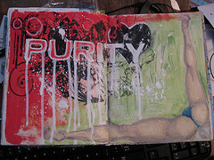
This was a NaNoJouMo prompt. I'm working in an 8×8 inch journal with Strathmore 400 series drawing paper inside. The paper is 90lb. I started out by gessoing the page lightly. I used a soft brush so as to leave few brush strokes.
I then used red acrylic in the upper left of the spread. I then googled the word purity to get some inspiration> For whatever reason when I think of purity I think of the absence of it. I also think of purity groups and… Well I find them hilarious. I won't go into it here, this is neither the time nor place, back to technique.
I found a particularly bad example of a "purity card." It was clear to me that someone's mom had made it in MSPaint. The design work is terrible. I pulled it up into GIMP and began my changes. I cleaned out the word purity and darkened some of the lines as well as cleaned up some of the other junk in the design. There was no making it much better than it was. I then printed it via laser printed to some transparency film. I knew it would give me the true "grunge" look the original artist was looking for and had failed miserably to attain.
I slathered on some gel medium and crossed my fingers, transfers are tricky at best and one this size was a lay it down and hope for the best kind of thing. I began burnishing the image with my bone folder. It transferred better than expected with some of the smaller areas not transferring well at all. The main part of the image transferred perfectly.
I then googled the image in the lower right, a woman bent over with little to nothing on. The best source for this sort of image? Car websites, apparently this is a favorite pose. It took some searching to find a "decent" image to draw from. I quickly sketched the image in pencil I intended the image to be black ane white but didn't like the way the legs looked in bl&w, so I added some color and shaded them in purple tones.I filled in the white gesso area with some green watercolor crayon.
After everything had dried I used a white paint pen to outline and fill in the word purity. I wanted it to pop off the page. I then added some water to gesso to make a runny paint. I allowed this to drip of each of the letters. I loaded up a large liner brush with the gesso and spattered it over the page… I allowed the paint to drip off the brush in several areas creating drops and splattered blobs of paint.
journal spread by maryfreeman on flickr
journal spread
Originally uploaded by maryfreeman
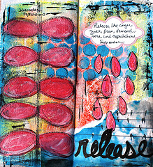
Love this image, and it's in an oddly sized journal.
Pretty Soon by MS. Natty on flickr
Pretty Soon
Originally uploaded by Ms. Natty
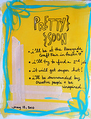
love the frame on this one.
The work is what counts by pageofbats
The work is what counts
Originally uploaded by pageofbats
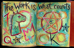
HOLY CRAP I love this person's work. Head over to their flickr page and look at everything, so very awesome.
11 may 10 “normal” by fred’s scratchings

11 may 10 "normal"
Originally uploaded by fred's "scratchings"
Lovely sketchbook page on flickr. Love the use of line in this one.
journal pages 69 – 70 by This Chicken
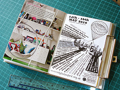
journal pages 69 – 70
Originally uploaded by this chicken
Love this person's journal on flickr. Been ogling their stream and you should head over to flickr to do so too.
Video by MarizaTeria
Check out this video of the making of a nice little AJ Page, by one of my favorite you tubers MarizaTeria
Faces 2 videos
I get a lot of questions about faces and how to shade them what colors to use, wher are the darkest areas etc. I've got plans to do a video, but I suspect that my weird and kind of realistic style is not what people are looking for. I found this 2 part video by YouTuber MyCreativeBliss that details shading and coloring one of those faces with overly large eyes. She uses several shades of peach, cream and ochres to color the face and then Glazing medium to blend and melt the colored pencils together. It's an interesting technique that I'm going to have to test out, not on a big eyed girl face but somethign a little darker and creepy, because I'm like that. Anyway check out these 2 videos, if you are interested in big eyed girls you'll like them.
Part 1:
Part 2
Trial by Fire
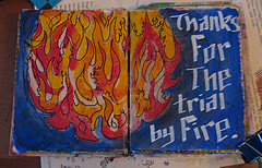
Trial by Fire
Originally uploaded by lessherger
In this image I'm working on 140lb Stonehenge fawn colored paper. It's very absorbent and nice for a lot of acrylic work. It's very sturdy. I sealed the page with gesso.
After I sealed the page and it had fully dried I lightly sanded it smooth with an extra fine sanding block. I then used a stencil of flames and layered it over itself several times to get the flames. I used yellow, orange and red to give the flames some shape and interest. After I had stenciled that I dried the image with my heat gun. After that was fully dry I mixed some blue paint with gloss gell medium and mixed it well on my palette. Using a coarse brush I put in several layers of the blue around the fireball. I left a lot of brush strokes visible purposefully. Brush strokes add a little more interest to the image.
After the blue dried fully I mixed some burnt sienna with some glaze medium and brushed that around the fire ball to darken the edges. I used a soft rag to blend the paint into the edges of the fire ball.
After that was dry I was considering the image of the fire. It was off somehow.So I decided to add some black outline to it. Using an Elmer's paint pen, in extra fine black I quickly doodled in some flame detail.
After everything had dried I added the lettering in white Elmer's paint pen with a calligraphy tip.