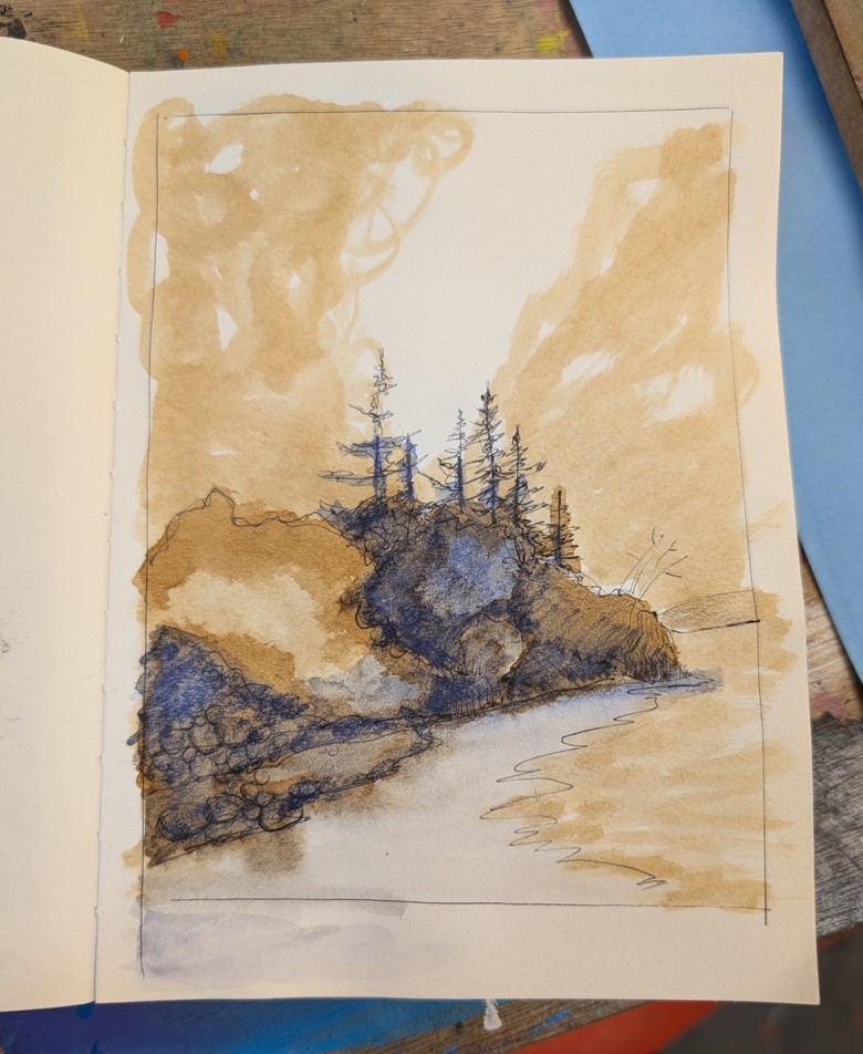
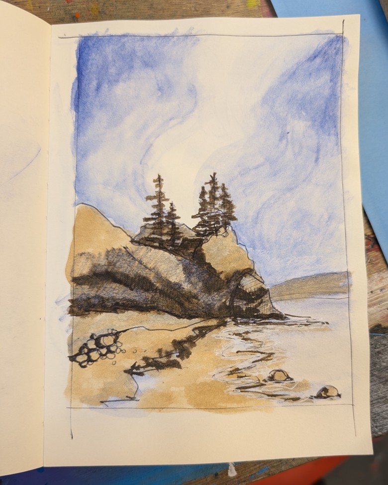
Disappearing Act

I have mentioned here several times that I’m working on this DIY Artist residency and applying for grants. I’m also gathering information about artist residencies that I can apply for to do next summer. I’m trying NOT to get too deep into the research rabbit hole but I find avoiding deep research hard.

My current process is to go to websites that promote residencies and grants and then dump the link to the residency or grant into a spreadsheet with some basic info- due dates and scope. This is basically me creating a database of things to apply for when the time is right. Some of the applications get a calendar entry as a further reminder to apply.

There is one grant application that I’ve been watching closely for the last 4 years. It opens up several times a year for applications. I get their newsletter several times a month. I think the last time I looked at their application was a month ago, but it could have been as recent as 2 weeks. I watch this one closely because it’s unrestricted, I qualify and it’s local.

This past round they removed all mentions of LGBTQIA+ as a priority for funding. This particular grant priorities marginalized and underfunded communities. Up until this round LGBTQIA+ was listed as a marginalized and underfunded community. Their website had a paragraph describing what that meant. This round- it’s gone.

The rest of their diversity initiatives remain, but LGBTQIA+ is wiped out.

After I noticed the removal on the state grant website I looked at many others.

Gone.*

It’s like LGBTQIA+ never existed on those pages.

I know much of this is due to the current administrations attack on Diversity, Equity and Inclusion initiatives. The interesting thing is that on most of these sites they continue to mention race and ethnicity. It’s interesting, as a gender non-conforming lesbian** to watch my state fight with the Tangerine Mussolini for equality when it comes to race and ethnicity but not for LGBTQIA+.

Let’s be clear here, all minorities and under represented folx, are under attack, but it’s interesting to watch in real time as states perform the trolley problem with my rights and humanity. It’s even more chilling to see this with the state where I have resided for the last 25 years of my life, Massachusetts, say they are fighting with this admin and performatively indicate that will not submit, only to have state agencies perform triage on their DEI language and trim off LGBTQIA+ from their DEI language.

The message to me is that these state agencies are willing to take a stand on SOME but not all of it’s marginalized communities. Sadly, not mine.

What does this mean for my residency dreams? *BIG SIGH* I’m not sure. I’m hopefully that for 2026 that I’ll still be able to attend one of these, I will likely stay in-state or in New England. As for grants. This is even more iffy. Grant money is drying up all over the US and in my state. I’ve spoken to some people in larger non-profits and they are looking at massive budget shortfalls. The non-profit where I work, well, it’s not pretty.

*Several residencies which are funded through private endowments and other private funding still have LGBTQIA+ listed.

** I don’t know that I’ve ever written about being gender non-conforming or a lesbian here. I have never hidden this online, and I know I casually mention my wife on my YT videos and while I’m clearly a woman in my videos, I often wear a hat… I dunno. I’m gay, been gay all my life, and embraced being butch in my 20s. I do openly talk about queer issues on the rest of my social media.

Continue reading

Prep is Necessary

Rolling* gesso onto a panel.

Taping off watercolor paper.

​Measuring off working area on paper.

Cutting sheets of paper down to size.

All of this is prep work. It sets the stage for what our actual art sits on. Without the prep the work suffers. A solid amount of gesso gives paint, pastels, and other mediums something to stick to. Taping off your watercolor paper gives a nice clean edge that looks good to buyers. Cutting sheets of paper down in advance means that you won’t scramble when it’s time to work.

I used to resent prep work. I thought it cut into my art making time. I skimped on gesso on my panels. I didn’t tear down sheets of paper in advance.

I regret skimping every time it ends up cutting into my art making.

I’ve had times when the lack of layers of gesso meant my surface wasn’t exactly where I wanted it. I’ve torn down paper for prints in the middle of a print session only to get ink on them. I’ve made so many watercolors without taking  off the edge only to struggle to frame it.

Now I not only accept prep as necessary and needed but I try to use the monotony of prep as a mindful moment. I roll out gesso onto panels and take deep breaths and listen to good music. I read while I wait for the first coat of gesso to dry. I then roll on another layer in a perpendicular direction to the first. I don’t sand. I usually do 3 coats. The great thing about rolling on gesso is that it lacks the directionality of brush strokes. I don’t need to sand it. It has a bit of a pebbled texture. But rolled on evenly and smoothly, it almost levels itself. The result is an even coat with plenty of tooth, ready for my paint or pastels.

When it comes to tearing or cutting paper down to size, I try to do a few more sheets than I think I’ll need or want. Better to have more than too few. I plan now for prints that don’t print well.

I write this as I get myself ready to do a mass gesso roll out. I have 12 wooden panels that need to be gesso. I have 24 8x10inch canvas panels that need some gesso love as well as *ahem* 30 more 5×7 inch panels that need gesso.

I have been avoiding the gesso roll out. Also it’s better to do this in a mass. I’ll spread out the panels on paper at work and roll out the gesso over all the panels at once.

These are part of my DIY Artist Residency that I’m crafting for myself this summer. More on this in another post.

*Or brushing, I like to roll mine.

The THING Doesn’t Bring YOU to the Paper

The expensive pen or specialty distraction free writing tablet thingie is not going to make you a writer. Buying Golden brand acrylic paints isn’t going to make you a painter. Buying Blackwing pencils isn’t going to make you a draughts* person.

We have all at one point in time or another spent far too much on an art supply in the hopes that it would, somehow, inexplicably, make us a better artist.

While it’s true that a quality art supplies won’t fight you as you work they also don’t help you do your work. They don’t bring you to the page or get the work onto the page. They just don’t fight you as you work.

What does help is a regular practice. Routine. Regularly getting to the paper and making. It doesn’t have to be every day, just a routine. 

I think an art routine is akin to fiber for your creativity.** Making art on some sort of routine can only be beneficial. Mine is almost daily. I’m in a space in my life where I have a job that is about art, not everyone has that. Back when I worked corporate I regularly made art. For me back then it was several days a week. My day off was packed with more art than any other day. I often took my breaks in my car. I’d sketch in my small art journal or write.***

That was what I was able to do, or so I told myself. I look back and wish I had prioritized my art making more.

That said, when you see an image here, my instagram, or as I make it on youtube I’ve got YEARS of effort and experience behind making it. It looks effortless now, but it took me almost 40 years to get there.

It’s not the materials it’s the years of effort.

I began with kid’s stuff. Then move into student grade. Currently I buy professional grade materials.

There are ranges of quality within these materials. There are also personal preferences, some of these shaped by availability.

I prefer Liquitex paints. Why? They were what was readily available to me in college. Golden wasn’t around. I’ve bought Golden acrylics but my muscle memory and understanding of the paint is for Liquitex.

Anyway, buy what you can afford. Buy quality if you can, or build up to quality over time. A 5 color mixing set of a quality paint or pastel is going to serve you better than the 24 set of student grade.

Unless you won’t use the quality set.

Know yourself and what you will or won’t use. If you won’t use the $50 5 color mixing set, then get the $20 fifty color set and use the hell out of it to BUILD A PRACTICE/ ROUTINE.

*Drawing person and draw-er are wrong.

**I made a joke about regularity, I’m officially old.

***I fell for the early Moleskine marketing hype and I swear Moleskine got me through those early days of working retail. I filled a lot of them in a few years.

It’s Important to Update Knowledge

Knowing history is a good thing. But knowing you are history is another.

I don’t generally feel old, occasionally the kids I work with with make a joke about how I don’t get something because I’m OLD, but more often than not I feel pretty okay and not old.

But then I dive into research mode on something I realize that I haven’t kept up on that thing and everything about it has changed.

I wrote here (and spoke on youtube) recently about how I wanted to apply for grants and residencies and because of that I needed to figure out how to write an artist statement. I also mentioned using art jargon in that post (and video). I have never been so happy to find out that something I learned is considered passé. 

Using professional simple language is the way!

Thank jeebus.

Results of Values Journaling

One of the main goals I mined from my values journaling session was that I really want to focus on making my own art for 2025.

Somewhere in my research for values journaling someone suggested (I really should do better at keeping notes) that you ask yourself the question, “When was I the most happy?” When I applied that to thinking about art and making art, I immediately thought to AJ Ning and the summer I paid my bills with art.

I believe I told the story here before, but back in the summer of 2002 I had moved home, had a disastrous break up, well 2*, and decided to focus on me. I had a summer where I didn’t have a full time job and I would wake up in the morning, drive to a scenic spot, hike, draw and paint. My pieces ranged from little 5×7 inch drawings and watercolors to large 22×30 inch watercolors and gouache pieces. There were a few small desk top sized driftwood sculptures too. 

All this went up on eBay and sold from anywhere from 10 cents to $125. $125 was decent money in 2002. It was close to half my rent for the month. 

Anyway, back then I looked at the landscapes and drawings of lighthouses as selling out a bit, no matter how much I enjoyed making them. Landscapes sold to tourists felt like selling out.

Today I see landscapes as an exploration of my space in the world. I always enjoyed painting and drawing them, but now I’ve embraced landscapes and portraits and everything else as something that I can just enjoy making. I’ve released the idea of “selling out” as a judgement I made on myself and made by others onto myself. It was a juvenile judgement.

From this goal, to focus on making my own art, I’ve decided that I want to apply for grants and artist residencies. In my research I realize that I’m late to the party when it comes to residencies and grants for this summer. I’ve missed most deadlines for residencies that occur during the time I can take vacation this summer, and likely will have to schedule into the following summer. Though summer 2026 will be more flexible if I can find things out in advance. My summer schedule at the DayJob is flexible.

It’s an interesting thing, applying for grants and residencies as I approach 50. When I graduated from my undergrad program I was told I should apply for residencies, but I saw application fees and also the various fees associated with the residencies. The information I had access to didn’t show any residencies that paid the artists, and many do. Many just cover housing. If I had done more research I’d have found what I’ve found now. And that are a lot of grants and residencies that cover expenses of the residencies. There are some that make sure the artist can even eat!

Anyway, if I can’t find a residency for this summer, I’m going to see if I can get a grant and craft my own. Maybe it’ll be a residency on my bike- I’ll ride my bike places and paint and draw there. Maybe camp. We’ll see what happens. All I know is that like last summer I want to immerse myself in making art then set about having a show.

*It turned out that my now wife and I just needed a break from one another to grow the f*ck up and be a good couple.

Koh-I-Noor Magic FX

Not long after I moved to Massachusetts I made my way to the best art supply store to ever exist- Charette. Sadly Charette folded 15 or so years ago. It was a very sad day. I hit their clearance sales with intense sadness in my heart.

Not long after my first visit to Charette I picked up my first Koh-i-noor Magic FX pencil- glossy black lacquer with glitter. It featured a mixed color core- a rainbow core of bright colors. According to the Koh-i-noor website, the colors are neon. Whatever it was, I used it quite a bit. I have no idea if I ever finished it or where it is now. (Probably with my missing in action clutch pencil*.)

I recently reinvigorated my love of them. I’ve been taking the train again and while I wait I draw vehicles in the parking lot. I usually have between 5 and 15 minutes to wait. I’m sketching in a 5×5 inch Talens Art Creations sketchbook or a 4×4 inch sketchbook from Dollar Tree.

​Also, I started to take the train again right after the weather here in Mass decided to be seasonably cold and windy. My markers and pens started to freeze up. The acrylic paint in the brush paint markers just wouldn’t dry or would thaw as I worked on the images on the train.

I pulled my Neocolor 1 and 2s out and started to draw with them.

In the back of my mind I thought, “Hey I’ve got all those clutch pencil leads and that clutch pencil, that would be great for this.” So I looked for it. I couldn’t find them. So I stuck to the markers and crayons. 

Then I pulled my rainbow pencils out of storage and started to use those. I can see why I loved these- capable of a thin line like a regular pencil but also with some practice capable of some delicate shading. I also liked the fat size of the pencils so I could keep wearing my gloves. I also had snagged a package of cheapo rainbow pencils. They were also very nice.

Over the last month of cold weather I kept thinking about those clutch leads and where that lead holder might be. This weekend I took a deeper look around the house, office, and studio.

I found all the leads but not the lead holder. I have no clue where it might be. So I gave in and ordered a replacement.

Funnily enough, now that I’ve ordered the lead holder and found the leads for it, the predicted temperature for tomorrow and the whole next week is in the 40s.

*I have been scouring my home and attempting to figure out where I stashed my beloved E+M clutch pencil. I couldn’t find it so I ordered a replacement- a Koh-i-noor Magic version of their clutch pencil.

Getting Back To IT

Having norovirus sapped my strength for a lot longer than I expected. For a week post… acute symptoms, i felt tired and lethargic. Generally crappy. I got behind on everything. I came home from work and crashed.

This past long weekend (I saw the Monday off weeks ago and decided to take the previous Friday off, not even realizing it was Valentines day*) really felt like I was back to my old self.

I hit record on a bunch of new videos and got editing them.

I hit a minor snag though- the mic picked up the high pitched hum of our pellet stove. It’s obnoxious. Apparently I still had 3 days left on my CapCut sub and used their software to clean it up. It’s too clean but whatever, it doesn’t have that hummmmm.

I’ve been working on a lot of things, despite feeling tired and run down for the last few weeks.

While I wait for the train I’ve been sketching cars and trucks in the parking lot. I’ve headed to the station a bit early to get in a few extra minutes of sketching time. Not today though. It’s under 20°F with a wind chill of who knows what. I’m going to cut it as close as I can to the time the train SHOULD arrive.

I’ve also decided to attempt a 100 people challenge. The challenge is usually set for March, I think, so I’m starting early. And I’m making blob and simplified forms. I find them vaguely unsettling. I’ve also been churning through the Gesture Drawing Party channel on Youtube. 

Anyway. I have many thoughts about what I’ve been learning as I make these vehicle sketches as well as the gesture drawings and blob people images. LOT’S OF THOUGHTS.

I’m learning a lot about processes and color and composition. 

*We aren’t big on celebrating Valentine’s Day. Working as a florist really ruined it for me. There’s nothing like seeing people be performative about love to sour you on a holiday about love. Back when I worked retail my coworker and I set up a Valentine’s Day display of red roses, condoms, and lube…  Our boss was not impressed and made us dismantle it. I enjoyed telling him that we had already made sales off of it and many customers had a good laugh.

The Space Between Winter and Spring

I love spring but I hate the transition from winter to spring. Here in Mass it’s full of mud, trash emerging from gray brown snow piles, and dog poop. Seriously so many bags of dog poop, and unbagged.

Walking anywhere, is a slalom of avoiding stepping in and on dog poo.

It’s also the season where suddenly I want to spend all my time outside making art or riding my bike. Or a little of both.

This liminal space between winter and spring is a great time to prep for actual spring.

This week I have cut down several larger blocks of watercolor paper to the small size I prefer for plein air sketching- 4.5×6 inches. This gives me 4 sheets per 9×12 inch sheet of paper. I use inexpensive paper for my plein air sketching. I also have a quick way of ruling it out for these sketches. 

I have a small mask that I trace around with a pencil and it becomes similar in proportion to an oversized polaroid- not quite square but visually pleasing.

I ruled out around 30 of those, many of which I’ve filled with blob people. Then I remembered my inexpensive pack of paper and I chopped that down- roughly 100 little pieces of paper ready for blob people and en plein air sketching. 

I also found some damaged scrap matte board at work* and chopped that down to roughly 7×8 inches. I mounted the watercolor paper to this with low tack artist masking tape. These little sheets are ready for me to draw and paint on wherever I might like to. The board makes these loose sheets hard and stiff and able to be supported by a pochade box or easel, in other words ready for making art outside.

They are also light enough that I can dump 8 of them into a backpack or pannier and have more than enough sheets for painting and drawing in any session.

I’m also working on making a pochade box from a cigar box. I have a tea box that I might also attempt to turn into a pochade box.

*from a donation a few years back that I gathered in a house clear out. The roof had leaked near where the matte boards had been stored and some had damaged edges. I have used most of the board with the kids but had chopped off the water stained edges and now I’m using it to stretch the watercolor paper. If you’ve never had a chance to draw or paint on matte board, try it. If the matte board is good museum quality stuff it’s absolutely a dream to work on. Even cheaper matte board is great to work with.

Experiments with Cheapie Paint Markers

(Editor’s note: This was posted to my ko-fi account a month ago, if you would like to see these posts in real time head over to Ko-fi and follow me there.)

I had hoped that I would have spent the last 2 or 3 days making art and recording videos of myself making art. Instead I switched gears and rested.

Why?

Shear necessity.

You see, I work with kids and I caught either norovirus or food poisoning. I will spare you the details and instead tell you that for 8 hours my home was my bathroom then the next 16 I spent in bed. Then the next 24 sleeping fitfully and rehydrating.

I have had food poisoning once before.

This was worse.

Anyway. My stomach still feels like I’ve gone a few rounds with Claressa Shields* or done a severely heavy routine of planking. I’m back on solid food and I mostly feel normal.

​And my normal includes drawing. I finally picked up my materials this AM and did a gesture drawing session. I’ve done over 35 of them at this point and while this morning’s session wasn’t my best, it was a great way to start the day.

I then started to churn through my emails, which included many many substacks and free Patreon subs. Luckily at this point, it was Saturday, I lost 2 DayJob days to this illness, and Saturday was destined to be slow.

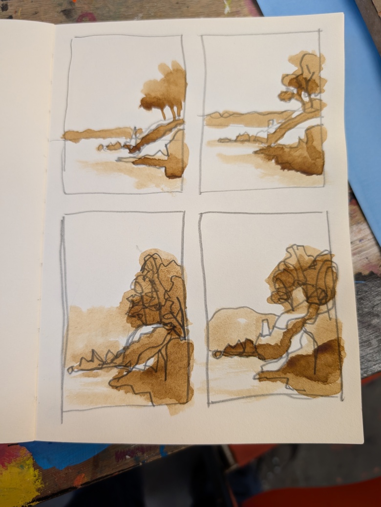
Anyway, I started reading and I hit Orla Steven’s message for February Plans (read here) and the image was great so I decided to play with it a bit. I did 4 different thumbnail images (gah not on camera) with cheapie rainbow colored pencils and cheapie brush tipped paint markers that blend and show through. It’s rough and ready and I kind of love them. They may need some crayons.

Who am I kidding? Adding crayons is always a good choice.

Crayons were a great choice here because these darn acrylic markers are all very much in the same value range. That is if I squint and look at them they all blend into one big blob. It works the same if you take a pic and turn it black and white by turning the saturation all the way down. A useful tool. I attempted to build value through layers and the use of the few colors in the set- brown and purple that have a darker value.

An observation that I’ve made about some of these cheaper acrylic marker sets is that they very much remind me of a very inexpensive acrylic gouache. They have a bit more of an acrylic film that resists other water soluble media, but not enough to make it impossible. These markers probably won’t last that much longer as I do keep using them, despite finding them frustrating and that they freeze up when I use them in cold weather. I won’t be buying another package of them.

*I had to look her up, she the current Women’s Heavy Weight boxing champion. As of this writing. according to some weight classes. blah blah blah. I don’t follow boxing.

The Right Tool for the Job

I am a proponent of using the best materials that you can afford at that moment. Sometimes the best materials for the current job are an inexpensive sketchbook (CHEAP) from 5 Below. Sometimes it’s buying a single tube of Holbein watercolors or gouache at a time to build up a collection of the right materials for the job.

And maybe Holbein isn’t your favorite brand of watercolors, maybe you’re a  Winsor&Newton or Daniel Smith person. It’s not the brand it’s the quality of material we’re discussing here, and if you want to go on a deep dive of comparing brands and their quality there are many spaces to do that.

There are many spaces where you can get reviews (that aren’t sponsored) of materials to assess their quality and use. I have been quite skeptical of art material reviews over the last few years. Certain brands have flooded review spaces with free products and sponsored videos.

That is not what I’m writing about today.

I have been using oil pastels. I have been seeking out a more budget friendly alternative to Sennelier oil pastels. Because at about $5 a stick, I can’t afford that for myself or my groups. I have a generous budget, but not that generous. I spent some time diving deep on budget brand reviews.*

I found some quality alternatives and I’ve been using them and WHOA WHOA WHOA.

The key word to search for when buying oil pastels is soft- if you want that sennlier lipstick type feeling.

First up are the Mont Marte 48 pc set in a metal tin. I admit I purchased this for en plein air- the tin will stick to a pochade box. They are described as soft. The 48 color set is adequate for most sketching of portraits or landscapes. There aren’t quite enough greens but softer less garish greens can always be mixed.

Compared to Pentel or CrayPas or most of the budget brands I previously discussed, they are very soft. They are probably 2/3rd as soft as Sennelier. They are buttery and layer well and have nice vibrant colors. Think cold chapstick instead of lipstick.

I like them quite a bit. I like that I can get a nice thick layer and that as they warm up in use they really work into the page. The colors are nice and mix as expected. The ultramarine blue and burnt sienna mix to form a really nice dark gray. They are capable of nice impasto effects.

A downside is that they have a bit more crumble to them- in the same way as CrayPas, they have a tendency to snap.

They have a bit of a waxy odor, which I find pleasant.

The other budget brand, on the higher end of budget friendly is Paul Rubens. (look for sales on this one. When I bought my set they were a few dollars more) These sticks are warm butter soft and layer well. The slightest pressure applies a large amount of pastel to the canvas. They produce a wonderful impasto effect. The colors are vibrant and are reported to be mostly lightfast and the actual pigments are labeled. The sticks don’t break unless you want them to.

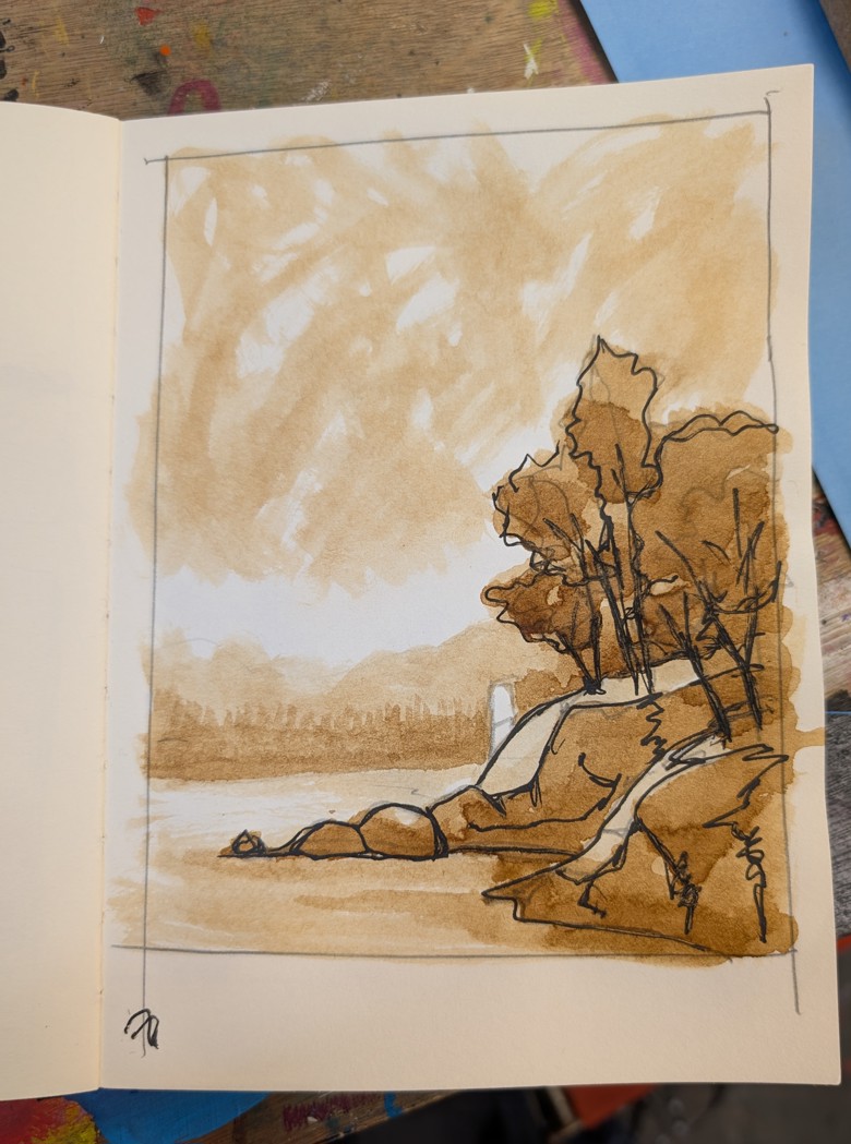
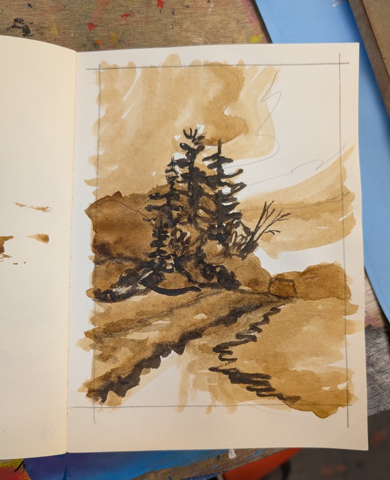
These are a smidge harder than Sennelier pastels. They feel very similar. Image produced as part of @emmablockillustration Patreon Art Hang

I really  really like these and will be using them a lot. I think a few sets of these along with more sets of the Mont Marte will be what I stock the group space with.Image produced as part of @emmablockillustration Patreon Art Hang

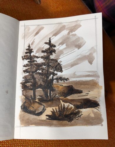
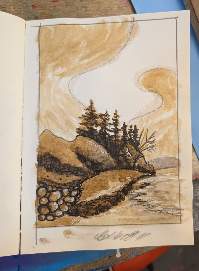
There is one big downside to the Paul Rubens and that is a very strong odor. It smells a bit like used motor oil, turps, and old school printing ink. It’s not unpleasant (to me) but I could see many folks finding it VERY unpleasant. It smells mostly like used motor oil to me. I also found that some of the sticks were oozing or weeping oil. This seemed to mostly happen with the dark purples and blues. It was easily wiped off and the tray wiped clean. From one of my own photos. I’ve drawn this one a few times.

I do have one additional set on the way- Lightwish. I’ve been heard (via a YouTube review) that Lightwish is the Paul Rubens’ more budget friendly brand. Lightwish and Paul Rubens are 2 brands I give the side eye to when it comes to reviews on YouTube.

Anyway, we’ll see how those perform and I’ll write more.

*In disclosure, these were purchased through my work budget and for my job. A perk of my job is purchasing testing supplies and then getting to use them to determine if they will be good for the kids I work with.