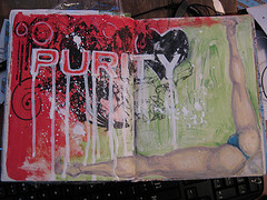
nanojoumo- purity
Originally uploaded by lessherger
I get a kick out of all the online "purity" groups. SO when the word purity came up for nanojoumo day 2 I had to lampoon it. The purity "logo" was put online as a purity card for a church group. It looks far cooler here than it did on the card. I pulled the card in to MS Publisher, reversed it and resized it to be about 8×10, i then printed it off onto a sheet of transparency film. I put it on the right side of the film this time and used a great deal of matte medium to transfer it to the pages.I had to cut it into 2 pieces to get it on, and I'll tell you the fold was a beast. the original logo was clearly going for a "urban and graph" feel. So the tendency of the transfer was a perfect medium to really take it there. I then outlined the letters with my pentouch pen, pressed down to get dribbles and runs. While that dried I looked at hundreds of images of scantily clad women bent over various objects, and quite frankly there are things that can't be unseen. Just the very act of attempting to find the image for the right corner has left my brain irreparably damaged. The things I do for art. I found the perfect picture, of a woman, scantily clad washing a car. I wanted the legs to frame the corner, so I first drew the leg for the right most side in soft pencil, added the crotch area and then the left leg. Next was to mix up some white person flesh tone and layer it over the drawing. I added her thong and it's all set. I blocked in some green coloring to set off the legs. Then I mixed up some gesso really thin and used a liner brush to spatter it on the page…
Maybe not the most pure purity page, but it's exactly what popped into my head when I first saw the word as the prompt.