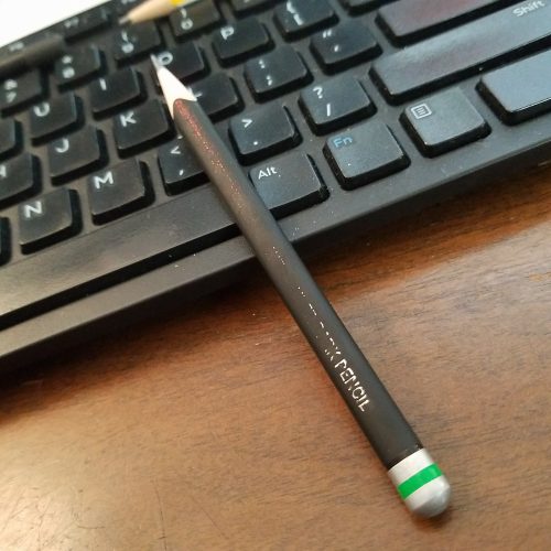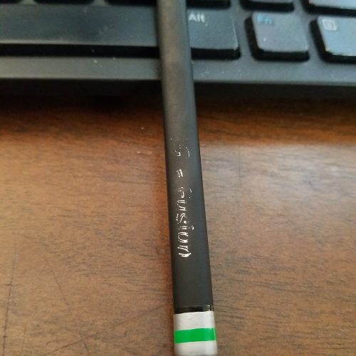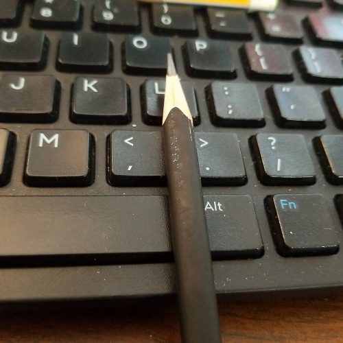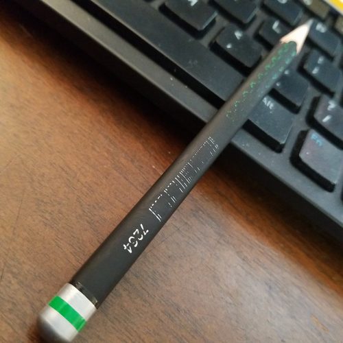
Doms Fusion with imprint partially worn off.
I posted a review of the Doms Fusion pencil. It’s a nifty little pencil with a grippy matte finish printed with loads of little foil starbursts and silver words. I love everything about its weird little design choices. Why red, blue and green foil with a silver imprint? Why not have all the printing be one color for each pencil? The end dip is spectacular.
I know a lot of folx want their imprints to be pristine from the start to finish of their pencils. The last few weeks I’ve been using the Fusion pencils as I write up notes, outlines, and jot down research. I’ve carried one with me to and from work. I’ve been shoving it over my ear and under the folded brim of my beanie.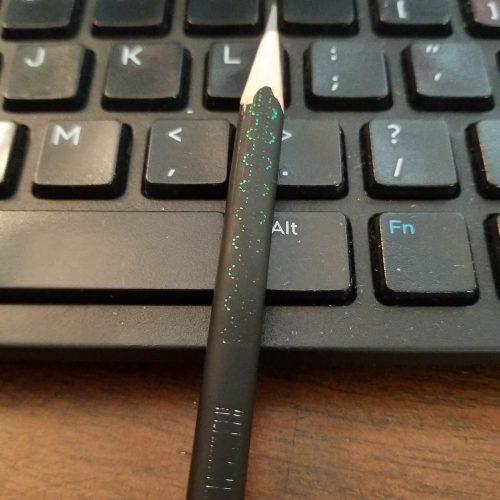

As I’ve used it, the foil has worn here and there. As I sharpen it, it gets a little more worn. I love the look of a tool that shows I’ve used it, I’ve worn it into my use. To my eyes, it looks better every day.