Author Archives: leslie

some more pictures

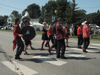
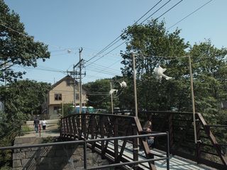
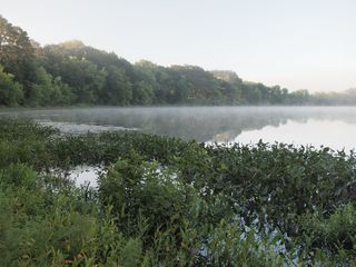
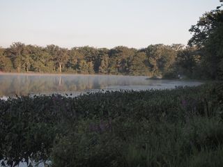
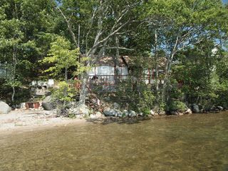
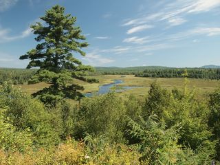
I'm being a terrible blogger these last couple of days. Just know it's for good reasons, m'kay? So here are some pictures I took over the last week or so. _7141066

 These are PINK day lilies. I never thought I'd be a fan of them but these kick ass, and people like to trade other day lilies for them. This is a nice sunset shot of one.
_7141066
_7141066
_7141066

Apparently my city has a couple of "working" docks and not just docks for fancy boats. In this case, a  lobster boat is at the dock. 
_7141066

*SIGH* Teenagers and Jager go hand in hand, sadly the drunk teens leave "stuff" behind. This will make some great sea glass later- dark gree is great. (I also found some err used "protection" in the beach trash. Seriously people, dispose of it in better ways!)
_7141066
Another shot of the lobster boat. This may become a painting later this winter, or not, who knows.

Taht being said, I'm getting to know the camera better and I'm thinking more about the shots themselves, not just pointing and shooting. I'm better at composing a scene just by looking than I am through the lens, I guess years of en plein air painting has some positive effect. I've figuring out how to start teh pricocess of applying how I look when I'm painting to the lens of my camera. It's not that different, it seems to be about looking around, like i do when I'm painting and then holding up the camera and clicking.

Wordy Wednesday: Paint Observations

As i was mixing my color swatches I noticed a few things. first, the Liquitex Basics colors are thinly pigmented. it’s great that they are relatively pure pigments but many colors that are not traditionally considered truly transparent are, due to the low pigment load. Now this is not much of a problem when you are using colors straight out of the tube but it becomes an issue when mixing shades and tones.

It’s great for mixing thicker glazes where you want some brush strokes to show through. but you may find that when you are mixing colors that you reach for those colors that have a low pigment load more and more often.  while a 2 ounce tube of Liquitex heavy body cadmium yellow light is $12- $8 and a 8.5 ounce tube of basics is $8 you’ll find the tube of the heavy body last longer because you’ll use less due to it’s EXTREMELY heavy pigment load. Meaning I can mix more greens with the heavy body versus the Basics. The 8.5 tube of basics has less than a ¼ of teh pigment that the 2 ounce tube of heavy body contains. (that could just be dramatic but it’s significantly lower.) Roughly saying a 2 ounce tube of the same color could last 4 times as long as the same tube of Basics.

I should do a measured experiment to prove my theory but I’d rather use my heavy body paints for painting…

The other observation that I made is that many colors have an inconsistent texture or consistency. The tube of cadmium yellow light is like spackle where with tube of cadmium yellow medium is thin like heavy cream and the cerulean blue is like greek yogurt. When i open a tube of Liquitex heavy body (or golden heavy)  the consistency is the same thick buttery texture, across the board for every color, unless I add gel or air brush medium.

Treat yourself to one of those pricey tubes of artist grade colors, you’ll appreciate how much longer they last versus the student grade. The texture is also very very nice. Also there is nothing that says you can’t mix and match artist/professional grade with student grade.

Technique Tuesday: Watercolor Water Application

This week’s technique Tuesday is ridiculously easy.

It’s this:

IMG_3196
IMG_3196

I know, you are thinking, it’s a bottle with water in it, with a narrow tip. You think I’m crazy. Hold up, let me explain. This is a fabric dying squeeze bottle. Available for about 80 cents at artist & craftmans. People who dye stuff use it to apply tiny small precise amounts of dye to things like silk. It will dispense a fine line or a single drop of liquid.

I read a blog post that suggested that people use an old eye drop bottle to apply controlled droplets of water into a watercolor palette instead of a mister bottle to wet the palette, which is what I’ve been using until now. As many of you who have been reading this for any period of time know, I have allergies, I use massive amounts of eye drops so I don’t look like I’m crying constantly. (Seriously I use a lot of them.) Anyway, I’ve kept the bottles until now to use with ink. But the last time I was at A&C I was poking through the small baskets of stuff and found these (apparently I did this once before too as I found another of them) little bottles. At 80 cents Jane and I both bought one.

And it’s perfect, it dispenses one perfect drop or several with ease and only in the pan I want it in rather than EVERYWHERE like the mister.

It also keeps the water pristine, I’d like to see you stick a brush into the tip! It fills easily, either by sucking water in or by removing the little tip and running it under running water.

Technique Tuesday: Watercolors

I enjoy my watercolors, a lot and I'm always looking for fun new techniques to try out> Eveline sent me this link to a guy she mentioned could be the British Bob Ross, and I have to say she might be right. I really enjoyed his tutorials! Go check them out.

You can also sign up for  a download of a 60 page PDF of his watercolor book, it's actually a very worthwhile download. A lot if these free downloads are worthless junk, this one however is filled with practical information. Things like paint strength, adding water to a wash of color and things you learn as happy accidents. Good stuff and a great cult of stuff download to get you thinking about practical use of paint and how to manipulate it for the results YOU want. Go sign up and download it.

Paint Swatches

After my art adventure with Jane Saturday I really wanted to narrow my palette down to the 8 colors I thought would work best for me. I’m not exactly sure what I’m going to do when I run out of the paints that are in the small 22ml tube sizes. I may be forced to remove the water bottle from the pochade and just use my drinking water bottle for rinse water. If I do that I’ll switch to my 40 ounce KleenKanteen instead of the 1 pint bottle I’m using currently.

I headed to the basement and painted swatches of how colors mixed with one another. A scientific approach to picking the right colors for me. I used cheap mead 3×5 inch index cards. I painted on the blank side and wrote the name of each color represented. Here are some pictures. Please be aware I did not focus on making these neat, merely on mixing 2 colors; sometimes 3 colors.

IMG_3190
IMG_3190
IMG_3190

These are held together by a 7 Gypsies cable ring that Dede kindly sent me. These things are super cool and very useful. I may have to buy a whole package of them. Or figure out how to make them…

Continue reading

Limiting the Palette

Important to note that this post was written with acrylic in mind, watercolors have their own palette choices that work differntly from acrylics. I'll address watercolors in a future post.

Why is palette choice so important to painting en plein air? Ultimately you want to carry the minimal amount of equipment to make the picture happen. You could carry every color you have available but that would make for a very heavy pack and awkward hiking. Using every color available tends to leave a painting with a disharmonious feeling. Paintings tend to have a harmonious feel when colors have been mixed with other colors in the painting. When you using paint straight from the tubes paintings tend to not jive as well as if you’ve added a touch of another color in your palette to the other colors.

The important thing with an en plein air palette is the colors you get by mixing 2 and 3 colors together. Some people use the same palette over and over again and others are constantly rearranging their palette, dropping in a new red or blue or swapping out a yellow. To each their own.

In acrylic I tend to work with the same palette for a warm season and switch to a more expansive palette in the winter months. This is because I usually work mostly inside in the fall and winter whereas in the summer I tend to work on location far more often.

Currently my palette is considered pretty large by plein air standards and it’s highly likely I’ll get rid of a yellow and a blue shade, but we’ll see.

Here are some excellent links on the subject of limiting your palette.

 Gurney

Learning to See

Channeling Homer

Channeling Homer also has a "pamphlet" about palette picking, and it's good

I frequently limit my palette to 2 or 3 colors, usually titanium white, a blue and then a warm color like titan buff or yellow ochre. This is an exercise I may explore again.

Picking a Palette

Yesterday Jane and I headed to Salem Willows for a little painting. My goal today was to get a handle on my sky and the forms of the trees. Whilst painting I realized that the palette I’ve included in my pochade is not completely right for what I’m doing. Jane and I also had a discussion about palettes and how somethings are right for some things but not others, like portrature verses landscapes.

My current palette is as follows:

  • Cad yellow light
  • Cad yellow Medium
  • Cad Orange
  • Aliz Crimson
  • Pthalo blue
  • Cobalt Blue
  • Ultramarine Blue
  • Unbleached Titanium white (Titan Buff for you Golden fans)
  • Titanium White
  • Mars Black

Now to be fair I’ve never included a black in my pochade palette in the past and I just sort of tossed it in on a whim, which is strange to think given how damn small this pochade is and how much smaller it is than my last box.

It is also interesting to note that I don’t have a single earth tone in here- not a drop of raw or burnt umber or sienna. Again, an oddity given my love of earth tones and their heavy use in my watercolor palette. Perhaps I was unconsciously rejecting my watercolor palette? Who knows, but an earth tone or two will be included in the next packing of the pochade. Also, yellow ochre is nowhere to be see.

It’s as if I closed my eyes and picked a palette not really suited to the sort of painting I was planning.

The all of the color except unbleached titanium were colors that my Painting 101 instructor listed on the “to buy list” for the class. Perhaps I was just grabbing some old familiars?

I’ve been trying to mix all the shades of green that I want but the truth is that it’s making me smash my head against the wall. Color mixing is entirely different for watercolors and acrylics. With watercolors it is much easier to mix the shades of green you need from just a few shades of blue and yellow. It is not the same for acrylic. I’m adding pthalo green to the mix. It will replace one of the 3 blues, which I’m not sure but right now I’m leaning toward ultramarine getting kicked out. I’m replacing the black with burnt umber.

This will shock people, given my love for this particular color, but I’m considering kicking Alizarin Crimson out of the box. It’s a great shade of red but for the space in the pochade I can get more mileage out of Napthal red. If I add nappy red (as I like to call it) I’ll also get rid of cad orange. Nappy red makes great oranges with either of the cad yellows. I will keep both cad yellows as they mix with the blues and the pthalo green to make different shades of green.

Cobalt blue may be replaced with cerulean blue but I’m not sure yet. This leaves me with the following:

  • Cad yellow light
  • Cad yellow Medium
  • Cad Orange-
  • Aliz Crimson- Napthol red
  • Pthalo blue
  • Cobalt Blue (questioning this one)
  • Ultramarine Blue- Pthalo Green
  • Unbleached Titanium white (Titan Buff for you Golden fans)
  • Titanium White
  • Mars Black– Burnt Umber

After I got back from my art adventure I headed to my studio and dumped the contents of the pochade out and started making color swatches of the colors in the box, to see what colors I could mix by mixing each color with the others in the box. It was enlightening and led to the switches seen above. Then I look through my swatches and I debate removing ultramarine from the mix…

Next up will be mixing a series of swatches from my studio palette. That will take substantially more time, I have 20 or 30 colors of paint. Then… I'll be doing this with my watercolors. This will certainly cut back on my cult of stuff purchases. I have that in check with watercolors, as I've always kept a list in my planner of the watercolors I need to replace. INterestingly enough I rarely stray from that list. Though on the rare occasion i have, I've ended up with colors that I use regularly, like indigo and red ochre.


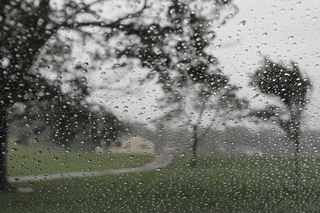
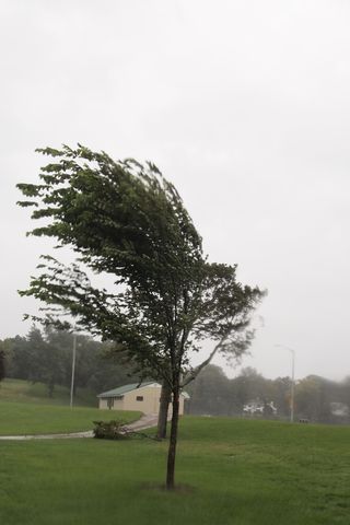
Looks like rain!

I checked the weather for the day and it was supposed to be nicer than it is. Everything is wet and it’s VERY overcast. Really I swear mother nature wants  me to sit around in coffee shops drinking really good coffee and not painting outside.

Mother nature better buck up soon, ‘cause I’m headed to the park to paint! (Even if the light is terrible today)

Camera Shenanigans

On my lunch break I did  a little reading today about camera settings, you know that funky stuff- ISO (the sensitivity of film to light), aperture- how wide the opening is in the lens, and stops or shutter speed. I didn’t have my fancypants camera on me but I did have my point ‘n shoot. My point and shoot has controls for shutter speed and ISO. I set it to macro and started to snap pictures of a G2 pen I had on my desk, in the back ground is a stack of folded letters ready for mailing.

The first picture is at ISO 1600, with the camera’s self setting for shutter speed.

IMG_3172

The second picture is the same image at ISO 1600 set to expose at the camera’s setting of +2, or double the camera’s regular shutter speed.

IMG_3173
In this one you can see the graininess of the background, which I rather like in comparison to the foreground. Additionally the image itself is not quite as crisp as images shot at 200, 400 or even 800 ISO.

The 3rd picture is the same image at ISO 1600 and down 2 from the camera’s regular setting.

IMG_3174
Below check out the same item, shot at 400 ISO at the camera’s internal “regular setting.”

IMG_3182 Anyway, the whole thing is fascinating to me in that I’m learning I can control the camera to get results I want before transferring the images to my computer and editing, even with just a point and shoot. This clearly opens up a lot of options.