Author Archives: leslie

Limiting the Palette

Important to note that this post was written with acrylic in mind, watercolors have their own palette choices that work differntly from acrylics. I'll address watercolors in a future post.

Why is palette choice so important to painting en plein air? Ultimately you want to carry the minimal amount of equipment to make the picture happen. You could carry every color you have available but that would make for a very heavy pack and awkward hiking. Using every color available tends to leave a painting with a disharmonious feeling. Paintings tend to have a harmonious feel when colors have been mixed with other colors in the painting. When you using paint straight from the tubes paintings tend to not jive as well as if you’ve added a touch of another color in your palette to the other colors.

The important thing with an en plein air palette is the colors you get by mixing 2 and 3 colors together. Some people use the same palette over and over again and others are constantly rearranging their palette, dropping in a new red or blue or swapping out a yellow. To each their own.

In acrylic I tend to work with the same palette for a warm season and switch to a more expansive palette in the winter months. This is because I usually work mostly inside in the fall and winter whereas in the summer I tend to work on location far more often.

Currently my palette is considered pretty large by plein air standards and it’s highly likely I’ll get rid of a yellow and a blue shade, but we’ll see.

Here are some excellent links on the subject of limiting your palette.

 Gurney

Learning to See

Channeling Homer

Channeling Homer also has a "pamphlet" about palette picking, and it's good

I frequently limit my palette to 2 or 3 colors, usually titanium white, a blue and then a warm color like titan buff or yellow ochre. This is an exercise I may explore again.

Picking a Palette

Yesterday Jane and I headed to Salem Willows for a little painting. My goal today was to get a handle on my sky and the forms of the trees. Whilst painting I realized that the palette I’ve included in my pochade is not completely right for what I’m doing. Jane and I also had a discussion about palettes and how somethings are right for some things but not others, like portrature verses landscapes.

My current palette is as follows:

  • Cad yellow light
  • Cad yellow Medium
  • Cad Orange
  • Aliz Crimson
  • Pthalo blue
  • Cobalt Blue
  • Ultramarine Blue
  • Unbleached Titanium white (Titan Buff for you Golden fans)
  • Titanium White
  • Mars Black

Now to be fair I’ve never included a black in my pochade palette in the past and I just sort of tossed it in on a whim, which is strange to think given how damn small this pochade is and how much smaller it is than my last box.

It is also interesting to note that I don’t have a single earth tone in here- not a drop of raw or burnt umber or sienna. Again, an oddity given my love of earth tones and their heavy use in my watercolor palette. Perhaps I was unconsciously rejecting my watercolor palette? Who knows, but an earth tone or two will be included in the next packing of the pochade. Also, yellow ochre is nowhere to be see.

It’s as if I closed my eyes and picked a palette not really suited to the sort of painting I was planning.

The all of the color except unbleached titanium were colors that my Painting 101 instructor listed on the “to buy list” for the class. Perhaps I was just grabbing some old familiars?

I’ve been trying to mix all the shades of green that I want but the truth is that it’s making me smash my head against the wall. Color mixing is entirely different for watercolors and acrylics. With watercolors it is much easier to mix the shades of green you need from just a few shades of blue and yellow. It is not the same for acrylic. I’m adding pthalo green to the mix. It will replace one of the 3 blues, which I’m not sure but right now I’m leaning toward ultramarine getting kicked out. I’m replacing the black with burnt umber.

This will shock people, given my love for this particular color, but I’m considering kicking Alizarin Crimson out of the box. It’s a great shade of red but for the space in the pochade I can get more mileage out of Napthal red. If I add nappy red (as I like to call it) I’ll also get rid of cad orange. Nappy red makes great oranges with either of the cad yellows. I will keep both cad yellows as they mix with the blues and the pthalo green to make different shades of green.

Cobalt blue may be replaced with cerulean blue but I’m not sure yet. This leaves me with the following:

  • Cad yellow light
  • Cad yellow Medium
  • Cad Orange-
  • Aliz Crimson- Napthol red
  • Pthalo blue
  • Cobalt Blue (questioning this one)
  • Ultramarine Blue- Pthalo Green
  • Unbleached Titanium white (Titan Buff for you Golden fans)
  • Titanium White
  • Mars Black– Burnt Umber

After I got back from my art adventure I headed to my studio and dumped the contents of the pochade out and started making color swatches of the colors in the box, to see what colors I could mix by mixing each color with the others in the box. It was enlightening and led to the switches seen above. Then I look through my swatches and I debate removing ultramarine from the mix…

Next up will be mixing a series of swatches from my studio palette. That will take substantially more time, I have 20 or 30 colors of paint. Then… I'll be doing this with my watercolors. This will certainly cut back on my cult of stuff purchases. I have that in check with watercolors, as I've always kept a list in my planner of the watercolors I need to replace. INterestingly enough I rarely stray from that list. Though on the rare occasion i have, I've ended up with colors that I use regularly, like indigo and red ochre.


Looks like rain!

I checked the weather for the day and it was supposed to be nicer than it is. Everything is wet and it’s VERY overcast. Really I swear mother nature wants  me to sit around in coffee shops drinking really good coffee and not painting outside.

Mother nature better buck up soon, ‘cause I’m headed to the park to paint! (Even if the light is terrible today)

Camera Shenanigans

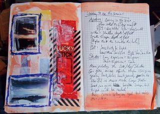
On my lunch break I did  a little reading today about camera settings, you know that funky stuff- ISO (the sensitivity of film to light), aperture- how wide the opening is in the lens, and stops or shutter speed. I didn’t have my fancypants camera on me but I did have my point ‘n shoot. My point and shoot has controls for shutter speed and ISO. I set it to macro and started to snap pictures of a G2 pen I had on my desk, in the back ground is a stack of folded letters ready for mailing.

The first picture is at ISO 1600, with the camera’s self setting for shutter speed.

IMG_3172

The second picture is the same image at ISO 1600 set to expose at the camera’s setting of +2, or double the camera’s regular shutter speed.

IMG_3173
In this one you can see the graininess of the background, which I rather like in comparison to the foreground. Additionally the image itself is not quite as crisp as images shot at 200, 400 or even 800 ISO.

The 3rd picture is the same image at ISO 1600 and down 2 from the camera’s regular setting.

IMG_3174
Below check out the same item, shot at 400 ISO at the camera’s internal “regular setting.”

IMG_3182 Anyway, the whole thing is fascinating to me in that I’m learning I can control the camera to get results I want before transferring the images to my computer and editing, even with just a point and shoot. This clearly opens up a lot of options.

Technique Tuesday: Deep Darks in a Painting

I want to tell you about mixing darks. For years I lived under the impression that a “real artist” doesn’t use black paint, even though it’s a part of many colors, like one of my favorites Payne’s Gray. In school mixing black with anything was definitely frowned upon. Instead we were expected to mix colors together to create deep dark shades. One of my professors taught me a dark that I really like and still use. It’s useful with a variety of colors because it can be mixed warm or cool.

It uses the following 3 colors:

  • Pthalo Blue
  • Alizarin Crimson
  • Pthalo Green


For the standard deep dark color, mix all 3 in equal proportions. If you’d like it warmer add more aliz crim.

This recipe can be changed up by mixing in various proportions:

  • alizarin crimson
  • Pthalo Blue
  • Cadmium Yellow Med or Cad Orange


Again start with equal amounts of each and adjust the colors to get the shade you want and need.

The various art professors who had issues with black said it “muddied” your colors. To a point that’s true, if you add a TON of black to a mix of colors it can turn to mud and not be clear. That being said, adding a  touch of black to a color will dull it and darken it.

One professor that I had suggested that we use it as a base color for shadows. Where another suggested that we use thalo blue for shadows and another suggested that we use thalo green for shadows.

I’ve found that the truth lies somewhere within the maze of contradictory and fuzzy advice these knowledgeable ladies and gents shared with me oh so many years ago. The core of this whole discussion is that you need to stare at a shadow and decide for yourself what color does it lean towards? Red Blue Green? Depending on what you see you should lean that way.

For me, my shadows lean toward the blue purple side of the spectrum so I start with a touch of pthalo blue and a tough of alizarin crimson hue or quid magenta.

Even though I feel okay using black now, I still tend to make my darks from blends of colors. In the image below that dark dark color is the second blend I wrote about AND I had it lean toward blue.

IMG_3167

Technique-I-can’t-wait-until Tuesday: Mini Polaroids with the Pogo

I was over here reading Crafty Moira’s site and I stumbled upon her tutorials, this one caught my eye– pogo printer yes, making it look like an old school mini Polaroid, why yes thank you very much.

After checking it out, I realized it would be cool to have the pogo print the square image and then simply trim off the excess. (read, I'm too lazy to go get my white cardstock.) After some trial and error I figured some stuff out.

First. Don’t work the actual 2×3 inches of the print, you’ll get a grainy print. You need to work larger than the print size so the pogo can compress it down, or something like that. I chose to work in GIMP (a free photoshop clone that kicks butt) with a “canvas” size of 4×6 inches, which is the same aspect ratio as the pogo print, which is 2×3 inches.

Then I opened a photo, I cropped it square and then cut and pasted it to my 4×6 blank “canvas.” It was over sized, I then selected “resize layer” and resized the image to 3.375 inches square. This will give you a 1/8th of an inch border around the sides of your image, and about 1 inch at the bottom. After this you have to flatten the image and then save it as a jpeg. Now send it to your pogo.

When it prints you’ll notice several things. First the pogo has a hard time with square edges, the top edge of my images are all just a hair off square. I don't mind this, but if you do you may wish to go with Moira's original instructions. The second thing you’ll notice is that the bottom part of the image is really long. You’ll need to trim the bottom so that it is ½ an inch high or so that the whole thing is 2 3/8ths tall. Trim with a ruler and an exacto and voila! You have a mini Polaroid, from a Polaroid Pogo. Sawweet.

In Journal Revolution there are instructions on how to make a Polaroid mat from cardstock for a perfect polaroid full sized image. It looks awesome too.

Some tips for printing you want the image to be at 300dpi, if you let the program autoselect 75 or 150 dpi the resulting print will be pretty grainy. I’m pretty sure it has to do with how the pogo processes the images to its format. In any case the higher the DPI the better the pogo print will be. Also be sure that you save it as a jpeg, if you don’t the pogo will not print it at all, its little lights will blink at you, you might get frustrated because you don't understand it's blinking light, unplug it and then turn it on and off*.

So as I was doing this I realized that I could really add any color to the back ground. I remember Polaroid did some neutral gray and black bordered polaroids at one point, but what’s to stop me from making the background any color I want? Or what if I wanted to add some text to that little area below the photo? Or what if I tweak the image in GIMP to create a pinhole effect?

There are so many alternatives to this that it’s crazy.

Here are a few of the images I made, ready to go for anyone's pogo.

Arcadepogo
Arcadepogo
Arcadepogo
Arcadepogo
If you don't have a pogo you could create your blank canvas as 4×5 inches and then scale it to the "correct" Polaroid size of 3.5×4.25 inches. Then you can print it on any printer or load it to a thumb drive and take it to CVS/Walgreens/Walmart/or anyother store with photo printing. (Walgreens has a service where you can load a bunch of photos to a website, place them on an 8×10 sheet of photo paper, and then print the whole thing for a couple of dollars. All you have to do is pick them up at the store in a few hours, they will ship to you for a few dollars.)

Continue reading

Barriers

I’ve said that I’m anti-copyright, let me explain further why.

I see copyright as an invisible barrier between myself and the viewer of my art and writing. I think art and writing need fewer barriers. I like to think that my writing and art have a relationship with the viewer and when you start a relationship off with a bunch of legal disclaimers, it’s off to the wrong start.

That being said I don’t want people to use my art for just any purpose, I want to have control over who uses it, after all I wouldn’t want to see a a group I dislike using my work. But I really want to see you be able to share if you like something. All I ask is a link back. It's why the blog and my art is licensed under Creative Commons, link is to the left of the screen to provide more information. This allows people to share my work as long as they are not for profit and they provide attribution.

Copyright is designed to protect big companies (the man) and intellectuals from the average person using their stuff. Sadly, it doesn’t do as good a job protecting the average person from big companies snagging their stuff, after all check out the blog You Thought We Wouldn’t Notice. It's a whole site about bigger companies lifting the designs of smaller designers and artists. In some cases the design is a line for line lift, in others it's changed just enough to avoid legal issues*.

I used to be ALL ABOUT THE COPYRIGHT. Remember the woman who bought my journals, only to swipe my design so she could teach it? Or my penslips and the myriad of crafters who thought it would be OK if they made them and sold them? (I now encourage people to take my design and make and sell them, open source crafting.) Or the term I should have trademarked, Jotters?

My initial reaction was that I was pissed off that people would have the gall to take someone else’s design and remake it, stitch for stitch and then sell it, thinking it wouldn’t be noticed. Then I realized, this is the price of doing business, online and offline. (Please note, I’m not saying this is right. It’s still very very wrong.) Crafters and artists have been fighting this fight since, well, probably the dawn of time. I’ve read about people going to craft fairs and snapping pictures of items and then grilling the crafter about how the item was made.

The whole thing is just rude.

I feel like copyright is for “the man” with deep pockets. It doesn’t cost a lot to copyright your work, but as I said previously if I registered for copyright on everything I produce or posted online, I’d soon be broke. Really, what would I have? Other than a bunch of art with a barrier between it and the viewer? Money shouldn’t preclude protection from being ripped off.

I know now that when I post something that I’ve made online that I stand about a 50% chance of having it ripped off by a crafter somewhere.

It’s why I’ve taken the tack of throwing on here all my process shots. If I make something, well, screw the people who want to steal the design and then sell it. No, I’d rather see my readers make it themselves. If you aren’t going to buy an original from me, well make your own.

A friend pointed out to me that the best protection to being ripped off is to be so uniquely you that when you are ripped off it is blatantly apparent.

I am also not a proponent of the idea that everything on the internet is free. There should be respect.

*This is a whole other issue, when designers/artists/authors who understand copyright enough to manipulate what they use just enough that they aren't infringing on the other person's copyright and they can then avoid legal consequences. They can then hide behind the phrase, "ideas can't be copywritten."

The Gift that Keeps on Giving; Cult of Stuff!

The cult of stuff has been great. I've felt more free since I identified the worm of stuff inside my head. The need to buy more and do less with it, collecting supplies like they are Hummel figurines. (Don't know Hummel? I bet your grandmother had one or 2.)

Since casting aside the yoke of stuff I've noticed I'm more inspired to create. I went painting again this weekend. This time Jane couldn't go so I headed to Salem Willows on my own to grab a rocky patch and do a little painting. The pochade on the tripod was a raging success. The adjustable legs let me set up where ever I wanted. The thing I was mostly worried about- stability of the quick release head, I'm pleased to report, it did just fine. There wasn't any wind to speak of so the stability of the lid and bungee cord wasn't tested, but I suspect it will do just fine.

P7020812
Moira, of Crafty Moira has a post up called "Buy Nothing Summer." It's great and she quotes the Cult of Stuff in it. Go Go cult of stuff!

Not so Wordy Weekender: The Humble Doodle

I find that the doodle, also known as sketchnoting, helps me to focus and comprehend large quantities of information. I have sketchnoted all my life. There are a lot of myths out there about sketchnoting aka doodling. Here are some links and videos about sketchnoting:


Links:
Sketchnote Army
SketchNote Power Point
RohDesign

I have a lot to say about this but I think that the experts and research is more substantial than what I have to say.