I’ve been having a lively discussion about pencils and erasers with Joyce of EraserGirl. Which really got me to thinking about the erasers that I use regularly and those that I hate. I’ve written on here before about how much I dislike the Paper-Mate TuffStuff. In this recent discussion, I suggested that I might be better off attempting to erase with a hotdog. I continue to stand by that sentiment. The TuffStuff came out in the 90s and hasn’t changed since. Sometimes you might think, “Keep it classic.” But other times you look at a snazzy eraser like the Tombow Mono Zero and wonder why Papermate hasn’t slimmed down the case of the TuffStuff so it’s more sleek and portable. This is one of my main gripes about the TuffStuff, it is huge when compared to other click erasers, especially when you look at the size of the actual eraser cased in the mountain of plastic. The eraser itself is a mere 4mm in diameter encased in 10mm of plastic. It’s too big when I’m grabbing stuff to go sketch, I’m just not reaching for it. Also, the eraser inside is a gritty mess of eraser that just smears pencil around. It takes more time to clean the page after it’s use than it should.
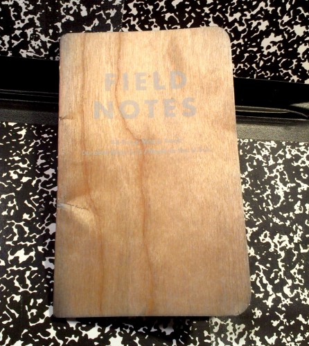
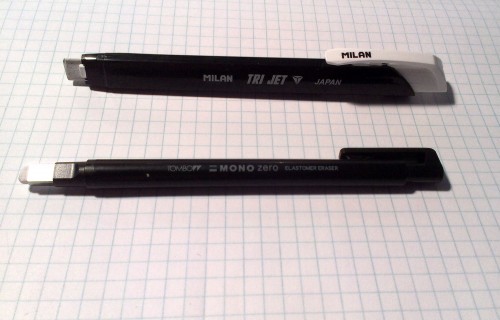
 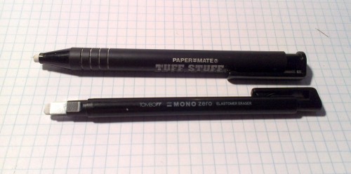 That brings me to the click erasers I do use and like. I’ve already mentioned it, but the Tombow Mono Zero has been my go to for the last few months. It’s easy to use, the eraser does a fine job, and best of all it’s sleek. the plastic and metal case is pared down to just the essentials and it’s not much bigger than a regular pencil in diameter. I’m not using it to clear giant swaths of paper, but to remove writing in my Field Notes and details in my sketchbook. For this, it does very well. The width of the rectangular eraser is perfect for cleaning a line in a Field Notes. The edges and corners make detail work a breeze. This is why it’s my go to eraser for any sketching moment.
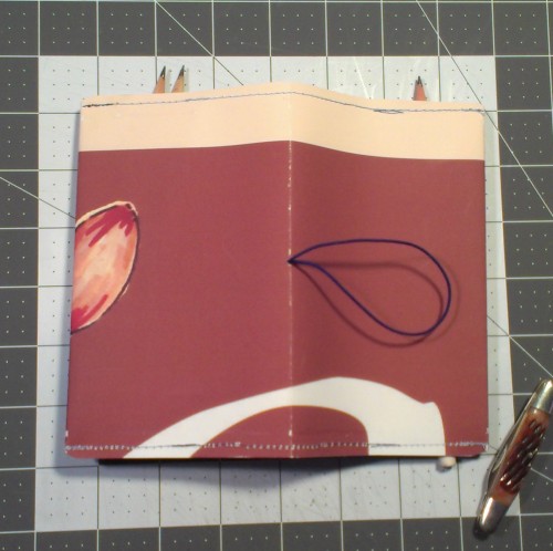
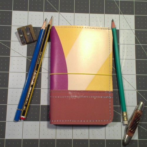
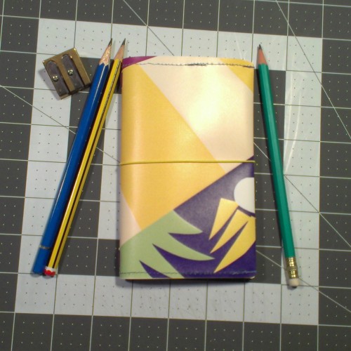
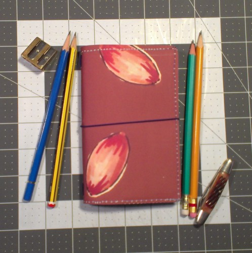
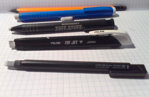 The next click eraser I use often is one I have yet to write a review for. Why I’ve neglected to put up a review is beyond me, but let’s just say it’s a great eraser with a few issues. The Milan TriJet is a budget friendly triangular stick eraser housed in a black and white plastic body. The eraser itself is firm and well suited toward cleaning pencil from paper. It makes short work of most pencils. The 3 triangular points allow for detailed erasing while the flat edges can clear a page in my BanditApple Carnet in no time. Because refills are inexpensive and I was able to get 6 of them for $1 I don’t mind cutting off chunks of it to use a fresh clean edge. The plastic housing is okay. It grips the eraser pretty tightly and occasionally shavings from the eraser will clog the feed mechanism and the eraser won’t advance. This is easily solved by removing the eraser and blowing through the tube to clear out the pieces. I occasionally throw this into my pencil wrap, but generally it stays on the desk.
 Another old favorite that i don’t use any more is the MagicRub eraser. I stopped using it when I was doing a lot of pen and ink work and found that it lifted a great deal of ink off the page. Removal of ink it was it was designed for. When doing detailed ink drawings it’s not a good idea to use the MagicRub. However, it’s a great eraser. (I do have a great deal of hand carved stamps made out of majicrub erasers. they have stood up really well.)
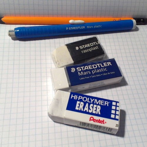
The Staedtler MARS plastic eraseris another old standby. I use both the click and block version of this eraser. The click housing hasn’t changed much since the mid-90s but unlike the TuffStuff this housing isn’t ridiculously huge for the size of the eraser contained within. Rather, it’s simplicity itself. It’s easy to use and works time after time. And it’s not cludgy. The eraser is soft plastic with crumbs that roll together, making clean up easy. The click eraser and the block eraser are the same inside and work equally as well. The great thing with the block eraser is that it can be cut to any size and shape you want. I must’ve had dozens of these in school that i cut into smaller more manageable pieces. Back in the 90s these were the Mercedes of erasers.  Another eraser that I reach for, in block form, is the Pentel Hi-Polymer. I consider it to be an equal to the Staedtler Mars eraser for art erasing. It handles pencil, chalk, charcoal, and everything else I’ve ever thrown at it with ease. It is soft and white, the dust clumps together, making clean up easier. A 3-pack can be found at any Staples and most other office supply stores very inexpensively. I found my first 3-pack at K-Mart in 1994. Prices have gone down since then. they have also introduced them in triangular cap style! (I need to find some of those!)
Keep in mind that I’m generally erasing pencil with these erasers. If I was erasing other things I’d use other erasers, like the art gum or kneaded eraser. Well, maybe not the art gum. I hate those.


 The next click eraser I use often is one I have yet to write a review for. Why I’ve neglected to put up a review is beyond me, but let’s just say it’s a great eraser with a few issues. The Milan TriJet is a budget friendly triangular stick eraser housed in a black and white plastic body. The eraser itself is firm and well suited toward cleaning pencil from paper. It makes short work of most pencils. The 3 triangular points allow for detailed erasing while the flat edges can clear a page in my
  Another old favorite that i don’t use any more is the MagicRub eraser. I stopped using it when I was doing a lot of pen and ink work and found that it lifted a great deal of ink off the page. Removal of ink it was it was designed for. When doing detailed ink drawings it’s not a good idea to use the MagicRub. However, it’s a great eraser. (I do have a great deal of hand carved stamps made out of majicrub erasers. they have stood up really well.)