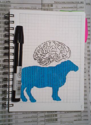
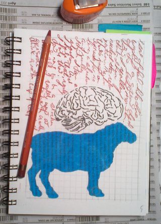
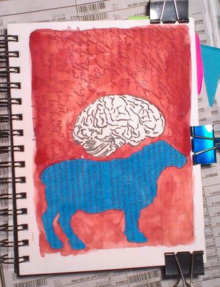
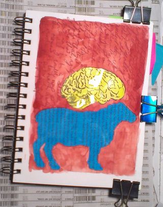
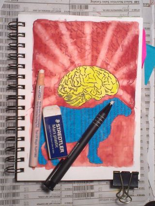
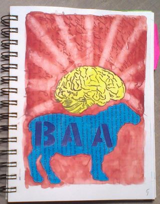
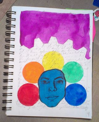
This
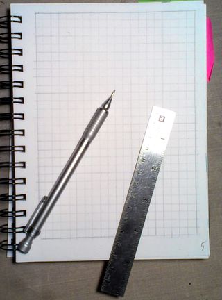
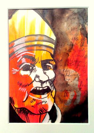
page was done in a 6×8 inch Stillman & Birn Epsilon sketchbook. I
chose it for it’s smooth yet tough paper. The finished image is 5×7
inches and is available matted and ready for framing on etsy here.
This
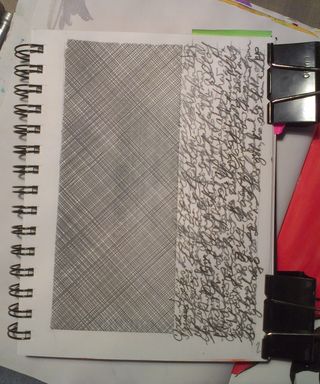
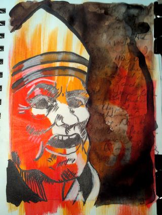
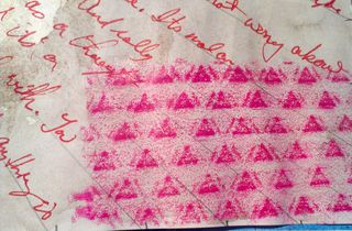
page started with a section of junk mail security envelope collaged
onto the page. I used a UHU glue stick
to glue it to the page.

I
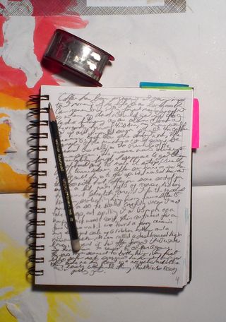
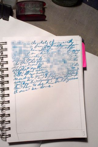
then did my writing, in a technique I call overwriting. You’ll be able
to read exact instructions on this technique and more in my upcoming
zine, “My Headlines and Stories.” I used Derwent Watersoluble Graphitone 2B
labeled as a brown or tan. (It turns out the
color on the label is only for identification and NOT to indicate that
it’s tinted a color.)
 After
After
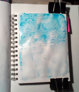
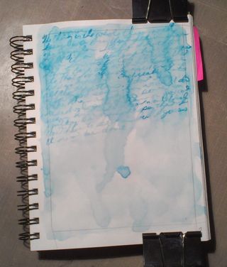
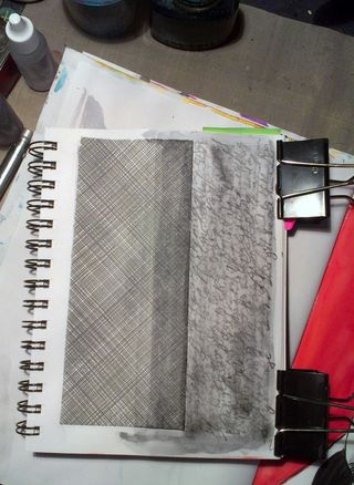
I was done with the writing I wet the water soluble pencil, completely
saturating the page. I used my brush to move the graphite around, but
mostly allowed the water to do the work.
 While
While
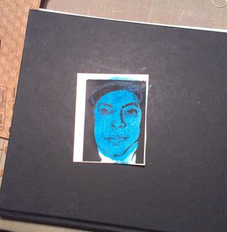
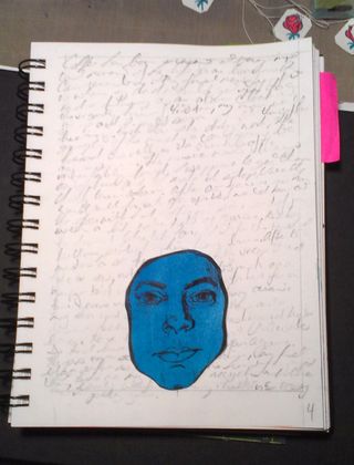
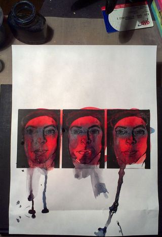
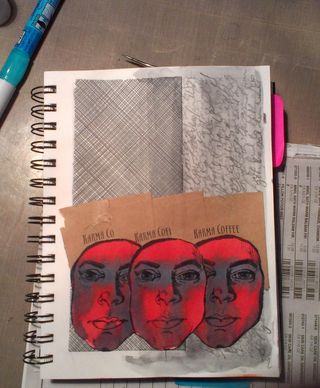
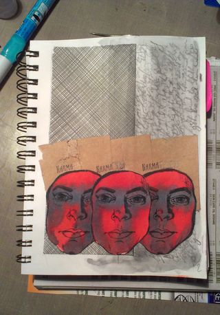
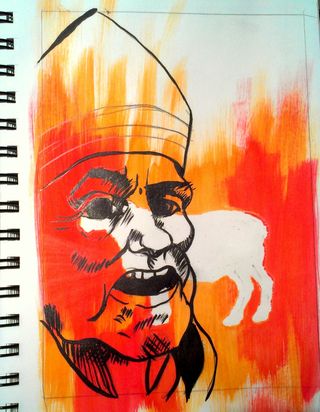
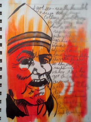
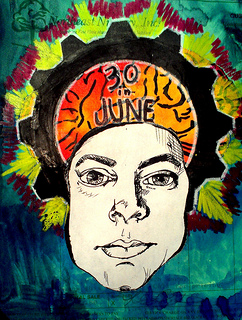
letting the page dry I printed off 3 copies of a self portrait I drew. I
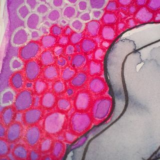
painted these with a hot orange red. I used turquoise blue to paint a
stripe over the eyes. The red and blue mixed to create a purpley grey
color. I painted these pages very wet so the colors dripped down the
page. I encouraged this by tapping the page on it’s edge.
 While
While
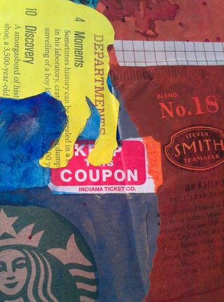
waiting for the faces to dry I went through my personal ephemera, stuff
I’ve gathered over time and looked for items that struck me as fitting
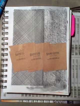
the page. I pulled 3 cup sleeves from Karma Coffee. I was not sure if
I’d use them or not. After some fiddling with them and the faces I
decided to glue them down with just the word KARMA sticking out over the
heads. After the faces were completely dry I cut them from the larger
page. I used UHU glue stick to adhere them to the page. After gluing
them down I realized I could use my exacto and scrape off the word
coffee, so I did.


 I
I
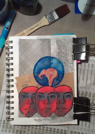
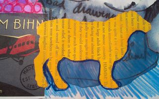
wanted to utilise the elephant that is part of the Karma Coffee logo,
but wasn’t sure how. I fiddled around with the look and placement of the
logo. Then I decided it would be a shame to cover up the great texture
created by the overwriting technique, so I cut the logo from the cup
sleeve. I then positioned this here and there over the page before
settling on a final spot. Once I glued it down I realized it
disappeared. I drew a circle around the logo and then filled with
withthe same turquoise blue I used on the eyes. I used a rag to lift up
some of the color, creating a nice mottled effect.
 Things
I like about this page: I like the use of repeated imagery, something
that happens in a lot of my work. The use of personal ephemera,
particularly the Karma coffee sleeves, as they are now from my past as
is the topic of the writing. The logo of the Karma Coffee Company is an
elephant a perfect metaphor for the topic of the writing. the overwriting texture is awesome, but hard to see in these images.
Things
I don’t like about this page: The lack of control on the watercolors in
the faces. I went very wet into wet with these and wish I’d let the red
dry a bit before applying the turquoise. Alternately, the lack of
control is very appropriate given the subject of the writing.
Available on Etsy here.
Continue reading →
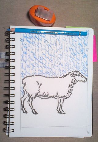
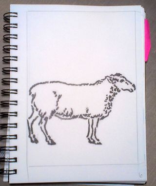 I then wrote my entry with a colored pencil.