It’s been a hot minute between posts here. It seems i Have trouble balancing my life.
Every summer it is the same thing, it gets warm and I have fewer work days with kids and time off, so I ride my bike. Which, excuse the drama, has saved my life in the same way journaling has in the past.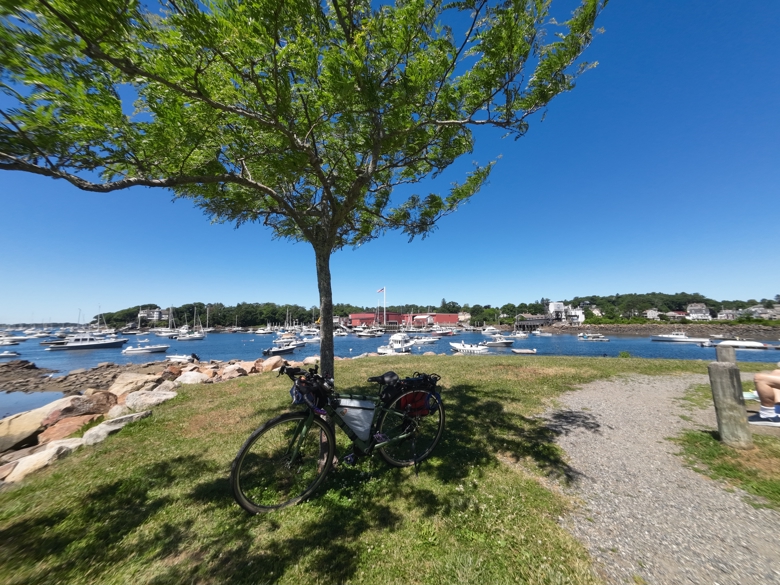
I know I’ve written a bit here about my health struggles with Type 2 Diabetes, but riding my bike has allowed me to get down to one med for my blood pressure and one med for the diabetes. Wild. My blood sugars are generally pretty even and my blood pressure has been good enough that my doctor said I don’t need to come in and see her until next year, unless I have an emergency.
All summer long all I really wanted to do was ride my bike. I had a great time doing it. I’ll hit 1100 miles ridden this week. 1000 of those miles on a modified Walmart bike. The rest were on a vintage Kona mountain bike.
Anyway, if you want to hear and see more about my health journey you can check out my health and wellness channel, Less is More Healthy on youtube.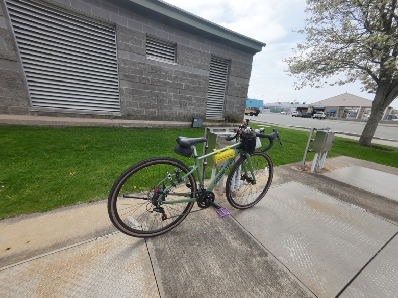
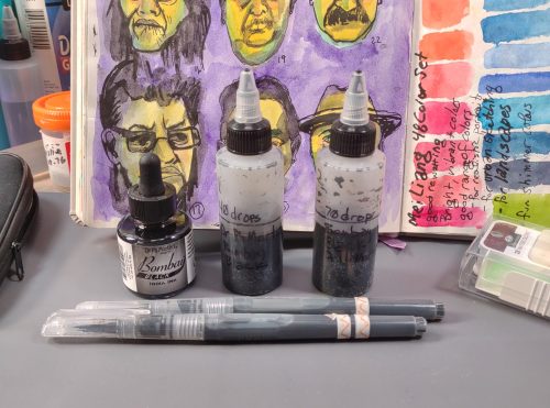
I was recently able to pick up the Osmo Action 5 action camera. This is great for the health channel and the art channel. First off, when I’m recording me drawing with a POV camera, the Action 5 is better than the old Action 3. But this also means that I can put the Action 3 into my overhead camera mount and leave it there. 
This means a lot of things. First off It eliminates a lot of set up and take down that has stopped me from recording my art making in the past. Even though I set up a nearly permanent mount on the overhead rig where I can just clip the Action 3 in and out of. No one said that decision paralysis makes any sense. Now the 3 will just live on the mount most of the time, ready for me to hit record. This also means that I can record audio AS I WORK. My old Cannon doesn’t have an audio in port and the mics on the budget cams is trash.
While I love a voice over, sometimes it’s more intuitive to record as I work.
This also means that if I can get my shit together I can do some livestreams. I used to LOVE doing livestreams. Except for the trolls, but hopefully I’ve got those dudes all blocked.
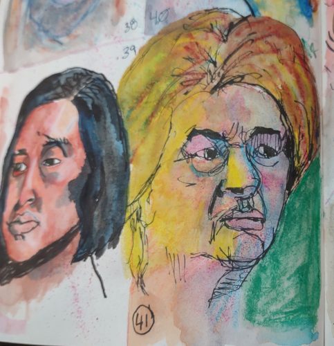
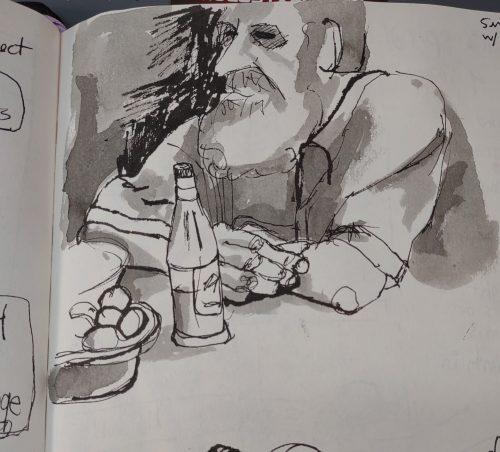
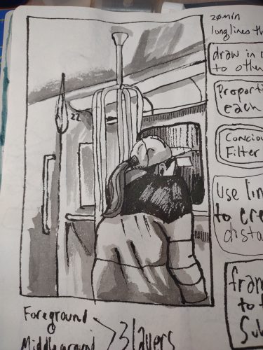
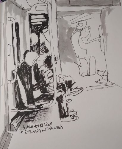
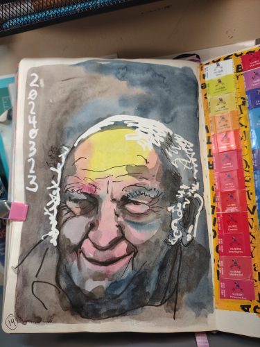
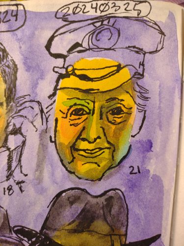
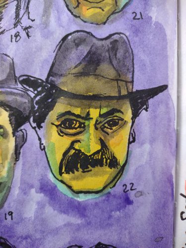
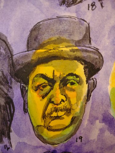
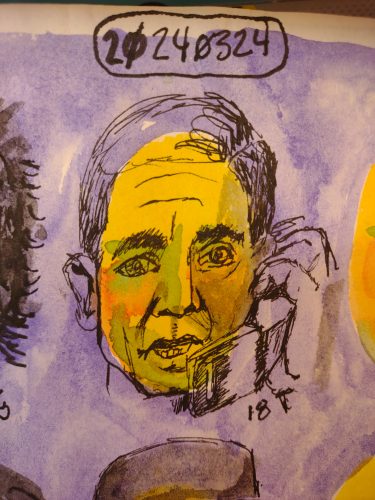
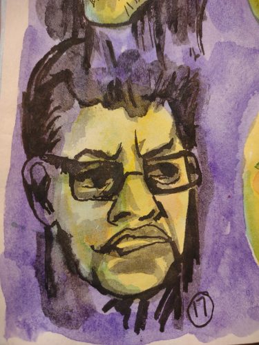
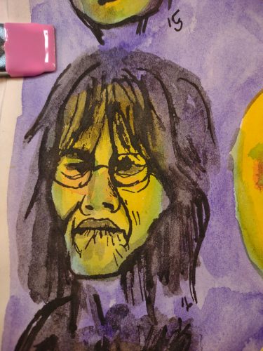
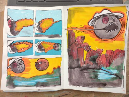
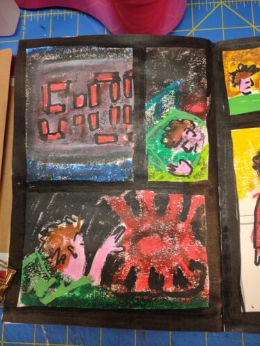
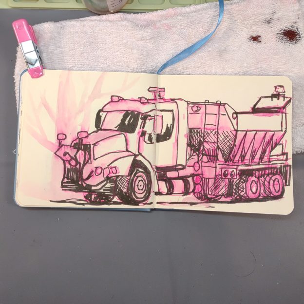
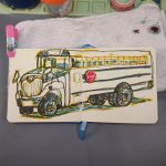
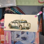
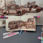
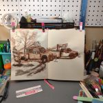
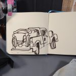
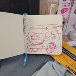
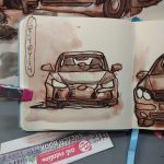
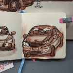
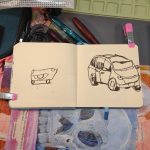
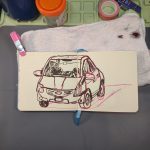
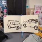
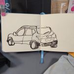
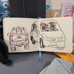
I did some drawing this summer but not a lot. I drew some boats when I rode out to Manchester-by-the-Sea * and I drew trash while I waited for the train. 
People aren’t impressed with my drawing trash. Which has brought up a lot of thoughts around the purpose of an art journal/visual journal and deciding NOT to draw pretty things. I may have to do another series where I draw used tea bags again.**
At work I fired up our Vandercook press and it was everything I’ve been missing in art making. So I’ve decided that all my groups will be making posters and using the press this year at some point. I can’t wait. This also means I get to use the press more. I REALLY can’t wait.
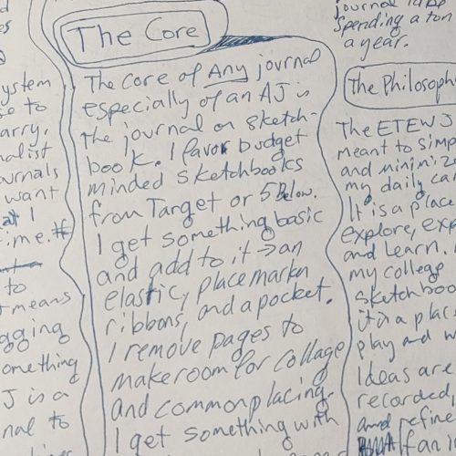
I’m also going to do a section on keeping a visual art journal.
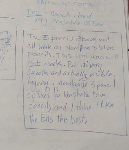
Which brings me to my hopes for this Ko-Fi page and Comfortable Shoes Studio the YT Channel and blog. I’ve been working on a couple of classes which will include some hand drawn printables, possibly bundled into a zine, and a video series to support it. I’ve been writing my ass off and gathering ideas for this project. Yesterday I made myself a template to create the blank pages with non-photo blue pencil and I’m deciding how I want them to look.
I’m blocking up a little bit, because I want them to look like my work notebook/sketchbook pages and my Every Thing Every Where journal pages. I’m totally over thinking it.
My goal for this week is to loosen up and commit to making one of the pages of the handouts and zine.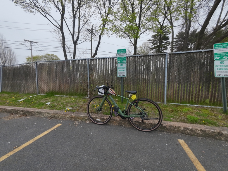
*MbtS is almost as bougie as it sounds. It’s not as bougie as Magnolia, which has a corporation dedicated to keeping it’s private beaches private and keeping out of towners off the beach.
**Tea bags are a useful drawing model. First off if you make tea you will have them. Secondly you can easily pose them and they stay in place. Finally The forms involved are great- loads of shapes and lines to play with drawing. Yeah I just talked myself into it. I’m going to draw some trash.
Re-post from my Ko-Fi page, get my posts much earlier there.

 Let’s look at what did work first.