The Bic Cristal seems to be a heavily favored ball point for sketching, drawing, and doodling. One might wonder why when there are so many “better” options out there for pens. Please keep in mind that this review/discussion is abou the Cristal and NOT the shite Bic Stic.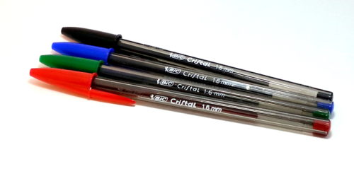
First and foremost, I’ll point out that my strongest belief is that the best tool is the tool you use. If you have a Bic in hand and you feel like drawing, then you should.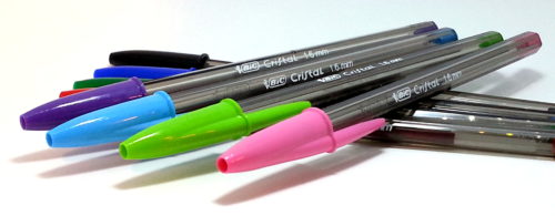
Bic Cristals are available everywhere. I found them in CVS, Walgreens, target, Staples, Walmart, and every other place I looked. They are also very inexpensive. A 24 pack of mixed colored Xtra Bold were $4 at my local Staples while the 15 pack of Ultra Fine “Precisions” were $3.49 at my local Target. (Calling these two chains local sort of begs the question of what local is- in this case I’m using it to describe a location to which I could, if pressed, ride my bike to in a reasonable amount of time, that is roughly 5 miles from my home.*) For less than $10 I was able to purchase 39 pens in 8 colors and 2 tip sizes for under $10. That is very cheap.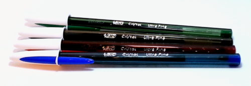
Because they are quite inexpensive and easily available everyone knows what they feel like to use. Because of this they do not feel precious. You can use them to your hearts content and not be worried that you are going to use them up, because for another $4 you can get another 24-pack.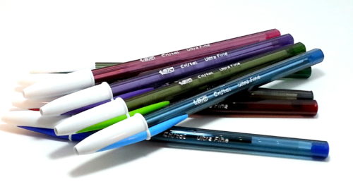
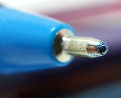
For the most part, they simply work. I’ve found that a few of the colors seem to flow more slowly than others, and that the Ultra Fines seem to skip a bit here and there, but that is also useful when sketching or drawing- using a pen with a “rougher” flow can give a bit of character to a sketch that otherwise might be flat and boring.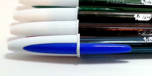
The various colors are all pretty standard. Their core colors are black, dark blue, red, and dark green. The new 4 seem to be part of their “fashion” line up- dark purple, light blue, pink, and light green. The purple, light blue, and pink are okay but the light green is a sick shade of yellow green that borders on the color of bile. Nasty.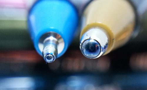
What makes the Cristal stand out from the Stic is that the Cristal body is hard, while the Stick flexes quite a lot in use. When I was a kid my Bic Stics ALWAYS ended up curved. In some part because I would use them as a worry and bend them as I read, but also because I’d put a lot of pressure on them. The Cristal doesn’t allow for flex. Too much pressure and it will shatter. Unlike the Clic, the Cristal’s point doesn’t flop all over the place as it is used. This makes the Cristal great for sketching, doodles, and drawing.
Currently, I’m testing the lightfast abilities of all the Cristals in my possession but I strongly doubt that the majority of the colors are lightfast, if any at all. I suspect that the light green, pink, red, and purple will be gone in a week or 2, and in a month the majority of the other colors, including black, will have shifted in shade substantially. I’ll keep you updated.
For the art journaler who uses acrylic in their journal, the Xtra Bold pens have the added bonus of being able to write over acrylic paints.