New Make it Mine video up.
Make it Mine 003
Leave a reply
New Make it Mine video up.
I finally made my own gel plate with gelatin, glycerin, rubbing alcohol and water. I used a microwave method, which seems to be the best method for me. Most of the instructions I found use a double boiler set up. It’s too hot for that in my house.
Keep in mind that this is an investment. For a few dollars you can make a permanent plate that if it gets damaged you can chop it up melt and remold it.
I am providing links to the ‘zon for the materials. Prices are the cheapest for that product by unit price at the time I ordered.
Tools:
Recipe:
2- 3 tablespoon of gelatin per cup of fluid. Roughly 1 ounce of gelatin to each cup of fluid. The fluid should be 50% water to Glycerin/Alcohol. This ratio is important. You can adapt the recipe to any size container by measuring the volume of your container. The more gelatin you add the firmer your plate will be.
You want your plate to be at least a half inch thick and the consistency of Jello Jigglers. In my experience the larger the plate the firmer you will want it. I prefer a very firm plate so I use additional gelatin.
Pour 3/4 c Glycerin into a microwave safe dish. Add in 3/4 c of rubbing alcohol. (You can use 100% glycerin for this recipe but rubbing alc is cheaper) Sprinkle 8 tbsp of gelatin over the alcohol and glycerin. Let this sit for roughly 10 minutes to bloom. Use a spatula to gently stir this. Add in 1 1/2 cup of rapidly boiling water. Gently stir. The mix should be opaque and a bit gritty. Put this into the microwave for 1 minute intervals. Stir at every minute until the mix is clear. It took 5 minutes for mine to be perfectly clear. Stir gently but thoroughly.
Pour the hot mixture into your cookie sheet or whatever tray you plan to use. Skim any foam off with a piece of news print. Pop any bubbles with a finger or toothpick. Let sit at room temp for a few hours, once set put it into the refrigerator to finish setting.
You may also want to add in a couple of drops of essential oils like tea tree or lavender. I do not like the smell of the gelatin. A few drops of essential oils mix into the glycerin or alcohol well and do not impact the ability of the plate to function.
Some Science:
The glycerin and isopropyl alcohol are plasticizers. That is they interact with the gelatin to turn the protein strands into something plasticky. They change the proteins of the gelatin to elongate them, which bugs and mold no longer recognize as food. This is why the glycerin and alcohol plates don’t mold or rot.
Some videos that explain the process:
The video below has recipes for a variety of sizes of gel plates. Look from 18:04 to 18:58
As the last video explains, there is some wiggle room in these recipes. You can add a bit more glycerin or a bit less and the plate will still plasticize. If you don’t like the smell of the alcohol, don’t use it. Many of the recipes I saw online did not use it and in fact, Linda Germain, who I consider to be an expert on gelatin plate making, doesn’t use alcohol at all. you can get her recipe by signing up for her mailing list here.
Here is a link to another blog with info about making your own plate.
This is another good blog for making your own plates.
Keep in mind that by making your own plate you are saving a lot of money over buying the commercial plates. You can also chunk them up, melt and remold them, many times. You can add a bit of water to rehydrate the plate and it’s good as new. This is an investment.
One of the key items in my art making and creative arsenal are my headphones. With these I can create a place to work, make art and be creative, just about anywhere. By extension music helps too.
I’ve used headphones as a way to tune out and tune in since I was in elementary school. Back then I slipped the foam cushions of my Sony Walkman over my ears and tuned out of the world and into my art or homework and later in high school to work. Soon I was using foam covered earbuds and trying to hid the black cords around my ears, through my hair and into a hoodie to wear them in study hall.
My parents had rules on when my brothers and I could wear them.
As I got older I used headphones to tune out a variety of things- the noise of my roommates, construction, late night noises in the neighborhood, the people on the train and other various things. Over time I moved to in ear buds (IEB) and I found they worked better to help me tune out and tune in, and it really kept the noise of the subway out of my head.
At the DayJob I needed to buckle down and get a LOT of paperwork done, some of which I had let build up, so I popped my IEB in and sat in the gallery with my laptop and churned through the work. In the few hours I had I churned through pages and thousands of words of work. The combination of noise cancelation through the DIY plug tips and the music I chose (The Tidal 420 Playlist for giggles) let me tune out of the stuff that was happening around me, while I focused on the music.
Of course when you use true wireless BT IEB it can lead to confusion- one coworker laughed as I pulled a bud out, apologized, then said hello back.
For me, there is something really helpful about being able to isolate myself from the noise around me. I tend to look up when I hear a noise and then get distracted. It takes me a minute or two to get back to what I was focusing on. Headphones means I can ignore all the little inconsequential noises around me, and just focus on the task ahead of me.
It seems dramatic to call this bliss, but as an easily distracted person, being able to focus on just one thing is fantastic. That combined with the controls being on my ears just makes setting up a place to work easy.
In some places, like my home studio, I use a speaker system. That works well enough there since it is a private location, in a more public location, like my DayJob studio, I use a speaker when I’m not feeling distractable, otherwise it’s headphones.
I have to admit, I never really thought much about my use of headphones until recently. I’d been feeling very distracted and popped my IEB in, did my work, then realized I’d been doing this for YEARS of my life, and that I’d unconsciously been making a place to be creative.
It works for me. Do you use headphones or music to make a creative space for yourself?
I want to start this off by stating that I’m not an audiophile, I just want my true wireless in ear buds to stay in my ears, which they just don’t with the typical silicone tips that are packaged with most entry level buds.
My search for tips that stay in my ears began when the collar of my winter coat brushed my new BT earbud and it tumbled out of my ear and onto the train tracks. Luckily the train was still 10 minutes away and I was able to retrieve half my investment.* I’d heard of foam tips before but hadn’t ever needed them for my corded earbuds. Everything I read suggested that the foam tips would solve my problems.
Because I didn’t know what size would fit my ears, I ordered a mixed pack of small medium and large tips from Comply. Be sure to check the Comply website for the right size tip to order for your in ear buds- I ordered the wrong size and the tip would slide off the stem and stay in my ear. The cost plus shipping for 3 sets was just a hair over $20, you can get them on the ‘zon for about $15. After that I purchased a package of JLab Cloud- you get 4 sets, 1 small, 2 medium, and 1 large. The cost for those was around $7 (price fluctuates).
My right ear is sized small and my left medium, so each mixed pack nets me 2 usable sets with Comply. With the Cloud, I can wear medium in both ears. But the small fits well. I like the JLab Cloud– they are super soft and feel great, but they don’t fit my back up pair of Skullcandy Sesh (purchased via Woot for under $15.)
Foam tips stay put and my expensive buds stay put, my cheap Sesh stay in my ear. Also, the noise canceling effect means that my wife can watch TV and I can listen to music while I read.
A major downside of foam tips is that they degrade and after 3 months or so they get mushy and floppy, they still stay put but they are a pain in the rear to put in. You have to have fast hands to get them in place before they expand.
Even more annoying is that every brand of bud needs a different Comply tip or they won’t fit into their case, then they won’t charge. Annoying. My search for a cheaper option lead me to the JLab Clouds. At $7 for 3 usable pairs is a better deal for my more expensive JBL buds, but they don’t fit my Sesh well.
I knew I could get a perfect fit from Comply foam, but I have a hard time spending more on tips than I spent on the buds. I could order a mixed pack and get 2 usable pairs, or I can order a pack each of small and medium- which would cost around $40.
Yikes.
So DIY options?
Most that I searched for were for IEM like Klipsch with very narrow posts for the tips or to make large silicone custom tips that lock into the ear. I have a couple of sets of heat moldable material (link to a DIY silicone version) that I use with corded buds, but I’d be into the problem of removing the tips every time I needed to charge. I’ve also grown very fond of the noise cancelling effect of the foam tips. It’s great for when I use the lawn mower or snow blower.
I found a number of DIY options using ear plugs. Which totally made sense- ear plugs are made of the same soft squishy foam as the tips. I also considered craft foam. Which did not work at all.
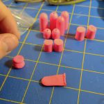
My reading of the above linked articles and more led me to picking up the softest ear plugs with the highest sound blocking rating that I could find… at the local CVS. I found a 10-pack of super soft plugs that reduce noise by 32 decibels, in hot pink. They had a variety of other colors but they all looked rather medical, other than another version that didn’t reduce noise by nearly as much. I like the hot neon pink though. 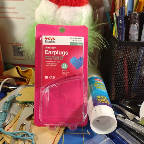
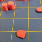
I decided to poke the holes first then cut to size. I used 2 different hole punches- a Japanese screw punch with a 2mm and a 3mm bit and a hammered leather punch with a 3 mm bit. Because of how they cut and the properties of the foam, the holes were smaller than the bit themselves. With the punch the middle section and end of the hole are substantially smaller than the first part, which helps hold the tips to the buds very tightly. 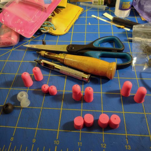
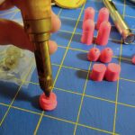
I was worried that the plugs would slip off the buds without recycling the interior of a Cloud or Comply tip, but the hole is so small and the fit so tight they don’t. Keep in mind that the memory foam is expanding in all directions- so the compressed foam is trying to compress back into that tiny hole and compressing around the stem for the tip. I’ve been using a set for a week now and not had a problem with them slipping.
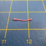
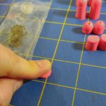
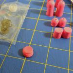
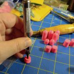
After you punch the hole through the height you need to let them expand, this works better if they are warm, so hold them in your hand. After they have expanded to their full height you are going to lay them down and flatten them along the height. Measure a silicone tip, add a millimeter or 2 and then cut the plug with a sharp pair of scissors. EDIT: The step of adding a couple of mm to the length of the tip is really important. Without that length they are too loose to stay put.
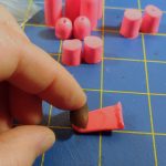
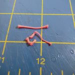
Now be patient and let them expand again, then flatten them like you are punching the hole again. While the plug is flattened pancake style, stretch and pull the donut shaped plug over the stem where the tips usually sit. Pull the plug down past the end of the stem, the stem should poke out a bit. Let the tip expand, when it is fully expanded, wiggle it around until it’s sitting where you want it. It should not expand too far past the tip of the plug.
Every brand of IE buds will need a little different work. The Skullcandy Sesh were much easier to DIY- the way the plug fit over the stem was easy, and it fits into the case perfectly, so the buds charge without interference. My JBL Tune125TWS needed a bit more tweaking- I had to trim out the tiny hole over the stem so the foam wouldn’t interfere with the sound. I also used the interior of a dead Comply foam for these buds and they worked well. I would suggest, leaving a bit of old foam on the core to keep them put inside the plug.
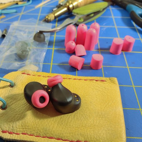
The ultimate goal here was to create a cheaper alternative to Comply foam tips that fit into the case of my various BT IE buds. This has been accomplished and they look pretty decent and fit in my ears just as securely as the Comply, if not more so. They sounds pretty decent too. Like I wrote in the intro, I’m not an audiophile, but I like it if my buds sound good and don’t need to be cranked up to be heard.
The cost? A little elbow grease and $0.25 per pair. Not gonna lie, I’m pretty excited.
Many of the instructions offered other suggestions for poking the holes- from mechanical pencils to the metal tips off gel pens. Anything will work so long as it is at least a millimeter smaller than the stem on the in ear bud.
I did reuse the interior tubes from a couple of Comply tips, they were a bear to fit into the ear plug material, but once in there, they seem to hold well enough. I get the Comply tips with the added acoustic grate that keeps dirt out of the IE buds. I’m not sure this extra step is worth the effort and work. Continue reading
My brain works in mysterious ways, well not really, I know how my brain works but sometimes it puts 2 things together in a way I didn’t expect.
Case in point:
Not the chicken leg I presented her with!
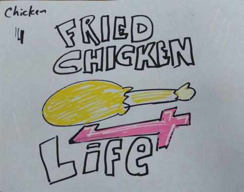
I work with someone who loves fried chicken. I, also love fried chicken. We talk about all the different fried chicken places in the area. Unabashed love for fried chicken. After a few weeks of fried chicken talk, I doodled a fried chicken leg on scrap paper and presented it to her. We laughed.
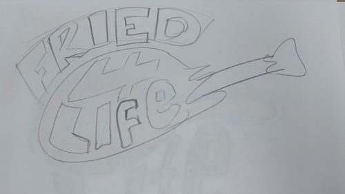
Early sketch and color scheme.
Somehow I started to doodle more chicken legs, this time with the words “Fried Chicken 4 Life” in various arrangements. Then with black Posca pens and finally with some color.
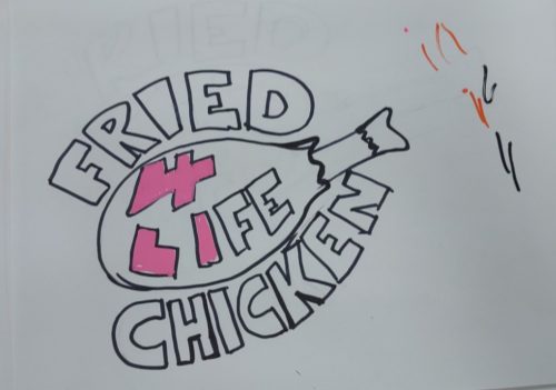
This was declared the winning sketch, and the one that gave the idea of making it a sticker.
The final color scheme and thick black outline. 7 different colors of paint pen were used.
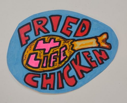
When I arrived at a final image and color scheme that I liked I took a nice clear photo and then arranged it into a grid in (yes) publisher. After that I printed it off on a color laser printer to sticker paper. Finally the individual stickers were cut out of the sticker sheet.
The sticker paper I used was the most inexpensive I’d found on the ‘zon and has done well with letterpress inks and now paint pens. It also traveled through the color Xerox machine we have at work.
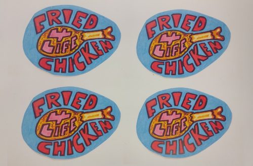
The final xerox printed colors are a bit lighter than the original, but they look great.
Overall I’m pretty happy with how this ridiculous sticker turned out, even the little hand colored version is great. The color photocopied is awesome. I’ve also run this paper through the letterpress at work with some pretty good results.
Now that material snobbery has taken hold of my brain I battle it in the best way I know how- by focusing on the art. 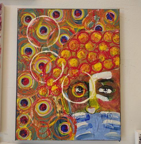
Last week I had a moment where my entrenched material snobbery hit me head ON. I was taking part in an art prompt with my coworkers when I realized that the paints we’d been provided with were…. not my usual brand. Further we were given only the primary colors plus white and black. I was having trouble mixing the colors I wanted and was getting frustrated.
I wanted to run to my studio and grab a package of acrylics I ordered for a group and use all the colors I couldn’t mix.
After a bit of frustration I focused on what I COULD do with what I had on hand. The image ended up working pretty well. I used cups to press circles of paint onto my canvas and little creamer cups to press perfect dabs of color all over.
In the end I had fun.
No matter what tools I have on hand I can always find a way to make them work in some way. It might be different than my initial plan, but it’ll work. This is what happens when you let yourself be flexible, and look at the possibilities instead of the limitations of the material at hand.
I try to remember that limitations are possibilities.
Art journaling is something I return to again and again. It’s the best form of expression I know and soothes my mind in even the worst situations. Yet, these last few years when I could have used it the most, I wasn’t using an art journal in its most effective way. I was using a sketchbook and drawing but I wasn’t art journaling in the form that I find most effective. That is to say, with stencils and paint and drawing.
I’m happy to report that I’ve been art journaling again. I’ve been focusing on short sessions, instead of my old marathons. Though I’ve done some marathon gelatin printing sessions, those are forming the base layers of my art journals. I’m adding symbols and more layers of collage and drawing.
Here’s an example:
I made a few foam tray blocks (I’ll have to detail this classic printmaking method later) and stamped them onto my page with black water soluble block printing ink. The ink stays wet for a long time and even after drying remains soluble with water. I sealed these with a low odor sealant to keep them in place as I worked. 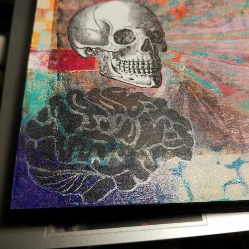
Then I attempted to transfer a color photocopy of a selfie I took. It transferred poorly to this surface- the combination of gesso and gloss gel didn’t like the toner. You can see this ghost under all the other additions to the page. I pulled another image- a skull with a hole cut in it, and attempted another transfer, another bust, though this one left an image that could be reworked with ink. 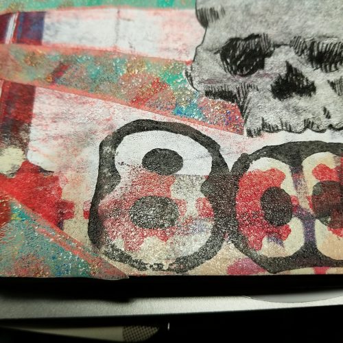
After that I layered in a skull from a sheet I keep on hand. I like to draw skulls and they have no particular dark meaning to me, but I understand that the combination of skulls tends to lend a dark look to this page. Though I see skulls and bones as a metaphor for underlying strength. Anyway, I carefully cut out the skull and glued it in.
I considered drawing on the rays from the skull’s eyes, but instead went with another collage style. In this case, I used another gelatin printed sheet, this time, on sticker paper. Pro-tip: Pick up some sheets of sticker paper and gelatin print on them. This creates some awesome badass sticker sheets for collage. It’s super easy to cut out stripes to use like washi tape. I was quickly able to cut and assemble the rays from the sticker sheet. 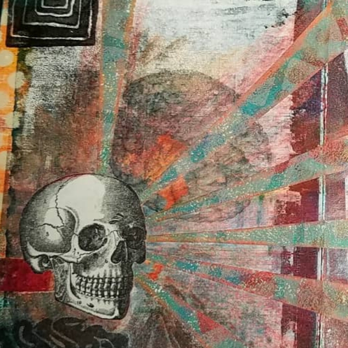
After applying the sticker paper, I added in some orange colored pencil. This was to push the rays up and off the page and make them pop. It worked, mostly.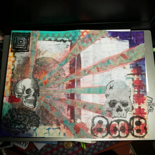
Overall, I like this page. As with all art journal pages, the process is the most important aspect of the page, but it’s nice that I was able to create an interesting visual page.
An aspect of learning any new art process it learning about your new tools and the marks they make. Each tool in a new material makes a different mark, add in something new and it alters the mark made. Learning these marks is a whole new visual language.
Enter in my exploration of drypoint via the use of recycled materials. each material responds to the tools of dry point- etching needles, needles, sand, grit, and other tools in a slightly different manner.
This plate is a good example of how the substrate changes how the coffee bag responds to my tools.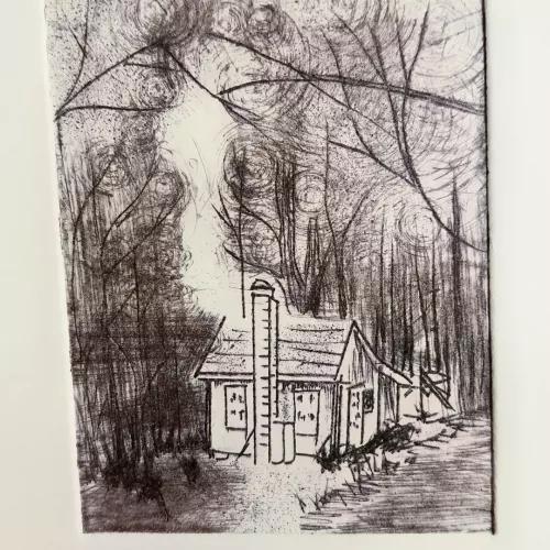
I glued the coffee bag to a piece of old binder board, one I never liked for books because it has what I can only describe as a “soft fluffy” texture. It indents wit a finger nail and though it cuts with ease, I’ve used it as a base for collagraphs in the past and hated it. But here, it works great. I did run it through the press a few times, each on successively increased pressure to compact the soft fluffy fibers. It is still soft, but less fluffy.
This soft texture allowed me to press into the board with some decent pressure, giving nice bold lines. Light pressure allowed me to get the finest of fine line. I used some sandpaper with varying amounts of cross hatching to create some very fine lines that created a nice depth of texture and darkness. It really evokes the depth of the woods in that area. 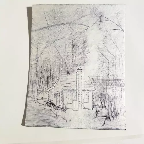
The sandpaper wrapped around a finger and then with the plate spun under it gave the swirls of lines in the branches. I really like the look and hope to make a few texture tools with sandpaper to give more control.
Anyway, now that I I know I like the coffee bag on a substrate as a method of printmaking I’ve been able to experiment with the look that each tool makes as I use it in different manners. I’m having fun with it and developing a visual language of marks. I’m learning each and every tool.
The great thing about trash printmaking is that you become hyper aware of plastic coatings on everything. I mean, okay, that’s not great. So many things in our world are coated in a thin film of plastic and that means they can be used for making prints.
At least I can reuse many of the plastic film coated things.
I picked up a meal at a fast food chain. (Don’t judge, we all have our weak moments.) The cups were made out of paper card and the ice cream pie I added on had a plastic coated card container. I decided to test them out to see if I could print with them.
Results were varied.
They had a super thin film of plastic, soft and pliable it feels more like a membrane than anything else. I washed and dried them then cut them into flats. Any glue layers were removed as was the cup rim and bottom seal for the cup. I should have taken pictures of this process but, alas, I wasn’t thinking of documenting the process.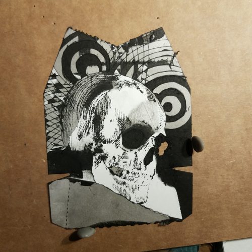
I used a variety of tools- needle, needle scribe, and an Exacto knife to scrape and score into the surface. It was clear that all the tools were raising a burr and breaking through the surface of the plastic film. I could feel the paper fibers raising up through the scores. The plastic film began to peel a bit as I cross hatched lines. Peeling back the plastic film was surprisingly easy it revealed super smooth cardstock, peeling that back left a fiber-y ink soaking surface. 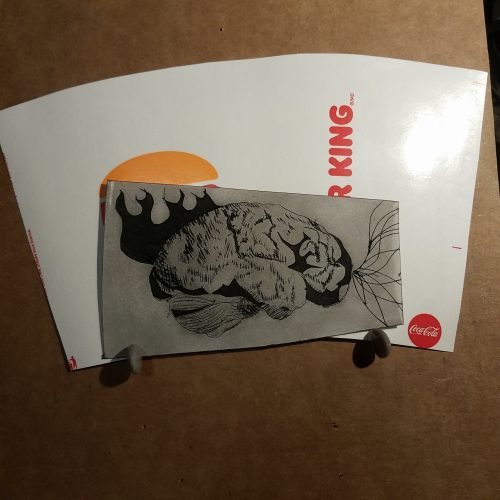
Both stocks felt similar but the ice cream pie box felt softer and thicker.
I used Speedball Supergraphic black ink. A water soluble but oil based ink. It’s a favorite but relatively stiff and sticky. Even with the first print of each small thin slivers of the plastic from cross hatched areas peeled up during the wipe. The sticky ink pulled it up despite the warmth of the day and my studio. 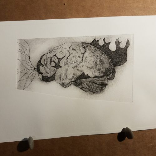
The printing went well and the plate released from the paper well.
The second printing is where things got… rough. The soda cup survived the second print, loose slivers of plastic stopped peeling up* and the second print was as good as the first. The pie box, well not so much. The membrane started to peel even during the adding of ink. I used a soft piece of waste cardboard and scraped the ink over, only to have the membrane peel of in some areas. When I began wiping, well larger areas peeled away. This lent an interesting effect to the print. Some areas that had had ink on them duding the previous print, printed deeply dark while newly revealed areas showed a paler area of dark- charcoal gray. And areas that peeled away entirely were fresh and white showing the etched in areas in great contrast.
You can see how the box started to break down in just warm water when I washed it.
This means that the box and the cup create monotypes with etched in details. Which is fun, but, I greatly prefer that if I’m going to go to the effort of etching in details that I get more than 2 prints were piece of trash. 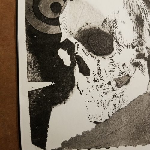
I do wonder if the oils in the ink broke down the plastic and if a loosened up waterbased ink would work better. I have some Speedball waterbased inks so I might try some of those with them. It is also tempting to mix up some paste and black watercolor to test these pieces of trash.
Anyway, even if it is a single print it’s better than just tossing the stuff in the trash. (This sort of packaging is not recyclable in my area.) The plate is also a work of art and can be mounted and framed. Some won’t be as successful.
With regards to using Akua inks. I know that a lot of blogs and sites call them “water-based.” They are not they are made of a modified soy oil that is water miscible, which means they are oil based and water soluble. If it is the oil that started the break down of the plastic film the same would happen with Akua inks.
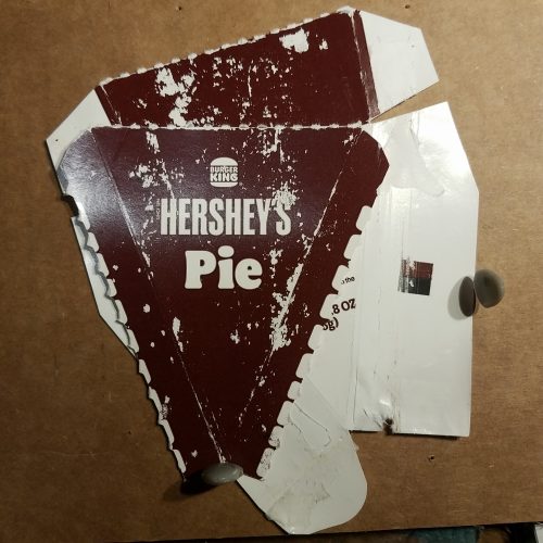
Most folx know that I’m devoted to recycling. I started to explore recycled items as part of my printmaking process with the use of heavy card packages- like cereal, frozen pizza, and seltzer can boxes. As I was flattening the boxes in our bathroom recycling bin, I realized that most of the boxes had a plastic coating, and thus could be used much like aseptic packaging. We’re talking things like facial toner and toothpaste boxes.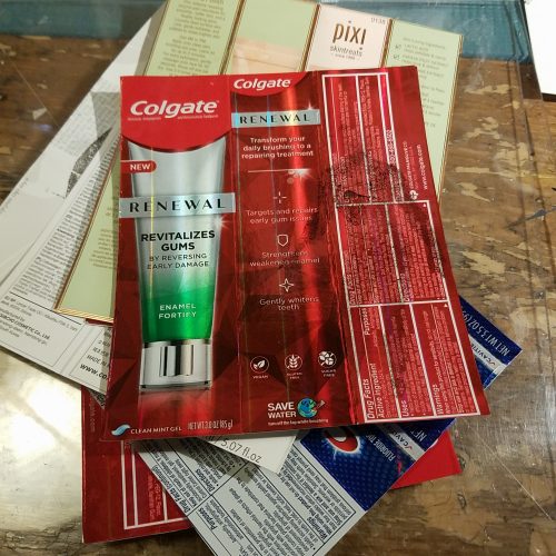
To start I opened up the boxes and trimmed off any torn or wrinkled areas. I couldn’t decide if I wanted to leave the flaps on the boxes or cut them off, but using the mini press constrains my efforts, so for these, I trimmed them off. They just wouldn’t fit on my paper or press. After that I wiped then down with Simple Green. Finally I ran them through the press to flatten and smooth them.
Some people like to trim off the folds and just use the parts of the boxes that are smooth and flat. I chose to leave the folds to get a larger space for creating images. I ended up with plates roughly 4 x 6 inches.
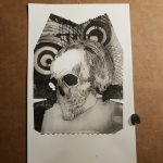
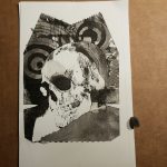
I’ve been wanting to use toner transfer for awhile so I printed some skulls and brains. I used my chartpack blending marker. It smells like hell and uses xylene but it’s the one thing that I have found that works flawlessly for the toner in my Brother B&W laser printer. I made the mistake of trying to run the whole thing through my mini press between my plates and it hazed the clear acrylic top plate, so that’s fun.
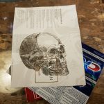
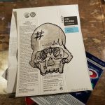
Anyway, no need for the pressure of the press, the marker does the work on its own. I ended up with pretty good transfers on most of the packages. I combined these transfers with some freehand sketching with a sharpie. The sharpie doesn’t seem to transfer from this packaging to the final prints. It does with other plates.
Finally I scratched and scored into the card with an Exacto and a needle. I also used a ball embossing tool. All worked pretty well. For larger dark areas I cut into the plastic and card with the Exacto and peeled away areas of the plastic and card. Most of this packaging has the plastic layer, plus a super smooth very sealed layer of card, then the pulpy fiber layer of card. Finally the plates were sealed with a top coat of water based varnish. Normally I seal the edges and back of the cards, but wanted to get printing. This was a mistake. The edges of the cards hold a lot of ink and can make for a VERY mess printing experience.
Inking was done intaglio style. I used a brush to lay down ink and push it into my lines. I ended up using a silicone scraper to push more ink in and scrape off the surface ink. After that the surface ink was wiped away leaving behind a bit of plate tone to make a more interesting print.
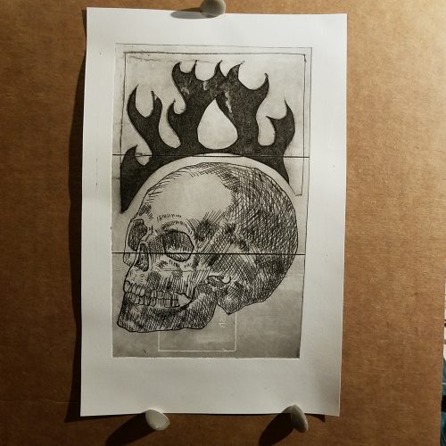
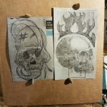
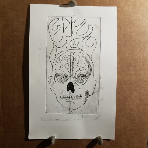
I really dig the dark flames at the top. They were cut and peeled. You can also see where the package imprint wiped cleaner than the surrounding area. If I’d been thinking I’d have carved and peeled this away too.
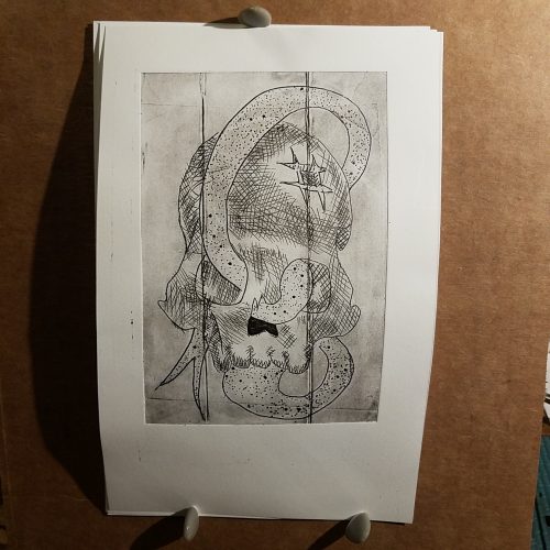
I’m not pleased with this one, the tongue doesn’t slide through the sockets properly and is distorted. I probably won’t print this one again.
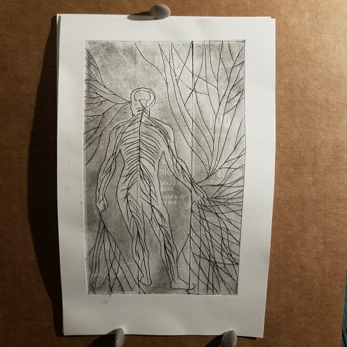
This one is fun, I’ve always liked the image of nerves running through the body. I just embellished. You can see the embossed details of the package.
meh. I won’t be printing more.
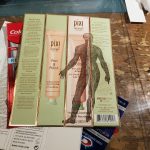
As you can see from the pictures these little plates make really interesting images and print surprisingly well. With the exception of the Pixi box. That coating seemed to get a bit sticky with the ink. It might do better with Akua or other watersoluble inks. But it did not like the Speedball Supergraphic Black ink.
It was a lot of fun making these plates and printing them. It’s very freeing to use trash to make art.