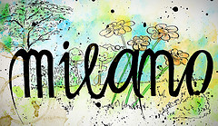
Milano drawing
Originally uploaded by geertvanleeuwen
love the lettering over the background images.
love the lettering over the background images.
I put up some of my travel journal pics, head on over to flickr to see them all.
I’m a big fan of Danny Gregory’s work. THis is a nice watercolor sketch he did in LA of a landscape. Check it out.
L.A. Landscape from DannyGregory on Vimeo.
So have ya ever wondered, Who ya truly are? I mean KatieLynn asked a question that I believe alot of us don't know. It's easy to say ya a Mother, Father, Friend, etc… But do ya KNOW WHO YOU ARE? Try to answer it truthfully without adding the usual typical as KatieKal (my nickname for her) Says…
via lillovecreations.blogspot.com
NaNoLouMo not enough journaling for you? Need another prompt? Check out Poe over at Lil Love Creations, she's got a good one for you?
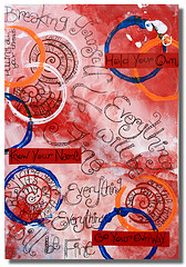
love the circles and red stripes.
Nice sketchbook video.
Cuaderno Nº 3 (de viaje) from cristian luengo on Vimeo.
Well folks. The scary part is over. My Mom's heart surgery went SPECTACULARLY well and she is very far ahead of schedule in terms of how she is progressing. She was out of the ICU in 24 hours and moved into her own room. Next week the hard work of coming home, cardiac rehab and the 3 month road to recovery begins. It will be the first time I do Thanksgiving dinner at my Mom's house. It's something I didn't expect to happen for another 30 years. That being said, I'm up for the challenge.
No matter what the doctors tell you and how prepared you think you are for the first 24 hours, you are never ready for it. That first visit is hard. You don't expect it. the tubes, the wires. You just don't. It's frightening and just too much to handle. Then things get better, eyes open, hands move, fingers squeezed. Then you know they will make it. You can see it. Things are better and they are good.
While this was the longest 48 hours of my life, I can't imagine what it was like for my mom. Though earlier today she didn't know what day it was.
I didn't get to do any journaling in the waiting room. It was too crowded, too many family members I've not seen in years and too hard to focus on pencil, ink and brush. Later when I came home for the evening I did manage to get a page done, only because I felt I had to get that feeling onto the page. It's stiff, gray and white on a colored background. Pencil and gesso. It was necessary for me to get that onto paper. It gives me an indication of how hard this was, how raw my nerves are and the intensity of the waiting room. Will I show this work? I'm not sure. i'll need to give this some time. I may block out part of the imagery, it's raw and personal. Its the open wound of my emotions on paper, and frankly I'm not sure if right now I'm that brave.

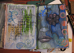
love sparkelface's most recent sketchbook spread.
So over the next few days I'll be on limited internet access. I'll be checking emails 2 or 3 times a day, updating twitter via my cell and checking internet via the "old man's laptop" (which doesn't seem to like me) and my Mom's mac and the house computer… I'm in Maine but my family is internet'ed to the hilt so you see where I get my internet addiction from.
So kids, take this as a lesson learned, if you know about a trip for 2 months, don't pack the hour before you leave, because you forget something important, like your laptop, but you'll remember the less important peripherals like your digital camera and camcorder. Luckily for me the camcorder has a 30 gig hard drive so that's freaking hours of footage for me to edit when I'm home.
Later folks!
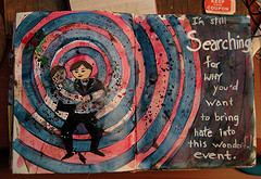
Text says: I’m still searching for why you’d want to bring hate into this wonderful event.
For those of you who don’t follow my twitter (lessherger) My father-in-law is getting remarried. He made it very clear that I am not invited to the wedding. While I’m hurt and angry about this slight; I’m partially happy that I don’t have to dress up and pretend I like a bunch of people I hate. So Perhaps it’s a blessing in disguise.
I have a video going up on YouTube showing how I made this image.
I started with a base of red acrylic. I then swiped it with some walnut ink pad. I sketched the couple in really quickly and then blocked in the image with gesso. Then the black of the suit went in. Then layered some watercolor pencil in for the faces. I wanted them to look sort of vapid and hollow. I made the circles with a compass.
The blue circles are made of blue and black paint mixed with matte medium to make a transparent glaze. I used 2 brushes tapped together with wet paint on it to splatter paint on to the page. I first wrote the words on with my pentouch white marker and found that it isn’t working well, as I’ve used most of it up. I’m burning through pens like crazy. I went over that with white liquatex ink on a liner brush..