Author Archives: leslie

Review: Steadtler essentials HB Graphite Pencils

I’ve seen some whispering around the stationery groups regarding these pencils. Staedtler’s new offering for the American Back-to-School crowd. These look like a riff on their Yellow Pencil 134 HB, only not. These were priced at $1.88 at Walmart for an 8-pack. 

The packaging of these is my least favorite type- a plastic bag. The pencils knock around in transit and often arrive with broken cores. I’ve received other staedtler pencils broken in half and in disastrous condition. These seem okay, well not harmed by the crap packaging.

Once opened the pencils were revealed to have a decent lacquer finish a nice bright yellow. The ferrule is silver and holds a dark pink eraser which is quite stiff and gritty despite being latex free. It works well enough but isn’t anything to get excited about. The wood beneath the lacquer is jelutong and sharpens well with all my usual sharpeners- including the Pollux. Kind of amazing. The imprint is good on 4/8 while the other 4 suffer from either too much paint or not enough and not enough or too much pressure. The imprint is shoddy. The cores are centered well enough.

The core is standard HB for Staedtler USA. That is to say that it is smooth, but also darker than some other brands but pretty middle of the road as HB pencils go. I’ve tested these on a couple of different types of paper, from a toothy composition notebook to a smooth toothy paper to smooth less toothy paper. It performs best on a paper like the Yoobi composition book. This is a pencil that does well with toothy paper. It’s also nicely dark on those papers. On less toothy paper it’s a little light for my taste. It is smooth when compared to other school pencils.

At $1.88 it’s a bit overpriced for 8 pencils though. That’s nearly 24 cents per pencil. When compared to other pencils like the Pen+ Gear plain yellow school pencil, well it’s not a question. The only reason to buy these over the P+G is for the brand, which as you know is something that teen Less would have considered (Ahhh the issues of a poor kid) but adult Less will chose performance over brand any day. So all that said, skip these.

It says something when Staedtler USA doesn’t even list these on their website. They aren’t proud of these pencils.

Review: Rotring Visuclick 0.7 Mechanical Pencil

I’m not gonna lie, if these had been available when I was a teenager my heart would have exploded. A Rotring with a sliding pipe? At $4.99 a 4-pack? Yes please. Sure they are bright jewel-like colors but, still Rotrings!

I will also admit that my adult heart had an increase in heart rate as I gazed at these with love. I didn’t notice until I got home that they were 0.7mm instead of my favored 0.5mm.

These plastic Rotring pencils are budget friendly. At only $1.25 per pencil, these are not disposable but they aren’t so expensive that if your kid (or you) break them you’ll cry. The pink, orange, blue and green are bright and cheerful and mostly easily found in a backpack. The sliding tip protects the lead and the tip from breakage. 

The pencil is all plastic except for the sliding tip, clip and nock cover. The tip and nock work well. I quite like the rounded bullet pointed tip of the nock. It is comfortable. The Tip cradles the lead well. The clip. The clip is garbage. It’s sloppy and not springy. If you clip it to something it doesn’t spring back well at all and in fact stays all sprung. Gross. I clipped mine into my pant’s pocket, a bad choice. It was bent to hell. I took the clip off and fixed it with ease, but still. 

The first click of the nock deploys the tip the next, 1mm of lead. The nock is solid and satisfying to click. It’s quite nice to use. The included graphite is Rotring HB and each pencil has 2 sticks. I do not like Rotring graphite. I swapped mine out for NanoDia B for a silky smooth and satisfying writing experience. 

The plastic is molded into a triangular grip. It might be a bit narrow for some people, but I have small lady paws, so this might not work for someone with large meaty paws. I found the triangular section to be perfect for my writing grip. I used these for writing in some of my composition notebooks, swapped out with a nice NanoDia 2B lead. I noticed that when writing if I pressed too hard there is a bit of play in the sliding pipe and it breaks off the nib inside the tip of the pencil. It doesn’t jam but when you advance the next bit of lead it ejects that broken bit of lead out onto what you’re writing on. The first time it happened it was a bit of a shock. Then I noticed when I broke the lead- usually when I was thinking about the next line I wanted to write and pressed down on the page with excitement at an angle. It’s not a deal breaker (PUNNY!) but certainly annoying

Overall, I like  these mechanical pencils. The colors are bright and they feel good but very lightweight. It did get me wondering if the tip and sliding pipe would work for other pencils. These might be a great way to adapt other pencils to a sliding pipe. Or maybe swapping out a flat nock cap to a rounded one? Not that clip though, that’s garbage.

Review: PaperMate EverSharp

I picked these up for a variety of reasons, first I’d ever seen them in any store. Which is not a difficult task. I haven’t been looking at pencils in stores in a long time. At $2.99 for 12 these are priced in line with many other school pencils, though it seems clear that these are meant to be a bit more adult. The package makes a LOT of claims- BREAK RESISTANT LEAD! Reinforced! Strong Lead!

These claims led me to believe this would be a hard light lead. 

Let me tell you the good about these pencils. They are made with bass or linden wood, so they have a pleasant odor, not cedar though. The ferrule is recognizable and the Mirado ferrule. The paint is a nice deep yellow. The eraser is plastic and works wonderfully well. The pencil sharpens really well in every sharpener I own, including the Pollux.

The core is hard and light but not on every paper. On the slick smooth paper of my current composition notebook it left a line that looks like an F or number 3 pencil would make. It was displeasing and difficult to read. In another composition notebook, one with toothy pencil friendly paper, it left a nice line but still held a point for a reasonable amount of time. The core is silky feeling, and smooth. It’s hard to describe this as feeling silky when it is such a hard pencil, but it is. I’ve had other H leads and they felt  like scraping the page with a nail. This reminds me of polymer leads.

The lacquer was thin and rough. And the pencil itself felt undersized in my dainty lady paws. I cannot imagine someone with large hands attempting to  use this toothpick tin pencil. 

Overall, this pencil is a solid meh. If you have a nice toothy paper it’s okay, but not great. The core is confusing in that it feels terrible on some paper and okay on others. I wanted it to be dark to match the polymer like feel on toothy paper, but instead it ended up too light to use on some paper. I won’t keep this in  my pencil rotation and can’t really recommend anyone buy it.

Composition Book Round Up: Walgreens

The local drug stores have been a bust. CVS only had wide ruled Caliber brand and nothing else in the Composition Book category save Moleskine giant Cahiers, which were tempting but VERY expensive.*

Walgreens had meager offerings this season as well- not a single Mead book in sight, None of the cute Studio C books**. A mere 2 boxes of Wexford College Ruled Composition books in the standard black and primary color offerings. The whole Back to School section was… half an aisle when it normally is 2 full aisles. Damn you COVID19!!!

I bought two Wexford College ruled Composition Books for 79 cents each. One black and one bright blue. It felt decadent. Total with tax was $1.68.

When not on sale these books are $3.49.

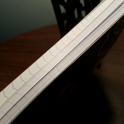
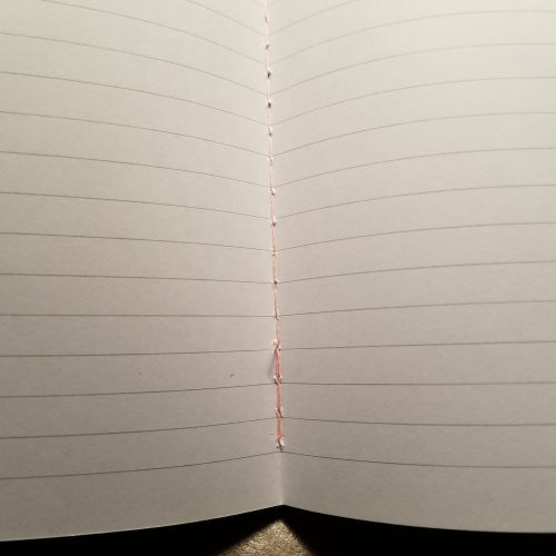
These are everything a GOOD composition book should be: Solid tight stitching, thick stiff chip board covers, generously well textured spine tapes, smooth paper with a barely there pale blue college ruling.

And the paper? Oh wow is it great. It handles wet liquid inks with ease, sheen shows up, lines stay true to nib size, no bleedings, no feathering, and enough tooth for a pencil to feel good.

The down side is that the only have 80 sheets. But when they have such darn nice paper? When they are on sale for 79 cents? And when they have the best covers of the good paper composition notebooks? Yeah, these are winners. If I hadn’t just bought 16 (sure 6 of those notebooks were dogs) I’d stock up on these.
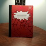
*I’ll wait until they have them in clearance and then review them. I do like a giant sketchy area for thinking.

**I’ve since learned Studio C has rebranded (Thanks NoteBookJoy!) as Carolina Pad Company, which seems like a bad idea given their wide range of products. Do I really want to buy a lunch bag from a pad company? Eh

Review: Sharpie S Gel 0.7 Pen

My partner saw a pack of these and decided to score a few points with me and bought them for me. Wise choice partner, wise choice.

I enjoyed the porous point of the original Sharpie pen but I was not in love with the longevity or lack thereof. The narrow grip left me wanting.

The S Gel has a curved body with a swirled ribbed rubber grip. The plastic is matte black. The grip dips in a bit and flairs out near the base of the grip. The clip is extremely sturdy, the plastic is slightly flexy so it is likely that if it is clipped to something fat that it will stretch over time. But with some fiddling around and fidgeting I was not able to break the clip easily. The allblack body is accented with a silver ring and nock, and the Sharpie name and name of the pen are printed in silver.

The pen looks good. I found that I had to get accustomed to the curvy grip. I found myself holding it in the more narrow section but needing to hold it closer to the point for comfort and writing legibility.

The nock is satisfying. It pressed down with a stiff feeling and makes a satisfying click when engaged. The spring in this pen feels sturdy.

The gel ink is smooth and wet. Writing is effortless. Even on rough paper it feels smooth. On smooth paper it glides. The ink is deeply black. It rivals even fountain pen ink in its darkness. It doesn’t lift when a highlighter is used over it. I’ve yet to test it out when sketching with watercolors. The pen flows so smoothly when sketching. I haven’t noticed a skip or blurp. I have not had a blob on my page. It flows smooth and clean.

This has become my new favorite gel pen for writing and sketching. At $5.27 at Walmart this isn’t the cheapest 4 pack of gel ink pens but it’s also not the most expensive. That is flows so smoothly and deeply black makes it a winner for me. I do need to test it’s lightfastness in my window of fading. But right now it’s great for writing, doodles, and thinking.

I picked up a second 4-pack of blue ink S-gel after reading Brad’s review over at the Pen Addict. I snagged the black pen my wife had been using and we broke the waxy seal on 2 of the blue pens, and ours were all silky smooth and the flow was consistent on all the paper types I used- from the crappy paper at work, my various composition notebooks, and a nice Rhodia graph pad I had on hand. I’ll be buying more of these due to their silky feel and deep dark black on the page.

Composition Book Round Up: Which to Stock Up

If I had to stock up on one of the options which would I chose? It’s a tough question. We’ve got Walmart, Target, and Staples as places to shop. We’ve got plastic covered and card covered. Then we’ve got made all over the world or made in the USA. Then we’ve got books that are great with pencil and terrible with fountain pen, and great with fountain pen but too slick for pencil. The choice is ultimately made by what each person is going to use. Frankly, what I use changes from year to year and sometimes changes on a whim. Lately, I’m using more pencil than fountain pen, and more gel ink than fountain pen. Mostly because I’m attempting to use up some of my tools rather than letting them dry up in a cup. That said I might pick up a fountain pen on occasion. So I’m going to suggest a few all around notebooks that work well for all of the above.

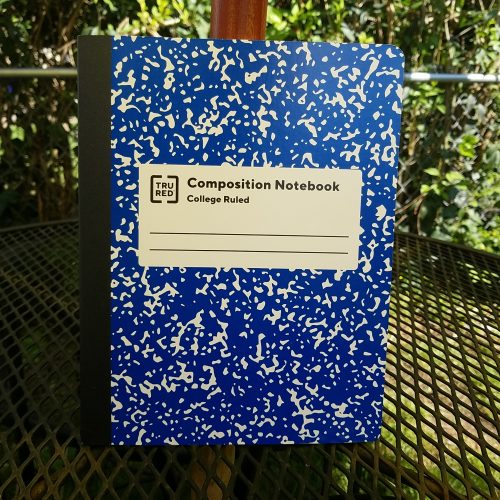
Let’s start with my top choice from Staples. Here I’m going to pick the TruRed card covered book. It works well with all my tools, but isn’t the best with any one in particular. Despite the mess of how it looks, it’s better than the atrocity of the regular staples cover.

Next up in Target. I’m still team Unison. The paper is the best around for a 50 cent notebook, and despite the mere 80 sheets, it works so well with so many tools makes it a winner for me.

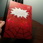
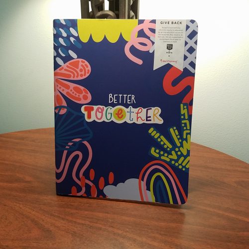
Lastly, Walmart. This is the first time I’m going with a poly covered notebook. I hate the plastic covers but here the interior is what matters. The paper is great. The covers are printed with fun things.

If I were only going to use pencil or ballpoint? For the best covers it’s Yoobi every time. Sure it’s a bit more money, but those covers are so fun. For the best monetary value? Pen+Gear card covered made in the USA. At 50 cents for 100 pages it offers the best pencil and ballpoint paper.

If I were to switch over to using only liquid ink in a rollerball or fountain pen all the time? My budget choice is going to be the Unison. For 50 cents and 80 pages it worked the best over all for fountain pens and other liquid inks. My less budget choice would be the $2.50 standard non-fashion poly covered Mead Five Star. The paper is pretty good, with minimal bleed with wet pens, and the poly cover isn’t awful.

These reviews were made possible by readers just like you. They decided that these reviews were worth a few bucks, namely $3 via Ko-Fi. So they hit that Ko-Fi button on the side bar of my blog and let me know they like what I do. And I appreciate it so much. When folx send me money to do reviews I’m able to do them without the worry of the company cutting me off from review products because I’m too critical. So if you like this kind of review, smash that Ko_Fi button and let me know. Every $3 counts.

Composition Book Round Up: Walmart

This year my local Walmart was less of a mess than usual. Their Back to School display was downright organized. Color me shocked, every year until now it’s been an awful mess. This year we have four Pen+Gear offerings and an Exceed; an added bonus is a “junior” sized composition book from Pen+Gear.

Let’s start with the P+G Fashion Poly covered book. This costs 64 cents and sports 80 sheets.  This poly cover is thin and floppy, the worst of the worst when it comes to poly covers. The front is printed with rainbow foil words. There were quite a few designs available, I just liked the rainbow* foil. The cover is scored at the front and back but not enough to make the cover easy to fold. The printing is great, very well done. The spine tape is metallic and smooth. I’m not a fan of smooth spine tapes. They feel meh to me. The stitching is nicely done, very tight and even. 

The paper is college ruled and smooth to the touch. Gel and liquid ink pens. Fountain pens were surprisingly nice on this paper. No bleed and little to no show through. I was rather surprised. The paper would be better for pencil with a bit more tooth, but it’s not bad at all. Soft dark pencils are a joy on this paper and hold a point really well.

The standard poly covered P+G composition notebook is even better. At 50 cents for 80 pages it’s a good choice for affordability. The cover sports all the same issues as the fashion poly cover- floppy, no scoring, doesn’t stay flat well, and is plastic.

The paper is slightly different. It’s smooth and great for gel and liquid ink. Fountain pens are lovely on this paper. There’s no bleed or show through and it was just a joy to use. It seems to have a bit more tooth than the fashion version, pencils were better on this paper. 

If you were looking for a good all around composition notebook the standard single color poly covered P+G would be a great choice.

When it comes to card covered P+G composition notebooks we have 2 choices made in the USA or made in Colombia. They are drastically different.

Let’s start with the Made in Colombia. This has a standard black marble cover, a decently sized and textures spine tape, neat tight stitching and 100 pages. They sell for 50 cents. This looks to be old stock. I should have looked at the labeling. This one is marked 2018. Damn. 

The 100 pages are smooth and toothy. It’s great with pencil and gel ink. I liked the feel of pencil on this paper. Gel ink is nice. Fountain pens and liquid ink pens feel good but feather all over the place. There isn’t any bleed or show through. 

Note bad, not great.

The made in the USA  version is 50 cents for 100 pages. The cover is thin card that is not overly floppy but not what I would call stiff either. The cover is just one color and is available in a wide range of colors. The spine tape is black and smooth. The stitching is tight and even.

The 100 pages feel rougher than any others available. This might be the perfect composition notebook for pencil. The level of tooth on this paper is perfect. My HB pencils look great on this paper. Gel ink does well. Liquid ink is awful. Fountain pens feel okay but the minute the nib  hits the page it starts to spread and feather and bleed and soak through. It soaked so badly the ink spread through to the next page. It’s atrocious.

If you are only going to use pencil, ballpoint, and gel ink, this is okay. But gosh don’t put liquid ink near this, unless you want to see how is feathers.

A bonus is the P+G “Junior” composition notebook, measuring 5×7 inches. It’s made in India and sports 80 perforated college ruled pages.The poly cover is even thinner and more floppy than other notebook I’ve reviewed. The size doesn’t seem to follow the compostion book size. It just seems a bit off in measurements. The spine tape is nicely sized  and textured. The stitching is tight and even.

The paper feels smooth. I wasn’t expecting much here. But it’s nice. It performs as well as the larger version. Pencil feels good. Gel inks look good. Liquid inks are stunning. My fountain pens glide and don’t bleed or feather. There’s little show through. At 67 cents it’s a bit more expensive, but not bad for a pad of paper.

Finally, we have the Exceed poly covered composition notebook. Previous versions of this made in the USA were awful. At $1.47 it’s not the cheapest of the bunch but not the most expensive either. It has 80 college ruled pages.

The poly cover is not as floppy as other poly covers. The tape is narrow and smooth. The poly is scored in several places to facilitate easier folding and it does help. The issue then becomes that the book does not close as well as it did before it was folded. The stitching is tight and even. The corners are not rounded well at all.

The paper feels smoother than the previous version. It feels good with gel ink and quite shockingly, with fountain pen and other liquid inks. There was no feathering or bleed. Given the previous years awfulness with liquid inks I am shocked. Pencils felt amazing on here too. The tooth level is great and HB and softer pencils feel good and look good too.

I’m sad that the new versions of the P+G card covered books are not great unless you plan to use only pencil. Sadly my best recommendation is to get the poly comp books from Walmart. At 50 cents and 80 pages they are the best value. Though the Exceed are also pretty great and have 100 pages.

A big note about what is now available in my local Walmart. Studio C is completely gone from the shelves. I even went to check the office and school supply aisle, nothing. Also of note is that Norcom’s made in the USA composition notebooks are absent. Not a single one on the shelf. Interestingly the made in the USA P+G feel a lot like the old Norcom comps. 

Composition Book Round Up: Staples 2020

It’s been a few years since I did a proper round up of composition book reviews. I had a bunch of readers smash my Ko-Fi button and buy me a few coffees which means, REVIEWS. I have the best readers! Y’all rock.

This year Staples has 4 standard offerings when it comes to composition books- TruRed and Staples unbranded both poly and card covered.

All 4 offerings are made in India and feature solid tight stitching and a black paper tape along the spine. All but the Tru Red card covered book have 80 pages, with the TruRed card covered having 100 pages.

I have harped and griped about poly covered composition notebooks in the past, and my loathing remains consistent. These poly covers are not scored for easy bending nor are they particularly stiff to support writing out of hand. They are the worst of all things poly covered.

Both the new Staples and TruRed card covered books are covered in what I consider to be a disturbing trend of flimsy card covers. The covers are barely thicker than the flimsy paper inside and the card bends and folds in hand. Ugh these flimsy covers are so gross. They do protect the inner pages from harm well enough and even survive in my bag for the week or so it takes me to fill a comp book. To me, the flimsy card covers are inherently dissatisfying. Yes they do the job but they just feel… cheap.

Cheap is the name of the game when it comes to comp books, I mean it is a 50 to 75 cent notebook. But there is quality within the game as well. After all, we’re on the hunt for a book with great paper aren’t we?

Just look at this mess of non-repeating pattern. EDGES. Looks like Angelfire or Geocities back in 2001. Do better Staples!

Staples books are often plagued with design issues. The new TruRed cover label on both the poly and card covers is ugly. While it harkens to the old style of composition book cover labels, it simplifies it and slaps on a widely kerned label and the TruRed logo and 2 badly spaced lines. I can barely stand to look at it.* Look away, it is hideous. The  TruRed card cover has the marbling blown up to bold proportions, it’s rather large. Probably the better design choice over the atrocity that is the Staples book. Here you can see where they just copy and pasted the pattern but didn’t bother to create or buy a pattern with edges that allowed it to repeat smoothly. Oh no, Staples has the equivalent of a 1990s Angelfire background with visible edges and NO ONE BOTHERED to fix this before they made 900billion of these notebooks.

The covers are available in a wide range of bold primary and neon colors for the poly notebooks. The marbled card covers were available in primary and secondary colors.

So all around the Staples notebooks are ugly, but what about the paper? In 3 of the 4 books it is identical. The outlier is the TruRed card covered book.

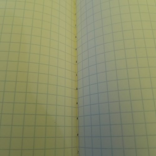
The first 3 have silky smooth paper with college ruling and blue lines. The lines are neither pale or dark. They are printed tight without any spreading. The paper has a bit of tooth, but not a whole lot. Even with pencil these feel silky smooth. Surprisingly the paper handles even wet italic nibs with ease. I had tweaked a Wing Sung 3008 to write wet for sketching purposes and this silky smooth paper handled the intense amount of ink well. There is no feathering or bleed through. Since most comp books have 15lb paper, there is some show through but this paper is lovely. I was pleasantly surprised at the quality of the paper. The lines left behind are true to the nib size, so no feathering or ink spread.

The TruRed card covered paper has roughly all the same qualities as above with slightly more tooth for pencils. It feels great with everything. There was a bit of bleed in some areas with my very wet pens with some inks. Largely the paper is great.

Overall the bar has been set relatively high for paper quality by all the contenders from Staples. All four of these books are a decent value for the paper inside. Sure the covers are a mess of shoddy design and plastic and thin card but if we think that the paper is the important aspect, well, these have you covered at 50 cents each for a card cover or 75 cents for the poly covered.

Composition Book Round Up: Target Part 3

In this section we’re going to examine all the Mead books I was able to find at my local Target. In the past Mead books have ranged from down right awful to amazing. When you venture into 5 Star territory the Mead comps are downright nice. The standard Mead offerings I’ve found outside of Back-to-School Sales have been awful. The three I’m examining in this post have some range.

Let’s start with the Mead Five Star Fashion Poly Covered. This year’s was made in Vietnam. I found one in dark teal* with a metallic gold design. It kinda looks like pencils, or just triangles and lines. I love it. I hate poly covers, but of all the brands, Mead does a good job of them. Their poly feels slightly thicker. The score the spine so that you can actually fold the cover over on itself and it will lay flat, though with some effort. The cover design is cute as heck and the spine tape is gold to match the design and nicely textured and sized. 

Inside is filled with 100 sheets of smooth toothy paper. The stitching is tight and even. The paper feels great with pencils and pens of all types. It feathers and bleeds a bit with liquid inks but does well with gel and pencil. This isn’t going to be a book for the fountain pen crowd. It’s also not my favorite for pencils. It’s got tooth but not quite enough for my taste. I prefer a bit more for my pencils. Overall this is a great book for gel pens.

At $3.50 it’s rather over priced.

Next up is the Mead Five Star non fashion poly covered comp book. This one sports a textured design and some square pixelated design work. There are 100 pages. The pixelation design reminds me of 2002 for some reason. This one is made in Vietnam. This one boasts that the book with LAST ALL YEAR, GUARANTEED! This book was on sale for $2.49.

Again Mead does a great job with poly covers, scoring at the spine for flat-ish opening. The stitching is tight and even lending itself to opening with ease. The spine tape is thick, well textured and a nice size. This cover has a white lining 

The paper is smooth and toothy. It is better than the fashion version. The paper despite being smooth, has enough tooth for pencils. I really like this paper. It feels good with pencil, gel ink, liquid ink, and fountain pens. There is little show through or show through. This was the best of the Mead comp books.

The final Mead book is the Mead “We Mean Green” composition notebook. At $3.99 this was the most expensive book of the whole lot, in fact of all the composition books I bought this season. It has 90 pages. It was assembled here in the US of US and imported parts. So… 

The cover is a nice thick and stiff card. This is the least floppy of the notebooks available. The Spine tape is a bit on the narrow side but it’s a nice shade of white that allows you to see the print beneath it. I think it’s a nice design touch. The cover printing is super cute and available in green and blue. The matte design is very appealing to me. The warm shade of the card looks good with the ink. 

The stitching on  mine and most of those I saw on display was a bit off center. It’s a wider stitch than most of the books out there. The labeling reports that it is compostable, but it’s a polyester string, so not so much. 

The paper is a warm off white shade that is pretty nice. I could ONLY find wide ruled at my local Target. It feels smooth under fingers and when writing. It is great for pencil and gel ink. With any liquid ink- fountain and rollerball it is awful with feathering and bleed through. The pens feel good on the page but as soon as nib is put to the page it starts to feather and bleed. 

I’m not going to go too in depth here about my thoughts on stationery greenwashing, but I do know that young environmentalist Less would have been all over these notebooks. It is not clear how much of these books are made out of post consumer waste versus the industrial scrap that would have been “recycled” or put back into the paper vats as part of the paper making process anyway. If a paper is 100% pre consumer waste, it’s not really recycled IMO it’s process as usual. Okay i’ll stop here.

Clearly, the We Mean Green is only okay if you are only going to use pencil, ballpoint, or gel ink. 

This season’s Mead standout is the regular standard Five Star poly covered book. The big loser is the We Mean Green and being the most expensive of all the options you really pay for that green washing.

Composition Book Round Up 2020: Target Part 2

Target had a lot of options for comp books this season. I left the store with 9. Some are old favorites and some are new brands. I’m dividing this round up into several parts because, well 9 books are a lot to write about. I will also include here that my “local” Target was a shit show, which is to be expected in some part due to the Covidalypse, but also it was hard to find things and despite the state requirements to have a scanner every so many feet in the store, it took me forever to find one to scan each item for prices. Also whoever had set up the display had mixed all the wide and college ruled books… together in the same bins, so I had to search and search for college rule and in some cases never found any.

I decided to start this out with the regular Target offerings- Yoobi, Up+Up and Unison. These seem to be offered at my local Target every year, but not year round. 

Let’s start out with Yoobi. The paper inside is smooth but not slick. It has plenty of tooth. IN fact this might be a perfect paper for pencil. I love pencil on this toothy yet smooth paper. My HB pencils feel good and leave a dark line. Ballpoint and gel ink feels good and performs well enough on this paper. Roller and any liquid ink, well it’s not pretty. The line tends to spread and feather. Fountain pens exhibit show through and some bleed through. It’s not great.

The stitching is tight and sturdy. The spine tape is textured and a decent width. The covers are what make Yoobi books special. Every year they come out with new designs and wow are they cute. This year’s designs span from cute and fun to funky. I picked up a design featuring gold stars and phases of the moon. The moons are black and white on a lovely salmon background. The card covers are thick and stiff though not as thick as previous versions.

The Yoobi books are $2.50 each and have 100 pages. This is their regular price and I’m not sure they ever go on sale, though I find them in the clearance section often. WHen I find them in the clearance section I snap them up, because I love the covers. Since I write with pencil often these work pretty well for my writing needs, but if you are  a fountain pen user these are going to be a hard pass, the paper is just too feathery and bleeding for fountain pens.

Last year’s Target winner was Unison. This year they sport red, blue, yellow, green and black marbled covers. They have 80 sheets and are available in college and wide (YUCK) ruling. The covers are made of thin but stiff card. The taped spine is generously wide and nicely textured. The stitching is tight and well done in all the books I looked at. They are made in Vietnam. These are priced at 50 cents. THe covers are available in a wide range of shades- from your usual red, yellow, and blue with green and neon colors.

The paper inside is smooth to the touch of my hands but has enough tooth for pencil to do well. All my pencils felt good on the page. My gel and liquid ink pens all felt great. Fountain pens did quite well on this paper. I noticed zero bleed or soak through with  my wettest pens. Sheen showed on the page. 

This is still a great choice, no matter what you write with this paper performs well. There are a few areas of the marbled design where it’s clear that the design didn’t blend the edges of the pattern well, but overall, it’s marbled.

Next up we have the first of the Up+Up books- the Poly Covered. At 99 cents it’s expensive (IMO) for what you get. The poly cover is thin and floppy but scored for easy folding of the cover.  The stitching is tight and sturdy. The taped spie is appropriately sized and has a pleasing fabric texture. 

Inside you get only 70 pages of smooth paper. It is drastically different from the past pack of Up+Up comp books I purchased. This paper is downright… NICE! It isn’t great for pencil, but it’s not bad either. It lacks the level of toothiness I like but it’s not awful either. With a darker softer pencil this paper is decent. Where it shines is with gel ink. It feels perfect with a gel pen. It also feels good with a fountain pen. Though it does have some show through and spots of bleed where the pen sits for a moment too long. Overall this is a solid contender for decent.

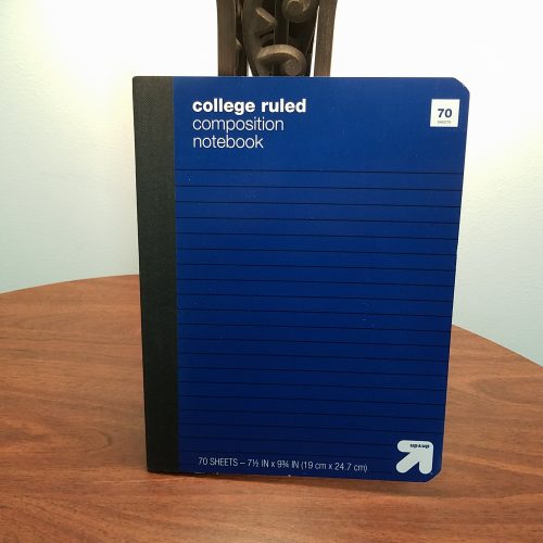
Finally, for this section of the review we have the Up+Up card covered book. At 69 cents it’s not over priced, but really should be at 50 cents with the rest of the books, especially considering it has only 70 pages. These are made in Vietnam.

The cover is as basic as basic can be. Rather than the usual marbled covers we get one color with white labeling and lines. It’s available in red, yellow, blue, and green. I didn’t see any black covers. Odd. Why not the rest of the secondary colors? I like orange and purple. But this section of the display was a shit show of mess. The stitching is tight and even. The taped spine is wide enough and nicely textured. 

The paper is great. Mine worked better than the poly covered version of this same book. It was smooth yet toothy. Pencils felt great and left a nice dark line while fountain pens felt GREAT. The smooth paper is key here. The nibs glide over the surface. Also the wet inks stayed put and didn’t spread, feather or bleed. It doesn’t get much better than this.

In this section of the round up the Up+Up card covered and the Unison are in a tie. I might like how the Up+Up card covered performed a bit more, but the Unison is priced better and has 80 pages.