This popped up into my suggested items based on my searches and I had a good chuckle. Then I did a search for other reviews and found that they were all over the map in terms of experience, so I had to get one.
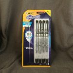
Like many Amazon items this fluctuates in price from the base of $9.99 up to $15. I snagged mine at $12. Not bad, not great.
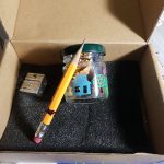
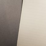
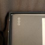
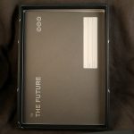
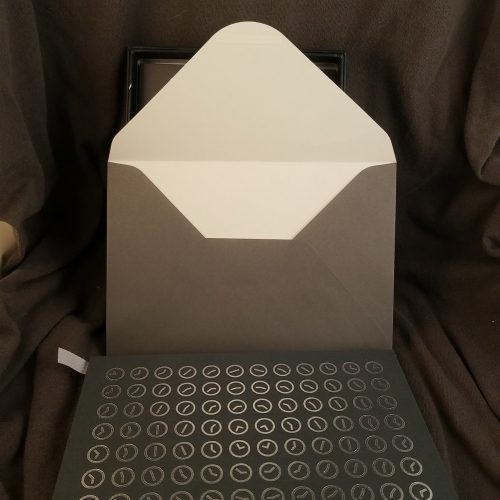
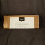
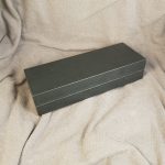
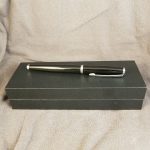
It arrives in a bubble mailer and a very sturdy cardboard box that is sealed with packing tape. Inside the box is an extremely nice and well made gift box in forest green. It snaps open and stays open. Inside is a die cut foam piece, instructions, and some satin covering of the rest of the foam. It is a stellar presentation of a pen.
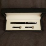
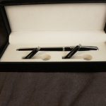
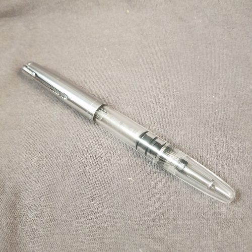
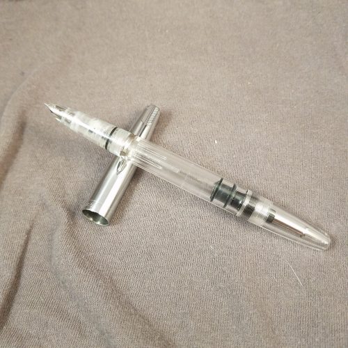
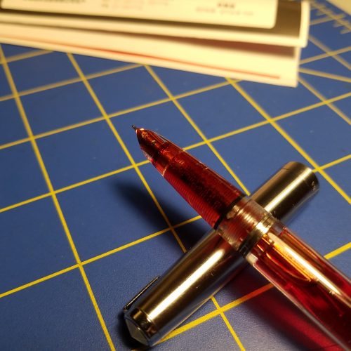
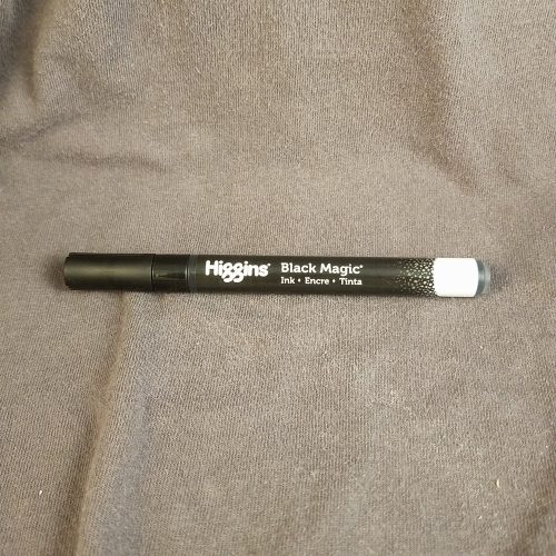
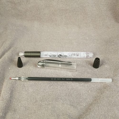
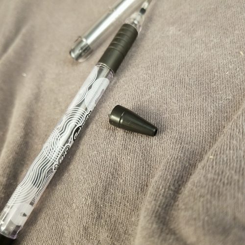
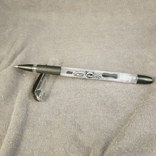
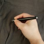
The pen itself is pretty small and glossy black with silver trim. The clip is adorned with the AmazonBasics logo in left handed format. Odd choice but I’m here for it. The cap snaps on and off with some force and posts well. It does not feel as if it will work loose easily. There are fingers inside the cap that could be adjusted with a wooden skewer if needed.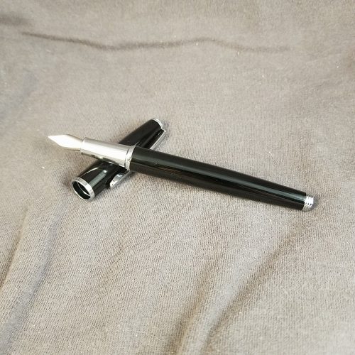
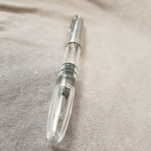
The solid metal construction of this pen is done well, it feels pretty good in hand. It weighs less than I expected given what I read in other other reviews. It is lighter than the Pilot Metropolitan but weighs more than my Wing Sung 601. Though it posts I will not be using this pen posted, the balance is wonky once posted, leaning very heavily to the back of the pen. I have small hands so this might be a more balanced feeling for someone with larger hands.
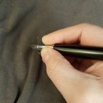
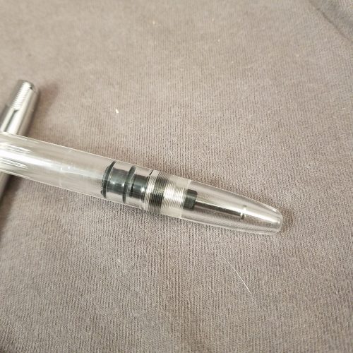
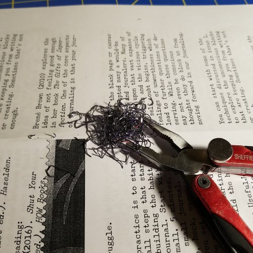
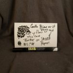
Initially, in use the pen had nice ink flow but the nib wasn’t amazing. Eventually in the midst of writing a letter it just dried out completely. Later during a journal entry it also dried out. The nib didn’t dry because I wasn’t writing, it dried out of ink completely and took a few minutes for ink to flow back into the feed and nib, weird. It took a bit of work to get the nib to feel good. The tip was just a smidge scratchy but also only in one place, it smoothed out easily. Other reviewers had a smooth experience with their pens. The grip was a good size for my hands, though the step from body to grip section sits exactly where my thumb holds the pen. It’s rounded and not sharp so it’s not painful, just annoying.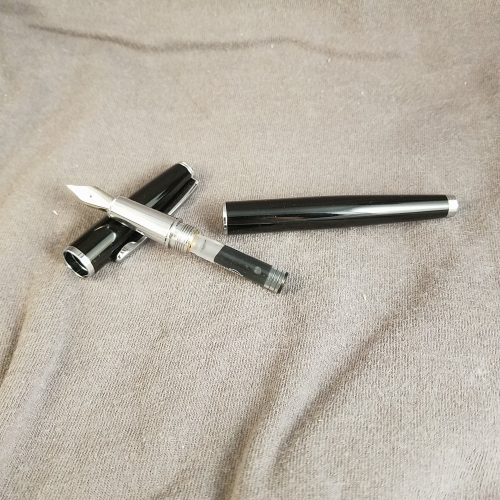
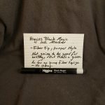
My thoughts on this pen are mixed. It’s okay. It has a very classic pen look- glossy black lacquer on a brass body and nicely done silver trim. The unadorned silver nib has only the M on it to designated the size of the nib. I think it’s a better pen experience for me than the Metropolitan, but the nib is not as nice. For $12 I think most folx would be better off buying a couple of WingSung 3008/9 etc. The AmazonBasics logo is a wart on this pen. The gift box is unadorned and could easily be repurposed to hold another pen for gifting. It’s a solid meh on this pen.
This pen was, sadly, purchased with ko-fi fund. I feel as though I have wasted your money. Though I have assisted you in avoiding this purchase. If you like this sort of review, feel free to buy me a coffee via my ko-fi button on the sidebar.