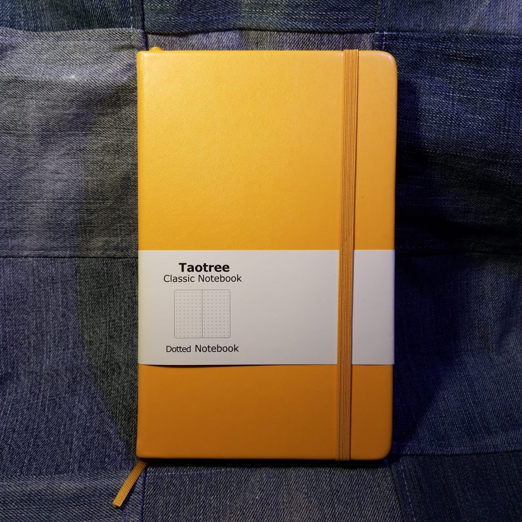
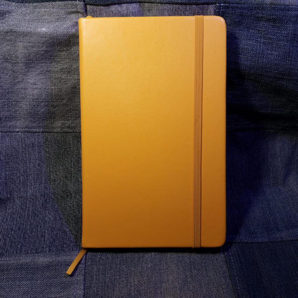
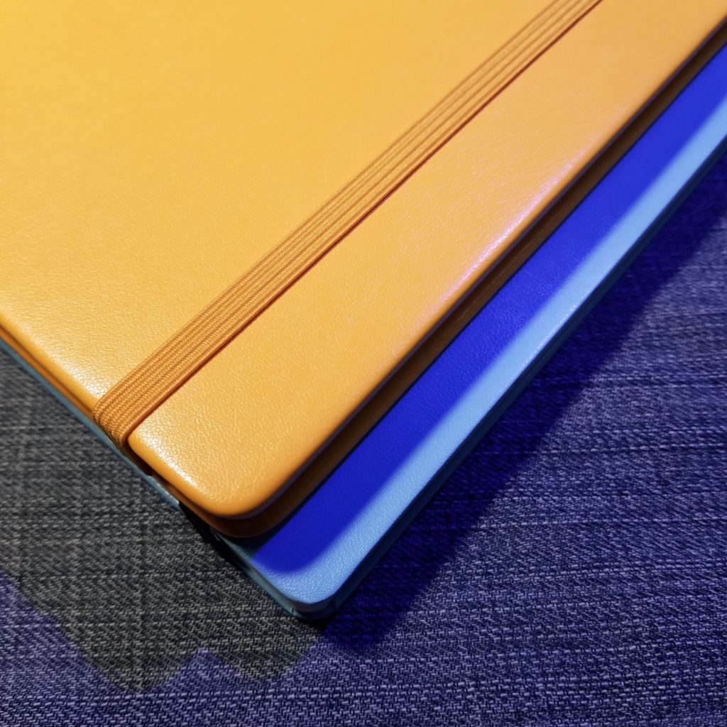
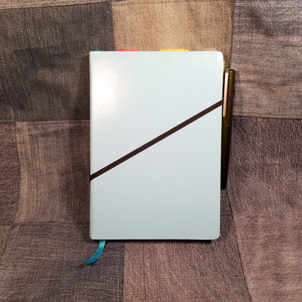
I picked up this Leuchtturm 1917 (L1917) years ago at my local Artist and Craftsman. The sky blue color called my name.
Since the L1917 is the suggested journal for bullet journaling, I pulled the failed notebook out of retirement and pressed it into service.
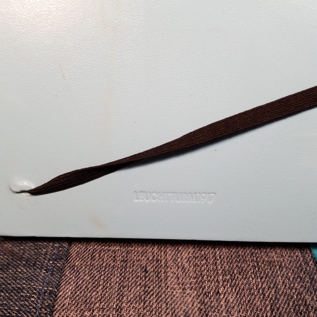
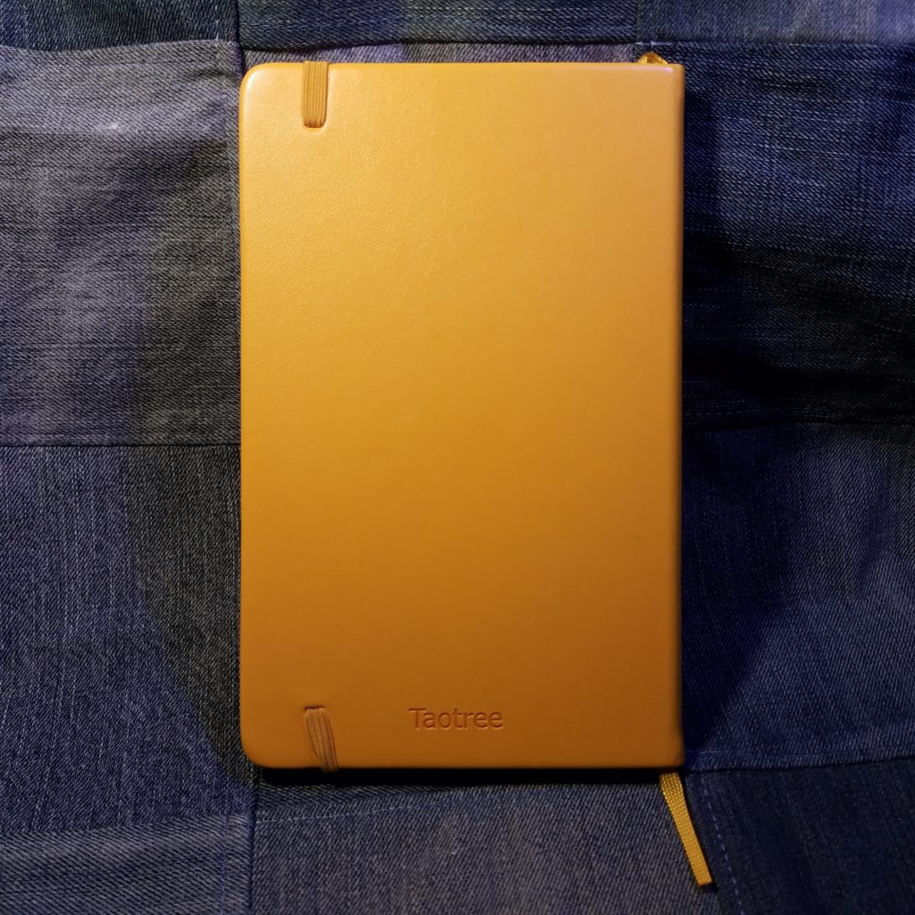
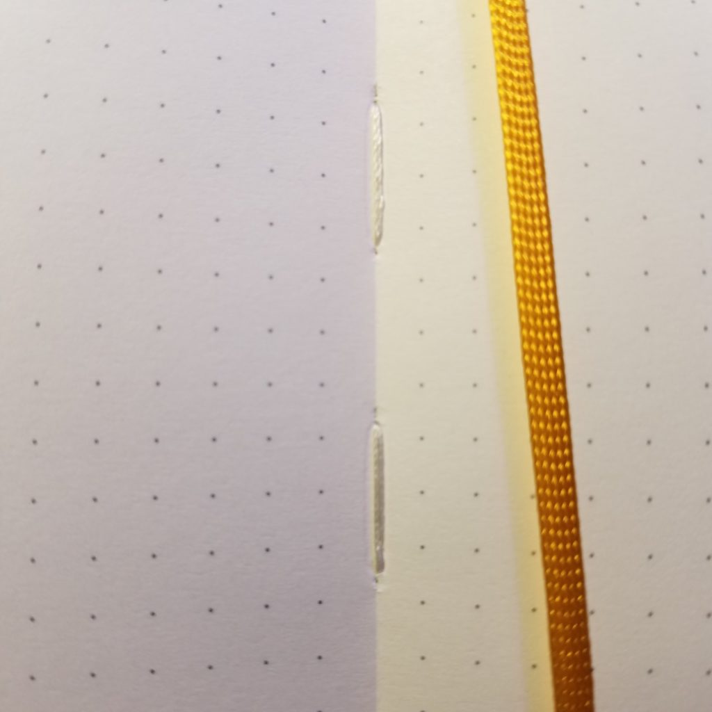
A few notes. This book sat in my abandoned journal bin for years. In this time the elastic lost its elasticity and stretched completely out. I remember it was loose even when first purchased. I ripped it out and replaced it with a new sturdy black elastic. Inside I found several loose stitches, which I clipped and melted into place. Otherwise the notebook was well made.
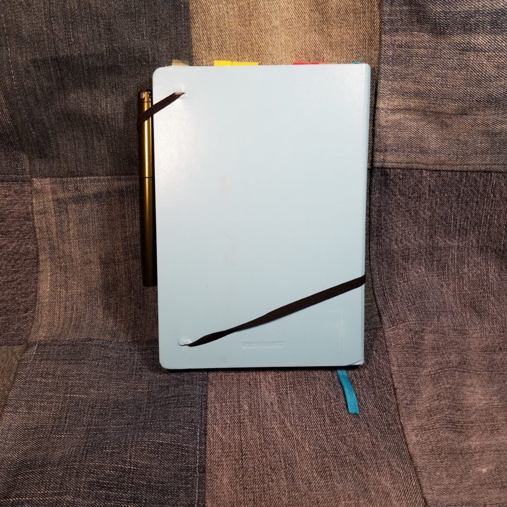
The journal is Smythe sewn with nylon thread. It opens completely flat and can be folded over on itself for writing in hand. Unlike a Moleskine the L1917 features a supported rather than hollow spine. This means that folding the book over on itself takes a bit of work and requires creasing the spine. It looks natural on my L1917, but some folks might not appreciate the look. The cover is made of vinyl over stiff hard card that feels very sturdy.
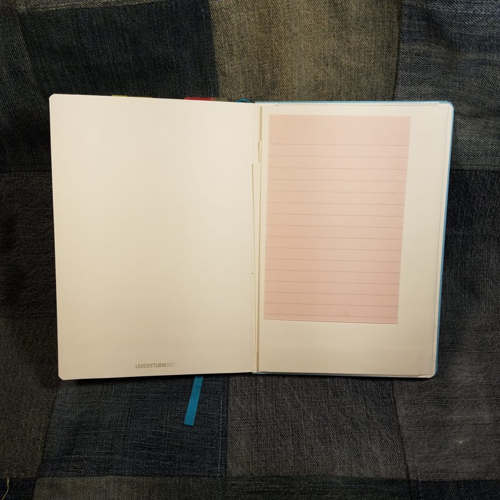
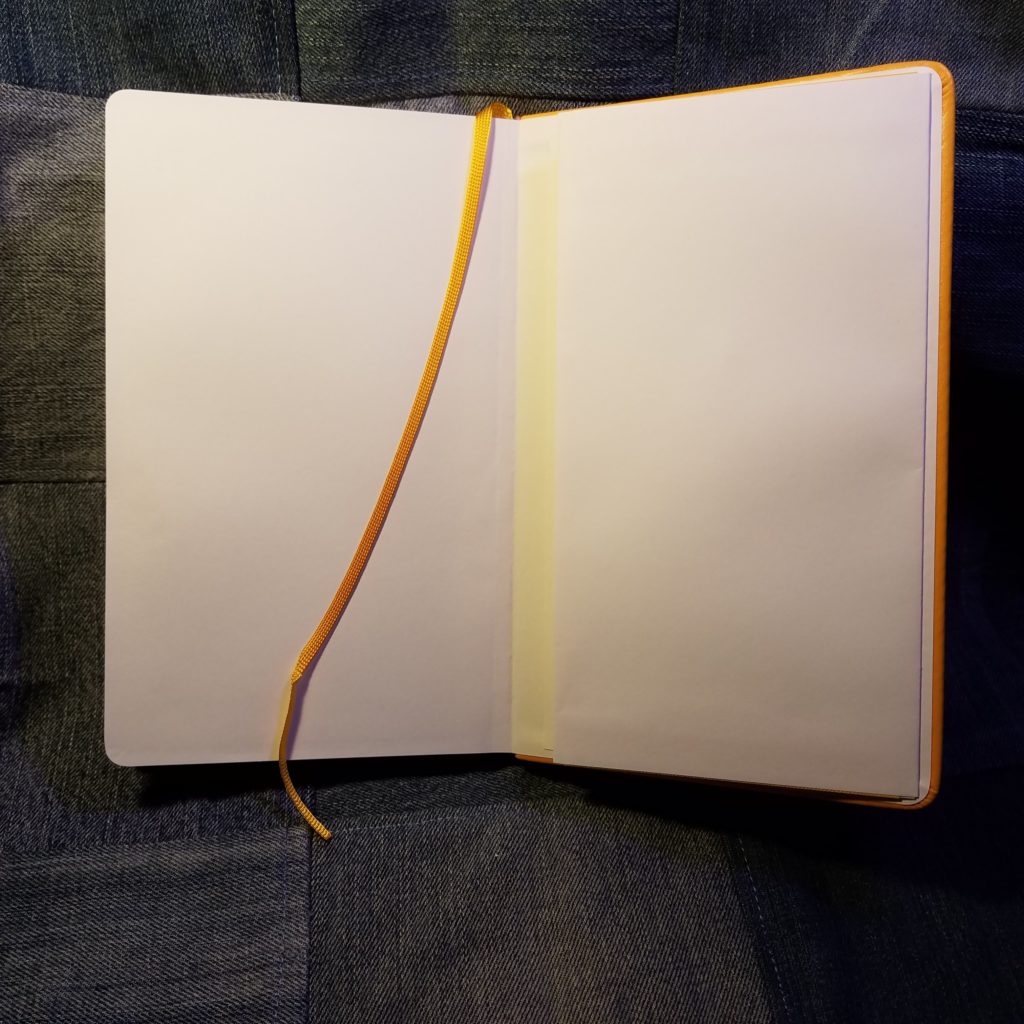
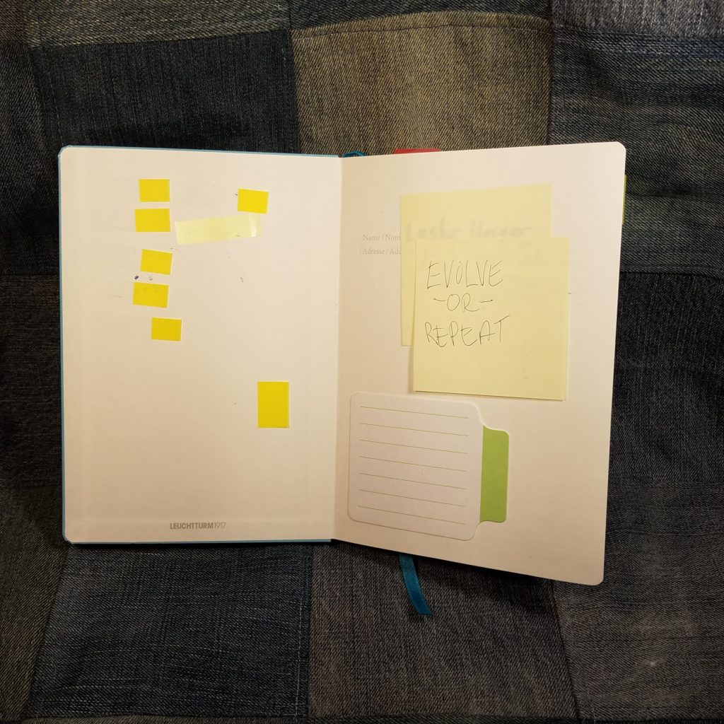
The ribbon marker is a shade darker than the cover and is also made of nylon. I think mine arrived heat sealed but I do know that I sealed it more deeply. The marker is generous and has several inches outside of the book. I like this. I can grab it and open the book with it easily. It is also glued deeply into the spine. I gave it a good yank and didn’t feel any give at all. The back of the book had a generously sized pocket that holds the stickers that arrive with the book. I also store my sheet of blotting paper here.
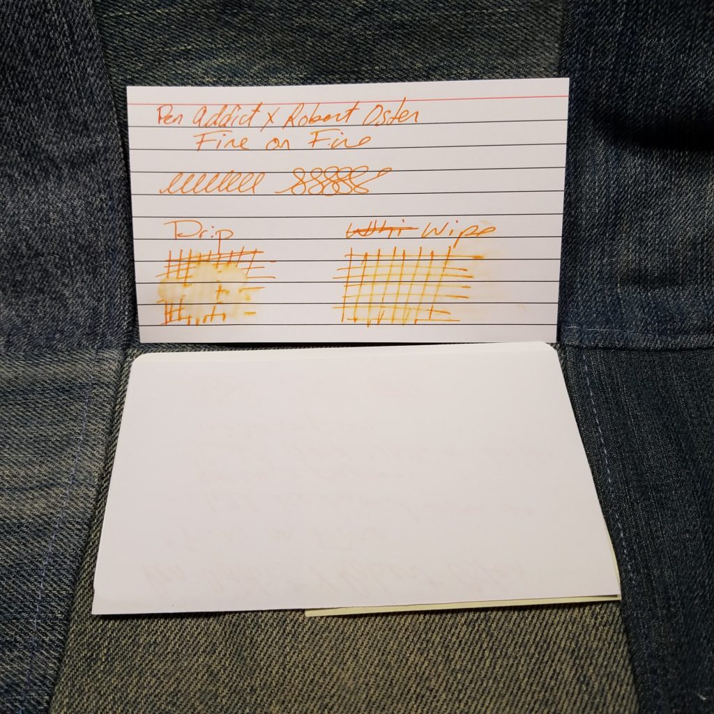
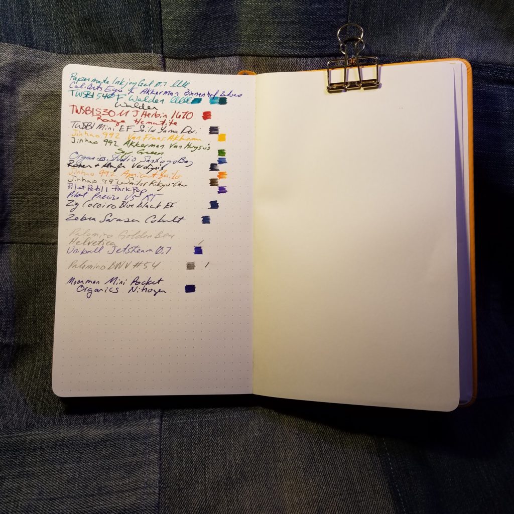
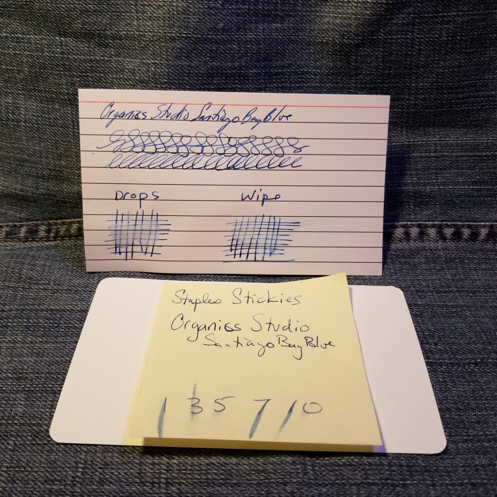
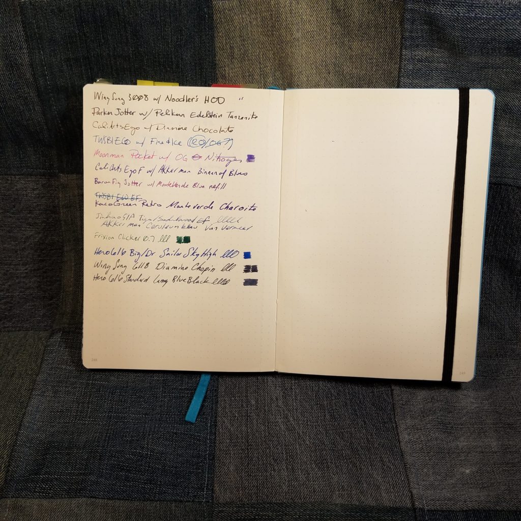
The paper in my is labeled as “ink proof” and indicates that there should be no bleed through. I have found that this is true, but I have also noticed that there is some feathering. Some ink wicks along long fibers in the paper, which is a major complaint that many fountain pen users have against Moleskine. I don’t notice this with all inks, just some of them. The paper is heavily sized, and even quick drying inks seem to take forever to dry, which is why I keep a sheet of blotting paper handy. I use it VERY often. I’ve had issues with gel pens smearing hours after I’ve finished writing.
I’ve frequently touched a page days later only to have the slight moisture from my hands* smear the ink all over the page. Forget about using a highlighter to emphasis an item in your bullet journal, it’ll smear.
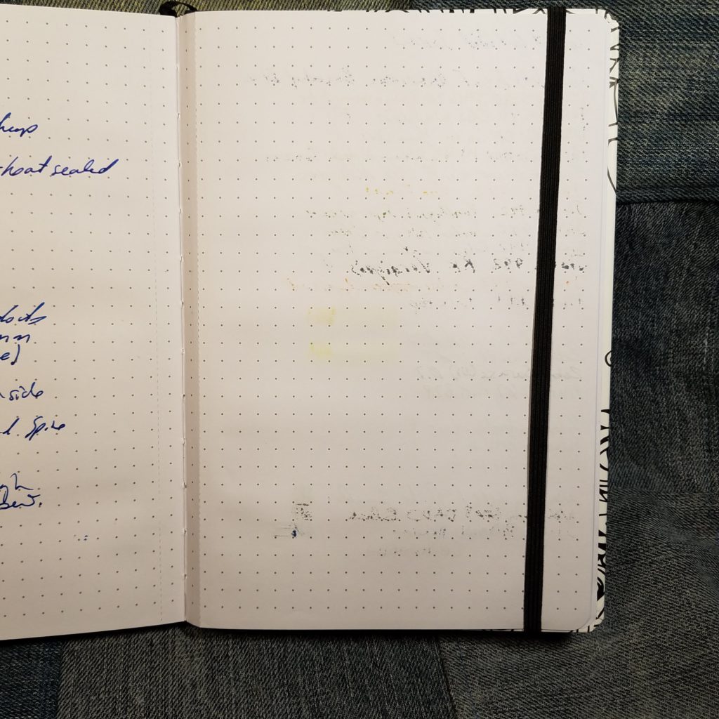
The paper is very thin. All the inks I used had show through on the back side of the page. It’s not so bad that the page is unusable, just very obvious, particularly with black ink.
Complaints aside, this paper feels great with everything- even pencil and ballpoint. It’s smooth with a hint of tooth. Even rubber stamps perform well on this paper. In fact the variety of stamp inks I used on this paper responded well- dye, pigment, and Staz-on. The paper takes a great impression.
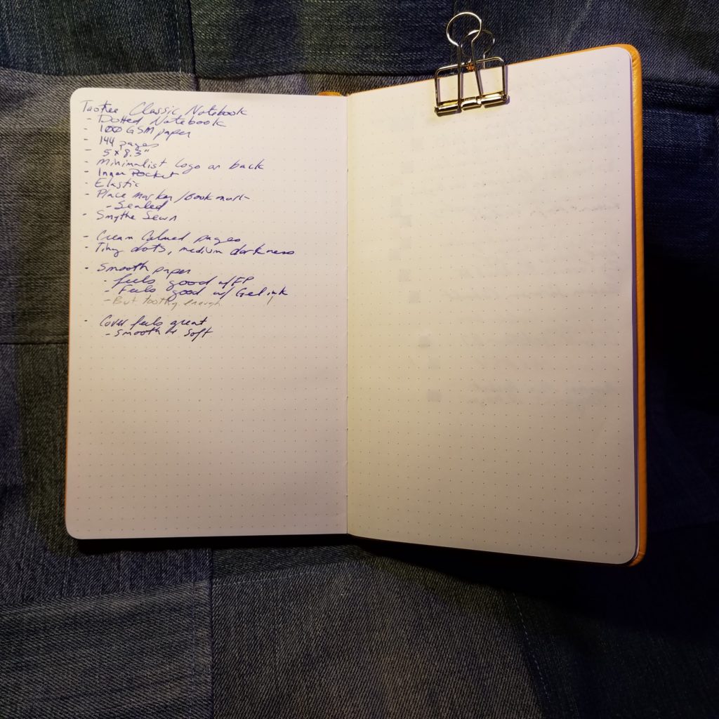
The dots are tiny and the palest of grey. They completely disappear behind any writing, which you know I love. The creamy shade of the paper looks great with all the colors of ink I’ve used and graphite looks great on it too.
Overall, this is a perfectly acceptable notebook. I like the pale gray dots, that the pages are numbered, and the feel of the paper. The generous page marker and sturdy pocket are great too. The elastic left something to be desired but that could have been due to age and storage. The price of $$$ is within range for hardcover A5 journals with quality paper. If you watch the stationery sites you can often find them on sale.
This is a nice journal, it’s just not my favorite.