Tag Archives: baron fig

Review: Monteverde Gel Ink Refills

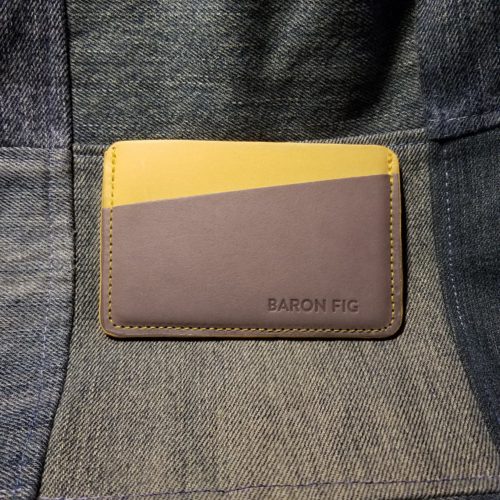
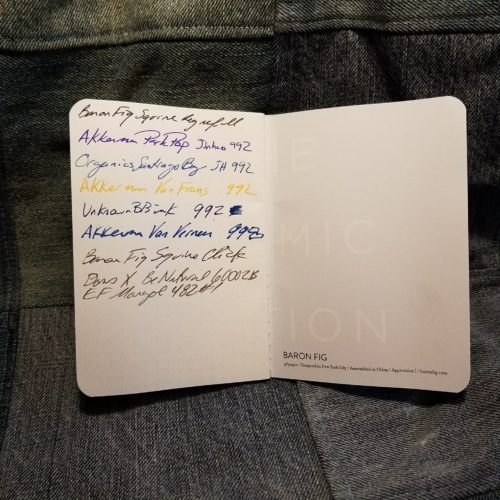
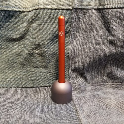
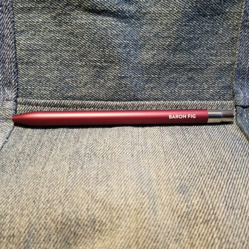
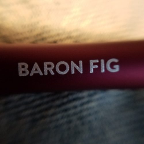
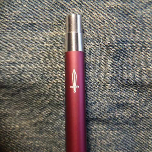
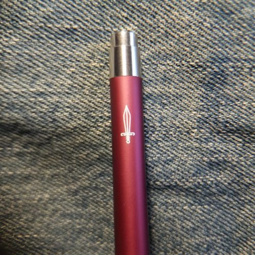
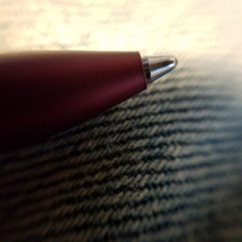
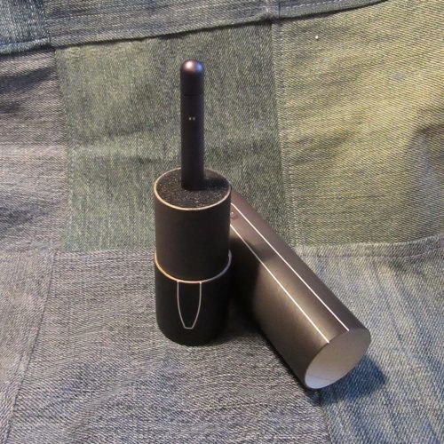
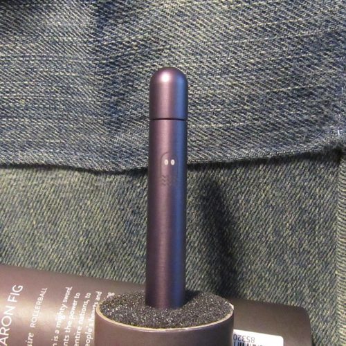
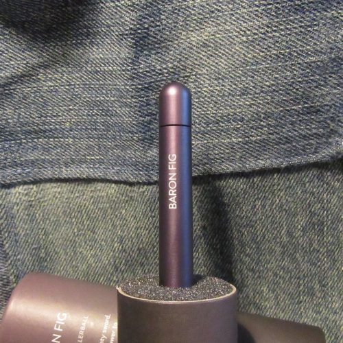
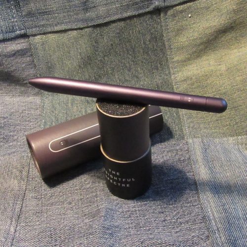
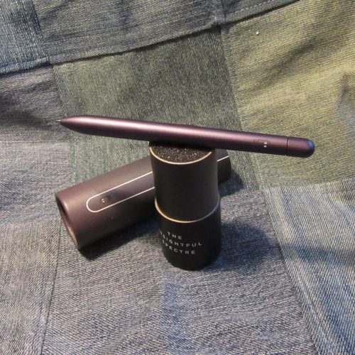
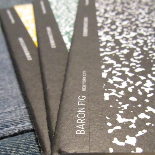
I like gel ink. I want to use gel refills in all my pens, when possible. Unfortunately, many gel refills don’t fit pens like the Baron Fig Squire and Click, or Parker Jotter. Either the tip portion is too thick or short, or the body of the refill is too thick for the body of the pen. Enter all the Parker style refills that use gel ink. Monteverde is just one option.

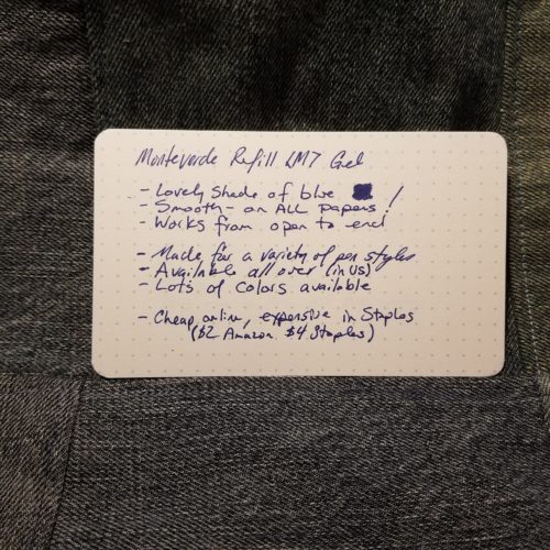
Monteverde refills are available just about everywhere from Staples to Walmart (online to Amazon and every fine stationery store. The prices seem to fluctuate wildly. I picked up a 2-pack in the clearance section for 50 cents, but normally a 2-pack is about $8 at my local Staples! I found 5-packs on Amazon from a variety of sellers for about $14. Clearly, online stores are the winner when it comes to offering up Monteverde refills.

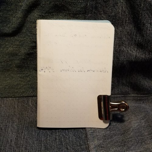
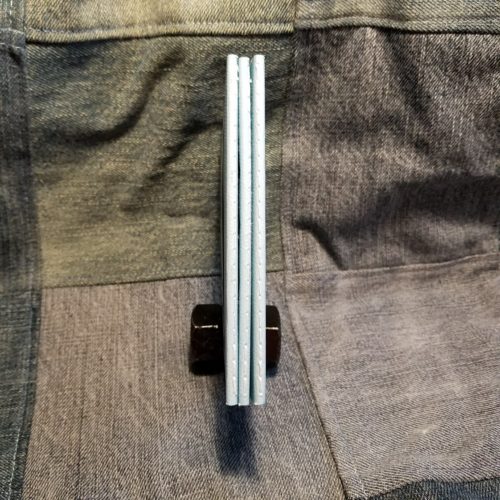
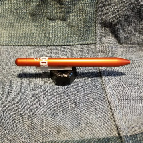
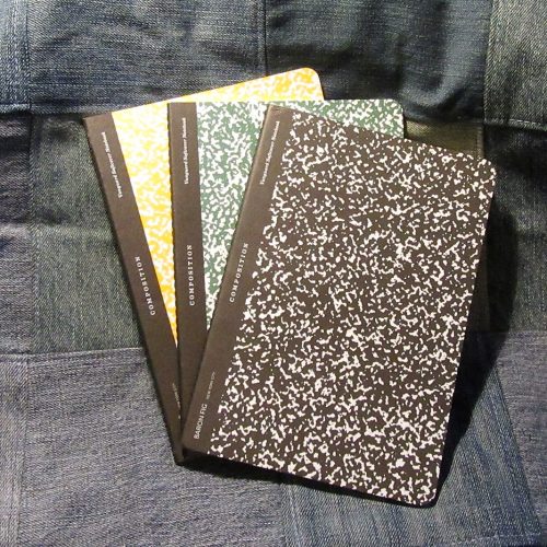
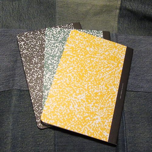
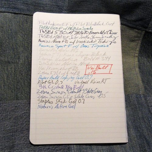
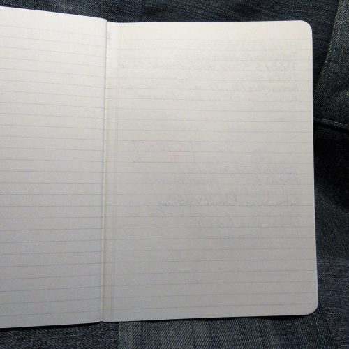
The gel refills are available in a vast variety of colors, mine are blue. The next package I purchase will be blue-black, but they offer purple, green, red, teal, black etc… The blue is lovely. The gel ink is smooth on all the paper I’ve used, including the finest cheapest paper we use at work. The ink has flowed smoothly from the moment I took the little waxy blob off the tip to the point I drained the refill.  

These are great refills, but not the cheapest. They range from $2.80 to $4 per refill. To me the price is comparable to the regular Squire refills and they have the performance of gel ink on cheap paper which I’ve bloviated about before this post, but gel ink on the crap paper at work works better than liquid. End of story, these are a great refill and worth every penny to me. You won’t be unhappy with a Monteverde P44 (Parker style) refill. Continue reading

Review: Baron Fig Card Sleeve

This review is a little outside my typical reviews. That said, I think you’ll appreciate it.

I have carried a front pocket wallet for many years. I started in college with a zippered card sleeve that was intended for student ID and maybe a few other cards, plus a zippered pocket for your cash. It was integrated into a keychain. I had several different versions over the years, but I always liked the form factor.

After I graduated I switched over to a card sleeve with an integrated cash clip. I liked these more but the clip always wore a hole into my jeans or irritated my leg. Around 3 or 4 years ago I switched over to a Cortier leather card fold, basically, 2 card sleeves linked that folds over on itself. Cortier is a Massachusetts based leather goods maker that has set my bar for all leather goods. Which is to say, my bar is set ridiculously high when it comes to leather goods. (WE could also talk about One Star Leather too. Or hell Galen Leather.)

The BF Card Sleeve (BFCS) arrives in perfect packaging, a little gray cardstock envelope. It looks lovely. Inside the wallet is swaddled in tissue paper, The presentation is perfect for gifts. I felt like I was opening a gift for myself.

I picked the gray and yellow colored wallet. The exterior is gray with bright mustard yellow inside. I love the coloration of the leather. I’ll make a few notes about the feel of the wallet. The maker uses a very different leather than most that make things by hand. This leather is crisp and stiff. Unlike most artisanal makers who use cordovan or shell leather which is supple soft and has an amazing hand feel, you won’t be petting this wallet. The stitching is thin and looks like regular machine stitching, unlike the thick thread I’m accustomed to seeing from the artisanal makers.

I admit I was skeptical that I’d like this card sleeve. It was too crisp too slim, too little. I was able to slip 9 cards into the various pockets. The interior slot seems to be sized for cash, but I’ve yet to carry any cash with it. Instead, I’ve got my license and insurance cards in that middle slot. One slot holds the 3 credit cards I use regular, the other my gas card, a loyalty card for the local cafe I love, and my library card.* Whe I went into Cambridge to visit a friend, I slid my Charlie card into one of the outter pockets, I was able to scan the card withoutremoving it from the sleeve. Perfection.

What I really love about this little card sleeve is that it is lightweight and disappears into my pocket. Unlike other card sleeves I’ve used, there isn’t anything that protrudes to wear unsightly holes in my denim, nor does it cause unseemly wallet bulges in my front pocket. It is lightweight and feels great. The stiff leather grips the cards well but allows for them to slide out with ease, but they don’t fall out.

You can get yours over at Baron Fig. At $35 it’s not a bad deal for a well-made card sleeve that really does disappear into your pocket. The hardest part of owning this wallet is figuring out what cards you are going to shove into it.

Continue reading

Review: Baron Fig X Codecademy Computerworld LE Vanguard

I’ve reviewed a few BF vanguard sets in the past. This set sports the same great paper and soft but sturdy card cover with stitched spines. The big difference in this set is that they arrive in a box, instead of belly banded and shrink wrapped. If you are seeking a lovely presentation for a gift, this is a good one. The interior paper is printed with a nicely sized ruling with numbered lines. The numbers are pale enough that if you wish, you can write over them and it won’t interfere with reading your writing later.

What is truly enjoyable about this set are the covers. Each cover sports a different theme and intricate artwork that I can’t help but stare at as I think. The covers are colorful but use muted shades of all the colors used. Teal, yellow, and magenta call back to the late 80s and early 90s while the interior numbered lines are a full-on thrown back to dot matrix printer paper I used in elementary school.

The back cover of each book is one solid color with an icon in the center and the title of the set in the bottom center. It is a simple reprieve from the business of the front. The inside covers sport a pale shade of that back cover with info about the cover in white text. Overall, the covers are lovely.

This is the first Vanguard set I’ve received with a sheet of stickers. I think it is a great addition to the set. BF has pulled out little icons from the covers and made stickers. They are a lot of fun.

Overall this set is a lot of fun. It looks great and has amazing paper inside.

Continue reading

Review: Baron Fig LE Apprentice The Atomic Edition

Baron Fig hasn’t put out an Apprentice in years. This is a great new edition that I love. My RSVP cohost, Lenore might hate the planetary atomic model but I love the look.

The pale baby blue textured cover feels great in my hand. The tactile feel of all the BF covers really draws me in, this is no exception. I find myself picking the notebook up without thinking about it. The spine is stitched, which I’ve blathered on about my favorite of all the pocket notebook bindings.  It’s sturdy and mine are all straight and well done.

Inside the covers live 48 pages of cream-colored dot grid paper. As usual, the grid is pale gray and fades behind any writing. The paper is great with pencil, ballpoint, gel, and rollerball, but I found that my fountain pens tended to have a great deal of show through and even a bit of bleed. It doesn’t feather so I use my EF and F nibbed pens on it and ignore the show through.

My big problem with the BF Apprentice isn’t the bleed or show through with fountain pens, it is the size. It is about ½ inch (1cm) too short and roughly ¼ inch (5mm) narrower than most other pocket notebooks. The size feels precious and small. The size feels great in hand but it doesn’t fit any over my covers and slides down deep into my Nock FodderstackXL. Of course, this means that if I want to slap this into a cover I’m stuck using the BF Guardian.  

Overall, this is a worthy addition to the scores of pocket notebooks on the market, but I think BF missed out by not making this the standard pocket notebooks size. The stitched binding could have made this a serious contender but instead, it falls a little short and narrow. Continue reading

Review: Baron Fig Mysterium Squire

I’ve previously reviewed the BF Squire pen, so it’ll be no surprise for me to say that I like this pen. Let me tell you more about the Mysterium. A friend of the blog, Harry Marks wrote a lovely short scifi story for the pen, you can head to the previous link to read it, everyone should, it’s lovely.

First off, it is a lovely shade of burnt orange. Orange may not be my favorite color but this shade is less brilliant and more toasty and warm than safety cone. It looks great with all of my stationery items. It goes well with the Stone.

Secondly, it’s got a d20 engraved in place of the Squire sword. Don’t know what a d20 is? It is a 20 sided die, and it is integral to playing certain roleplaying games. To get geeky on you, BF rolled a 20 on this pen.

Finally, it is filled with the Schmidt P8126 with black ink. Of the rollerball refills available, this is one of the best. It is smooth and free flowing and deep black. It works perfectly on all BF paper, plus anything else available.

The twisty mechanism is smooth and satisfying. The big problem that I have with the Squire is that if I toss it into a pocket the twist mechanism deployed in my pocket and the free flow of the refill destroys my pants. As a result, I have a Tofty clip on mine, it works but is ugly as hell. Continue reading

Review: Baron Fig Squire Click

Baron Fig announced the clicky version of the squire last week. When I received the reviewer announcement I was excited- a click mechanism is my preferred pen point deployment method. I immediately asked BF to YES PLEASE SEND ONE!

Mine is in the fig wine colorway. You can also get charcoal gray. The fig wine color is burgundy or maroon depending on your level of fancy. The anodized coating is really tough. I tested it by slipping it into my Nock Fodderstack XL pen pocket along with my MetalShop CT Twist Bullet Pencil. I carried it around like that for the week, sitting on the two as I was at work and around the house. Some aluminum transferred from the Twist bullet, but there were no scratches.

The most important difference between the Click and the standard Squire is that the Click is substantially smaller than the standard. It is narrower and lighter and weighted toward the click and slightly less balanced than the standard Squire. For smaller hands, the Click is a great pen. Inside it uses a standard Parker refill or the Schmidt Easy Flow 9000. If you are going to use a ballpoint refill this is a great refill. It’s smooth and dark. I do wish it used the regular Squire refill but if I’ve gotta use a ballpoint the Schmidt Easy Flow 9000 is great.

My least favorite part of this pen is the nock. I prefer a nock with a satisfying and notable click, this nock doesn’t deliver that at all. If you like the Kara’s Kustom nock, it’s the same. It works really well and feels good, but doesn’t give me the sound I want in a nock. The Click would be made substantially better with the addition of a clip. The lack of clip means that I need to stash it into my Fodderstack XL or get one of the pen cases BF sells. (Or a Tofty printed clip.) If I don’t get one of these options and it is loose in my pocket the point is deployed and well, the ballpoint is less messy, but still marks up my pocket and wallet.

Overall, I like the Squire Click. Because it is smaller and lighter than the standard Squire I find that I can write with it for longer periods of time without hand fatigue. It did take a bit to become accustomed to the balance but now that I am, not an issue. The Click is a sturdy well made pen. It retails for $45.

Continue reading

Review: Baron Fig Lock and Key LE Confidant and Squire

Let’s start this review off with a statement about the internals of the Confidant and the Squire- they are exactly the same as any standard edition. The Lock comes filled with BF’s dreamy creamy paper with enough tooth for all your penciling needs and enough coating to pair with almost any fountain pen. This paper is where it is at for both graphite and ink. The pale gray dot grid is a tad narrow but disappears into the background of your writing. Perfection. The Key is loaded with a Schmidt P8126 refill and the standard spring loaded twist mechanism, that works smoothly.

The Key (Squire) is machined out of solid brass and is uncoated which lends itself to forced patina as well as natural patina via use. The weight is more than double a standard Squire despite the extra weight the pen is still ridiculously comfortable to use. Because of the balance of the pen being toward the front end, I don’t find that it tires my hand at all in use. I’ve spent several days working on characters and an outline with the pen and filled many composition book pages with it. The pen is perfectly comfortable.

The Lock (Confidant) is covered in dark forest green fabric that reminds me of Maine Balsam Fir trees at dusk. The debossed maze on the front and back cover lends a layer of structured tactility that begs for the cover to be stroked. The end sheets are printed in gold foil that matches the bright brass of the Key. The subtle linen texture of the end sheets paired with the smooth foil is a lovely touch. Again, it’s tactile and I find myself absentmindedly stroking the pages. The ribbon bookmark is golden in color and typically about an inch too short for my taste.

The pairing of the Lock and Key in terms of look and color is perfect. The gold of the brass on the dusky forest green is a perfect combination. The brass shines against the deep green color and looks great. The combined tactile nature of the Lock and Key is fantastic. I want to pet my journal and fiddle with the pen. The weight of the pen is great and the whole package feels good in the hand. Continue reading

Review: Baron Fig LE Squire Spectre

If you have been listening to my podcast, RSVP, then you know how I feel about the BF Squire. The pen is perfectly comfortable. The weight is nice. Just heavy enough so I always know it is there, but not so heavy as to tire my hand. The size is perfect for my hand. The pen is short-ish, if you have really big meaty paws, this might not be the pen for you. The weight is toward the front of the pen for good writing balance. It feels wonderful. The twist mechanism twists the refill down just enough to expose the point without excess. I find myself fiddling with the twist mechanism in much the same way one might fiddle with a clicky nock. There is a slight gap between the nock and the body of the pen. It has been noted on other blogs that the pen should be seamless, but I see the slight gap as part of the aesthetic. The gap is perhaps .5mm. Though I tend to cart my Squire around in my pants pocket the anodized finish as remained perfect. Not one chip, ding, or scratch mars it’s surface. I would suggest that you NOT cart your Spectre in your front pocket, lest you end up ruining as many pairs of pants as I have. The motion of it rolling around in your pocket is enough to twist the nock, expose the point, and leave a nice large black stain on your favorite pair of camel colored khakis. Not only does this suck most of the ink out of an otherwise full cart, the refill never quite works the same. If you are wondering if the ink washes out, it does not. The Schmidt ink bonds quite well with cotton. The Schmidt refill works really well on the garbage paper at work, which is why it ends up in my pocket so often. It is also quite nice on Baron Fig’s paper. I quite like it in my Confidant journals.I find that the ink tends to bleed through on other paper- Write and Field Notes as 2 examples. The HP Laserjet I use in No Brand Notebooks handles it’s liquidy black ink just fine. If you are not a fan of the Schmidt cartridges you can buy many Parker style refills. Be careful though, many will not fit due to the super narrow opening at the tip of the Squire. Itoya and Monteverde refills both fit.As for the Spectre, I really dig everything about the pen. The little engraved ghost, the weight and feel. I was a little surprised at the color. Many of the images online show it to be BLACK the actual color is a deep dark purple black. The color is warm and looks a lot like graphite. I like the color but it was not expected. While I found the green of the Experiment too eye catching for my workplace the muted purple charcoal shade is perfect for work. It’s professional and flies under the radar and most people won’t peg this as “fancy pen.” The cost of the pen is $60, which makes this one of my more expensive pens. But any pen you refill is an investment. While my Pentel Alloy will likely break after a year of use, the Spectre will continue working for years and years of use. It should be noted that the pen does not have a clip or roll stop. The slightly narrower nock doesn’t keep it from rolling off a desk top. Because it is weighted toward the front, it will land tip first, likely ruining the refill inside. Baron Fig does offer a little pocketable leather case for the pen, which is a solid investment, if you intend to pocket carry. I quite love my Squires, I’m lucky enough to have an Experiment and a Spectre. They are solidly made and worth the investment. One of the great things about using a refillable pen is that you get to pick what refill you want to use- from Monteverde to Itoya to Parker to Schmidt you have plenty of choices here. Continue reading

First Look: Baron Fig LE Archer No.2 Pencil

With limited editions, my focus is on evaluating the aesthetics of the look and less on evaluating the internals. Viarco makes Baron Fig pencils. I’m not a huge fan of Viarco pencils, I find them to be a tad on the scratchy and gritty side for my taste. Which is BAFFLING because Viarco is capable of creating the smoothest and prettiest graphite as they do with some of their art graphite. Their Art Graph Sticks are creamy smooth brilliance. They are capable of SO much more.As much as I love the look of the Prismatics, the No.2 hits me in the feels. There is so much to love about this pencil. Part of what I love is that pencil nerds have been asking any of the makers of limited edition pencils to do something with a classic yellow school pencil. No one has delivered until now. Baron Fig not only nailed it, they hit it out of the park. This pencil is steeped in American school pencil tradition. They went with a matte but bright finish. The yellow  is bright or light chrome yellow versus the mid or dark chrome yellow we usually see on school buses and school pencil. It’s cheerful and put a smile on  my face. The green end dip and imprint are light chrome green. It’s also super bright. The color combination is classic. It calls out to Dixon’s Ticonderoga, General’s Badger or their Semi-Hex, and John Deere tractors.* the change in colors for pencils- the Ticonderoga uses foil in its imprint and a dusty shade of green on the ferrule. While the Badger sports green foil and a gold ferrule. IN contrast the No.2 has no ferrule at all, just a simple green end dip that perfectly matches the imprint. Unlike the budget pencils this has a thick application of the matte lacquer. Inside the matte lacquer is, for the first time, good old cedar.

The core on mine were mostly centered, though I had 2 pencils that were pretty off center in my dozen. I tested the No.2 out on a variety of paper from Baron Fig’s Vanguard and Confidant, to Write, to Field Notes, To No Brand Notebooks, and finally P+G index cards. The results were surprising. The 3 that I tested and used extensively for several days were much less gritty than the previous Archers I’ve used. As usual the archer’s perform best on Baron Fig’s own paper, the smooth yet toothy paper is optimum for gaining the darkest line with the least amount of effort. While smoother paper like the Write pocket notebooks forces the user to use much more pressure to get a good dark line.

For a pencil I wasn’t expecting to like but enjoyed quite a bit more than usual. The core is much more consistent and not gritty as in previous versions. The look is awesome and definitely reminds me of old school pencils. Thanks Baron Fig for the trip down memory lane. Continue reading

First Look: Baron Fig Vanguard The New Composition

Here’s what happened, I love my composition notebooks but I was frustrated with the often nasty paper inside. I thought, “You know who could make an awesome updated version of the composition book? Baron Fig.” I picked up my phone and called Joey and Adam and told them my idea. They told me it was great and awesome. That they’d read my obsessive composition notebook review, then let me know when it was going to happen. Okay, so that’s not really what happened, but it doesn’t hurt to think that maybe the guys over at BF read my obsessive reviews of composition notebooks. You know, where I harp on the amount of white to black in the marble and the size of the tape on the spine… I mean that probably didn’t happen either. But these Vanguards feel like the guys at BF crawled into my head and put all my thoughts about awesome composition notebooks into play. The ratio of color to white in the marbling is great, the black “tape” on the spine is almost perfectly proportioned for the size. I’m just so  in love with the cover style. They even fit my requirement that the spine is stitched. Inside is that great toothy but smooth enough for fountain pen paper. The Vanguard paper seems to be a tad thinner than the Confidant paper, but doesn’t feather with fountain pen inks. The flagship size is perfect for tossing into a bag, or if you must, the pocket of cargo pants. The only downside of these is that the cover is thin and not the stiff hearty cardboard comp books should be made from. Luckily they are a smaller size so the weight of the cover material is less important. These notebooks are a fun miniaturized twist on the larger traditional composition notebooks.  They look lovely with the Baron Fig No.2 pencils. Which I’ll review in their own post. Anyway, head on over the Baron Fig’s website to pick up a set.So some deeper fuller composition book analysis is needed here. Is this a comp book by my own standards? No. It is a good update on a comp book. It lacks a few things that I use to determine a true comp book- the size is too small (though there are mini and 6x9ish comp books), the spine is not taped, and finally the covers are soft and not card. It also lacks the standard generic label on the front. Even with all of that I love these. I’m glad they did this on the Vanguard and not a Confidant because this is the closest thing to a comp they offer. A marbled Confidant would not be in the tradition of comp books, in the same way that I cannot see the Kickstarted Comp as a composition book. I think that the Baron Fig Composition is a good modern take on the old school composition notebook.

Continue reading