Category Archives: Inspiration

Technique-I-can’t-wait-until Tuesday: Mini Polaroids with the Pogo

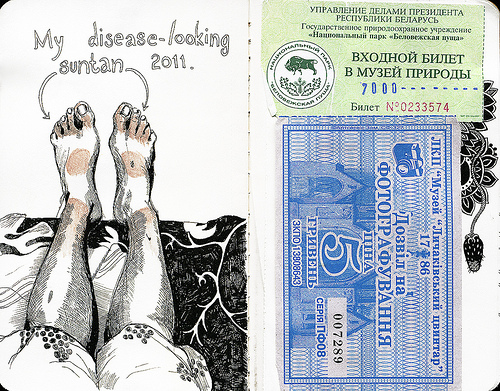
I was over here reading Crafty Moira’s site and I stumbled upon her tutorials, this one caught my eye– pogo printer yes, making it look like an old school mini Polaroid, why yes thank you very much.

After checking it out, I realized it would be cool to have the pogo print the square image and then simply trim off the excess. (read, I'm too lazy to go get my white cardstock.) After some trial and error I figured some stuff out.

First. Don’t work the actual 2×3 inches of the print, you’ll get a grainy print. You need to work larger than the print size so the pogo can compress it down, or something like that. I chose to work in GIMP (a free photoshop clone that kicks butt) with a “canvas” size of 4×6 inches, which is the same aspect ratio as the pogo print, which is 2×3 inches.

Then I opened a photo, I cropped it square and then cut and pasted it to my 4×6 blank “canvas.” It was over sized, I then selected “resize layer” and resized the image to 3.375 inches square. This will give you a 1/8th of an inch border around the sides of your image, and about 1 inch at the bottom. After this you have to flatten the image and then save it as a jpeg. Now send it to your pogo.

When it prints you’ll notice several things. First the pogo has a hard time with square edges, the top edge of my images are all just a hair off square. I don't mind this, but if you do you may wish to go with Moira's original instructions. The second thing you’ll notice is that the bottom part of the image is really long. You’ll need to trim the bottom so that it is ½ an inch high or so that the whole thing is 2 3/8ths tall. Trim with a ruler and an exacto and voila! You have a mini Polaroid, from a Polaroid Pogo. Sawweet.

In Journal Revolution there are instructions on how to make a Polaroid mat from cardstock for a perfect polaroid full sized image. It looks awesome too.

Some tips for printing you want the image to be at 300dpi, if you let the program autoselect 75 or 150 dpi the resulting print will be pretty grainy. I’m pretty sure it has to do with how the pogo processes the images to its format. In any case the higher the DPI the better the pogo print will be. Also be sure that you save it as a jpeg, if you don’t the pogo will not print it at all, its little lights will blink at you, you might get frustrated because you don't understand it's blinking light, unplug it and then turn it on and off*.

So as I was doing this I realized that I could really add any color to the back ground. I remember Polaroid did some neutral gray and black bordered polaroids at one point, but what’s to stop me from making the background any color I want? Or what if I wanted to add some text to that little area below the photo? Or what if I tweak the image in GIMP to create a pinhole effect?

There are so many alternatives to this that it’s crazy.

Here are a few of the images I made, ready to go for anyone's pogo.

Arcadepogo
Arcadepogo
Arcadepogo
Arcadepogo
If you don't have a pogo you could create your blank canvas as 4×5 inches and then scale it to the "correct" Polaroid size of 3.5×4.25 inches. Then you can print it on any printer or load it to a thumb drive and take it to CVS/Walgreens/Walmart/or anyother store with photo printing. (Walgreens has a service where you can load a bunch of photos to a website, place them on an 8×10 sheet of photo paper, and then print the whole thing for a couple of dollars. All you have to do is pick them up at the store in a few hours, they will ship to you for a few dollars.)

Continue reading

Wordy Wednesday: Learning to Embrace Fail and Fast

One of the important things I’ve learned over the years about art is that it’s okay to make bad art.

It’s okay to fail.

It’s part of the learning process of art.

Back when I was in college I pushed myself to make every piece of art I approached a successful work. I worked hard on things and labored over stuff and I grew to hate it. There were few pieces of art that I really liked when I was in college. Over the years I worked on less and less outside of class until my last year where I became fascinated with Matisse’s collages and started making my own with crayons and white glue. I loved making collages. The great thing about it was that it was easy to make something vaguely attractive.

After I left school and I worked with kids I realized that a good part of what I had learned was how to fail and how to make really really really bad art.

Some of the stuff I made in college was awful.

Really bad awful.

I avoided painting class but the funny thing is that some of my more successful pieces from college were from painting classes.

I’m not sure why I avoided those classes. Perhaps I didn’t want the challenge or I was too distracted by all the ohh shiny stuff of other stuff I hadn’t done yet- carving plexiglass? Why, yes please!

I gave myself a challenge today, to complete a 5x7inch painting of stuff in my office while on my lunch break. Before my break I noticed that my hand sanitizer bottle and tabbed paperclips made an interesting composition. I quickly set up my pochade box, grabbed a panel and sketched out the little bottle and clip, super rough. It took less than 5 minutes to sketch them out. I squeezed out 3 colors: titanium white, unbleached titanium (titan buff), and cobalt blue hue. I grabbed a crappy #1 bristle brush and dipped into the blue, applying color in bold strokes. I then added the unbleached titanium in dabs and small strokes, allowing the color to blend directly on the page. As I worked the thinner layers of color  dried the thicker layers stayed slightly moist. I scrubbed color here and there, dabbed it in other places.

At the end of 30 minutes I snapped a picture of my piece and posted it to twitter.

If I spent another 30 minutes on this painting it would be inherently better. I’d add more layers of color, maybe some glazes and maybe add some other colors. I could firm it up and make into a finished piece.

That defeats the point of a piece like this.

A piece like this is meant to stretch your skills force you into looking in broad bold strokes and attacking the canvas/paper.

Image0
There is no mincing around when working small and fast. There is no going back and touching up  little slips here and there.

It’s go.

Here’s the thing, I’m not beating myself up because this isn’t my best painting ever, instead I’m looking at it as a starting point. From here I can only get better. In 30 minutes I’ll be able to produce something neat.

But I won’t kick myself if I fail.

Technique Tuesday: Cigar Box Pochade

I’ve been on the hunt for the perfect cigar box for a pochade box for quite some time now. The thrift store I shop at often has cigar boxes for just a few dollars and I always buy one if they have one. I built my first pochade box back in 2009 with an empty wine gift box, it’s far too big and heavy but it is sturdy and good for short travel but not long walks.

Last night I found a nice small cigar box, wooden and very sturdy. When you look for a cigar box look for one that has a hinged top that is not just one flat piece of wood, that way you can replicate my very easy pochade.

_6190646

Once you find a box you’ll need the following tools and materials:
5/8th hardwood square rod/dowel
Saw
ruler
Pencil
Glue
Sand paper
Exacto knife

The lid will form your easel. Start by opening it to where you’d like the easel to rest. Use this as a guide for where your 5/8th wooden rod will sit. The wood stock will form the rest for the base of your easel. The lid will rest against the wood and be supported. For one of my boxes the wood pieces came 1/16th of an inch from the top of the bottom part of the box. For another box the wood sits flush with the bottom of the box.

_6190648
_6190648
Measure this and cut your wood to size. Depending on your box you may need to work around the hinges. In my case I cut 2 pieces of wood to create vertical braces. I sanded the edges smooth and used wood glue to adhere them to the box. Any glue that squeezed out I wiped off with a damp rag. I put them box under weight and allowed the glue to dry over night.

I cut a piece of plastic to fit inside the lid to act as a palette. I then cut a notch in the inside lip of the box to securely grip the palette. I did this with an exacto knife.

_6190656_6190665 
This box holds a large water bottle, 8 small tubes of Liquitex basics paint, a rinse tub, a small tube of acrylic glazing liquid, some rags, and soap. I added a mini bungee cord to help hold any canvases or boards in place. This pochade would easily hold 6 full sized tubes of paint. The water bottle could be discarded and more paint or mediums added.

_6190658
_6190658
_6190658
I may end up getting rid of the water bottle as it adds a lot of weight to the box and I always carry a reusable water bottle with me. This would allow me to add a mist bottle and a larger bottle of glazing medium. I carry 2 or 3 brushes in a brush wrap, 1 small round, a flat and a filbert.

In case you missed it, all I did for this was figure out where I wanted the lid to rest, cut 2 pieces of wood and glue it to the backside.

Beverly Arts Festival 2011

I spent the AM at the Beverly Art Festival, a yearly arts event here in my little city. I was struck by the contrast in the “nice” part of the city and the other part of the city. Cabot street has been beautified and streets blocked off for the festival, which routes traffic through the other parts of the city. It would be really nice to see the city expand the festival to the small park just off the main street and have some live local bands in the Gazebo. (Just a thought.)

I was able to meet a few really neat artists and peruse their wares.

The following people were of interest and had some great work for sale:

Altered Perceptions– a couple of ladies who make altered books and journals. Their work is very interesting and pretty affordably priced. It’s the first time I’ve seen a journal and thought, “That’s to pretty to use!”

Pins with a Past– jewelry made from found objects. ARGH GEARS so many gears, if I’d had the cash I’d have gotten a pendant. Very cool stuff.

Little House Art, aka  Tony Ziegler. He makes this fabulously simple art that he sells at affordable prices. He’s really nice too.

I also saw a local flamenco dance instructor and her students dance as well as the local Tae Kwon Do academy demonstrate their classes as well as their work. Check out my pictures for some high flying action shots and some graceful dance.

There were only 2 local food vendors there, a hot dog sales man and the local Indian place. Yum, mango lassi!

Technique Tuesday: Golden’s Tar Gel for Cult of Stuff

This week’s Technique Tuesday is an additive. I’m combining TT with the Cult of Stuff workshop on AJ ning. My choice of stuff to experiment with was Golden’s Tar Gel. It’s an additive that you mix with a liquid paint to get stringy lines that stay raised, think of Jackson Pollock, and you have the right idea.

I’d read that Tar Gel takes forever to dry, I don’t like my art journal to be out of commission for that long, so I grabbed a board and did one of my automatic continuous line drawings on it in sharpie. I’d had paper and thread glued to this board previously so there is a lumpy bumpy texture already in place.

I filed in the face portion of the drawing first with warm colors then added a flat dark blue background. To this I added the strings, bloops, blobs, drips, drizzles and splots. I mixed a good amount of color with the medum, so that it was thin and runny. I then loaded up my palette knife and dribbled away. It was fun to try and control the medium, as it really had a mind of its own. Sometimes large blobs would run off the knife, sometimes thin streams.

The interesting thing with this medium is that the drips and dribbles stay raised. I tried the heat gun on them but it raised air bubbles and the medium did not seem to like it at all. So I’ve put a fan on it to attempt to dry it faster. Hopefully tomorrow it’ll be dry enough that I can hang it and get some decent pictures.


  • IMG_3135
  • IMG_3136
  • IMG_3140
  • IMG_3137
IMG_3137


Technique Tuesday: Gelatin Prints

I spent Saturday making gelatin monoprints with my friend Jane. I’ve read a lot about  gelatin printing when I took a class in monoprinting in college. It’s a really simple and easy to use technique that lends itself to a variety of looks. Jane took a class with Tamar Etigen at LynnArts a few weeks ago. I found this blog about mixed media by Linda Germaine. Lots of good info on there.

First you need to make your printing plate. You need to make a big tub of unflavored knox gelatin, even sturdier than jigglers. You can buy bulk gelatin online but if you are only going to test this out, buy 3 boxes of Knox brand and mix it with 5 cups of water. This is the most expensive part of this technique. Follow the instructions on the package mixing. Pour it into a tray. we used those heavy paper disposable trays made for heating things up in a toaster oven.

Scrape the bubbles off of the top and let it harden.

We used acrylic paint and waterbased block printing ink. To use acrylic paint as ink you need to mix it with a product called retarder. You can buy Golden’s retarder for acrylic paint or speedball’s for block printing inks, both work. I liked the thickness of the speedball retarder. It allowed me to get heavy thick layers of ink on the block. The thin retarder from golden allowed me to get thin even layers.

You’ll also need a brayer. If you’ve never done any printmaking before you may want to buddy up and test this out with a friend, brayers are expensive and if you aren’t going to use them later for more printing, a pricy investment.* I preferred the soft rubber over the hard rubber.

Mix your paint and retarder well. I used about 1 part retarder to 3 parts paint. Different brands of paint used different amounts of retarder. But the 1:3 ratio seemed to work well. You can also add some gel medium to the paint to get very transparent colors.

Roll it onto the gelatin.

Here’s where things get interesting. What can you do with a solid sheet of ink? Well you can add masks and stencils to block out areas or lay down leaves from your nature walks. OR you can remove ink with q-tips, paper, old credit cards (careful not to cut the gelatin), papertowels, sponges, rags and well, just about anything. The possibilities are really endless.

Then lay a sheet of paper on it. Smooth absorbent paper works best, cardstock does wonderfully. Press down firmly. Peel it off.

Impressive isn’t it?

Spend a few hours playing with the technique. Don’t TRY to make anything. Just lay ink down, move it around, lift it up, put down multiple colors and finally print it. Don’t strive to make anything, just experiment. Make notes in your journal. What colors do you like? What colors lay over one another the best? What tool do you like?

This is one of those techniques that you can use to break up a creative rut, make background papers for collage or for you to allow happy accidents to occur. When you get an ink build up on the gelatin you can wash the ink off with tepid water and a sponge.

Ink mix0091
Ink mix0091
Ink mix0091
After you've made a few hours worth of prints you can wash the surface and toss it in the fridge for another day's printmaking. Or you can package it up and freeze it to use again. You can always melt it down in a double boiler and reform the plates. Don't ever put gelatin down your drains, it'll clog them.


Continue reading