This post is written by Lenore, one third of the 3 woman team that makes up the awesome RSVP Stationery Podcast. You can listen to Lenore talk stationery to you over here. You could also enroll at the University where she teaches chemistry if you really want to know more about the elements that make up the world around us. You can hang out in the RSVP stationery podcast Facebook group and learn even more about stationery!
My history with to-do lists and pocket notebooks has been a messy one. Like most of us, I often have lots of little personal tasks that need doing, some on a timeline, some not, along with tasks for my work including big jobs, small jobs, and big jobs that are made up of lots of small jobs. I’ve dabbled with various organization and productivity systems in the past, but have usually fallen back on some combination of a desk pad, a stack of index cards, a pocket notebook, or random scraps of paper, none of them organized in any intentional way.
So when I read Less’s post last week about her planner setup, [ed note this is from 2006 and unearthed when we were talking about OLD school GTD methods on RSVP.} there were three main components of it that leapt out at me and made the difference:
(1) The 4-page arrangement: two facing pages for lists, and the next two pages for random whatever. I needed this. One of my problems has always been the fact that there’s a combination of action items and random thoughts needing to be corralled, and like siblings in the back of a station wagon on a 13-hour road trip, these don’t play well together unless some thought is put into making space for them.
(2) The concept of marking things off *or moving them forward.* I don’t know why this had never occurred to me before as a formal part of a system; it always felt like cheating to mark something off one list and move it to another, but of course, it’s brilliant, because it keeps everything where you only have to look at one display, rather than checking back.
(3) Dropping in one vertical line for the margin, to check things off as they’re dealt with.
Of course, her setup, and the PigPog planner setup from which it’s adapted offer so much more than this. I was going to go the whole way, setting up my new notebook with sticky flags in the front, dedicated pages for various tasks, etc etc, but then it was four days after I had initially read her description and I still had no place to write down the first action item, which was, “Go back to Less’s blog post and set up planner.” So I realized that I needed to just take the very minimum components and get it going.
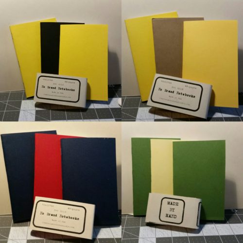
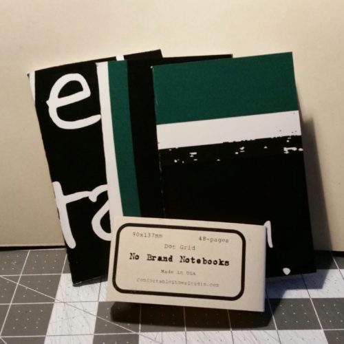
My setup is as basic as it gets: a dot grid No-Brand pocket notebook with a date in the front and my name and phone number in the back; 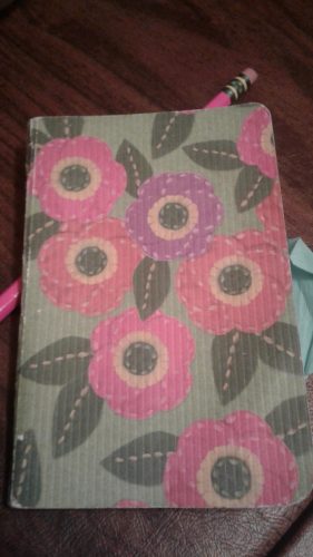
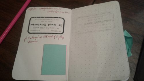
the first set of facing pages marked with margins and separated into four to-do lists;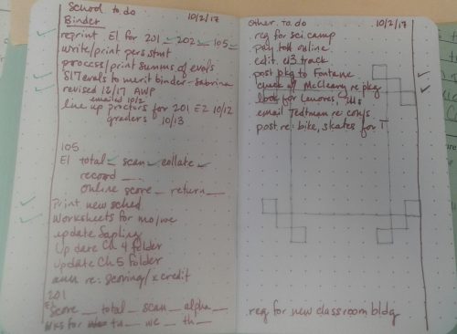
and the second set of facing pages marked as “idea pages”. 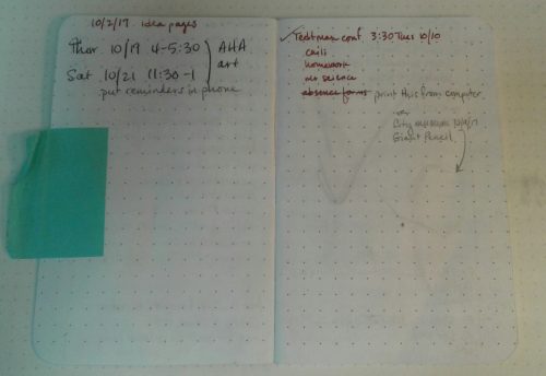
Because of the weird way my first day went, the “idea pages” didn’t get any play, while the to-do list pages were nearly full. But that’s ok because I just leapfrogged over to the third set of pages for my next set of lists. It was fine.
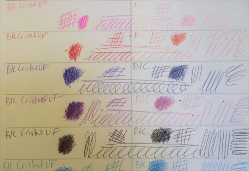
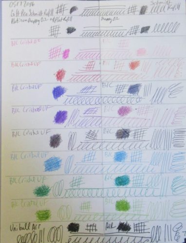
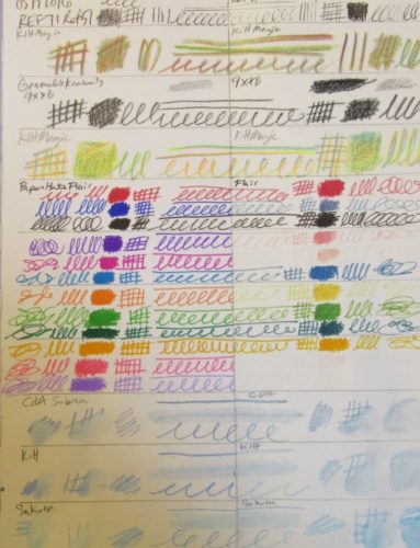
Less’s setup has dates in the margins for when jobs need to be completed; I rarely need this feature, since I have a sense of the necessary timeline for most of my tasks, and can naturally prioritize them in an appropriate way when I have them all laid out in front of me. And since the number of tasks I’m recording is small enough for me to have an idea where most of them are in terms of progress, I don’t need the dot-slash-X-circle kinds of codes a lot of systems use. For me, a check mark indicating completion is usually plenty. Similarly, I don’t need color-coded inks (and indeed this would be an impediment to my using the system, since I don’t normally carry a variety of writing materials.) For me, it was really critical to give myself permission to write—and check off—with literally whatever is handy to write with. (This is another point in favor of the pocket notebook, since I often feel pressure to match the ink and use good handwriting in a “nice” journal.) 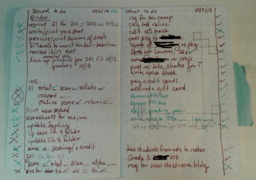 In my initial setup, I was thinking of three categories of jobs, but of course I didn’t allocate exactly the right amount of space for them so I ended up with some messiness when the longest list slopped into the next available space. Also, four lists is a more appropriate breakdown for me, if I’m going to use a single notebook for work and personal lists together. On my second set of to-do lists, I fixed that by starting two lists on the same page, one from the top line down, the other from the bottom line up. I left a space between them when they approached in the middle, and I still had to slop one list over to another area, but at least it was only one.
 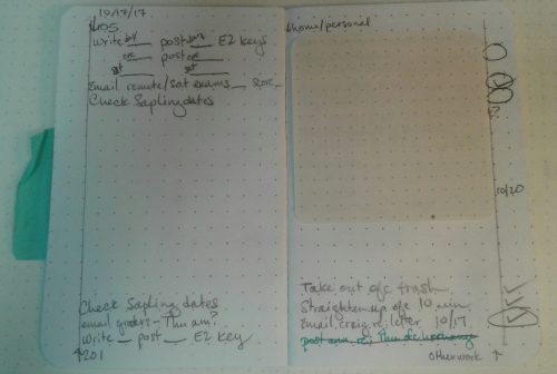 Oh, and here’s one of my revlations: when the pages started filling up with jobs, and then the margins started filling up with check marks, and I found myself staring down the barrel of opening a new page of to-do lists…I was reluctant to copy some of those jobs over. They were such little things, it really seemed like I should just do them instead of carrying them to the next list. I should just…do them…oh. I should just do them. Oh, yeah. I don’t know why it took me that long to catch on, I mean the point of a to-do list is to remind me to do things, but before starting this system, I was perfectly happy to let those jobs just sort of languish on an old list. I mean, I knew I needed to do them sometime, but…well, they were on my list, weren’t they? But now I have to put up or shut up. The day this dawned on me, I completed several small tasks that would normally have just fallen off the end of the day, again and again.
I use a few other adaptations that I haven’t noticed in other places (apologies if I’ve appropriated ideas without credit):
- For tasks that include several small sub-tasks, I often combine them on a single line, with spaces for check marks after each sub-task. Then when the whole series is done I can mark it off in the margin. For example, for an exam that has to be scored, the line might have:
“E1: Score___ Total___ Alphabetize___ Scan____ Collate____ Record____.”
Then if I need to move part of this to a new list, it might become
“E1: Collate___ Record___”
or just “Record E1.” 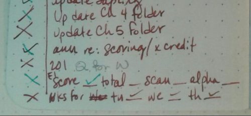 (b) I do use the PigPog method of keeping a sticky flag on the first page that still has active jobs listed on it. However I also literally mark across a page with a slash mark when everything on that page has been completed or moved. It helps me get over the uneasy feeling that I might be missing something.
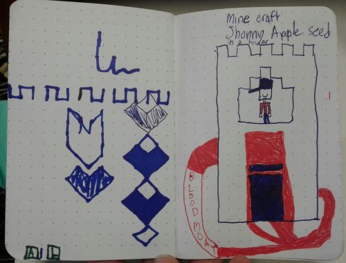
(c) For other needs that come up, I just start from the back of the book and use space as needed. Quotes, meeting notes, ink tests, drawings my daughter does when I’m trying to distract her at a restaurant, etc. Most of the things I might need to do in a pocket notebook are sporadic and unpredictable enough that I don’t need to invest mental capital in setting them up when I start a new book. The top consideration for me is low startup costs. The best planner is the one you’ll use, and my experience is that if I have to do a lot of organizational work before I can start my organizational work, I’ll close that loop by never doing any of it (and I’ll be back to a pile of index cards, a random scattering of pocket notebooks filling simultaneously, and a lot of dropped balls and missed deadlines.) 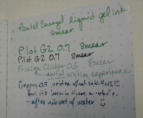
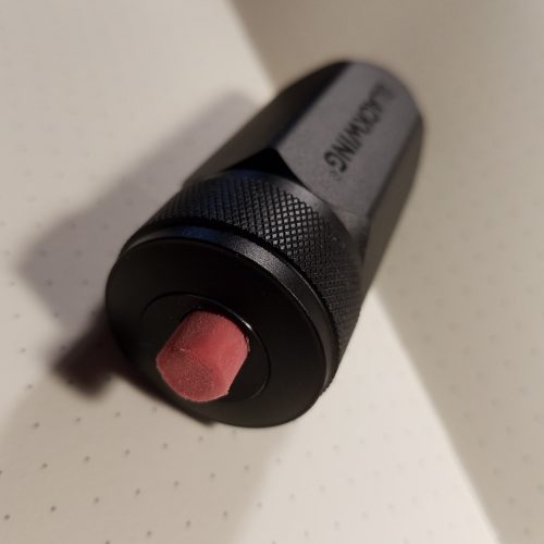
 (d) When I have a task that really has to happen pretty quick, particularly if it’s a kind of task that is outside my normal workflow (I’m lookin’ at you, insurance open enrollment period), I put a circle in the margin (with or without a date) to draw my eye every time I open the book. [Pic 8]
So, the tl;dr: new notebook; margin lines slashed in on outside edges of first two pages and date at the top (total setup time <30 sec); four categories of tasks, one category at the top and one at the bottom of each page; markthrough of entry and check mark in margin on completion of a task. A set of dedicated pages immediately after list pages for whatever brain dump/ephemera/info that needs to be captured and transferred elsewhere. A plan to use pages starting from the back for anything I need to use them for. Permission to be messy.
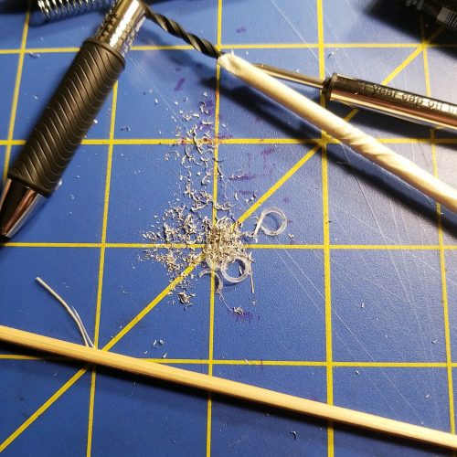
 I went through the process of stuffing every gel ink refill I own from Pilot G2 to Pentel Energel to Zebra Sarasa into the pen, and each and every time, blocked. I poked around with a skewer, and found that there is a lip down inside the tip area that holds the narrow tube that holds the pen’s tip. It is snug to stop the refill from rattling around. Since I really like the Energel Pro for sketching doodling and general writing, I measured it against the Schmidt P8126 refill I usually use for the Squire. There was exactly 1mm difference in the diameter of the tubes, and the Energel refill’s tube was roughly 1/8th of an inch.
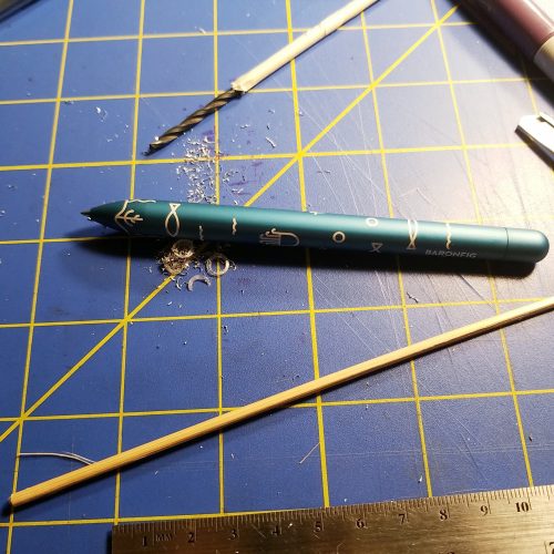
 Well, age and labor caught up with me and I have carpal tunnel as arthritis runs in the family. There are times when I can’t pull a needle though a signature of paper. The act of making stations in my signatures can be excruciating. The last time I made a serious number of books, well my wrist was in pain for days and I realized that I cannot make books in the same manner that I once did, so I put away my awl, sign vinyl, and stopped hoarding reams of paper.