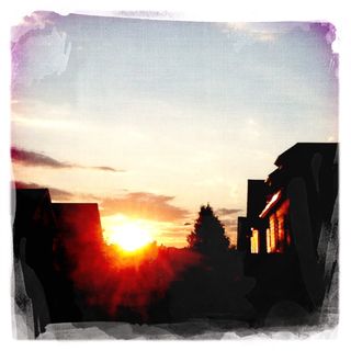
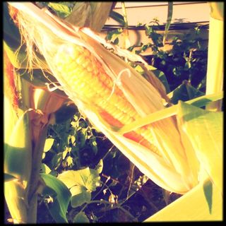
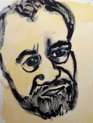
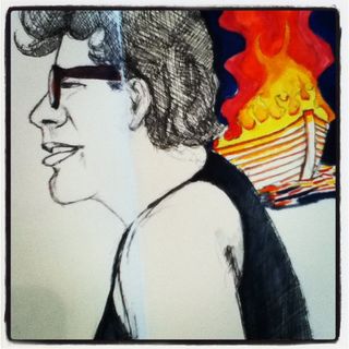
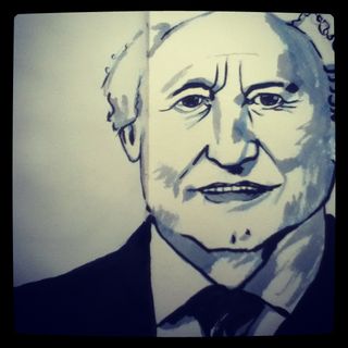
I’ve been working on some faces on ustream. Check them out
Category Archives: Uncategorized
Max Material Use
One
of the things I really like to do is get the maximum use out of all my
art materials. This means that I like to hack them for a secondary use.
AC Moore recently had a 55% off coupon. SCORE! I headed in and bought
yet another brush pen. At 50% off I spent $4.30 for a Niji brush pen.
Sweet price.
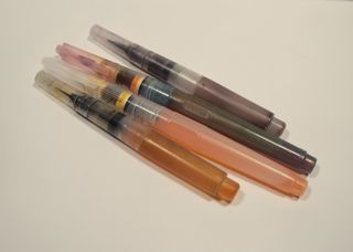
When
I get one of these the first thing I do is take an exacto to the body
and separate the restrictor that forces you to fill the pen via
squeezing it. I stuff that into the brush part. (Video on this later.)
This lets me fill the reservoir with water in my prefered method- small
squishy bottle. Or in the case of this particular pen, a bottle of ink
and a blunt syringe.
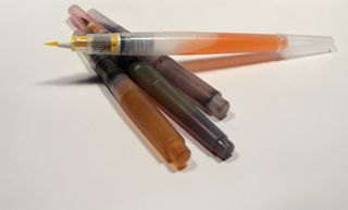
I placed 4ml of ink into the body of the pen, greased the threads with silicone grease and screwed the whole thing up.
I now have a brush pen full of ink.
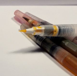
I
can fill this brush pen with any ink. Pigmented ink, acrylic ink,
fountain pen ink. Obviously it works best with ink that is watery in
thickness than super thick ink, but even super thick ink will flow, just
not as well. If using permanent ink you’ll need to make sure you clean
the pens out well and not let them dry out with ink in them.
Why would you want ink in a waterbrush? Uh, awesomeness.
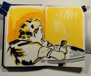
Personally,
I really like how the colors flow together and I get a really nice
amount of blending and feathering when 2 colors hit the page. I love the
loose brushiness that the brush pens force me into. I can’t spend time
worrying about anything, overthinking kills the look of the brush pen.
Worry is it’s enemy. It forces me to be free and to not overthink.
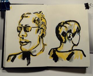
(I'm currently testing my yellow inks for lightfastness, or lack thereof. I don't expect much from these. I'm probably going to pick up a bottle of Liquitex or other brand of pigmented ink.)
Sketch Up #1
I attend a once a month artist meeting where a group of local artists get together and chat. Basically we shoot the breeze for a few hours in a low key setting. The gathering could take place in a bar but we get the use of a room at a local college. It's a very interesting gathering and I've met a lot of really neat local artists.
During one of the last meetings some of us talked about drawing and sketching together. I had been wanting to expand upon the bi-weekly get togethers that Jane and I were doing and get more artists involved. I hastily threw together the first (of hopefully many) Beverly Sketch Up.
Yesterday some people had to cancel so it ended up being myself and Scott of ArtfulChairs.com we spent a good piece of time shooting the breeze, as I think happens anytime you get 2 artists together. We finally got the the business of making art.
We parked infront of Maria's Pizza- there were chairs and a nice clear spot for us to view the street.
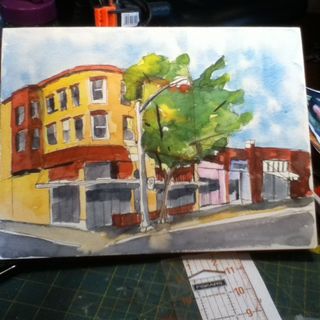
I set up my tripod drawing board, which worked totally sweet, and set to work drawing one of my favorite buildings in Beverly, the Brown's of Beverly bike shop building. (It also happens to be my favorite bike shop.) This location afforded us a view of Brown's, Casa de Moda, Cityside Dinner, Atomic, and a great view down Cabot St. It was also the frist spot we stopped at AND I have to admit I scoped it out as I walked to the meeting spot.
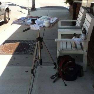
Scott took the tact of doing a lot of smaller drawings where I decided to work larger than usual. (I didn't get pics of Scott's work, he's shy.) I worked in pencil and then did a layer of fine ink pen. After that I layered in a lot of juicy water onto the paper. I was trying out the Fluid watercolor block with cold press paper. I'll write more about that later.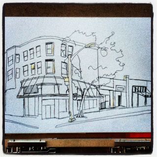
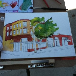
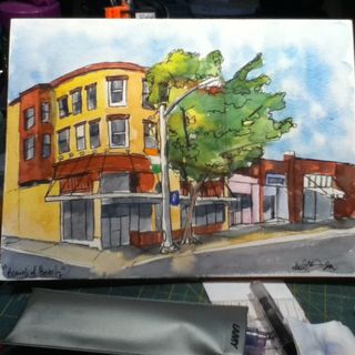
The final step after the image was finished and dry was to add some thicker line work and the brigh pops of clean color- the parking sign and the Irish flag hanging in the window.
It was a real challenge for me to draw with an offical set up in public. Normally I work small and pretty secretive. I try hard to not be noticed. This time I was totally exposed. We had a few people stop to look at what we were doing and kids looked at the art. Being so close to an art school I expected to be pretty much ignored, and for the most part, we were. People who did stop and look were very pleasant and very positive.
I enjoyed the company and the experience and I can't wait until next month! Anyone is welcome to join in on the fun, all experience levels, and any media. Stay for 1 hour stay for 4, it's all good.
Poster from Idea to Finish
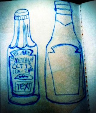
I'm organizing a "Sketch Up" in my city. It's like a SketchCrawl but without the trademark and rigmarole of getting permission to use the name. Anyway, I created one poster already with a hawker type dude announcing the Sketch UP via speech bubble. I wanted to make these a really graphic type image, eye catching in their simplicity. Also made old school, these were sketched onto paper and then inked with a sharpie, it doesn't get more old school poster design (crappy) than sharpie and paper.
The ketchup bottle idea came to me when I was just thinking over the idea at the cafe after hanging the hawker dude poster. Ketchup Sketch Up. Heh. It's funny in my head. I started out by sketching a quick old school round glass bottle of ketchup. I realized that maybe the kids in the area might not associate the round glass bottle with ketchup. Since the only ketchup in our house is heinz I went with a knock-off of their label and the shape of their plastic bottle.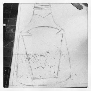 I sketched it onto a piece of cardstock with pencil. Erasing the extra lines.
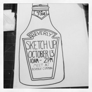 Inked up those lines and added the text. My writing stinks but who cares, I didn't want anything computer generated on this bad boy. (Until I add the QR code, which I will later.)
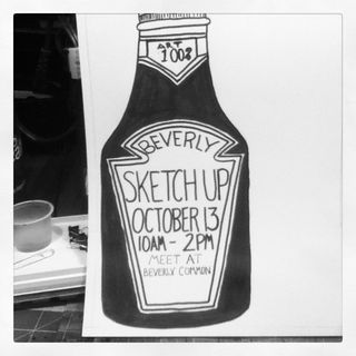 I filled in the ketchup with black ink. Though you can see some overlap the scanner will read this as all black and it will print as such. I've still not added in the QR code but it will go right below the phrase "Beverly Common."
This brings me back to my days of wheat pasting posters around my University. i've written about my single handed causing damage to my former Uni after I was graduated, but let's not bring that up again.
Week in Photos #10
I
started my picture a day project to find one beautiful thing a day as I
walked into my DayJob. One thing that would brighten my day, see it and
snap it. After many months, nearly a year of this project, I realize,
I’ve seen all the beauty in that short walk. Maybe I’m tired of the
scenery? Maybe I need a new photo a day project… Maybe I’ll look for
one thing in the afternoon that is beautiful.
One
thing I’ve learned with this little project is that no matter what if
you look for beauty in the world you’ll find it. Even if it’s as simple
as an accidental picture of your shoe.
Featured!
Jetpens selected me as one of their August Favorites! Go check out my work and the work of other artists. I'm pretty excited to be on their blog. I buy my ultra fine line Uni-ball Signo DX and Bit pens from them, since I can't get them anywhere around here.
Week in Photos #9
Old Town Hall
I wanted togive you a little look into how I created my large sized town hall image. I was asked to make a poster with a drop box for my coworkers to put questions in for a special meeting at work. My idea was to create an image of a town hall. My other idea was to create an image of a group of people inside an old style town hall. Given the time frame (1 day turn over) for creation, I went with the simple idea instead.
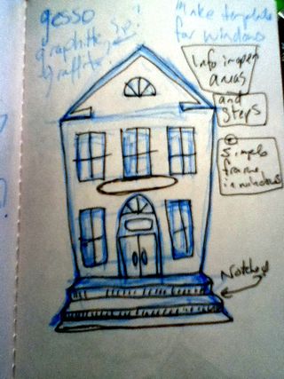
I spent some time looking through google images for "town hall" then remembered I shot a pic of Salem's Old Town Hall a few weeks ago. It turned out THAT was the image I had in my head. (That or the town office from my youth.) I quickly roughed out my idea in light blue ink and then finalized the idea in black ink. I jotted down some ideas for the image in words around the edges of the sketch.
Below you'll see the large sized version transfered from my mind to a large 4 foot high by 2.5 foot wide piece of standard corrugated box cardboard. To rough in the image I used a 0.5mm HB mechanical pencil. Then to fill it out I used my E+M clutch pencil with creatacolor 4B graphite pencil. I finalized the location of all the elements of the image and then started to add areas of shadow. I darkened these areas and gently filled in the rest with a light coat of graphite. 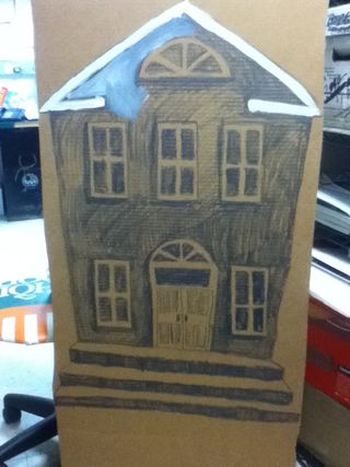
I started to layer in white house paint. Scrubbing it in with my brush gave me the blended and mottled gray effect. Sure the Salem Old Town Hall is brick but no one said I couldn't make it creepier with a black and white effect. 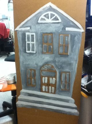
I used a clean brush to add put white to the windows and trim. 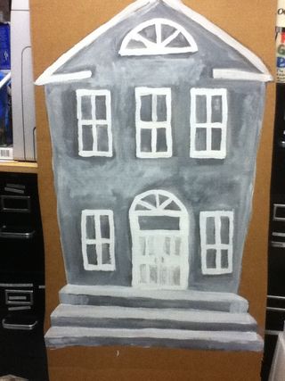
I then cut the image out of the cardboard. I added some definition with creatacolor's version of a conte crayon also in my E+M lead holder. I made a small sign that says town hall that is stuck to the image. The sign is 3d and adds some weirdness to the already wonky lines of the building.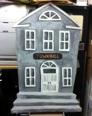
Overall I'm pretty happy with how this came out. I was given the assignment just before I left work on Wednesday, thought about it for about an hour last night and then completed the image over teh course of the morning at work.
Now I want to do a whole haunted village for the front lawn…. Hmm how soon is too soon to get ready for Halloween?
Willingness
I’ve been thinking a little more on the whole haters gonna hate concept. I think it is borne of fear and a been there done that attitude. After all we’ve spent much of our lives being told that if it has been done before there is no reason to revisit it.
What if we all took that attitude?
Nothing would be tried again and we’d stagnate.
Just because something didn’t work for one artist doesn’t mean it won’t work for another. Time and place can make all the difference in success.
My chipin was 106% funded in 48 hours. That’s some wild support. Would that have happened for everyone? I don’t know. I’m sure that my results can be replicated by anyone with drive and ambition.
You must be willing to succeed.
You must also be willing to fail.
The difference in the two poles is what you do to make them happen.
Portrait Process
A friend recently contacted me about creating a couple of trading card portraits as a gift for his daughter. After a little discussion and finding out who he wanted me to draw, I accepted the challenge. The real challenge for this commission was to have a realistic image that still retained my style. Keeping my style was the hard part. I tend to shy away from photo-realism because I can't put my mark on the image and it falls flat for me.
It was also important to get a good idea of where the light and shadow fell on the faces and the general shape of the face itself. I started off with a few simple sketches done with the sharpie brush markers.
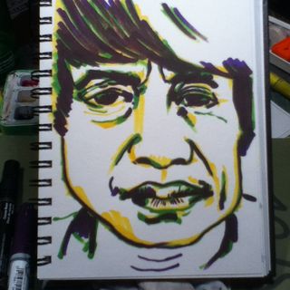
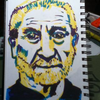
With realistic faces the important part is to get the eyes right. So I studied them. I did detailed sketches of the eyes, making notes of where I was off. Being self critical was very important in this stage. One I started to work on the card sizes errors would lead to doing the job over again.
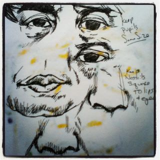
I started the cards with a light HB pencil sketch made with a mechanical pencil. This gives me a guide of where I want my ink to go. This lets me move an eye to the right or left if needed and move the nose closer to the eyes and to shrink the mouth.
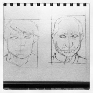
I then blocked in my first layer of ink with a 0.18 Uniball Signo Bit. it's light-fast and waterproof ink is a perfect first layer. I allowed this ink to dry for a full 3 hours before I used a kneaded eraser to remove in the pencil line. While I find the Signo ink to dry quickly I was taking no chance of ruining the pieces.
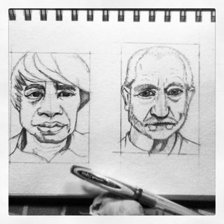
After the pencil was removed I went into the image with a 0.28 Uniball Signo DX black ink pen. Again, it's light-fast and waterproof ink is a nice deep black shade that let me build up my layers of ink precisely and easily.
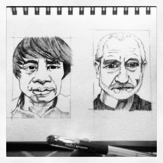
At this point the image is almost completely finished. I used the 0.38 Uniball Signo DX to add the darkest areas.
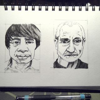
Before adding the watercolor I sat on the finished image for 24 hours. I wanted to be happy with every aspect of the image before I finished it with watercolor. Since these are a pair if images to be gifted to the same person I wanted to be sure they matched. Doing a little research into my subjects showed they were both architects who used a lot of steel and concrete in their work. I mixed a large puddle of Holbein watercolors, far more than I'd ever need to finish these images, in a shade of blue grey midway between slate and concrete. The color complements the images well. After allowing the images to dry completely I cut them from the parent sheet.
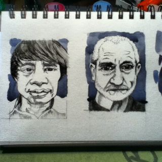
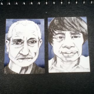
The final step will be to place each card into a trading card sleeve and carefully construct a presentation sleeve out of cardboard.
If you are interested in having me create a custom trading card sized portrait for you, please see this page or consider buying into my chipin campaign here. I'd be happy to work with you to create a treasured momento.
