Here’s what happened, I love my composition notebooks but I was frustrated with the often nasty paper inside. I thought, “You know who could make an awesome updated version of the composition book? Baron Fig.” I picked up my phone and called Joey and Adam and told them my idea. They told me it was great and awesome. That they’d read my obsessive composition notebook review, then let me know when it was going to happen.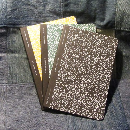
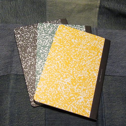 Okay, so that’s not really what happened, but it doesn’t hurt to think that maybe the guys over at BF read my obsessive reviews of composition notebooks. You know, where I harp on the amount of white to black in the marble and the size of the tape on the spine… I mean that probably didn’t happen either. But these Vanguards feel like the guys at BF crawled into my head and put all my thoughts about awesome composition notebooks into play.
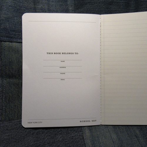
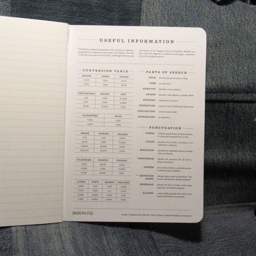 The ratio of color to white in the marbling is great, the black “tape” on the spine is almost perfectly proportioned for the size. I’m just so in love with the cover style. They even fit my requirement that the spine is stitched. Inside is that great toothy but smooth enough for fountain pen paper. The Vanguard paper seems to be a tad thinner than the Confidant paper, but doesn’t feather with fountain pen inks. The flagship size is perfect for tossing into a bag, or if you must, the pocket of cargo pants.
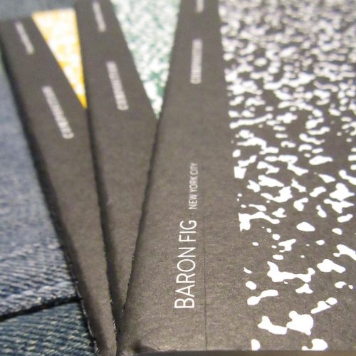
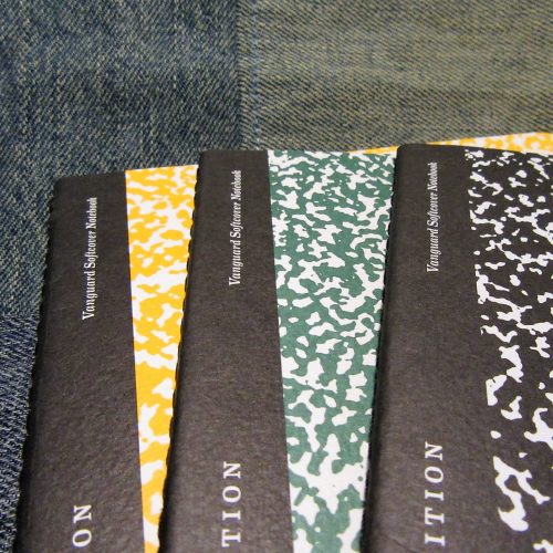
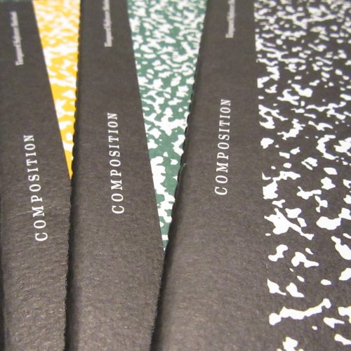 The only downside of these is that the cover is thin and not the stiff hearty cardboard comp books should be made from. Luckily they are a smaller size so the weight of the cover material is less important.
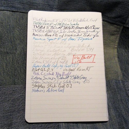
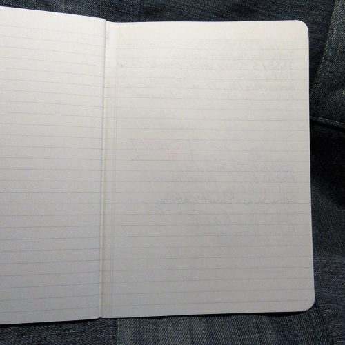 These notebooks are a fun miniaturized twist on the larger traditional composition notebooks. They look lovely with the Baron Fig No.2 pencils. Which I’ll review in their own post. Anyway, head on over the Baron Fig’s website to pick up a set.
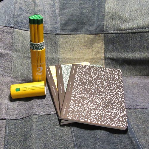 So some deeper fuller composition book analysis is needed here. Is this a comp book by my own standards? No. It is a good update on a comp book. It lacks a few things that I use to determine a true comp book- the size is too small (though there are mini and 6x9ish comp books), the spine is not taped, and finally the covers are soft and not card. It also lacks the standard generic label on the front. Even with all of that I love these. I’m glad they did this on the Vanguard and not a Confidant because this is the closest thing to a comp they offer. A marbled Confidant would not be in the tradition of comp books, in the same way that I cannot see the Kickstarted Comp as a composition book. I think that the Baron Fig Composition is a good modern take on the old school composition notebook.
Tag Archives: composition
Back-to-School Sale Composition Book Round Up Part 2
My last post was incomplete. I’d only been able to get books at Target and Staples. This week I went to two of the three the local Walmarts. One had not one composition book and was a wreck. The other Walmart was also a wreck but they had composition books. All are standard size (9.75X7.5 inches or 247x190mm) and college ruled.
Entry 1: Norcom Fashion Covers Made in Colombia 50 cents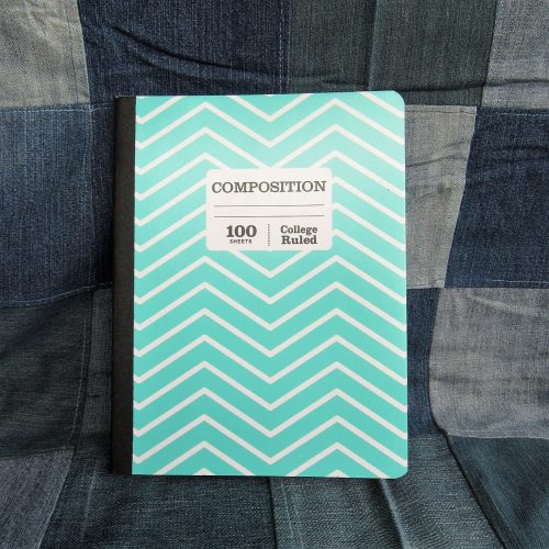
The so called “fashion covers” feature patterns in white and some fashion color. In the case of these there were light teal, salmon pink, and a few other colors. These were also available in awful tacky metallic animal prints. UGH. These were the least offensive of the “fashion” covers. I chose teal and white.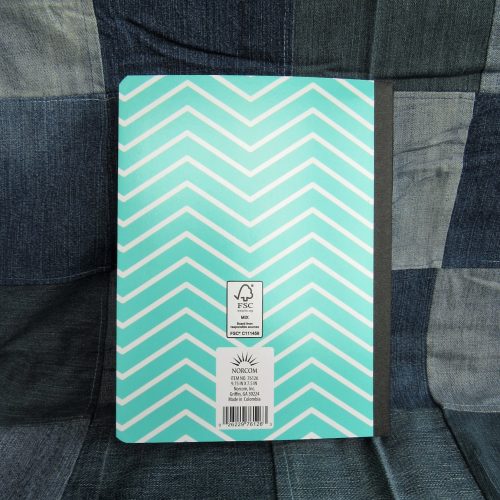
The cover is printed onto thin cardstock. It is not quite as floppy as a poly cover but almost. The card is sturdy enough that the notebook might survive a semester in a backpack but I doubt a whole school year. There is a rather thin strip of textured paper tape on the spine. The width of the tape is proportionally off. It looks wrong. The front cover has a label area, which I greatly appreciate. It is pretty generic looking. Good job on that Norcom, you nailed what a comp book label SHOULD look like.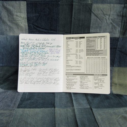
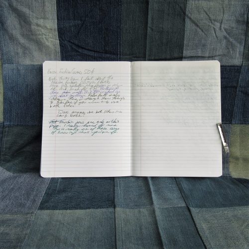
Inside the 100 sheets have light blue ruling that disappears quite well. The paper is nicely smooth but has enough tooth to be great for pencil. Ballpoint, rollerball, and gel ink all did great too. Fountain pens feel great on the page but spread and feathered all over. Even fine nibs bled through. If this didn’t do so well with pencil I’d say avoid it at all cost.
Entry 2: Mead Five Star Poly Cover Made in Vietnam $1.97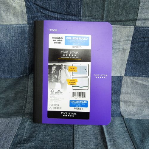
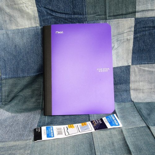
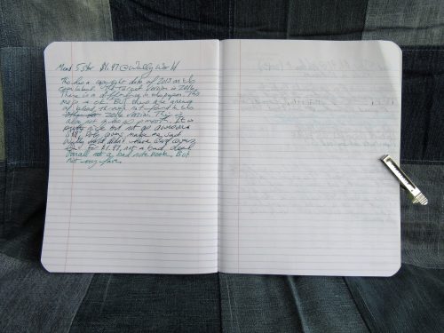
Why try another Mead 5Star when the one from Target was good? Well first this one is $1.97 and the copyright date is different. The Target version is 2016 while Walmart’s was 3013. Does it matter? Yeah.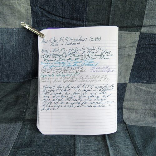
The cover is the same as in the last entry. Thicker and stiffer than most of the other poly covers in the race. The stitching is well done. Repeat the last entry.
Until you get to the paper. It is slightly more absorbent and you don’t get the super sheen with fountain pens. I also had some bleed through that I didn’t have with the Target 5Star. The price is better but you’ll have to dig through the boxes to find some from 2016. I checked but found none, all at this Walmart were from 2013. They were great for pencil and the rest of the pens. Well, except for the firehouse of a Papermate InkJoy I tested. That had issues with bleed through where the letters crossed themselves.
Entry 3: Pens+Gear Poly Composition Book Made in India 67 cents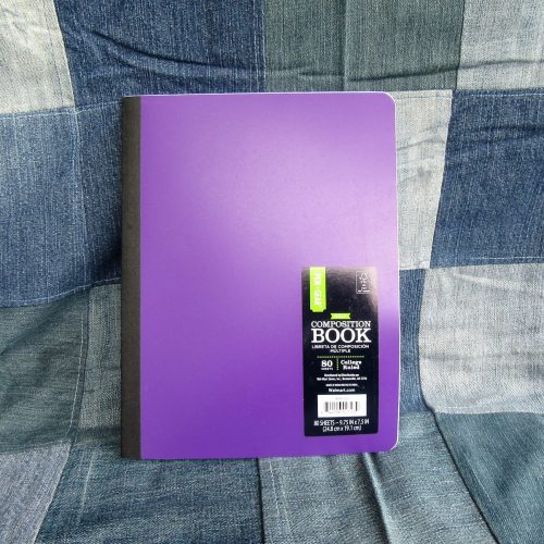
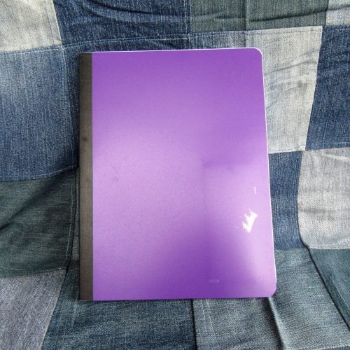
This is the first Pen+Gear* product that I can tell you to avoid. Get their made in India pencils and index cards but avoid this composition notebook at all cost.
Why? Let’s start with the cover. Yes it is poly, the thinnest floppiest poly I’ve yet to pick up. The textured fabric tape on the spine is far too narrow completely throwing off the look of the book. Normally I’d be super pleased that they actually used real fabric tape instead of textured paper, but not when a wider application of paper tape would look right but also do the job of protecting the area where the spine will flex properly. Further the spine is poorly stitched. It is not centered on the spine but folded oddly. The top half of the notebook has wider pages than the second half.
Inside there is an odd 80 count of sheets with bright blue ruling. It’s bright and thick and will never recede into the background. The paper is crisp and holds up well to fine fountain pens. Wider nibs tend to bleed but feel great on the page. Ballpoint, rollerball and gel all do okay. Pencils slip and slide. The paper lacks tooth. I had to really work hard to get graphite onto this paper.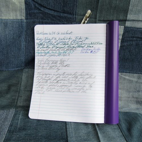
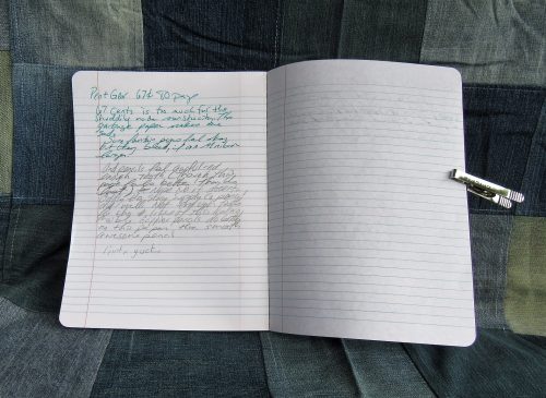
The label doesn’t peel off easily. It left a sticky mess.
I really disliked the Pen+Gear offering. It’s not good enough with fountain pens to justify buying for that purpose and it is just so terrible with pencil that it goes into my do not buy list.
Entry 4: Norcom Neon Ink Splatter Made in Colombia 50 cents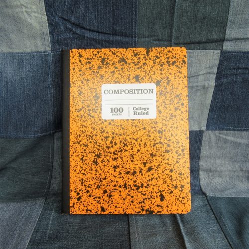
The paper in this is essentially the same as the previous Norcom offering. The cover, other than a different “fashion print” this one straight outta 1988 with neon ink splattering, is the same as well. It sports the same too narrow textured paper tape and thin card cover.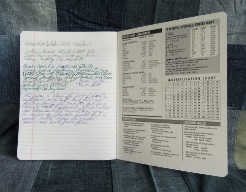
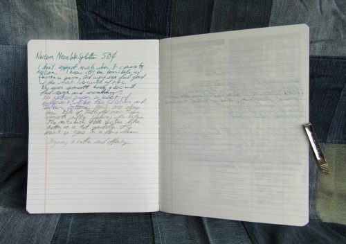
Norcom has another meh offering. It’s not bad at 50 cents- especially for fine or ef fountain pens, and pencil.
Entry 5: Studio C Pattern Play Collection Poly Cover $1.96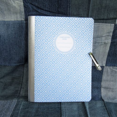
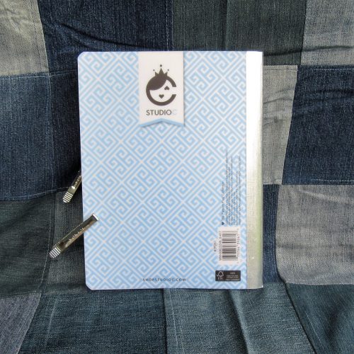
This entry sports a poly cover printed with a variety of patterns in a variety of colors. I picked out dusty blue in squared swirls. The classic front cover label is circular. The poly cover is as thick as the Mead 5Star cover but lacks the interior printing. The spine is taped with metallic textured paper tape. The width of the tape is generous and looks appropriate on the cover. The poly cover is translucent and to protect your work inside, they have placed a plain sheet of white paper with the traditional school info printed on the inside. It is a nice touch.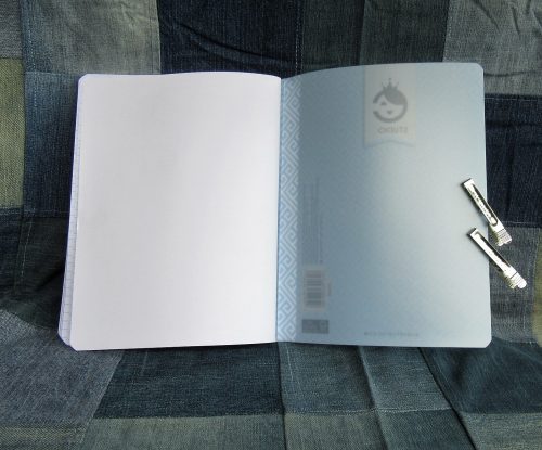
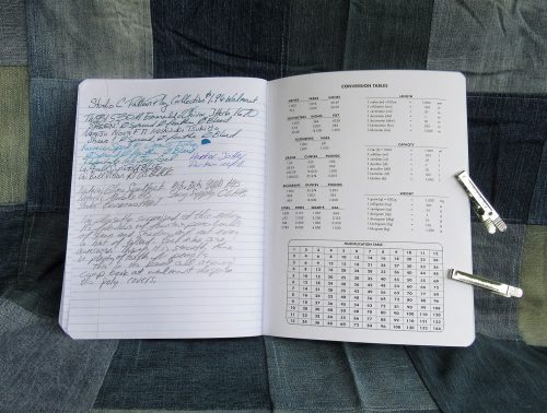
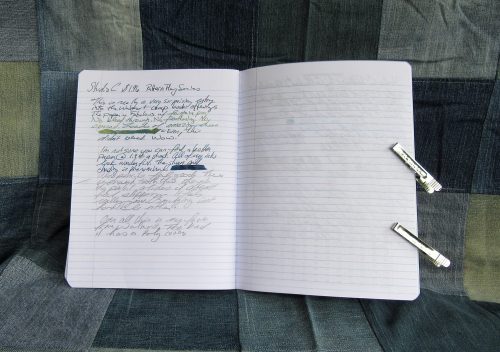
The ruling is bright blue and disappears behind most of the sample writing I did.The paper doesn’t feel particularly smooth, until you run a fountain pen across its surface. Then the pen dances and slides in the most wonderful way. Even better, there was no spreading, no feathering, no bleed through and loads and loads of wonderful sheen. This notebook performed as well as the Mead card covered from Target. My inks all look amazing on it. Also, pencil feels wonderful. There is enough tooth that the pencil slides perfectly and looks nicely dark. I didn’t have to work to get the graphite on the page.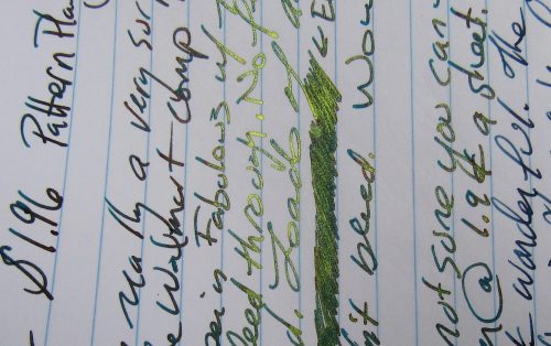
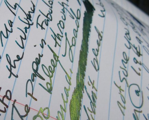
The Studio C was a very pleasant surprise given how disappointing I was with the rest of the Walmart offerings. It’s not the greatest value, at 1.9 cents per sheet it’s in the middle of the road of expense. The Target Mead card covered is still a better value at about 1.2 cents a sheet. But the price difference is negligible when you compare the 100 to 70 sheet offered in each notebook.
If you don’t write with fountain pens and you stay in the realm of gel, ballpoint, rollerball, and pencil the Norcom have fun covers, and some ugly stuff too. At 50 cents a notebook it is a good value.
I have to say, avoid the Pen+Gear notebook at all cost. The paper is terrible, binding shoddy, and poly cover flimsy and floppy. It is garbage.
Back-to-School Sale Composition Book Round Up
This is a very image heavy post!
I decided to head to back to school sales and pick up a few composition notebooks to update my old best of Composition Notebook review. I go through a lot of them writing my drafts, so I have room in my budget to spend the money to buy during the sales, because for the most part comp books are around 50 cents at Back To School Sale time. All are college ruled. Unless otherwise stated these are all the typical size for comp books:9.75X7.5 inches or 247x190mm.
Entry 1: Generic Made in Taiwan 51 cents (Target)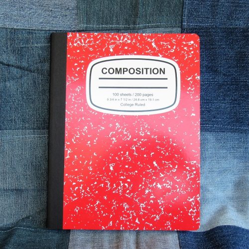
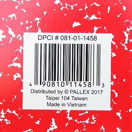
Target’s entry has thin flimsy card covers graced with a marble pattern that has bled together so much as to have little white space. It has a black textured paper tape spine. Beneath the tape it is stitched. It does have a nice oval shaped Composition label on the front cover that looks absolutely generic. I kinda love it.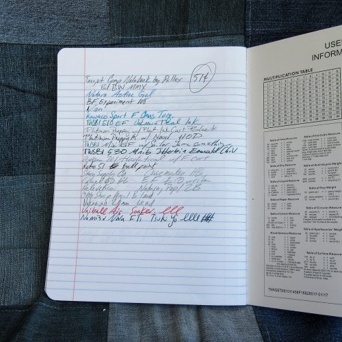
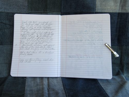
Inside are 100 sheets or 200 pages of thin smooth paper. In my testing I found it worked well with pencil, rollerball, ballpoint, and gel ink. Fountain pens bled through but didn’t feather until I started to use wet nibs paired with inks that tend to feather. With fine and extra fine pens it did okay. With any darker colored ink the verso of the page won’t be usable as the show through is intense.
What sets this comp book apart from the pack is the smooth paper. It is smooth yet toothy enough that pencils were superb on its surface. Point retention is phenomenal even with soft dark pencils like the Glimo Super Black. Smudging was minimal.
Entry 2: Staple’s Made in Brazil 50 cents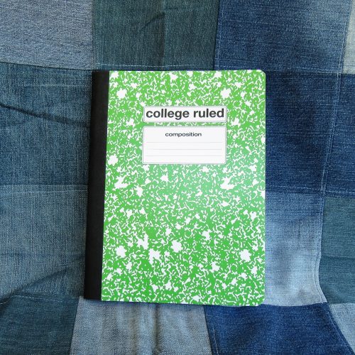
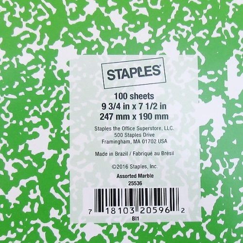
The latest iteration of the venerable favorite has thin flimsy card covers. A definite downgrade over past years. The marbling is splotchy and evenly distributed between white and whatever color cover you purchase. It isn’t very marble-y. The label area is rectangular and rounded over. Rather boring. The spine has a black textured paper tape over it.
Inside are 100 sheets/200 pages of thin bright white paper with a dark purple-blue ruling. The ruling is far too dark and never receded into the background.Even with thick black ink it stands out. Gross.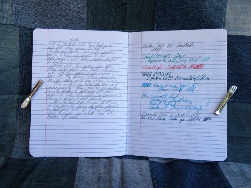
Testing proved that this toothy paper did well with the usual round up of pencils, rollerball, ballpoint and gel inks. It was shite with any fountain pen. Even the thinnest and stingiest of nibs feathered and bleed with the best behaved of ink. Wet thick nibs soaked through to the page beneath. The verso of the page is unusable with any liquid or hybrid ink. Even some of my gel inks tended to show through. What a mess.
What an abysmal fall from grace.
Entry 3: The Mead Poly Cover Made in Vietnam $1 (Target)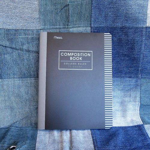
I’ve had very bad luck when it comes to Mead comp books in the past. This year’s is far different than the past iterations. There are 70 college ruled sheets, though they are also available in wide rule. The poly cover is thin and rather floppy. The tape is gray textured poly. The cover has lines printed on the fore edge but no other design. The typical label area lacks anywhere to write your name or other information. This is a sad oversight.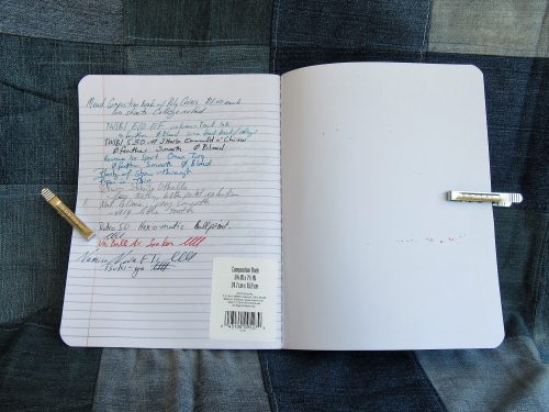
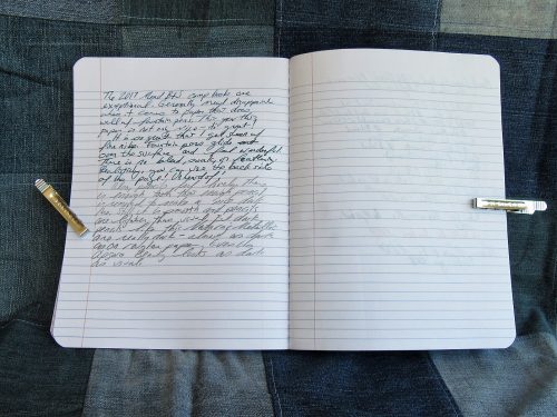
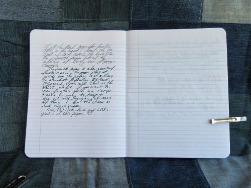
Inside the 70 college ruled sheets feature very thin pale blue lines that recede into the background of every ink. I’m in love! The paper is thin and crisp. It’s not slick feeling but it performs remarkably well with every pen and ink combination I’ve used. My wet pens and inks glide over the surface and feel wonderful. Better yet, there is no bleeding, feather or soak through. No, I even get sheen on this lovely paper. There is show through, but that is to be expected from paper this thin and crisp.
I find it shocking that I have a Mead contender for best Comp Book of 2017!
Entry 4: Mead Card Cover Made in Vietnam 79 cents (Target)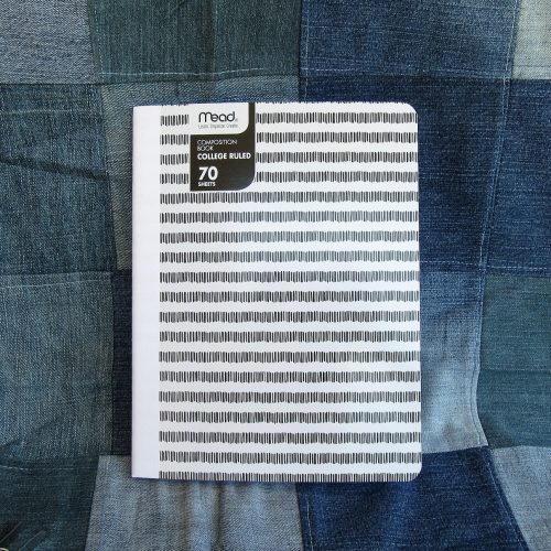
Repeat everything I said about the Mead Poly cover here. No Feathering, bleed through, or feathering. Loads of lovely sheen, even from my EF pens.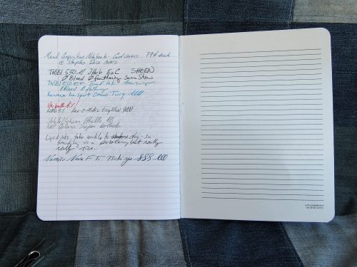
The covers are decently sturdy card, and at least at the Target where I purchased my sample they had 2 patterns- one for wide and narrow lines. The patterns consist of stripes made of vertical lines roughly the height of the lines inside the book. Clever. They were offered in a rainbow of colors with textured paper tape over the spine. Sadly this also lacks the classic front cover label area.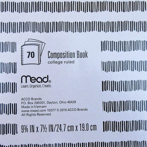
The big downside of this paper is that because it doesn’t absorb liquid ink, it takes quite awhile for that ink to dry, resulting in smudging.
Not only do I have 1 but I have 2 contenders for best comp book from Mead. Shocking.
Entry 5: Mead Five Star Poly Cover Made in Vietnam $2.99 (Target)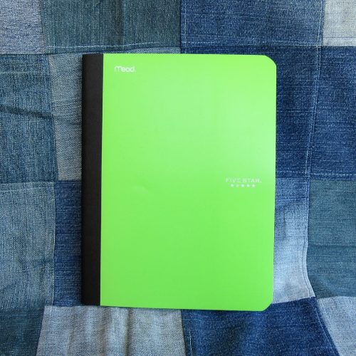
In another shocker, repeat all the good stuff from the last two Mead entries and it applies here. The paper is great. There are 100 college ruled pages in the 5Star. It features a classic textured black paper tape along the spine. Mead skips the classic front cover label area.
These poly covers are among the toughest of the poly covers. Though they are still floppy, they are less floppy than others. The interior of the cover is also lined with white poly so that the contents aren’t on display. Further, it features some of the classic composition notebook interior goods- class schedule and conversions.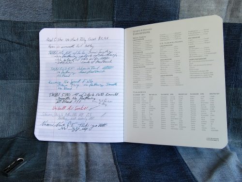
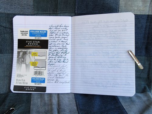
Comparing this to the other Mead offerings, this is not a great value. The paper is wonderful and the poly cover sturdy but not enough (to me) to justify the increased cost over the other poly cover.
Entry 6: Up & Up Card Cover Made in Mexico 5 for $4/80 cents per book (Target)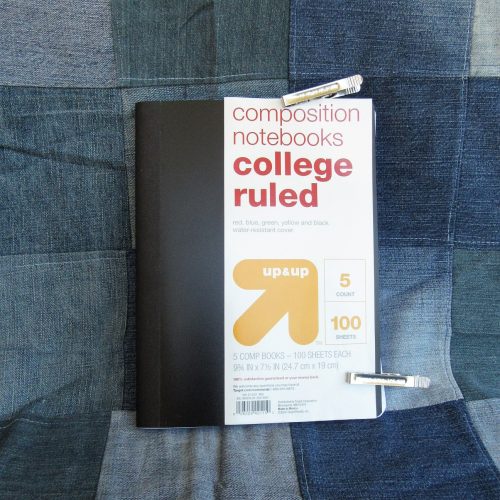
It is tempting to return these and cash in on the Target 100% satisfaction guarantee. Yes they are that bad. The poly cover is thin, flimsy and floppy. The paper taped spine features glue squeezed out of it’s edges. Unlike most of the comp books written about thus far which have stitches at roughly 10mm, the Up &Up is stitched at 15mm.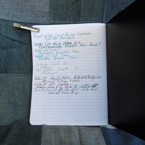
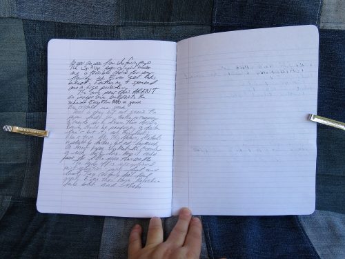
The paper is bright white with pale blue ruling. The positives end there. Every fountain pen I used feathered and bled, even dry extra fine nibs using dry well behaved inks. Blotter paper is less absorbent. The only thing that works okay on this paper are ballpoints and pencils. Even pencil doesn’t feel that great on the paper. It lacks tooth to get a decent line and what graphite does get onto the paper is pale and smudgy.
This goes on my do not buy list.
Entry 7: Greenroom Decorative Card Cover Made in Vietnam $2.50 (Target)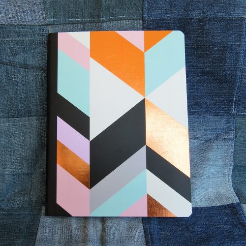
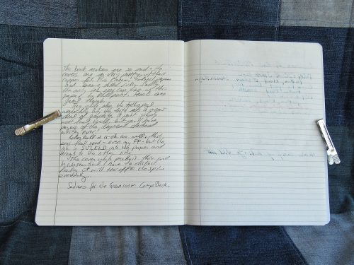
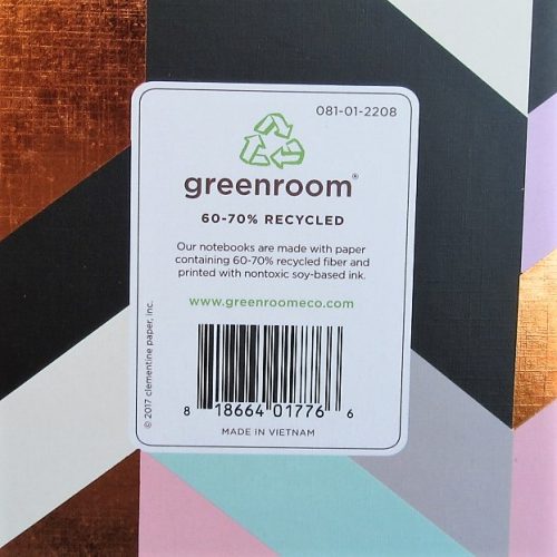 Here is another comp book with only 70 pages. The paper is cream colored with brown ruling. The lines are actually tiny dots. I really adore this ruling and wish that I had better things to say about the actual paper. This paper feathers and bleeds with every fountain pen used. Gel ink also feathers and bleeds. Unlike our last entry, pencil feels good on this paper. Rollerball and ball point are also quite nice, so there are a few more options for use than the Up &Up.
The very pretty card cover is very thin, very flimsy and as floppy as the poly entries. It will not survive carting around in a book bag for long. A spill will spell the end of this comp book. The textured paper tape is well applied and looks good with the lovely printing of the cover.
Entry 8: Yoobi Card Cover Made in Vietnam $2.29 (Target)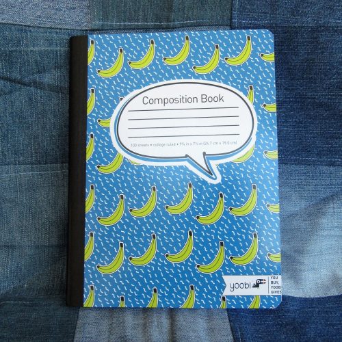
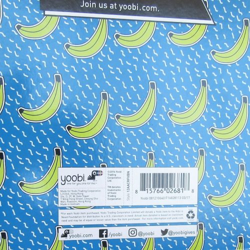 The Yoobi comp book is a venerable contender and little has changed since the last time I purchased one- the covers are sturdy and thick, printed with one color or a fun pattern. The textured black paper tape is well applied. The front cover features a large block where you can label your notebook with your name and other info.
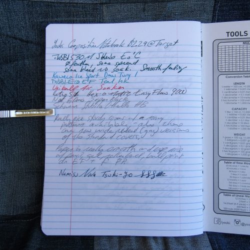
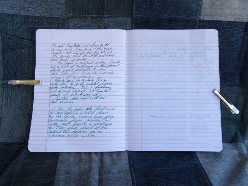
Inside are 100 college ruled sheets. The ruling in this year’s is pale and thin. I like it. The paper is smooth but not too smooth. It’s toothy enough for pencil but not so toothy that it eats up your graphite. Fountain pens fair less well than in the Mead notebooks but fine and extra fine do really well.
Though the Yoobi books aren’t the greatest value at full price, they are a great cause. Plus they go on clearance often enough that you can usually snag some decent deals in the middle of the winter.
Which is the winner here?That really depends on your final use of these notebooks. If you are a fountain pen user you can’t go wrong with the Mead card covered available at target for 79 cents. The paper is phenomenal for everything tested for this review. I was able to see sheen even with my finest fountain pens. Nothing bled or feathered. The per page price was 1.13 cents a sheet. While this isn’t the cheapest, it’s squarely in the middle of the road. If you are planning on using pencils or ball points (looking at you Bic Cristal lovers and folks who put the Fisher Space refill in friggin’ everything) you really can’t go wrong with the Staples 50 cent composition notebooks. At 0.5 cents per page these represent the cheapest of the cheap. Sadly they no longer fair well with fountain pens or liquid inks. Finally if you want a solid writing experience, fun covers, and a good cause, the Yoobi books are a good choice.
There are two here I’d avoid at all costs. Sadly the pretty Greenroom notebooks are just far too expensive at 3.5 cents per sheet to have paper that performs so poorly. Though the Target Up &Up brand is on the low end of cost at 0.8 cents per sheet the performance of the paper is abysmal and the shoddy stitching will likely give out before the poly covers have a chance to break down.
This series of mini reviews reaffirmed something I’ve know for a long time; I hate poly covers. They are floppy, you can’t write in hand or even in your lap. The plastic won’t break down for ages. The brighter the poly cover the more likely you are to be able to see through to your contents. They add unnecessary cost to a product that should be inexpensive. Here let’s put it into “print:” poly covers are garbage. Continue reading