Tag Archives: franklin-christoph

Review: Franklin-Christoph Firma-Flex Notebook

Often, when I write reviews of notebooks when fountain pens are tested they perform not so well. Fortunately, that is not the case with the oddly named Firma-Flex by Franklin-Christoph. Silly name aside, this is a pretty lovely notebook or journal. 

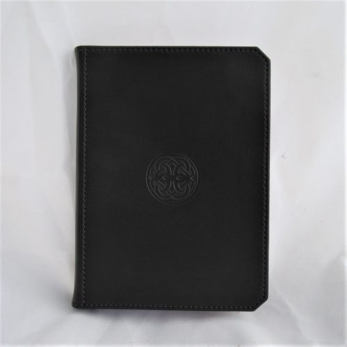
The journal is typical of all of notebook in this style and is Smyth sewn. The book block is well stitched and glued to the cover which is stiff flexible* but sturdy enough for writing notes in hand. The cover is made of “durable cover material,” I assume that it is some sort of vinyl or recycled leather impregnated with vinyl. It had a strong odor that reminds me of shoe polish I used on work boots in college. The odor fades quickly but struck me as very strong upon opening the package.

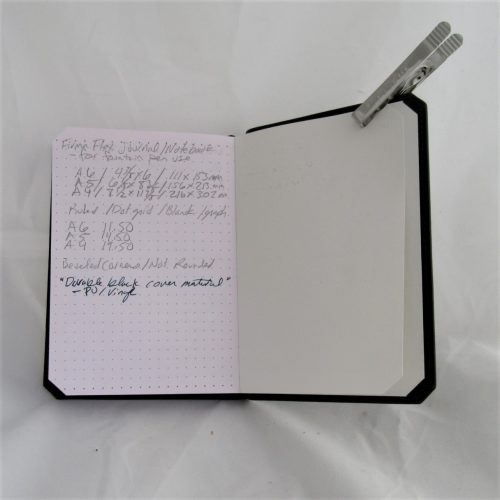
It features 192 pages of smooth 90gsm bagasse or sugarcane based paper. The paper has a pink hue with light grey dot grid. The grid is light enough to fade behind my writing. I really like the 5mm distance. At the top and bottom of each page are slightly larger burgundy colored dots. If you’re using lightly colored fountain pen inks on this paper they will not come out true to their color. The pink hue will darken the color.

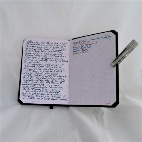
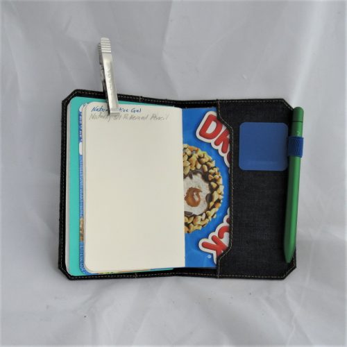
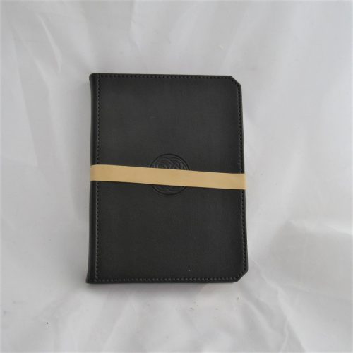
There is no elastic or pocket in this notebook but it does have a place marking ribbon in black satin. The ribbon is not heat-sealed however I was able to do that myself with a lighter in a matter of seconds. There is nothing especially noteworthy or new about this notebook except it has very nice paper. It is very well made and sturdy. The notebook is not quite pocket-sized. It is A6 sized or 4 3/8 by 6 inches or 111 by 153 mm. You can also get them in A5 and A4 size.

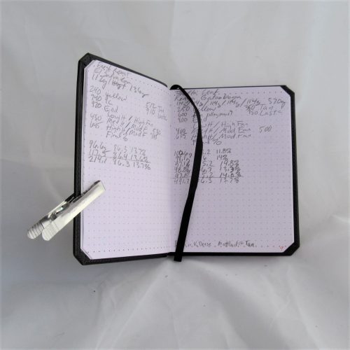
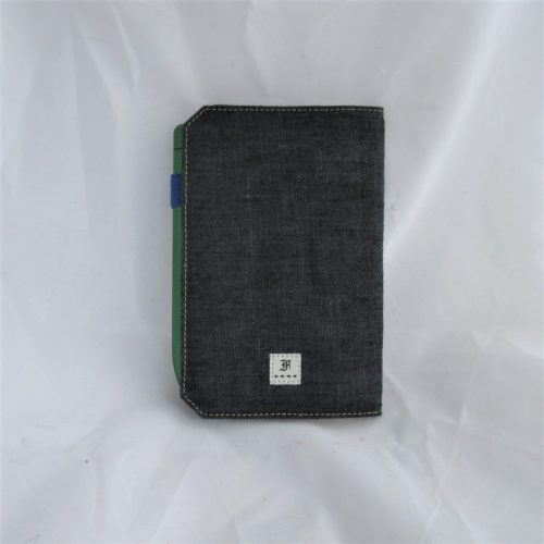
On the front cover the Franklin-Christoph Celtic knot logo sits dead center. On the lower back cover there is another Franklin-Christoph logo. The imprinted logo is tactile and I find myself fidgeting with it. The cover stitching is done in deep eggplant that looks quite lovely with the black cover. According to the Franklin Christoph website the stitching color varies depending on the type of ruling inside the notebook. Eggplant denotes dot grid.

Let’s talk about the beveled or mitered corners. They remind me of Battlestar Galactica. Anyway they seem… Odd. Most likely because I’m so accustomed to rounded or sharp corners. As I’ve used the notebook they don’t strike me as weird unless I’m looking and thinking about them. It’s simply another design choice, maybe an unusual design choice but it is a choice.

At $11.50 for the small, it’s not cheap but this is better quality than a moleskine at roughly the same price. If you’re a fountain pen user this notebook might be for you. It does play well with most of my fountain pens and inks it makes it a better value than others that are cheaper. Here and there with wider nibs and wet inks I had some show through, but none that made it hard to read the next page. Overall this is a fine notebook. It’s beautiful and well-made and looks and feels great. It performs well with fountain pens and pencils it’s got enough to be nice with most but not destroy pencil points.

Continue reading

Review Franklin-Christoph Pocket Notebook Cover Indigo Linen

The Franklin Christoph pocket notebook cover in indigo linen is a luxurious looking pocket notebook cover. The packaging is gorgeous and unfolds to reveal the cover. The indigo colored linen reminds me of raw denim and feels like a well worn in pair of jeans. The front cover has a Franklin Christoph logo dead center. The back cover has a tiny Franklin-Christoph logo along the bottom edge.

The cover arrives with one Franklin-Christoph pocket notebook inside. The cover perfectly fits the Franklin-Christoph pocket notebooks. It also fits Field Notes, Word notebooks, No Brand Notebooks, Story Supply Company, and many other brands of pocket notebooks. I found I was able to fit two pocket notebooks into the cover. It holds them well and still closes easily. There is no notebook overhang or hang out with two notebooks inside.

Like many fabric pocket notebook covers that the cover itself is somewhat floppy. Unlike a leather cover which is given heft from the leather itself, the fabric must be supported. Between the layers of indigo linen there is some sort of cardstock inside. If you plan to continue using the Franklin Christoph pocket notebooks this won’t be a problem. Because the cover perfectly fits their pocket notebooks. If, like myself, you plan on using other brands of notebooks inside. You may find that the cover is a tad too floppy. My solution was to cut a piece of cardstock that is about 7 and a quarter inches wide and three and a half inches tall. This gives the cover a little more heft than it does without. 

Once I added my little sheet of cardstock the cover is perfect and holds my two notebooks together, slides in and out of my pocket with ease and looks fantastic.. If you have someone who doesn’t want to carry leather around with them and once a cover this might be the perfect notebook cover for them. It conforms to your pocket ie your buttcheek and is lightweight and looks fantastic. If  you’ve been wanting a nice cover but not wanted to carry animal skin, the FC notebook cover is a great looking option. It’s lovely in hand and in looks. I added a  Leuchtturm1917 pen loop to mine and it is a wonderful pocket carry.

Continue reading

Review: Franklin-Christoph 1901 Mixed Grade Pencils

For those of you not as obsessed with stationery as I am, Franklin-Christoph (FC from here) is a fountain pen company that prides themselves on making their amazing pens here in the USA. When I saw that they were set to offer pencils, well, I contacted them for a pack for review.

F-C has confirmed that these pencils are manufactured for them by Musgrave, which can be good and bad. Many of the Musgrave produced and private labeled pencils are pretty good. Hell the SSC pencil is among my favorite round pencils for writing. The only Musgrave pencils with mixed grades are their Unigraph pencils, a pencil that I can only say is terrible. In fact they were so terrible I chose not to review them. Comparing the two seems inevitable

The first reviews that I’ve read about the FC 1901 were just as I’d feared- pretty terrible. They have all the usual issues we associate with pencils manufactured by Musgrave- thin blotchy paint, uneven imprinting, ferrules or caps set poorly, and like the Unigraph, cores that are barely discernable from one another. They also feature a sharp hex. Some people  like this some hate it. I’m indifferent. The sharp hex doesn’t bother me. For more detail on the looks read the linked reviews.

The packaging is gorgeous. The cardstock box is cut and folded well and it has a lovely F-C logo imprinted. It’s a gorgeous color too. Could the box be a harbinger of good tidings? Not likely, given the previous reviews.

I’m not reviewing these as a pencil for writing but rather from the direction of an art pencil. For writing they are fine, ugly but fine. In art looks matter less than the performance of the pencil. After all I’m pretty happy to use a variety of General’s pencils for drawing and they also feature shitty paint and bad imprinting. Their cores are significantly better, or at least the majority of the Kimberley and Draughting pencils I’ve used aren’t gritty.

So how do the F-C pencils perform?

Surprisingly good. The cores are silky smooth and really pleasing  to use. That said the HB and B are nearly identical in tone and feel. While the 2B and 4B are also nearly identical to one another. The step between B and 2B is not steep, though it is enough to be noticeable. In my testing on hand Book travelogue paper and HP laserjet 24LB paper I could barely feel the difference in grades let alone see them. The smoother the paper, the less of a difference I could see and feel. In fact on the smooth HPLJ24lb I couldn’t tell the difference between grades in feel or looks. I only noticed the difference on rougher paper. These pencils do a good job on rough paper

Curious, I tested them on rougher and tougher paper- some kraft sketch paper that is closer to grocery bag than it is to drawing paper. Again, the pencils did a great job, the various grades performed better. Though still the HB and B, 2B and 4B felt too similar to say they were different.

My final verdict on these is that for writing or drawing on rougher paper with loads of tooth, these are pretty decent pencils. Yes, ugly and poorly finished, but the graphite is silky smooth and decently dark. No the grades don’t differentiate enough, but if you think of HB and B as the same and 2B and 4B as the same, well, you get 2 grades of dark pencil. For the price, well, they aren’t a value. I like them well enough that I’m tossing them into my on the go sketching kit where they’ll be used up pretty quickly on the rough sketch paper for which they are best suited.

Continue reading