Tag Archives: neon

Review: Casemate Neon Pattern Printed Pencils Hex

The current iteration of Walmart’s Casemate pencils are darn good. Made by Hindustan pencil company they feature a top notch HB core that is dark and smooth. I find the neon and multi-colored packages to be better than the plain yellow pencils. The key to getting good Casemate pencils is to look and make sure the pencils are made in India. I’ve heard other reports that these are often round. The package that I picked up is a hex pencil.

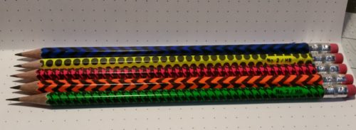
I had hoped to pick up a pack of the plain unprinted neon pencils or a package of the premium tinned pencils. Neither was to be found so I took a chance that the 30 pack of printed neon pencils was as good as the neons.

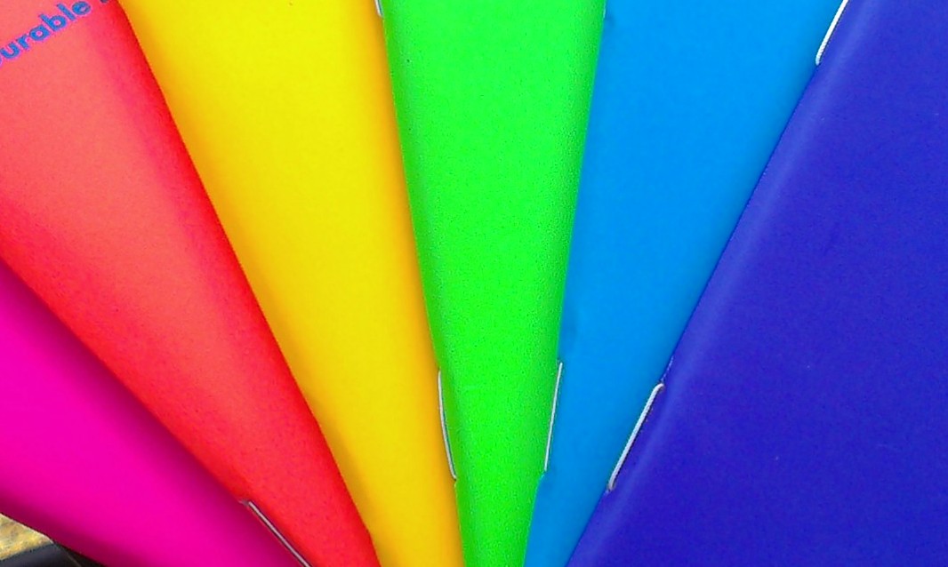
The packaging for the 30 pack is a pillow box made of stiff clear plastic, with a bit of foam at the base to protect the points, and a thick label wrapped around the belly. In a pinch it could suffice as a decent pencil case. Each tube has 6 pieces of 5 colors- pink, orange, yellow, green, and blue. All are neon except the blue, which in my package is a royal blue color. Each 30-pack is $3.24, which is roughly 11 cents per pencil.

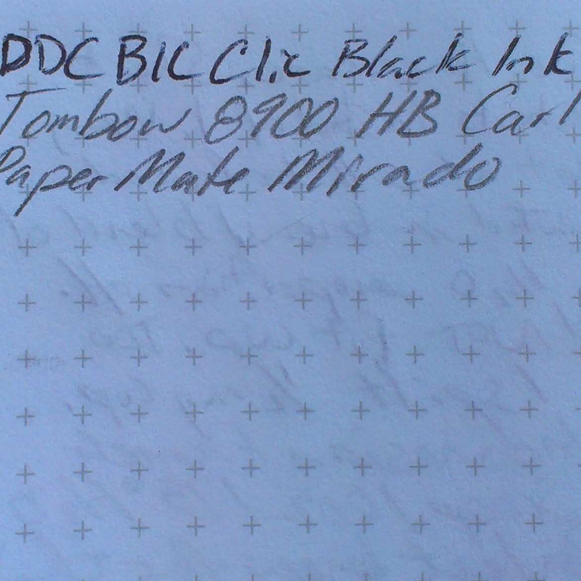
The pencils themselves sport a standard Hindustan HB core. That is to say it’s silky smooth across most papers and is nicely dark. I’ve found very occasional bits of grit in some of my pencils, but this is rare and to the same extent that I find them in much more expensive pencils. The core has excellent point durability/retention. I get a few pages from a sharpening with my Carl A5. The wood is jelutong which sharpens well but has no distinct odor that I can detect*. It is lightweight and I have grown fond of the look of this wood. It ranges from pinkish tan to nearly white to speckled. All of my sharpeners handle it well.

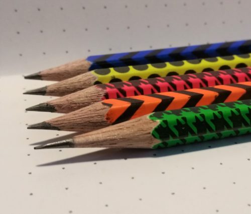
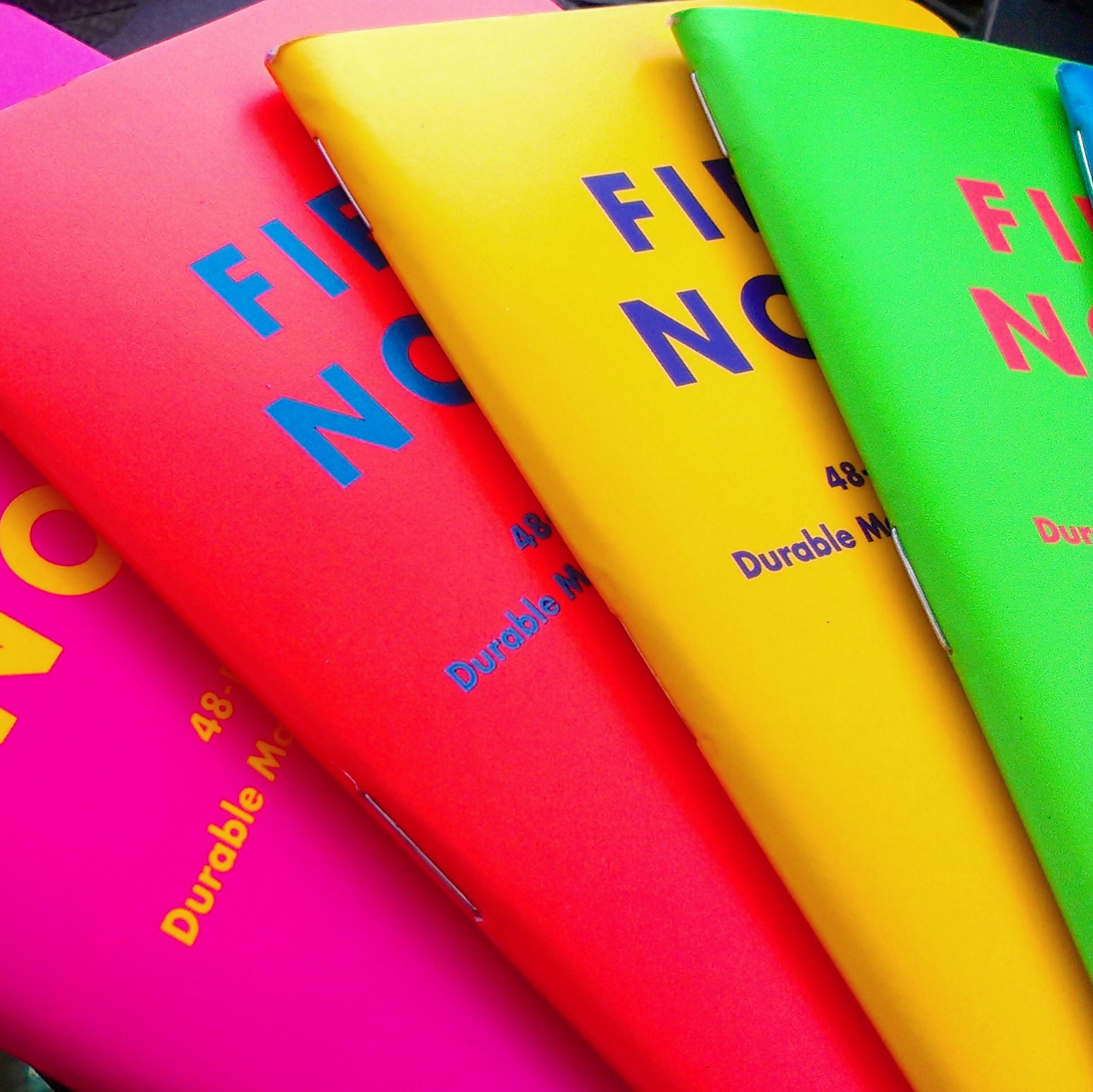
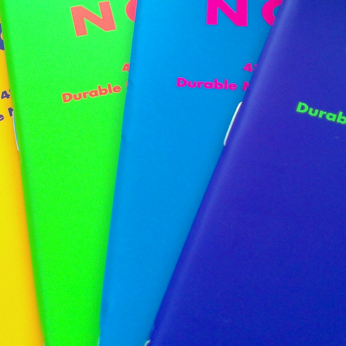
The paint appears to be a layer of white, with neon atop that with an overprinting of a very thin coating of black. The black is nearly see through in some areas and the neon colors definitely pop through the black patterns. The black patterns are a pox upon an otherwise lovely pencil. On my pencils- every single pencil the printing is crooked, the grade designation is not only off center of a side, it’s often printed on a hex point and at an angle. Further the crooked printing is overlapped in some areas and not others. The patterns are also everso slightly stretched on some of the pencils. The images I’ve included in this review do not do justice to how truly abominable the print job is. It’s atrocious. It is laugh worthy. It is, as my Grandmother would say, ugly as sin.
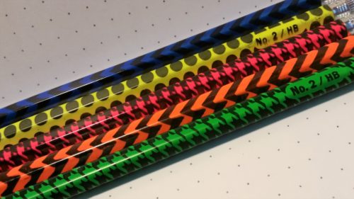
The silver ferrules are affixed well to the pencil and hold a pink eraser. The erasers are typical of Hindustan and Casemate awful. This batch of erasers is stiff and gritty. In use they have a hard time removing graphite from even the smoothest of pages, and yet seem to lift the fibers of the page. Through repeated use I could see these erasers tearing a hole in the paper. They remind me of the old grey ink eraser like the Papermate Union.

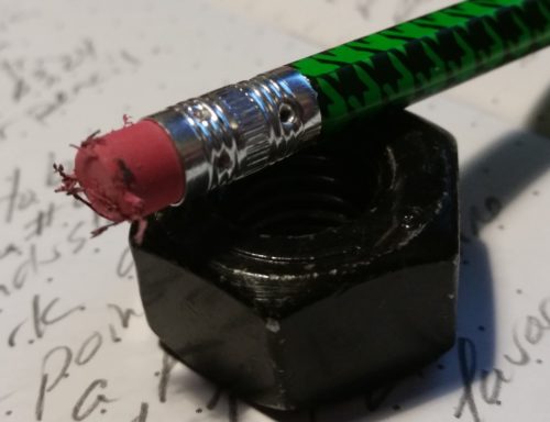
In short these are great pencils for a very low investment. The core is wonderful, its’ just the exterior that makes these look awful.

Continue reading

Review: Field Notes Unexposed

The new Field Notes edition, Unexposed, has been exposed. Like Shelterwood before,  this edition elicits both love AND hate from fans. The edition arrives within a black envelope so that you cannot see what covers you are getting. The editions are packaged somewhat randomly, so you have no guarantee of getting all 6 colors in your packages. To me this is a very interesting way of randomizing the packages. This has also led to frustration among collectors and subscribers. In some cases people have only received 3 of the 6 colors and are trading with other collectors and fans to get all 6 colors.unexposedI was one of the fortunate people who received all 6 colors in my subscription package. But I liked them so much I traded off my sealed Arts and Sciences edition to get another 3-pack. I received 3 more of my favorite colors and another black envelope.

Let’s get to the nitty gritty of this, the review. The colors are neon, eye searing neon with a near opposite color logo. I love these colors. They go very well with my Ticonderoga Neon pencils or Neon Wopexen. They bring me back to back-to-school shopping in 1989 or 1990 where neon ruled the world in pencils and pens. My love of these colors is pure thrown back, sort of like my total enjoyment of the new Trapper KeeperunexposedThe covers and interior feature the same soft touch printing as the Drink Local series, Which up until these was my favorite edition. The soft touch just feels really neat. When thinking I can rub the covers between my thumb and fore finger. The texture is just fantastic. unexposedI read more than one complaint about these colors being “not professional.” I use my FN as catch alls and journal, and now during my internship and a place to take quick client notes. Are they professional enough for me to take into staff meetings? I don’t know, but I’m also secure enough that if someone were to comment on the color to be able to say, “I know! Isn’t it AWESOME!?!”unexposedInside is what FN calls “reticle graph.” Before I had received my books I had to look this up. Instead of dots for dot graph they have replaced them with little plus signs (+). One could think of these like sights  or unfinished graph. They are printed in light gray. I wasn’t sure if I’d like these, but so far I really really like them. I might even prefer them to regular graph. I do like dot graph a little more but these are fun.  The paper itself is regular FN paper. It’s not fountain pen friendly but great with pencils, gel ink, and roller ball pens.unexposed unexposedAnother complaint I’ve read about is that people really really hate the near color opposite* printing on the inside color. It really does make the interior stuff hard to read. I find it impossible to look at and read the interior of the green covered notebook. The neon green on neon orange is impossible for my eyes to makes sense of. If I squint I can read it but it’s hard. I don’t mind since all of the FN stuff stays the same from book to book. I know where to write my name. I also found that once I wrote my info  into the various sections in black ink it broke up the field of neon and I was much more able to read the neon-on-neon printing.unexposedThe envelopes that houses the notebooks as they are shipped to you are a flat black. As soon as you remove the shrink wrap the envelope starts to show finger prints. The envelopes aren’t super sturdy but they are neat and a great way to store 3 FN in a bag or backpack.unexposedOverall, this is a great edition from Field Notes. Great colors, great “soft-touch” covers, awesome reticle graph grid inside, and your typical fun FN uses inside. This will be one of the few that I stock up on and keep a few extras in my stationary boxes.unexposed Continue reading