Category Archives: Uncategorized

Review: Baron Fig Limited Edition Pencil Oracle

With most limited edition (LE) pencils I review the outside and direct you to a review of the core. Given the variability of the Baron Fig pencil’s cores in the past, I’m going to tell you about the core on this pencil.

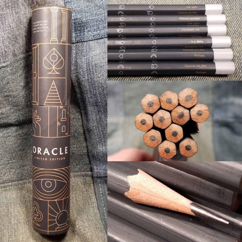
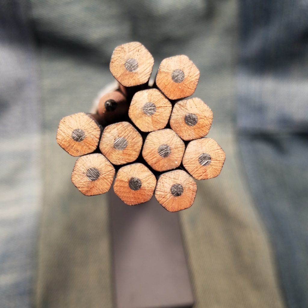
The variability of the core of these pencils is almost legendary. The first pencil was a true HB, the second a shattered 2B, and then back to HB but with a heap of grit. The pencil maker in Portugal* can’t seem to get the pencils to be an even true HB. Most of the other LE Archers have some grit in them. I sharpened 3 of these to get a feel for the core. I picked a pencil that had a centered core and the other 2 I purposefully chose uncentered cores. I sharpened with my Classroom Friendly and the Masterpiece after. I did attempt to use the Pollux but it shattered the cores and made a mess of the centered pencil. I have no such problems with the Masterpiece.

Testing consisted of me reworking the outline of my current novel and attempting to figure out why the ending I have doesn’t work. I used a Teen Vogue composition notebook and wrote up some character studies and a loose outline of the beats of the novel. In all, I wrote probably 25 pages, many of the lines crossed out, in the comp book. I also took notes in a Field Notes Snowblind for some audio testing my cohost and I did on Sunday. I made notes in the same pocket notebook for my weekly meal prep. I also used these in my L1917 to make note of the recipes I used and to log my Kombucha observations in my Bullet Journal.

All in all, I was pleasantly surprised at the cores. They are a true HB but I’ve yet to encounter large pieces of grit or other unpleasantness. I grabbed a couple of other LE Archers and tested those side by side, the No. 2 and Element and found grit. The Oracle has a pleasing grab on the page as it lays down graphite. It’s not silky smooth like a Blackwing or Mitsu-Bishi or even a General’s Cedar Pointe. It grips the page. The point retention is fantastic, only need a touch up after a few pages in my comp book and after 3 in my L1917. This is a pencil that does spectacularly with rougher paper, like a Confidant or a composition book.

Despite being a true HB in hardness it is nicely dark, leaving a nice dark grey line with moderate pressure.

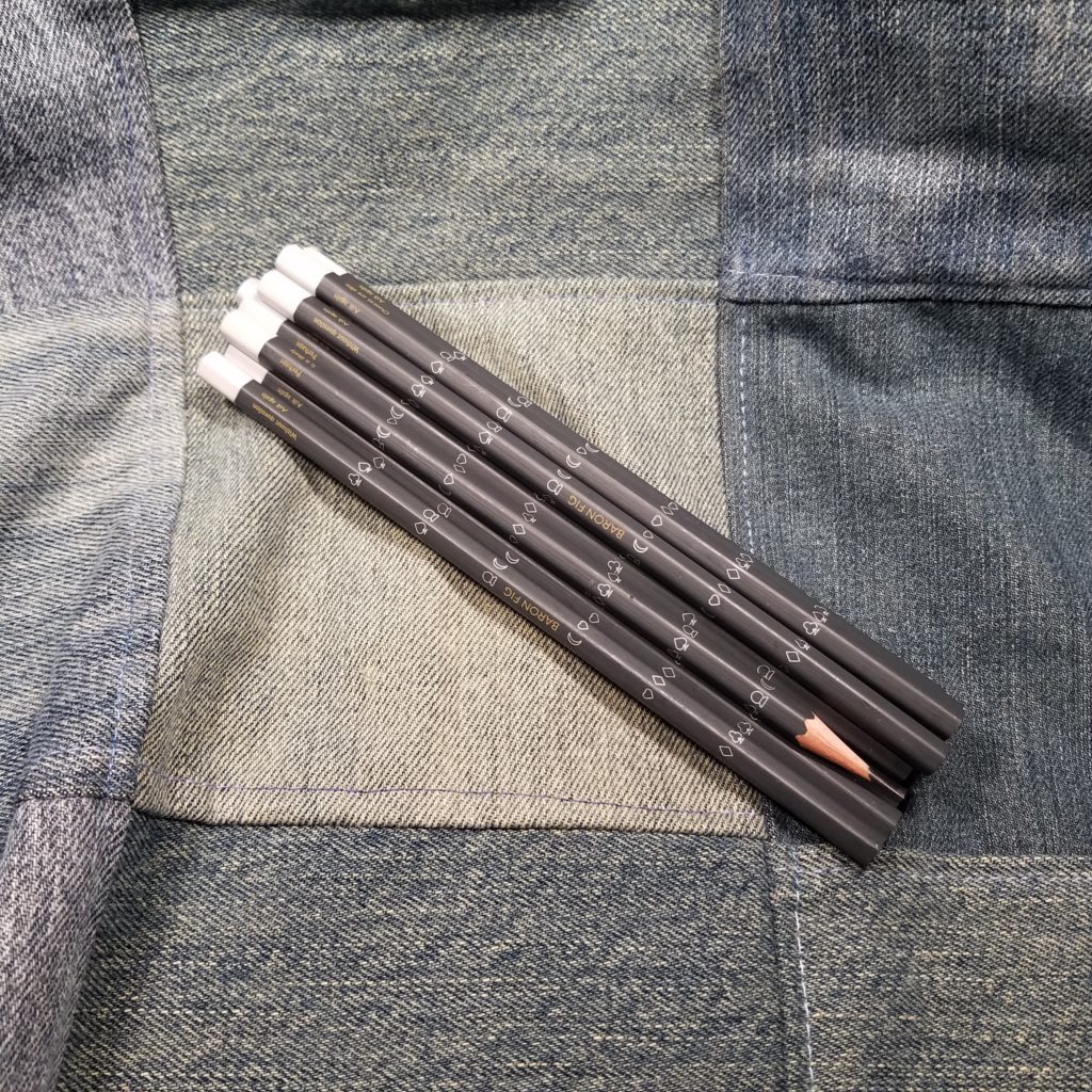
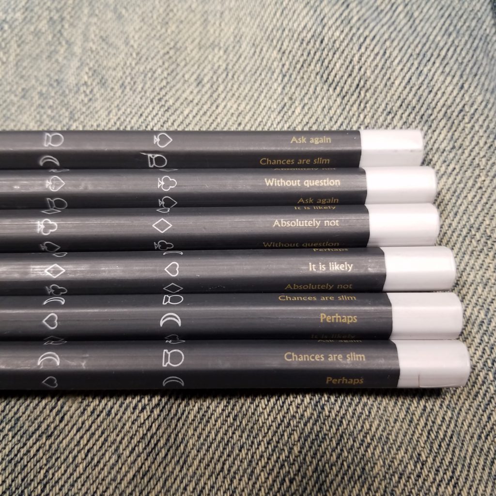
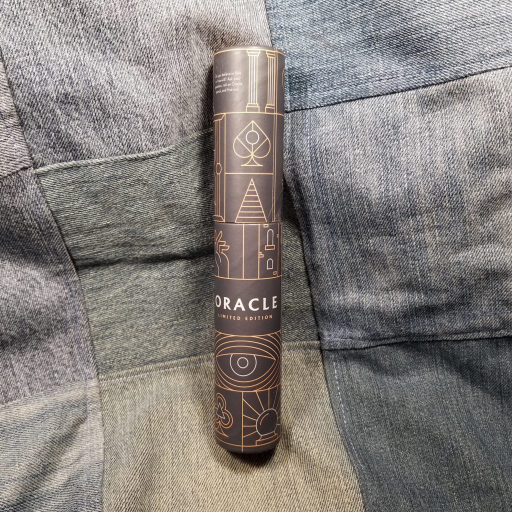
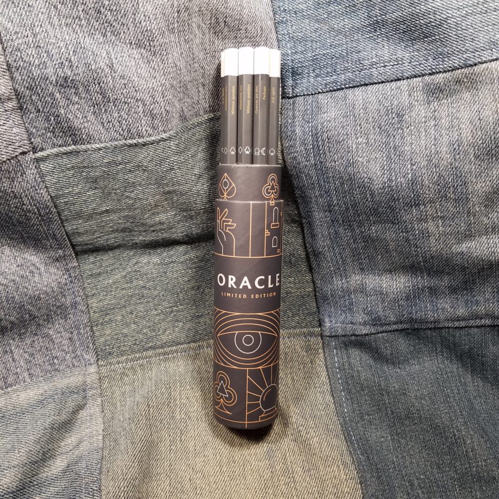
The packaging for the Oracle is gorgeous, as usual. The coloring is graphite grey, ash grey, and mustard yellow. The decorations seem to be inspired by playing cards and tarot cards. On each side near the dipped end is an answer, roll your pencil and whatever is up is your answer. Fun. Each side is adorned with playing card suits plus a moon and crystal ball. All this in pale ash grey on deep dark graphite grey. The pencil is matte finished and always has some shinier bits due to rubbing in the packaging during shipping.

In the past, the exterior of the Baron Fig LE Archers has always been gorgeous, but it was wrapped around uneven graphite filled with grit. This is the first time I’ve used the Archer and actually enjoyed the core. Really, the main difference is that there isn’t any grit. I don’t get these bits that leave snags and gouges in my paper. Overall I really like this version of the Archer, and I always did enjoy asking the Magic 8 Ball questions. Get yours over at Baron Fig.

Review: Leuchtturm 1917 Dots Notebook

I picked up this Leuchtturm 1917 (L1917) years ago at my local Artist and Craftsman. The sky blue color called my name. Initially I purchased it to practice calligraphy. I found that I didn’t like the grid size or the paper as much as I had hoped. Soon it was abandoned in my bin of journals.

Since the L1917 is the suggested journal for bullet journaling, I pulled the failed notebook out of retirement and pressed it into service.

A few notes. This book sat in my abandoned journal bin for years. In this time the elastic lost its elasticity and stretched completely out. I remember it was loose even when first purchased. I ripped it out and replaced it with a new sturdy black elastic. Inside I found several loose stitches, which I clipped and melted into place. Otherwise the notebook was well made.

The journal is Smythe sewn with nylon thread. It opens completely flat and can be folded over on itself for writing in hand. Unlike a Moleskine the L1917 features a supported rather than hollow spine. This means that folding the book over on itself takes a bit of work and requires creasing the spine. It looks natural on my L1917, but some folks might not appreciate the look. The cover is made of vinyl over stiff hard card that feels very sturdy.

The ribbon marker is a shade darker than the cover and is also made of nylon. I think mine arrived heat sealed but I do know that I sealed it more deeply. The marker is generous and has several inches outside of the book. I like this. I can grab it and open the book with it easily. It is also glued deeply into the spine. I gave it a good yank and didn’t feel any give at all. The back of the book had a generously sized pocket that holds the stickers that arrive with the book. I also store my sheet of blotting paper here.

The paper in my is labeled as “ink proof” and indicates that there should be no bleed through. I have found that this is true, but I have also noticed that there is  some feathering. Some ink wicks along long fibers in the paper, which is a major complaint that many fountain pen users have against Moleskine. I don’t notice this with all inks, just some of them. The paper is heavily sized, and even quick drying inks seem to take forever to dry, which is why I keep a sheet of blotting paper handy. I use it VERY often. I’ve had issues with gel pens smearing hours after I’ve finished writing.

I’ve frequently touched a page days later only to have the slight moisture from my hands* smear the ink all over the page. Forget about using a highlighter to emphasis an item in your bullet journal, it’ll smear.

The paper is very thin. All the inks I used had show through on the back side of the page. It’s not so bad that the page is unusable, just very obvious, particularly with black ink.

Complaints aside, this paper feels great with everything- even pencil and ballpoint. It’s smooth with a hint of tooth. Even rubber stamps perform well on this paper. In fact the variety of stamp inks I used on this paper responded well- dye, pigment, and Staz-on. The paper takes a great impression.

The dots are tiny and the palest of grey. They completely disappear behind any writing, which you know I love. The creamy shade of the paper looks great with all the colors of ink I’ve used and graphite looks great on it too.

Overall, this is a perfectly acceptable notebook. I like the pale gray dots, that the pages are numbered, and the feel of the paper. The generous page marker and sturdy pocket are great too. The elastic left something to be desired but that could have been due to age and storage. The price of $$$ is within range for hardcover A5 journals with quality paper. If you watch the stationery sites you can often find them on sale.

This is a nice journal, it’s just not my favorite.

Review: Pen Addict X Robert Oster Fire on Fire Fountain Pen Ink

Brad graciously sent me a bottle of this ink for review. When he contacted me I was so excited. Having a good orange or red ink is vital for editing, for me anyway. I need something with some pop against the borning black. I also want something that I can read with ease.

The color is a true orange leaning neither yellow nor red. This ink is not overly saturated and has some lovely shading with a hint of sheen. The sheen is red and the shading is warm and a touch reddish, though not overly so. In a dry-ish pen the shading is less pronounced and the sheen is negligible. To get sheen and shading out of this ink you will need to use a wet writing pen with a wider nib. The ink goes onto the page as a true orange with a fine nib.

I don’t know why I’m always surprised when a Robert Oster ink is so well behaved, but I am. This ink was amazingly well behaved on the garbage paper at work. It stayed true to nib size, didn’t feather, didn’t bleed through, and had little to no show through. On good paper I was able to get that shading and sheen. I used it in my L1917 and Baron Fig Confidant and it looks great on those warm creamy pages. With a fine nib it even did okay in a Field Notes, but with a wet or wide nib it was as awful as any other fountain pen ink.

I’ve put it into two of my cheap fountain pens- the Kaco Retro and the Wing Sung 601a. The Retro writes on the dry side while the 601A writes wet. The ink in both pens feels well lubricated and smooth. Flow in both is average, with neither pen exhibiting dryness nor excessive wetness. Both pens feel good with this ink on multiple paper types.

This ink isn’t particularly professional- unless you edit papers or need to use it to draw attention to places where people need to sign documents. I’m not someone who will regularly write with orange ink, even with a firehose of a nib this ink is too light to read large passages written with it. That said it is a pleasurable ink to use and I have used it to write several long entries into my bullet journal. I’ve also used it during a brainstorming session to highlight particular ideas. In my use this is where an ink like this stands out- highlighting and lending emphasis.

I’m running a giveaway. Sign up via the rafflecopter widget to win a 3ml sample of The Pen Addict x Robert Oster Fire on Fire ink and a few other goodies.

a Rafflecopter giveaway

Review: Hero 616 Standard “Bobby Launch”

Bobby is an eBay seller who seems to primarily focus on fountain pens and other office supplies. Shipping took 15 days from the date I ordered. The cost of this little pen was a whole $1.39.

The pen arrived swaddled in bubble wrap and inside a yellow bubble envelope. The pen was inside a plastic sleeve with cheerful red, white, and blue printing.

The pen outside of the plastic sleeve looks small and inexpensive. The stainless steel cap has lines engraved vertically. This version of the 616 has a brass clip. The plastic of the pen body is dull and flat. A little polishing might help bring out the shine.

The brushed stainless steel cap friction fits for capping the pen. Mine is secure but it would be easy to not cap it tightly enough and have the cap wiggle loose. The cap also friction fits for posting. I found that it posted deeply and securely. The cap and pen are so lightweight that the balance wasn’t affected at all. I find this pen MORE comfortable when posted.

It should be noted that, in my testing, I carried the pen clipped to the placket of my shirt and neither the clip nor cap, ever came loose. However, while traveling to and from work I had it along with other pens, inside a hard shelled case. On more than one occasion I knocked my bag over or dropped the case. Upon opening the case the cap had wiggled loose from the pen. I would not carry this pen in the pen pocket of a bag or anywhere the cap could wiggle loose. It is certainly not a pocket pen, despite its diminutive size.

The nib is hooded and also gold toned. Mine arrived misaligned with the hood and the feed. A little work pushing and pulling aligned everything. Once inked the pen was a tad bit scratchy, so I ran it over my buffing stick. Ten minutes work gave me a pen that feels great.

This pen is an aerometric filler. I’ve used the Pilot aerometric refill and that works well. The Hero aerometric is a piece of garbage. The small tube inside isn’t long enough and the feed not set up to work properly, so every squeeze pushes out all of the ink. Testing this filler with water I was able to suck in about 1ml of water. Once dried and inked I was only able to get the damn things to suck up a little over half a fill of ink.

I also managed to cover my hands with ink. Sadly I have 2 more aerometric fillers that I need to review and each fill pissed me off. I will never order another cheap aerometric filler for review, but you’ll need to suffer through 2 more reviews of them.

Overall, this pen is quite nice. The hooded nib once aligned and tuned writes like a dream. Like all hooded nibs, dependent upon ink choice, it just writes and writes well. It’s an easy pen to like, it is, after all, a rip off of the classic Pilot 51/21. Sadly, they weren’t able to get the aerometric filler to work well. I’ll probably adapt mine to work with a standard piston type converter, but that’s a kludge I’ll share later. If you want to read about the original that this is riffed from check out Parker51.com it’s a great resource.

Continued Change and Growth

2018 has been many things- for me, it has been a year of change. This blog has remained a constant in my ever-changing and evolving life. It is my touchstone. I return to it as a source of comfort, continuing self-expression and learning. I’ve been blogging so long that I cannot imagine my life without something of Comfortable Shoes Studio.

Thinking forward to 2019, I’ve been considering what I plan to do with this blog as I move forward with both my side hustle (this blog, writing, and my podcasts) and my professional life. Clearly, CSS will continue on. I’ve discussed some of my thoughts regarding reviews on RSVP and how they shape a blog. I hope that my honest reviews have helped you make informed decisions regarding your purchases and that has had a positive impact on your life.

As much as some might like to pretend that it’s just stationery, it’s not. The choices we make about stationery, the tools we use, adds to our life. When we take a mindful approach to these choices, and how we use our tools it has a positive impact on our lives. Sitting down with a pen or pencil that you love to hold and attending to how that tool feels as it glides and scrapes across a page is a deeply sensory experience, one that grounds us in the here and now. And at that moment as we allow our senses to take over and deeply feel that connection between ourselves and the page we are truly in the moment. This is at the core of mindfulness it is my belief that using this connection to our tools in a mindful manner can only add to our lives, never detract.

In the coming year, I hope to delve deeply into the affordable side of fountain pens. I’ve ordered a grouping of inexpensive pens to explore on the blog. One of the great things about the change instilled in my current DayJob is that I can safely test and explore the tools in my new surroundings. I hope to also explore more on the paper end of things. I’ve been looking at some of the notebook and journal options out there, and my hope is that I can review more notebooks and journals. My stance on ink reviews has generally been other people out there are better at them than I, but I’m hoping to expand into doing ink reviews but of specific colors and shades that I can use at work. I hope to explore these colors specifically in how they work for the DayJob.

I also hope to explore some of this tactile nature of the pens, pencils, and paper we use. What is it that causes me to like one ink over another? One paper over another? What are the specific tactile cues that I seek out? This endeavor will force me to be more mindful of my use and to also document these preferences.

This is less a roadmap but a listing of my hopes for the next year of Comfortable Shoes Studio.

(And of course I’ll be doing my yearly back to school sale composition book reviews!)

Thinking: Washing Notebooks

A few months ago, hell maybe it was a year ago now, I washed one of my Field Notes. It was an orange Unexposed. Unexposed is one of my favorite editions. The bright colors and reticle grid make me happy.

Sadly the Unexposed covers are garbage when it comes to water resistance. The notebook was a pulpy mass when it emerged from the drier. The cover had shredded into tiny pieces of paper that glued themselves to my clothing, it was especially attracted to my black khakis I wear for work. I had to wash the entire load again.

The book lodged in my pocket and as the washing machine and drier tumbled it’s paged matted together and formed a ball inside the pocket. What was left of the cover glued itself to the interior of the pocket. I had to peel the book from the cotton pocket liner. I flattened the book the best I could, the damp pages tearing if I touched them with too much force.

I had to look, I had to see what information I had lost. Fortunately, it was a recently started work notebook. So only 3 or 4 pages had been filled. I’d lost little.

In the past, I’ve been insistent on using waterproof inks. My love of the Signo 207 and other Uniball pens is well known. Much of the reason I love these pens is that they have great waterproof ink in them. Most of the ink in the washed Unexposed was gone. It had migrated to the rest of the paper, tinting it a pale blue-gray. Here and there you could see where I had written with a waterproof ink. (I can’t show you, as it was a work notebook.)

Each time I washed a notebook I lean more towards using waterproof inks, not for their archival qualities, but because I want my books to survive the wash. I’ve washed maybe 4 notebooks in my life, and dramatically, each time I do, I feel a deep sense of loss. The sense of loss is ridiculous and a bit silly. Most of my notebooks don’t have important info in them, merely notes for blog posts, story ideas, and reading notes. Even my work notebooks don’t have important info in them, those are comprised of to-do lists and paperwork I need to fill out.

Anyway. Don’t wash your notebooks, It makes a mess.