I realized I promised you more cult of stuff ranting and raving… However I forgot that I had a family obligation to attend to and if I had bowed out by saying, "I have ablog post burning my brain." I'd have been looked at dissapprovingly and told to get my ass in the car. So I give you, ART!
Author Archives: leslie
Technique Tuesday: Golden’s Tar Gel for Cult of Stuff
This week’s Technique Tuesday is an additive. I’m combining TT with the Cult of Stuff workshop on AJ ning. My choice of stuff to experiment with was Golden’s Tar Gel. It’s an additive that you mix with a liquid paint to get stringy lines that stay raised, think of Jackson Pollock, and you have the right idea.
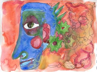
I’d read that Tar Gel takes forever to dry, I don’t like my art journal to be out of commission for that long, so I grabbed a board and did one of my automatic continuous line drawings on it in sharpie. I’d had paper and thread glued to this board previously so there is a lumpy bumpy texture already in place.
I filed in the face portion of the drawing first with warm colors then added a flat dark blue background. To this I added the strings, bloops, blobs, drips, drizzles and splots. I mixed a good amount of color with the medum, so that it was thin and runny. I then loaded up my palette knife and dribbled away. It was fun to try and control the medium, as it really had a mind of its own. Sometimes large blobs would run off the knife, sometimes thin streams.
The interesting thing with this medium is that the drips and dribbles stay raised. I tried the heat gun on them but it raised air bubbles and the medium did not seem to like it at all. So I’ve put a fan on it to attempt to dry it faster. Hopefully tomorrow it’ll be dry enough that I can hang it and get some decent pictures.
Cult of Stuff part 7
As an artist I know the value of having plenty of my materials at hand. There is nothing worse than having to worry about conserving paint because I’m almost out of that indigo blue I adore. It’s also difficult to know the cost of the materials I use. Some of the paint I’ve got cost $20 for a 15ml tube! I spent much of my time in college worrying about the cost of my materials and thus attempting to work small or lean so that I wouldn’t have to worry about buying another tube of whatever color I may run out of. My final project for painting 101, for which I was required to work big, I decided to work in a sepia tone, because I had the most of those colors. This annoyed the crap out of my professor.
If I could go back and do it over again I’d have bought tubes of Liquitex Basics, despite my professor’s sneers toward student grade paints. I’d have felt much more comfortable and free had I not had to worry about replacing $20 tubes of paint.
It’s part of the reason I preach “buy the best you can afford now, upgrade later.” I’d have been better off in college buying better brushes than splurging on the pricey paints. I’d have made better art too.
We’re all after the magic bullet; that special brush, watercolor set, color of paint, stencil, rubberstamp or glue that will propel our art into perceived territory of amazing. WE see what our friends make and compare, usually unfairly. We see them using a particular pen, or ink, or cutter and suddenly we think, “My art could be better if I HAD that particular tool.” We watch some YouTube videos on that product and soon enough we’re convinced, “MY art WOULD be better if I only had that tool.” We buy into the hype. Then we buy it and it sits gathering dust in a corner of our art room and soon enough we’re regretting the purchase. We forget that regret as we get onto the hunt for the next new product.
In the end we feed the machine and our guilt. Eventually the guilt is deep enough that we can’t even go into our art room because we’re reminded of the hundreds (thousands) of dollars we spent accumulating our stuff.
The reality is, if we learned better to use our current stash of stuff we'd be less insecure when we look at art on the interent, Ustream and blogs. Knowledge of our tools is what makes us more secure. Knowledge is security.
Knowing what you can and can't do with the tools is the first tool in the arsenal against the cult of stuff.
I have a rule that I need to use anything new in experiments. I have to learn how to use it to the best of my abilities. It's why anytime I buy a new color of paint I test it out on a page of it's own in my journal. I make blobs and lines, little squiggles. I try and mix it with other colors to see what colors I get. I see if I can add it to the tools I have. Sometimes It doesn't make it and sometimes a new color is magical.
Cult of Stuff part 6
When I was a kid I loved coloring. I never liked to color things the colors they were supposed to be. In my mind a horse could be blue and Smurfette could be green. I didn’t care if the colors stayed in the lines. The blue horse could fill the whole landscape if I wanted it to, she could blend in thewith the sky. In my head it was all good. When I was in 3rd or 4th grade the teachers started to praise another girl in my class for having perfectly colored in horses and smurfs. Her smurfs were the right shade of blue, from the 96 crayon set and the colors never went outside the lines. They were perfect. The teachers started asking me, “Don’t you want your smurfs to look just like hers?”
Well, no, I didn’t.
But she got all this praise for getting all the colors to stay in the lines. What I wanted as an 8 year old was for the adults to heap praise on me like they did with her. I watched her one day to see how she did it. She carefully outlined her coloring book with perfectly sharpened crayons, her little tongue sticking out from her mouth in deep concentration, she slowly and carefully shaded in the panels of color using the side of her crayon and carefully rotating it to keep the point shaped well.
I followed suit. I wanted the teacher to be impressed with my smurf. I concentrated hard and did everything she did, and my smurf kinda looked like hers. I used the wrong shade of blue because I only had the 48 color set and the regular blue had been worn down to a nub from making horses that blended in with the sky.
The girl came over and took a look at my smurf and said, “That’s pretty good but you went outside the line right there.” While pointing to a miniscule speck where I’d gone outside the lines. I probably spent the rest of that school year attempting to color in perfect smurfs rather than just making what I liked.
Are we all trying to make the perfect colored smurf by following instructions exactly?
Why are we so afraid of doing our own thing?
How can we unlock our creativity?
I have an exercise that I do when I’m feeling blocked and it helps unlock my creativity. I call it automatic continuous line drawing. The only rules are that you don’t lift your pen, it has to be done in pen and lines can not be erased.
Put the pen to the paper and make lines. You can make a drawing of something or nothing. Random shapes are cool. I tend to start with a face I work my way out from an eye, nose or mouth and build up a lot of thin black lines until I feel like I’m done.
I’ve filled up entire sketchbooks with these drawings.
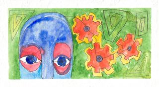
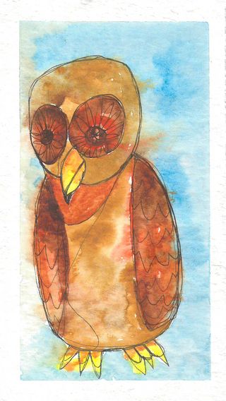
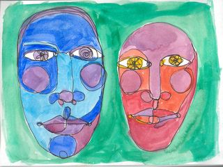
Sometimes I leave them black and white and sometimes I add washes of watercolor. I’ve drawn them on board and added layers of gouache or acrylic. Marker, crayon, or colored pencils would work too.
Line and color. These wake my brain up.
The best thing is, this exercise that completely wakes up creativity only needs a pen, a journal, me and maybe some color.
These drawings are my anti-smurf. A complete rejection of coloring inside the lines. I MAKE these lines. I apply color where I want, wet blue watercolor mergine with damp red watercolor creating a mingling of color that would have made my 3rd grade teacher question why I’d do such a thing and wonder what was wrong with my eyes, mental faculties and question if my hand-eye coordination was off. What she’d fail to see is that these little drawings are escape and awakening. They are my brain on creativity.
These drawings represent a way for me to step away from the teaching of conformity and feeling that I must do this just so.
I want to know, what do you do to break free?
Cult of Stuff part 5
People have been making art for thousands of years. The earliest cave dwellers attempted to document their lives. Simple pigments were spit onto the wall or they applied them with sticks and twigs, these were the tools people used to document the hunt.
The first art journals were on the cave walls.
I am not attempting to create a divide between art journalers and scrapbookers, nor a turf war. (Get off mah lawn!) I think we can all coexist peacefully with our different manners of expression, and overlapping expression.
What I do think is that we need to look at the stuff we’ve accumulated and see how we can better fit these tools into what we do in our art journals.
How can we use them more?
How can we adapt them?
How can we break the rules?
How can we use the tools to express ourselves more fully?
This is the essence of the cult of stuff.
Take what we’ve got and experiment with it.
Rising up against the machine of the industry aimed at our wallets. Or really just being aware of how we are targeted to buy more. Everyone wants to buy their latest product. Machines like the Cricut (here goes any chance of EVER being sponsored by provocraft) are crippled for use outside of their very narrow set of rules. To use them you HAVE to use their carts with their designs and they give you a set of instructions for how to put it all together. Rather than giving you a program like Makes-the-Cut which unlocks the real potential of the cricut. With it you can cut and create anything you want. You can make layers in a photo and cut that out. Amazing.
But it makes more fiscal sense for provocraft to have you buy cart from them at $40 each. That doesn’t open up your creativity. They help you some with a $30 (or is it more) program that allows you to mix up the stuff on their carts, which you still have to buy.
Then some brilliant people figure out how to crack it and give up programs like Make-the-Cut and Sure Cuts A Lot and really unlock the potential of the machine.
Meaning that you can break the rules.
Sometimes being aware of the difference in want and need. I might want that 2 inch circle hole punch but do I need it? Well, if I need to cut out 200 2 inch circles maybe, but if I’m going to cut out 5 2 inch circles maybe I should consider an alternative, like an exacto, scissors, or a click knife.
Do I need that shiny brass bijoux watercolor set or is my handmade mint tin set just as efficient and useful?
Some of the adaptation has been a lesson in letting go. Some were hard learned during those first few years right after college when I truly lived paycheck to paycheck. I survived by buying cases of ramen noddles ($5 for 24) and my fresh veggies off the “almost rotten” rack. I’d save a few dollars here and there and splurge once a month on a tube of watercolors or a pen. Sharpies would go missing at work. I drew in ballpoint.
My point is that I had to lean to let go of my notion that I needed the best and the most expensive artist grade paints.
I had to unlearn a lot of what I had learned. I did this by breaking a lot of rules. I learned to live my life.
I used scotch tape in my art journal.
I walked in Boston at 1 AM with hot pink hair and my good friend with bright blue hair, because we had nothing better to do that night and Boston at 2 am is beautiful. (It’s also incredibly stupid and dangerous, so kids don’t follow my path.) I documented the smells of Chinatown in August (yuck), the heat of Lynn at 1pm in July, the sound of firecrackers on July 4th, and how much my neighbors fought. Our lives aren't cookie cutter identical. Each one is unique.
I taped in bits and pieces of my life until it became whole and manageable and real.
Over time with hard work I’ve learned who I am and I’m still progressing.
So when I see corporations targeting art journaling and the journalers I get a little grumbly. Because I know you don’t need all that shiny stuff they want you to buy.
You need a journal, a pen, some glue/tape and you.
What you don’t need are rules.
You don’t need the trap of all the stuff holding you down and slick clever marketing campaigns targeting you to buy more and do less.
You need to be free of your stuff and the preconceived notions of what your art journal should look like.
Because it doesn’t have to look like anything but what you want.
Art Journal Essentials: How to Books
The following 3 books are what I consider must have’s for people new to art journaling. The techniques are basic but explained well and these books suggest that you experiment.
Danny Gregory’s The Creative License. He includes interviews from a wide range of people and suggests a simple set of tools- pens, watercolor, and journal with a sense of documenting the simple and everyday items around you to appreciate the moment. Danny Gregory has a great blog that he no longer updates as much as he used to but is a great resource.
The Journal Junkies Workshop by Eric Scott and David Modler. This is a comprehensive guide to techniques that you can use with pretty simple materials. Again observation is mentioned here, as well as writing and creating texture and visual interest. This book works much more in the abstract realm than Danny Gregory. These guys run a neat blog too.
Diana Trout’s book Journal Spilling is another favorite of mine to suggest to people just starting out. She gives you a serious list of tools to use in your art journal, all using simple materials that are inexpensive. Additionally she’s got a set of youtube videos that go along with the book as well as a blog. I’ve reviewed her books for the zine and I’ll report that article here at some point.
What you’ll notice about these 3 books is that they suggest simple materials and gathering your own materials to use in your journals. These books avoid pre made materials that you can buy at the craft store. This makes your journals 100% your own. It’s this sense of unique that I think people look for when they create a journal. These books all foster that spirit and not the “cult of stuff.”
Cult of Stuff Link Round Up
The cult of stuff posts have really spured a ton of conversation, read what others are saying:
And more to come!
Flickr Finds: Alshepmcr
This person's work is amazing in that it's done on garbage and using stencils and collage. Every time I look at his stuff it blows my mind. Simple and effective.
Cult of Stuff part 4a
Whoa. The cult of stuff discussion has taken off. On twitter and blogs (this needs a whole post) and other sites.
If you write on twitter about it include the hash tag #cultofstuff so we all can read your thoughts.
Most interesting to me is the discussion from this UK scrapper’s site. Mostly because these people don’t know me and I can safely assume that they have never ventured onto my blog. It gives me some insight into my tone.
It pains me to think that anyone would assume that I would sneer at their art journal. Nothing could be further from the truth. When someone decides to art journal they are stepping into a path of knowing, learning, exploring and experimenting. Sometimes art journaling comes along organically as people want more from their supplies and to see more results.
We shouldn’t take views centric to our particular art and craft as to a path to art journaling. I know people who have come to it from scrapping, others from fine art, others from writing, still more from the altered book realm and I’m sure that there are others who simply discovered art journaling.
We cannot assume that everyone comes to art journaling with the same experiences and tools that we each have. That is what makes art journaling so wonderfully individual.
And that is to say, even if you use mass produced tapes, papers, punches, masks, stencils, stamps and other things. no other person creates with your personal vision, set of experiences, and feelings. It’s still art, and your art.
But I want more. I want more of ME in that page. I want it to reverberate with what I’m feeling at that moment. If it’s a TH tape (that doesn’t stick) then that is what it is.
What I’m railing against here is the mentality that using mass produced stuff like TH’s wonderfully coordinated products and following the exact instructions that are posted to his blog, YT and where ever else. My feeling is that if you reproduce some one’s craft project step by step you are learning. That is great, but what next? Where do you go from making TH’s 12 tags of Christmas. You learned a lot of techniques. Do you take the next step and plunge into applying those techniques to your own work?
My point, and perhaps I’m a tad muddled here, is not that people are copying work but they are taking the easy way out. the companies make this even easier by making you really easy to use products and giving you step by step instructions. Insert tab D into slot C and suddenly you’ve got an art journal. Some might say that following someone else’s instructions is not art, I am not one of those people.
Art journaling is a path to self realization and taking the easy way out isn’t beneficial, it’s superficial. There are no rules to art journaling except that there are no rules.
Cult of Stuff part 4
I was emailing with one of my art friends and she said, “It’s as if people think that if it’s pretty everything will be okay.” I think it’s why many stick to the mass produced ephemera, stamps, and cookie cutter looks. It’s easy to make a pretty page when someone hands you instructions on how to do it. Use this color, use that color. Blend this colored pencil on this premade face. Stick this rubber stamp onto your page exactly 2.5 inches from the top edge and 3 inches from the right. And before long you don’t feel like you can do what you want, you are stuck in this pit of rules.
And here I say, screw the rules. Eff ‘em. Throw the rules out.
Take the rules you learned in that class about those faces and tip them on their side. Draw an oval and fill it with green and blues and all the colors YOU like. Those rules for blending? Follow those, but with the colors you love. Don’t worry about making it look just like so and so’s pretty girl. Make her yours. Give her purple eyes and red hair. Blend in some blue. Don’t think that you have to have the very same prismacolor.
You OWN that art journal, and that face, damn it, it’s yours.
Experiment on a few faces to create a look that is all yours. Fill a page up in your art journal to create your look, pick and chose colors you love. Go on, draw a variety of ovals, add some eyes, and a mouth you like.
You can do this.
Not because I say so, but because you KNOW you can and you WANT to.
When I was a kid I was pretty lucky to have parents that set very few limits for me. I was never told I couldn’t play in the woods (except when I cut down the neighbor’s tree, then Dad took my hatchet away for a week) or that I couldn’t go fishing on Saturday afternoons, as long as I told my parents, I was allowed to do it. There were rules but few limits. I never thought I couldn’t do things, and still I rarely stop to think that something isn’t possible, I do it. If I fail, well, I fail and I’m usually out a few dollars but I look to the experience as important as succeeding.
And that is the spirit I take to my art journal. I do it and think of the consequences later. I don’t think in terms of a ruined page, I think in terms of the experience of that page. I walk away and think, “Shoot, I won’t do that again.”
Don’t be afraid. It’s an art journal, it won’t bite. No one will see it unless you invite them to. You can close the book if you don’t like what its saying. You can change it. I’m a fan of leaving my ugly pages as they are, wart and all.
Remember to love your ugly pages too.
I deeply love my ugly pages. They teach me more about myself than the pretty pages. In the depths of layers glued in and painted on are deep thoughtful meditative moments. Moments when I’m so aware of who I am that it can be scary. I think that is what bugs us about ugly pages. Not that they are ugly but we’re afraid that we are reflected in them.
I’m not ashamed to admit that sometimes when I art journal the meditative moment can and does move me to tears. When I’m writing about deep painful things it’s not comfortable, but my art journal is about stretching me and opening my eyes to what I can be not just what I am. Sometimes when I’m brought ot that new level of who I am, that deep realization, I realize that I can be more.
Your art journal is your place to let that go. Glue in and paint down your fear. Meditate as you scrape paint over the pages, roughly gesso them, and gently massage a new piece of you into place. Your art journal doesn’t judge you, you judge you.
If you are new here, this is your first visit, please realize this is a (so far) 4 post rant on stuff. Feel free to head here to read the rest of my tirade. Also, please don't assume that I hate pretty pages or would sneer at your art. This rant is about empowerment not judgement.
