Muryō is a very personalized and interesting bullet journal indexing system. Muryō is the brainchild of Jessie Friedman and reflects his bullet journaling methods. Consider Muryō to be an add on for your bullet journal.


Muryō is a very personalized and interesting bullet journal indexing system. Muryō is the brainchild of Jessie Friedman and reflects his bullet journaling methods. Consider Muryō to be an add on for your bullet journal.
Lately the art I’ve been making has been written and mostly in the form of letters and journals and nonfiction writing. Someone once told me that writing nonfiction was easy because it wasn’t creating anything.
Envision a long pause as I take in what she said… LOL not creating. LOL.
Looking back it is laugh out loud funny, but back at that moment it fed into my inner critic which fed into my imposter syndrome.
Well, I’ve come a long way in the last few years, and quite frankly, that former friend can stuff it. Though If I ran into her again my language might not be as nice.
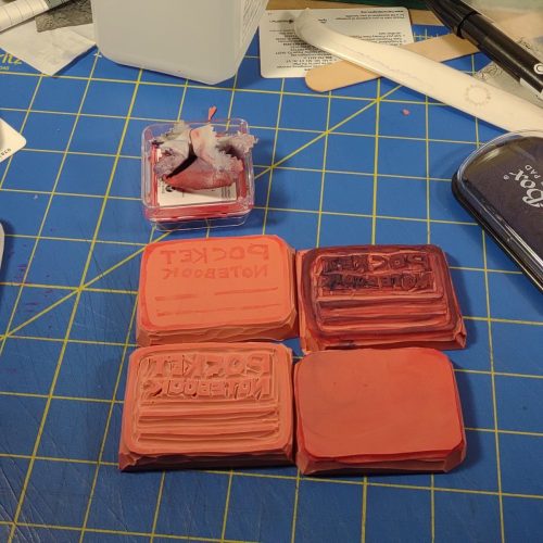
My zine, Useful Journaling has 3 issues out now. I’ve reprinted the first issue several times and the second is about to be reprinted. Making zines has been a throw back to my days of bookbinding, and wow do I want to make some pocket notebooks. I’ve been making simple collages as a future cover for Useful Journal (that will make sense for issue 4) and that’s been really fun creating a nice cover that will get photographed then manipulated digitally to create the final cover.
Though it’s not art, I’ve also been starting seeds and getting things read for my garden. It is creative in that I’m reusing as much as I can and recycling things, like Keurig cups and tp tubes for seed starting.
Markings Bulleting Log Notebooks with an orange cover
My first interaction with Markings journals was that the covers were sturdy black or dark brown vinyl with stitching around the edges. Classy and ready for the boardroom. The covers in Walgreens range from plain vinyl to mine- bright orange with a printed slogan, mine says, “Go get ’em!” Luckily I have a bunch of stickers to slap over that. It still has that classic edge stitching. The cover is sturdy with a hint of flex. It works well enough for writing in hand and opens flat for writing on a desk.
Inside are off white creamy colored pages with pale grey printing. You know how I love grey ruling, well this one isn’t super pale but stands out a bit. Better for low-level light writing than a few of my old journals.
I have to admit that in all the years I saw Markings at Staples I never purchased one. The paper always felt okay, but back when they would have appealed to me, I was firmly entrenched in Moleskine sketchbooks, with their thicker paper for my journaling. The Markings seemed too… parental and stuffy to me. Not this one, with it’s bright orange cover and cheesetastic slogan.
So how is the paper? Good. It’s smooth with a bit of tooth. Pencil is great on this paper and looks good on it’s warm creamy surface. Gel ink sings across the page. Highlighters don’t soak through, even with multiple passes across the same area! And fountain pen? Well, fountain pens perform really well. The page isn’t thin, but you can see darker colors in wide nibs through the page, but it doesn’t interfere with use of the reverse of the page. At 240 pages this is a chonky journal.
NovelPad recently made some big updates which addressed a few of the things I wanted to see from them. I’ve cut and pasted this directly from their email, as I couldn’t find a good link to it online.
The last time I sent one of these was over two months ago, but for good reason. On Monday, we released the biggest update to NovelPad ever:
But that’s old news at this point because we’re getting back into our weekly update schedule, and to kick it off here’s what got better in NovelPad this week:
1. Collapsable Chapter HeadersNow you can increase your writing zen when drafting in the Manuscript View by collapsing chapters that you’re not focused on:
|
![]() |
2. Manuscript View Remembers Scroll PositionNow every time you navigate within NovelPad or elsewhere, when you return to the Manuscript View, you’ll pick up right where you left off!
|
3. Word Import FixesA couple of minor fixes:
|
4. Total Word CountThis one definitely isn’t ground-breaking, but it was certainly overdue! Now you can see the total word count of your novel on the Analytics Page:
|
5. Selected Word CountsWhen selecting text, the formatting dialog will now show you the Scene word count and the Selected word count:
|
![]() |
6. Text JustificationSpeaking of the formatting dialog, now we also allow for all four standard text justification methods: Left, Center, Right, and Justified (unsupported in Firefox):
|
7. Typewriter Mode Scroll FixFixed a bug where replacing text with ProWritingAid in Typewriter Mode would occasionally cause the Manuscript View to scroll to an incorrect position.
|
8. Unindented First ParagraphWe’ve added a setting that allows you to disable indentation of the first paragraph in each scene. This should make the novel look a bit more “standard” while writing:
|
![]() |
I’m sitting here toasty warm after a weekend long warm snap wherein I began building raised beds that will take up the entire back half of my city sized backyard. The rough part of this is that I am now in allergy hell. Leaking nose, watery eyes, and sinuses so stuffed I’m surprised my nose can leak. I finally had a chance to sit down with a few zine friends that I’ve been meaning to dig into.
I’ve mentioned a few times that I’m pretty lucky to have my zine friends, not only do they make some killer content online but their creativity is stellar.
404 (Dunno where my picture for this went) Is Andy’s little ditty to error codes and poetry and UX writing. KIller. I can’t wait to get the next issue.
Pencil of the Week– This last issue was awesome. The folded library card like envelope was awesome, not to mention the collab with Ernest Theodore. Included in the package is a color post card by Ali Serra aka Ernest Theodore. I love it when zinesters go artsy, and this was great.
Just when I thought Pencil Revolution couldn’t get cooler, Johnny moved up to a half sized zine* and moved production to once a month. This means we get a thicker, longer themed issues. And the last 3 in this series are all great. I particularly enjoy this last issue that explores walking with writing. I’ve got to agree with Johnny that nothing gets those grey cells pumping out journal pages better than a good walk.
Johnny also does a series of zines about mental health issues. They are really wonderful snapshots of life with mental health issues.
Plumbago is coming back and they are looking for contributors.
The Apsara Matte Magic 2.0 pencil is pure fun. It hits all the buttons for me for an enjoyable pencil experience. First, the pencil is painted black. Black pencils are my jam and I always want more of them. The imprint is silver foil on black- classic and awesome. The end dips are colorful and have meaning to the inside of the pencil.
Inside the wood of the pencil, it sharpens like bass wood, is dyed a variety of colors. Some pencils have one color of wood inside, others have two colors. The end dips correlate to the colors inside! The mechanical coordination this must’ve taken in a factory pumping out millions of pencils is kind of mind blowing.
The core is labeled as extra dark, which in Apsara terms means nicely dark with a firm core. The extra dark core is one of my favorites for writing for long periods of time. It glides smoothly over a page and leaves a deep dark line. Killer.
I sharpened mine up in my hacked Apsara Long Point housed in a RandomThinks 3D printed holder (a killer tool check out his insta to see if you can get one) and it sharpens up to a lovely point.
The 10 pencils arrive bundled with a long point sharpener ripe for hacking and a little plastic eraser. I’ve immediately started to use the tiny eraser. It’s perfect for pocket carry and mimics the pencils- the inside of mine is yellow and the outside is black. Cool.
I picked these up on the ‘zon for $6.99. At 58 cents a pencil this doesn’t reach into most folx premium range, and it’s about 20 cents cheaper than last week’s review. These are nice pencils that have a core that works really well for all my writing needs, especially long form writing. They glide on all my paper and I love them. They are fun and bring me joy.
AKA Screw you Paper Source. Where’s my middle finger image when I need it?
Here’s a nice podcast about the Paper Source Scandal.
Ana of Well Appointed Desk writes about it.
Crain’s Chicago Business writes about it.
Obviously I’m with Ana on this one, Support your small local favorites as much as you can and never ever buy from Paper Source ever again.
I have to admit that other than collating, stapling, folding, and cutting aka MAKING Useful Journaling 1.3 I haven’t done as much making lately. I have been engaged in starting seeds and getting my hands into small amounts of potting soil.
But I appreciate other makers. As I put together my posts for the Doms Fusion I used the Apsara Long Point Sharpener holder that RandomThinks (Keith) makes and was struck by the utter simplicity and utility of the device. He also makes more complicated 3d printed designs like a diner mug ink vial holder.
The pencil sharpener case holds a tone of shavings too. I sharpened down almost an entire Pen + Gear pencil and probably could have sharpened more. The snug fit means that shavings and graphite dust don’t leak out, except from the pencil entry point. A plug carved from an eraser or cork would stop any graphite leak.
I’ll write more about my diner mug ink vial holder soon. Overall I love the stuff he makes and you should too.
There is a lot to like about the Doms Fusion pencil. It’s a rounded triangular pencil with black paint and metallic accents. You all know I’m a sucker for black pencils. This pencil is matte black with a rubberized grippy finish. It feels really great in my hand. I’ve spent a lot of time with it shoved over my ear and under my hat. It stays put.
The sides of the pencil feature metallic red, blue, green and silver printing. The point end of the pencil has either red, blue or green stars printed on each side. They aren’t especially tactile but they look great. Further up the imprint and bar code are printed in silver. The end dip on this pencil looks like a cap and it’s very smooth and well done. The pencils have a red, blue or green around their dip. The dip is super shiny.
The designation for this pencil is X-TRA SUPER DARK PENCIL. I’m hear for it. I love an extra tag line, this one is on par with “Manufactured by elaborate process.” I like it.
Review: Doms Fusion Pencil
All of the exterior stuff is printed onto a pencil body that smells like it it made of bass wood. Which is wrapped around the Doms dark smooth core. I really like the Doms X-TRA super dark cores. I find that while they are very dark and smooth they hold a point for writing reasonably well, they are a dream on smooth papers that don’t have a ton of tooth.
It sharpened well too. I popped mine into a hacked Apsara Long Point and the point is excellent. I’ve written a few pages in my current bullet journal with this pencil and it’s great. I’ve wrote the writing sample in a Baronfig Confidant.
This pencil arrived bundled with a short point sharpener and eraser combo plus a 15cm ruler. The Sharpener it arrived with is a short point and not very useful, though the eraser is pretty good. The ruler is made of clear plastic and does it’s job.
I paid $9.50 for these via Amazon and at roughly 80 cents per piece (eraser sharpener combo and ruler included) feels a bit spendy. The Doms Zoom has the same core and can be found in triangular format, though with metallic pastel paint. The Zoom can be purchased for $5 or so for a 10 pack. I really like the Fusion but I’d wait until it comes down in price to buy another pack.
Lisa led me down the rabbit hole of Raul Pacheco-Vega, Phd. website and his version of the Every Thing Every Where journal which he calls his Everything Journal. His notetaking methods and interaction with materials is NEXT level. Here’s a link to his Everything Journal.
He goes deep on the differences between bullet journals and everything journals.
This led me to Time and Date! What a great calendar printing site! In the past I used to print a little tiny yearly calendar onto card stock for my pocket notebooks. I abandoned that when I went to grad school, as it was less necessary for my needs, but also I purchased a smart phone- the phone carried my calendar. I used to move that little calendar from book to book. I might revisit that idea.
This led me to thinking about how I highlight and make notes as I read on my Kindle. It’s not perfect but I do like the notebook feature of the Kindle. I wish I’d had it when I was in grad school.
Here’s a good analog task management and planning system that is super simple and minimalist. I like it.