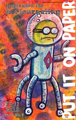
It's here! You can get it at the link below. Check out that sweet robot on the cover by Chongolio!
It's here! You can get it at the link below. Check out that sweet robot on the cover by Chongolio!
I attend a once a month artist meeting where a group of local artists get together and chat. Basically we shoot the breeze for a few hours in a low key setting. The gathering could take place in a bar but we get the use of a room at a local college. It's a very interesting gathering and I've met a lot of really neat local artists.
During one of the last meetings some of us talked about drawing and sketching together. I had been wanting to expand upon the bi-weekly get togethers that Jane and I were doing and get more artists involved. I hastily threw together the first (of hopefully many) Beverly Sketch Up.
Yesterday some people had to cancel so it ended up being myself and Scott of ArtfulChairs.com we spent a good piece of time shooting the breeze, as I think happens anytime you get 2 artists together. We finally got the the business of making art.
We parked infront of Maria's Pizza- there were chairs and a nice clear spot for us to view the street.
I set up my tripod drawing board, which worked totally sweet, and set to work drawing one of my favorite buildings in Beverly, the Brown's of Beverly bike shop building. (It also happens to be my favorite bike shop.) This location afforded us a view of Brown's, Casa de Moda, Cityside Dinner, Atomic, and a great view down Cabot St. It was also the frist spot we stopped at AND I have to admit I scoped it out as I walked to the meeting spot.

Scott took the tact of doing a lot of smaller drawings where I decided to work larger than usual. (I didn't get pics of Scott's work, he's shy.) I worked in pencil and then did a layer of fine ink pen. After that I layered in a lot of juicy water onto the paper. I was trying out the Fluid watercolor block with cold press paper. I'll write more about that later.


The final step after the image was finished and dry was to add some thicker line work and the brigh pops of clean color- the parking sign and the Irish flag hanging in the window.
It was a real challenge for me to draw with an offical set up in public. Normally I work small and pretty secretive. I try hard to not be noticed. This time I was totally exposed. We had a few people stop to look at what we were doing and kids looked at the art. Being so close to an art school I expected to be pretty much ignored, and for the most part, we were. People who did stop and look were very pleasant and very positive.
I enjoyed the company and the experience and I can't wait until next month! Anyone is welcome to join in on the fun, all experience levels, and any media. Stay for 1 hour stay for 4, it's all good.
I
like Kuretake waterbrushes so I thought these might be neat. I order 4
colors: yellow, green, blue and black from Jetpens. Pricing was $3.30
per pen. I do not know if these are available anywhere else. They come
in single colors from Jetpens as well as a larger package that has an
attractive hard translucent case.

I
got a mix of styles of these pens, some new and some old style. The new
style has a clear cap and a matching color section on the pen itself.
While the old style has a grey section and a color cap to match the
color of the pen. I have to say I like the clear caps better, they
simply look sharper. Not all of my pens came shrink wrapped. I think
this is a just a matter of new and old stock being mixed in the same bin
and it was no big deal.
The
brushes aren’t as springy as say my Pentel Pocket Brush Pen or even my
Kuretake waterbrushes but they provided a nice fine to broadline. The
ink is watersoluble and when adding water to it you can get some really
nice watercolor like effects. My favorite part of these were how well
they responded to water.

The
colors on their own are deep and bold. They don’t layer well, though
they are mostly transparent. They just don’t mix well, which is sad, because
they have so much potential to be a really cool sketching tool. If I
could layer the blue and yellow and green to get various shades of color
it would add another layer of depth. I did mix them with water and
found that each color did mix to give a sort of primary school like
color blend. A search found that there are 95 differnt colors available, many shades of the colors of I purchased. With a few more colors I'm pretty sure these would make for an expesive but complete sketching option.

Instead
of using these like watercolors I decided to approach them like alcohol
markers, layering them in bright bold colors, much like I did with the
sharpie brush markers. The effect is much like with any brush marker,
bright and bold, lots of great line weight and essentially looking
pretty good. In another instance I worked them like watercolors and was pleased with the results. The ink really moves around on the page well.

These
had a lot of variation in the amount of ink applied, when moving really
fast I was able to get some nice texture from the paper.
I
do not know if these are lightfast or not. I’ve got a card up in a
window so I’ll know in a month or 2. I expect major color shifting
across the week. In a month I expect major color loss as well. I do not
expect these to be lightfast, though I know that other ZIG markers are
lightfast. These are not made for the American market so it could be
that they simply do not label them as such.

I
like these, but like any brush marker they are for sketching only, at
least until I know they are lightfast. I do really enjoy sketching with
them. You get clean consistent color without fading like when you mix
your own watercolors. If you get it on your hands it washes right off.
The way the ink applies is great for landscapes and figure drawing. The
pen is not refillable.
All
that being said I find I’m being pulled in by these big bold colors.
I’ve been working black and white or with lots of crazy color lately,
these pens will add fuel to the crazy color fire I’ve been burning.

I'm organizing a "Sketch Up" in my city. It's like a SketchCrawl but without the trademark and rigmarole of getting permission to use the name. Anyway, I created one poster already with a hawker type dude announcing the Sketch UP via speech bubble. I wanted to make these a really graphic type image, eye catching in their simplicity. Also made old school, these were sketched onto paper and then inked with a sharpie, it doesn't get more old school poster design (crappy) than sharpie and paper.
The ketchup bottle idea came to me when I was just thinking over the idea at the cafe after hanging the hawker dude poster. Ketchup Sketch Up. Heh. It's funny in my head. I started out by sketching a quick old school round glass bottle of ketchup. I realized that maybe the kids in the area might not associate the round glass bottle with ketchup. Since the only ketchup in our house is heinz I went with a knock-off of their label and the shape of their plastic bottle. I sketched it onto a piece of cardstock with pencil. Erasing the extra lines.
 Inked up those lines and added the text. My writing stinks but who cares, I didn't want anything computer generated on this bad boy. (Until I add the QR code, which I will later.)
 I filled in the ketchup with black ink. Though you can see some overlap the scanner will read this as all black and it will print as such. I've still not added in the QR code but it will go right below the phrase "Beverly Common."
This brings me back to my days of wheat pasting posters around my University. i've written about my single handed causing damage to my former Uni after I was graduated, but let's not bring that up again.
I
started my picture a day project to find one beautiful thing a day as I
walked into my DayJob. One thing that would brighten my day, see it and
snap it. After many months, nearly a year of this project, I realize,
I’ve seen all the beauty in that short walk. Maybe I’m tired of the
scenery? Maybe I need a new photo a day project… Maybe I’ll look for
one thing in the afternoon that is beautiful.
One
thing I’ve learned with this little project is that no matter what if
you look for beauty in the world you’ll find it. Even if it’s as simple
as an accidental picture of your shoe.


Yesterday, I was doing my usual routine when sitting in a waiting room, I sketched. Usually, when I go to the orthodontist I'm in and out in 20 minutes, yesterday, I waited for 20. No big deal, I whipped out my sketchbook and sketched the people waiting. Adults were sparse and accompanied by 2 or more kids, one lady had 6!
I sketched away when a woman sat next me with her daughter. I could here some whispers and the mother finally said, "Just ask, what could it hurt?" Shortly after the girl, around 13 or so touched me on the shoulder and asked about my sketching. She was really sweet and I could have been more talkative. She was shocked to find out I was not able to make a living drawing. She watched me draw the rest of the time I was in the waiting room and we were called in at the same time.
It was neat to talk to some one who still finds art a magical thing and lacked the jaded feelings of adults.

Jetpens selected me as one of their August Favorites! Go check out my work and the work of other artists. I'm pretty excited to be on their blog. I buy my ultra fine line Uni-ball Signo DX and Bit pens from them, since I can't get them anywhere around here.
When I was a kid my Dad had a big 1976 Ford F250. The thing was huge and green. When I had an ear infection (age 7) and had a really high fever my mother threw me into the passenger's seat and drove it to the doctor's office, though she couldn't reach the pedals and shifting was nearly impossible. When I got a little older my father redid the body on it and painted it with a gorgeous shade of bright metal fleck limey green.
At some point around this time my Dad bought a dump truck that did not run. It just needed a little work. He didn't pay much for it and it sat at the end of our driveway and near the bushes where our rabbits were penned. We used it as a giant rugged jungle gym. The back of the truck was a club house and it's rugged body couldn't be hurt with our shoes and hands. We spent hours and hours climbing up it. the best thing about that truck was that the roof and hood had thick metal so you could actual launch yourself over the top of it and climb up over the top of it.
The bus that picked me up from grades K- 7 was a big old bus. A large rounded snout, dark green seats with hardly any cushioning, and a floor so grimey that anything it touched turned black. It didn't have any of these safety features new buses have, no instead, we bounced around on it's shockless carriage.
Those early interactions with those old trucks have cemented in my head that trucks should have big fat noses, big round head lights, and side mirrors you can do chin ups on. I love me some big round head lights. When I day dream of vehicles I think of trucks like these with character.
Do I forsee a series of truck drawings in my future?


I wanted togive you a little look into how I created my large sized town hall image. I was asked to make a poster with a drop box for my coworkers to put questions in for a special meeting at work. My idea was to create an image of a town hall. My other idea was to create an image of a group of people inside an old style town hall. Given the time frame (1 day turn over) for creation, I went with the simple idea instead.
I spent some time looking through google images for "town hall" then remembered I shot a pic of Salem's Old Town Hall a few weeks ago. It turned out THAT was the image I had in my head. (That or the town office from my youth.) I quickly roughed out my idea in light blue ink and then finalized the idea in black ink. I jotted down some ideas for the image in words around the edges of the sketch.

Below you'll see the large sized version transfered from my mind to a large 4 foot high by 2.5 foot wide piece of standard corrugated box cardboard. To rough in the image I used a 0.5mm HB mechanical pencil. Then to fill it out I used my E+M clutch pencil with creatacolor 4B graphite pencil. I finalized the location of all the elements of the image and then started to add areas of shadow. I darkened these areas and gently filled in the rest with a light coat of graphite. 
I started to layer in white house paint. Scrubbing it in with my brush gave me the blended and mottled gray effect. Sure the Salem Old Town Hall is brick but no one said I couldn't make it creepier with a black and white effect. 
I used a clean brush to add put white to the windows and trim. 
I then cut the image out of the cardboard. I added some definition with creatacolor's version of a conte crayon also in my E+M lead holder. I made a small sign that says town hall that is stuck to the image. The sign is 3d and adds some weirdness to the already wonky lines of the building.
Overall I'm pretty happy with how this came out. I was given the assignment just before I left work on Wednesday, thought about it for about an hour last night and then completed the image over teh course of the morning at work.
Now I want to do a whole haunted village for the front lawn…. Hmm how soon is too soon to get ready for Halloween?