I like cheap, who doesn’t? When I was in college a decent black sketchbook was expensive. I used to seek out plain black spiral bound sketchbooks for my notes, ideas and sketches. A favorite was Utrect 6×9. Small enough to be shoved into a bag, inexpensive enough I didn’t mind taking class notes in my chicken scratch or testing out materials on its pages. All in all they were what a sketchbook should be- inexpensive enough to not care too much about its safety but something that eventually became precious and meaningful through its use. To this day I still look for plain black spiral bound sketchbooks, though I loathe spiral bindings and detest perforation.
While thrifting I headed to my local Ocean State Job Lot. It’s a surplus and salvage store where you can find brand name irregulars to junk from closed out stores. Sometimes you hit a massive score and sometimes you find nothing. One of the interesting things that they always carry is a line called Marseilles Studios. This line of cheap art supplies includes: brushes, paints, canvases, pads of paper, easels and the ubiquitous spiral bound black sketchbook in a variety of sizes. Given that they are based out of Providence, RI a selection of super cheap art supplies is not surprising as it's also the hometown of RISD.
I purchased the 9×12 inch sketch book for a total of $4.99 plus tax. Inside are 80 off white 65# acid free pages. The covers are black textured plastic that looks nearly identical to the cover of a moleskine. The covers are hard and pretty stiff. I did manage to damage a corner by tossing the bag into the car rather roughly. The spiral binding is somewhat weak as well, as that dented with the toss. This is a minor gripe. Keep in mind my dislike of spirals. (Compared to the Picadilly spiral this is noticeably softer and warps more easily.)
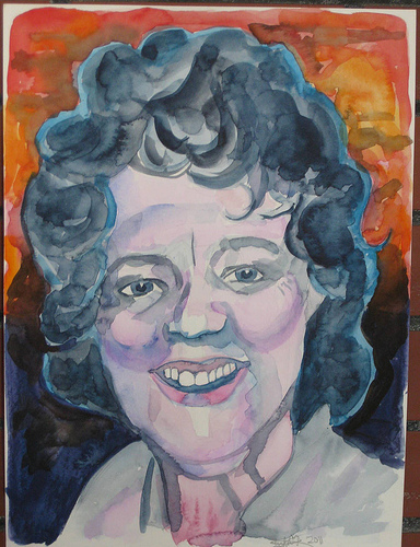
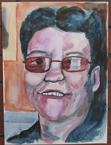
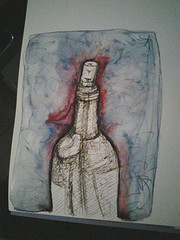
The paper is textured. Visually it looks pretty rough for fountain pen use, but while there is feedback with the nib. It wasn’t unpleasant using a pen simply noticable. An interesting thing to note is that there was no feathering on this paper, with any ink, even the less well behaved inks I adore, like Noodler's Nikita. I was rather surprised about that as absorbent toothy paper usually feathers all over the place. With pencils this paper was great. The toothiness of the page really allows for deep darks and light lights. I tested a few watercolor washes on the page. The paper is VERY absorbent. I was able to blob watercolor on the surface but blending or lifting after putting it to the page wasn’t happening. The color soaks in and stays put. The color is not intense because of the absorption of the page. While using the page the paper did cockle, like crazy. As it dried the cockles relax and aren't noticable.
I didn't test it but can tell that the page would take gesso
The pages are perforated for easy removal. BAH! I hate perforations. They have no place in a sketchbook! The good and the bad should stay! One good thing about these perforations is that they aren’t very good. When I was tearing the test page out it simply tore at the rings rather than at the perfs. So I won’t be losing any pages to the perforations.
I’m nearly finished with the Picadilly sketchbook* and can’t wait to put this one through it’s paces. Hell for $4.99 you can’t really go wrong. I was only able to find it online from one vendor and as I don’t know the site I’d rather note link to it. Using your Google-Fu I’m sure you’ll find the same vendor as well as others.