Tag Archives: paint

Thinking: 100 Days Projects

There are a lot, and I do mean a lot of projects that people sign up to do online, from 30 Days of something to NaNoWriMo to 100 Days Projects. I have trouble completing any month-long projects that I sign up for let alone 100 Days projects. Yet here I am at 33 days into a 100 days project. I’ll surely have more pointers at the end of the project but let me share what I’ve learned so far.

Break the rules– The rules of 100 Day project state that you work on something every day for 100 days. I can’t do that and know I can’t. It’s not possible for me to work my DayJob and then come home and do something every night. I work late on Wednesdays and I know that I cannot work on my project on that day. So I double up on a day when I work late.

Don’t beat myself up. Because I know that I’m not going to be able to work on the 100 Days stuff on Wednesday night, I also allow myself to not work on 100 Days stuff when I’m stressed out or very tired. Because I’ve built in some flexibility I don’t beat myself up for taking off a needed night.

Accountability– Despite building flexibility in, I need to hold myself accountable for catching up on days when I can. This means that often times I’m doing double duty on Saturday and Sunday. I do 2 items on those days. Or try to. Go back to not beating myself up.

Thus far I’m very much enjoying the 100 Days Project. I’m learning a lot about watercolors- how the various colors respond in use and with one another on a variety of papers. I’m learning which of the colors granulates, how they merge with one another on the page as well as when mixed in a pan. Anyway, the 100 Days projects are a great way to learn about a material in depth, and it’s worth the effort. Just remember to be flexible and not to beat yourself up when you need to skip days, then catch up when you have time.

Technique Today: Drawing and Sketching

No joke, I love to draw in my art journal. Sketches, doodles, all sorts of neat stuff can go in there. But what to sketch, how to sketch? Hopefully, these videos will help give some guidance.

If you have an issue watching the videos here on my blog you can click the title of the video (top left of each video) and it will open up in youtube for you.


Continue reading

Review: Princeton Arts Catalyst Wedge Tools

Phew. My semester, the first semester of my grad school adventure is over! Grades aren’t in yet, but in one of my classes I’m pretty sure I snagged an A. As a sort of congratulations to me gift I snagged a lovely Catalyst tool. I went simple and got the basic wedge. IMAG1397(The color of the tool is more of a cool gray than taupe, can't get the colors right on screen.)


Catalyst tools are hefty silicone tools for spreading paint around a page or canvas. the full size tools are chunky and have a nice heft in the hand. The “handle” side of the tool is comfortable and conforms to the hand. The large size is just right for spreading a great deal of paint around a page. It’s about an inch wider than an old gift card on the wide side and half the width on the narrow end.


With that in mind, the tool I purchased (W-06) is easy to manipulate and control. With a short session of use I was able to use it to spread a thin even layer of paint or leave a rough uneven layer. I was able to adhere antique paper to the page with gel medium without damaging the paper and leaving a perfectly even layer of medium.


I’ve used a variety of other tools- from the procaulking tools (pretty good) to rubber potter’s ribs (not so good) and none have come close to being as useful as my beloved old gift and credit cards. The Princeton Catalyst tool is the first to approach the versatility of the old plastic cards. The first that allows for thin and thick layers. The first that gives me a similar look to my spread of paint over a page, and the first that let’s me manipulate mediums in useful ways.


The final great thing? With a bit of water acrylic paint and mediums simple slide right off the tool, leaving it’s surface as clean as the day I bought it.


The tools are available in a variety of shapes and sizes. they have a series of mini tools as well as on handles. The handle tools look like funky spatulas. Some have edges that aren’t smooth but have a series of divots in rounded or triangular shapes so that you can scrape shapes into your paints. While I have less of a use for those, I do think they would be VERY useful in mixed media work.


I’ve seen the tools in a variety of places, and at a variety of prices. It seems they are between $5 and $8 and the MSRP is $10 for the large wedge tools. I paid about $6 for mine at Artist and Craftman. Which I see as a fair price for the tool. I’m probably going to look into getting the other smooth shape in the future, as well as some of the tools on handles.

(get it on Amazon here.)

Here are a couple of cradled boards I’ve picked up and have started to paint. I’ll be adding something else to the middle, probably a face. But you can see how perfectly the tool worked. The way the paint spread is very similar to my usual tools. Very happy. IMAG1398
IMAG1398
IMAG1398
IMAG1398

Continue reading

Wordy Monday Evening: Snake Oil, Sharks, Resonate

Lisa over at LifeUnity put up this post earlier and it resonated with me, in part because I’m going through some of the same balance issues but also because it’s a very real post and that is something I feel like the blog-o-sphere has been lacking.

Today Connie over at DirtyFootPrints posted this, and it also resonated with me. It’s also a place I’ve been in my head lately, thinking of what is “enough.” What is good enough? (more on this later.)

Aggression  and sharks.

Or as my Dad used to say, “There are assholes everywhere and some of ‘em, most of ‘em, are out to get you.” Often times my Dad meant this about boys (ha!) trying to get in my pants and people trying to take my money, but this applies to the wild internets*.

Let me back up here.

A few weeks back I decided I was going to cut back on what I allow into my internet and life. Every time someone put up a post on facebook or twitter that made me feel icky I unfollowed or hid them from my view. After another week went past I’d go back and check and see if their tweets or posts still made me uncomfortable, if they did, I unfollowed, blocked, and or unfriended them. It’s been about 3 or 4 weeks since I've been doing this and frankly the quality of my twitter feed has gone up, I’m genuinely interested in what people I’m following and I’m not burdened by reading stuff that offends me.**

Why do I do this? No one has the right to make me feel bad, When I allowed people to suck up MY time with their drama I was giving them power over my life and allowing them to waste MY time. Additionally I can't worry that I'm going to offend them, clearly they don't care if they offend me, so why am I concerned about offending them? 

It’s as if I gave them permission to crap on my good time.

So I’m done with it. The drama and the snake oil sales, done.

That’s another thing that is getting to me lately, the snake oil sales. If someone is selling you a promise to unlock your deepest inner power, it’s most likely snake oil. The only person who can do that is you. I’m  wary of someone who wants to whisper into my ear and ask me to do stuff that makes me feel icky. I’m not talking legit life coaches, teachers, licensed therapists and social workers who have been to school and trained to make you push your boundaries. I’m talking about the arm chair quarterbacks that want to tell me what to do when they haven’t put in the hard work themselves, the do as I say not as I do crowd.

I have made my way so far by listening to myself, going with what I feel is right. It’s why Art Journaling Ning is free and will always be free to join and enjoy with paid classes for those who are interested. I see this whole thing as living real.     

Continue reading

Review: Clairefontaine Graf It Pad

One of the other sketchbooks I received from Exaclair was the Clairfontaine Graf It pad. I’d seen these on several occasions at Artist & Craftsman and passed them by due to the cover being… well, kinda lame*. In addition to the plain black grainy text and images, each cover is made with various colors of card stock that folds behind the staple bound pad. The back is supported with sturdy heavy chipboard. Each page is microperfed for easy removal. The perf is sturdy enough that you can turn the page and it won’t tear out, unless you want it removed, it stays. The pad is often sold on American websites as “6×8.” That may be the outer dimensions of the pad but the actual sheet size is 5.75×7.5 inches. There are 80 sheets in each pad.

I did my usual battery of tests on this paper and it withstood them all. I have to say that this paper is amazing. Though it’s only 90g (41lb) it’s super sturdy and accepts a lot of media without issues. It takes some serious effort to get stuff to soak through. When I say stuff I mean ALL the stuff I’ve tossed at it. See the pic below.

Ink mix0044
With watercolor it accepts the color well. The paper cockles as is expected with paper this thin. I find this to be a great paper to experiment with techniques and color. It responds well to puddles of water as well as thin washes. Color stays true and doesn’t get muddy on the page.

While drawing with ink I was able put down multiple layers of ink without cockling and bleed through. Heavy layers that would have bleed through many other heavier papers did not bleed through on this paper. Noodler’s black bonded with the paper well enough that I didn’t worry about it lifting much with my water brush. Colors seem to pop off the page.

I did try gessoing the page but I don’t see the point as the paper is tough enough to survive most stuff without the gesso. I also scrapped acrylic paint over the page to see how it would work, and it worked just fine. This paper is also amazing for pencil. It has just enough texture and tooth that pencil feels really good on it and it hold a lot of graphite, so darks are really dark.

My final verdict on this pad is that it’s great. The paper is awesome. The format it’s served in is where it is lacking. I hate perforations (my own little quirk.) I prefer a pad that allows the pages to stay together. The staple binding is crap for keeping stuff together, I made a little folio out of a USPS priority mailer to keep my drawings together. For art journaling it would be a great pad to do drawings in and then cut out and glue into your regular art journal. The paper is thin enough that if you draw a face and cut it out the edges won’t be all that noticeable.

The pad is pretty cheap. I found it online for $4 to $6 the larger size is pretty reasonably priced too at around $9. These are prime pad for binding into a sketchbook. If this came bound like a moleskine or a Rhodia Webbie I’d buy it. I know that the reason this pad is so inexpensive is that its bound inexpensively, 2 staples straight through to a sturdy backer. I like this paper a lot, in fact the next time I’m at Artist & Craftsman I’ll be picking up another one of these in another size. Perhaps I’ll bind the large size into a nice art journal!

Continue reading

Review: Some Thoughts on Watercolors

I’ve bought a bunch of different watercolors from Grumbacher Academy to Winsor & Newton. My favorite travel watercolor set is a Cotman 12 pan set. The colors wet easily and lay down nice saturated colors. It was a  great value to get 12 half pans of color for around $20.

IMG_2824
I’ve since focused on purchasing tubes of color to replenish emptied tubes and adding a few extras. I’ve tried to buy a few different brands. If you’ve got an AC Moore or Michael’s near you, getting a tube of Winsor & Newton Artist watercolors with a 40% off coupon is a pretty good deal.*

My usual rant with any art material is that you get more out of artist’s grade than student. Why? They tend to have more pure pigment and less filler and that means you get more color out of a 5ml artist grade tube versus a 15ml student grade tube.

I’ve purchased a few tubes of Holbein watercolors at Artist & Craftsman as they’ve been having a sale. The 15ml tubes are a little pricier than the usual 5ml tubes of Winsor & Newton colors that I buy but it’s also 3 times the amount. The colors are intense.

The first time I sprung for a tube of W&N artist grade watercolor I was shocked at how much more intense the color was than Cotman and Academy colors. I was also surprised at how easily my damp brush picked up a lot more color than with Cotman. The “rewetting” ability of W&N over their own Cotman student grade colors was surprising and delightful. Creating an intensely colored wash was much easier than with my cheaper colors.

Now that I’ve discovered Holbein I’m feeling the same way about them as I did about my W&N artist grade colors. I feel like I’m getting more bang for my buck out of these slightly more expensive tubes of really intense color. So far I’ve bought a tube of indigo, turquoise blue, and sepia. All 3 colors perform flawlessly and wonderfully on everything I’ve tried them on so far. The Holbein turquoise blue is a very different shade than the Cotman turquoise. Since I rather like the color of the Cotman turquoise I may end up buying a new tube of it, but I have to say that I’ve been quite spoiled with the Holbein paints.

That being said I also tried out a tube of Van Gogh watercolor. These are larger sized tubes of color that are considered student grade. The VG colors had something going for them- they rewet on a palette like nobody’s business. A swipe across a dried out blob of red oxide brought up a fully loaded brush of intense color. These tubes are moderately priced around $4 a tube and come in sets. I’ve not tried their pan colors but the tube color is very well behaved and an excellent value.

Ink mix0042

Continue reading

Review: Rhodia Webnotebook aka Webbie

Stephanie of RhodiaDrive hooked me up with Karen of Exaclair, the American importer of several very fine French made stationary products so I could do some reviews. I received a box in the mail and I felt like a kid at Christmas. There is nothing quite like opening up a box of sketchbooks to get my heart racing, well pen products would be a close second. Anyway, one of the products contained in that wonderful box was a Rhodia Webnotebook. It’s the larger size, 5.5×8.25 inches (I14x21cm) with blank cream colored pages. There are 96 sheets or 192 pages.

When I first opened the covers the color reminded me of oak tag; creamy, warm and lovely. The paper is 90g (roughly 24lb) which seems kind of thin when you’ve been working on 140lb watercolor paper for the last few months. When I ran my hand over it felt glassy smooth. Clairfontaine paper is known for this feature and is sought after by people who use fountain pens.

The cover is black with the Rhodia logo inset into the center of the front cover. Like all notebooks of this style there is an elastic to hold the whole thing shut. The plastic/vinyl of the cover is soft, like fine leather. I have a journal made of deer hide and the feel of this pleather rivals its softness and feel. I handed the journal to someone to check out and she actually said “Ooohhh, that feels nice that feels really nice, what is it?” Like, leather the cover does show greasy fingerprints, unlike leather those greasy fingerprints wipe off with a damp rag. Yes, I tested this by eating French fries at my desk and picking up the journal and having to wipe it clean.

Continue reading

Art Habit part 1

I’m making a commitment to write more. Partially so my writing gets better but also because I’m working on a book. I’ve mentioned Art Habit once or twice before but this is my first public commitment to making it work. InkyGirl.com has 3 challenges on her blog, one of them is a challenge to write 500 words a day. When I’m focused on writing I can easily churn out 1500 words in an evening. When I’m not focused I write nothing. Goal setting is supposed to be good for success so I’m setting a 500 words  a day goal. Will I keep it? Who knows. I hope so. I suspect it’ll be an easy goal as 500 words is just a few paragraphs and about a decent blog post.

I can never keep to NaNoWriMo as it’s the busiest month of the year in my retail job. I’ve signed up nearly every year and failed every year. This year was no exception. I started and I’ve got about 10 to 15,000 words of Art Habit written. I’ve got another 10,000 or so stewing in my head and in various manners in various journals and I’ve given myself a commitment that in 2011 I WILL finish Art Habit. It WILL go into publication in 2012. That is my commitment to myself. This is something I’ve been working on for years, it’s been stewing in the back of my mind since 1998. Every year I’ve given up on it, put it further and further to the back of my mind and told myself that it can’t, won’t, and shouldn’t happen.

This is the effing year I MAKE it happen. This is the year I’m taking a sabbatical from my DayJob, working on an art show, a book, my blog and all the stuff that is important to me.

So let me tell you a little bit about Art Habit. It’s about making and keeping an Art Habit, how I’ve managed the screw up my Art Habit over the years, how I’ve shot myself in the foot, repeatedly year after year, and how I finally found my niche, my place and the ability to keep my Art Habit alive and strong. It’s my story, with some questions in there for the journaler and artist. It’s an exploration and I’m inviting you along to see what has worked and what hasn’t worked. It’s poignant and heartfelt. I’m going to let it all hang out and see what happens. Honesty is good. Hopefully you’ll enjoy the story.

I plan on sharing excerpts as I write here on my blog, I invite you to share with me, in the comments, your thoughts, feelings and stories. I invite you to share with your friends my words via your blog. I want you to muse on my writing in your journal. This is a personal journey I’m sharing but I’m inviting you along.

I can tell 2011 is going to be a spectacular year.

Continue reading

Washi Tape reviews

I have a particular artist’s book/ art journal project in mind. My design idea includes a very specific color of washi tape- white. I initially wanted masking tape colored but I think the white is a better fit for my idea. The secondary part of the project includes green graph style tape. Anyway, this led me down the path of washi addiction.

I always test my ideas before spending a lot of time and money on them. I headed to Michael’s with my 40% off coupon in hand to buy some washi tape. The only variety they had was the Tim Holtz line called symphony. At $8 for 2 rolls I was appalled at the price but figured with my coupon it was only $4. I brought it home and began to test my idea and also do a little art journaling. I was instantly disappointed. The tape didn’t stick to my heavily applied layers of acrylic paint. It also didn’t stick to itself well. I liked the look of the page but ended up having to use double sided tape to get it to stick to my page and itself.

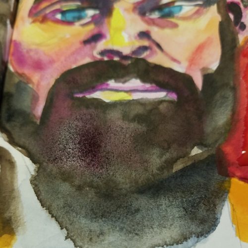
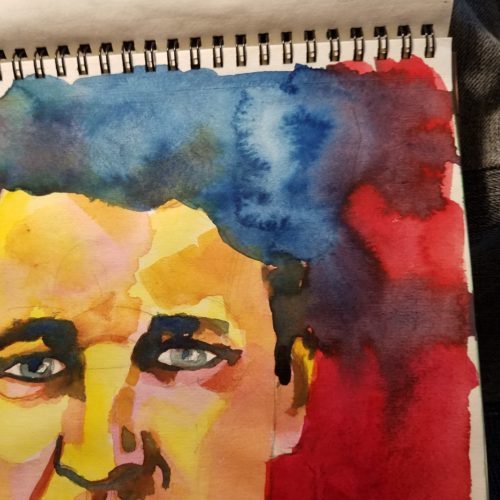
Being a mixed media artist I work heavily in acrylic paint in my journal. Many layers of it some heavily applied. I glue shit to my page and torture it into submission. I often refer to my pages as having been muscled into what I want them to do. So I need a tape that STICKS to acrylic, ink, watercolor, collage as well as raw paper. I get really angry with companies that label their products as MIXED media and it clearly doesn’t work with one of the media. This is not Tim Holtz’s fault. He doesn’t work in crazy layers of acrylic paint like I do, he works in thin layers. I’m sure the tape will stick to dauber applied craft acrylic. I need tape that sticks to artist grade acrylic and gel mediums.

I tweeted my disappointment. (Not one word from Ranger btw…) I got a ton of response from other art journalers- try this brand try that brand, I have good luck with x brand. Though sad I placed a couple of orders on Etsy for 2 different brands of Japanese Washi tapes. One I ordered through Washimatta and another through PrettyTape. Both arrived promptly and very cutely packaged.

The PrettyTape package of the gridded tape arrived first. So cutely packaged! I tore off a piece and found it was VERY sticky. The tape felt stronger than the Ranger tape as well. I stuck it to the first heavily acrylic covered page in my journal and it stuck, no peeling of the corners, no lifting just strong sticking to the page. I also peeled the tape off the packaging and used it to stick a penny to the page, it stuck well, though I had peeled it off a glassine envelope. I poured glaze medium over the top of it and let it dry. No color lifting, no curling of the edges and again just sticking. PrettyTape washi tape has a vote of confidence from me. The tape sticks everywhere and doesn’t peel up.

I decided to take part in a little retail therapy in the clearance section at AC Moore after a rough week at work. I shockingly happened up $3 packages of 7 Gypsies colored masking tapes. These are more like American Masking tape than the washi tape but were super cool. At $3 a roll I could not pass them up. I grabbed a package each of the available colors. Spending $6 for a total of 6 colors was a steam. These are a peel and stick tape with a backing. The colors are grungy and rough, the way I like them. I used them to stick a medication package to my journal page. They stick, with no lifting or peeling. I used them again on another page and added a glaze of color over the top and I noticed some peeling but I didn’t burnish them down well on that page. The verdict: For clearance steals the 7 Gypsies tape was awesome. I suspect that it was what we call in the industry a “miss-pick*” as I’ve never seen any other 7 Gypsies product in that location.

The Washimatta tape arrived last, as it came the whole way from Japan. Again super cute packaging, opening these tapes was like opening a gift. I love it. The perfect white tape is perfect for my project. She also included a super thin roll of bright blue tape. It’s very cool. I pulled a piece off the roll and could feel that it had strong sticking power immediately. I stuck it to the same page as the other tapes and again burnished it with my fingers, it stuck, strongly and cleanly. I peeled up one corner and stuck it back down, perfect sticking. I’ve not added a wash of color to the tape as I’m not planning on using it in that manner. But in a typical art journal application of sticking to acrylic paint, it sticks and well. Washimatta tapes get a double thumbs up. I can recommend them.

I’ve got to tell you, like anything that comes in patterns and colors you can get really addicted to washi tape. It’s super cool, adds a perfect line of color to an art journal page and is fast. I’m looking at those solidly colored pieces of tape I bought and imagining them with rubber stamped patterns, sharpie drawings and other embellishments. No need to buy all the funky patterns, or even that many colors. Buy a few rolls of plain colors and ADD to them the patterns you want or a glaze to alter the colors. I’ve seen a whole host of great tips and hints on how to do this online. I’ll get my rubber stamps out for UStream one of these days. I wouldn't have bought it except for my project but I'm glad I've gotten to play around with it.

Continue reading

Technique Videos

 Below you’ll find a list of art jouranling technique videos available for FREE on youtube, Vimeo and Blip.

This is a list of peeps I’ think make videos without too much bull
shit. You won’t need to fast forward through half the video to get to
the techniques being shown, listen to minutes of inane babbling before
you get to the real thing your there for. IN no particular order and
with commentary:

  • MIllande.
    Her videos kick serious butt. She focuses straight away on technique.
    It’s all how to and what to do with a serious focus on real techniques
    and not expecting you to create in her exact style. Information without
    BS. She does do classes but she does a ton on youtube.
  • Willowing.
    Some BS* but a lot of video of her making art. A lot of videos of her
    making art in journals. She shows her techniques. She also does online
    classes.
  • SamanthaKira.
    She’s occasionally a little long winded and occasionally she gets into
    scrapbook mode but her videos are filled with technique and little to
    no BS.
  • TheOneMinuteMUse The one minute muse has videos that are all about 1 minute in length to give you some ideas to start creating.
  • GaryReef gary
    reef is not technically an art journaler but he has hundreds of videos
    up on youtube all about art and making art, and he makes some of them
    in his underwear. 
  • ArtCentrix Not cute art. Love that. No BS either. The techniques are pretty clearly detailed and shot.
  • TheArtJournal. No BS here either, just video of the artist working
  • Mystele All art technique and watching her paint. No BS. Some talking but it’s about ART.
  • Rhomany’sRealm Some BS* but good videos of her making art, and generally positive videos about art journal keeping. She does do some classes through Willowing’s Ning site.

If you have any links to a youtuber without the bull shit leave a
comment and I can add it to the list. I”m going to make this a “page”
that will be links on the left of my blog all the time.

*On this page I mean BS to mean that there is talk, not the style of BS that got me started in making this page which is negativity and a general LACK of art discussion or technique or simple pimping of one’s art classes.