Category Archives: Uncategorized

20 of 30 in June

So I cheaped out on you yesterday. And I was going to again today. But I got inspired, deiced to work within the boundaries set, but not.

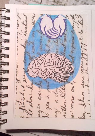
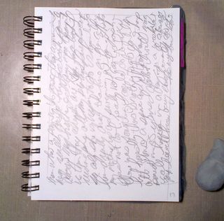
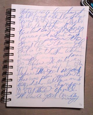
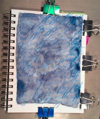
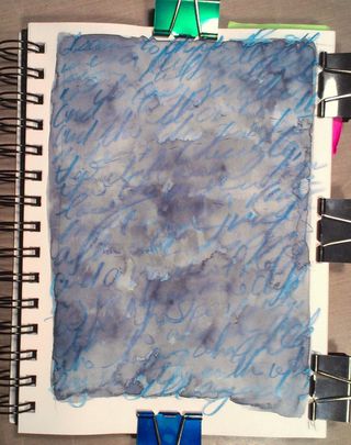
I started with this, and it was going to be all I did. It takes a long time to write that big, it's a 9×12 sheet of paper covered in my chicken scratch flex writing. Sorry it's hard to read.IMAG0813

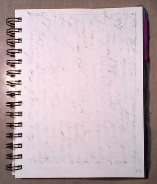
Then I decided to cut a chunk of it out and glue it to my 5×7 area.
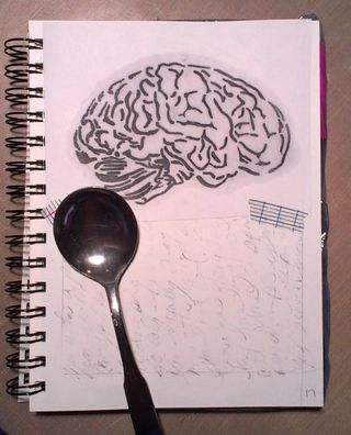
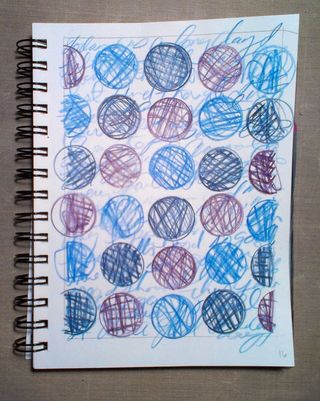
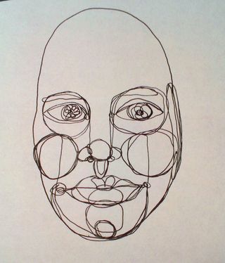
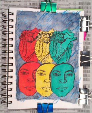
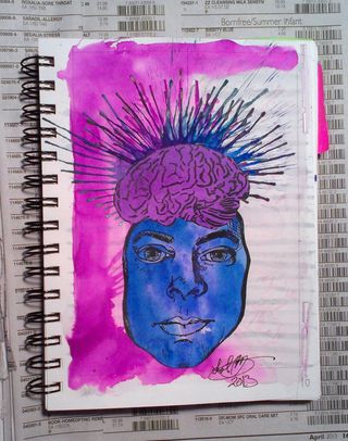
IMAG0814Then I grabbed some junk mail, and cut part of a logo out. Guess I'm in good hands? then I added a print off of my brain drawing. I then went around those 2 pieces with light blue colored pencil. Coloring hard.
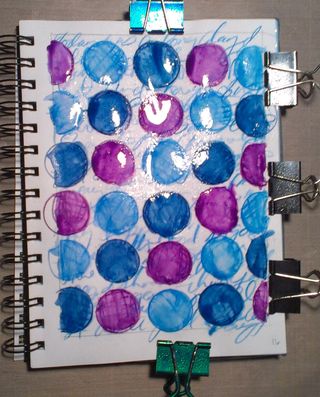
IMAG0815Then I added some magenta watercolor around the whole thing. 🙂 AJ Happiness even at 5×7 inches.
IMAG0816

Review: Scribal Work Shop Siren Blue Ink

****After reading this review please go read my update!****


Made by Scribal Work Shop, Siren
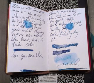
is a lovely shade of blue black. It leans toward teal or turquoise but
a very dark shade. Frankly, I’m in love with the color. After the
disappointment of my last ink purchase I’m super pleased with this color.
It’s the least boring blue black color I’ve ever used. My previous
favorite blue black was Private Reserve Sonic Blue. Siren is a shade or
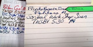
two lighter and brighter. The ink shades wonderfully in my TWSBI 530
medium nib.
IMAG0779It
dries in a standard amount of time, meaning that larger pools of ink
dry a little slower than the thinner areas. I had no problems with
smudging of ink after a few seconds of dry time. I found the ink to be a
hard starter after sitting out for a few minutes and even after having
the pen capped for a few minutes. That being said, I did have an epic pen
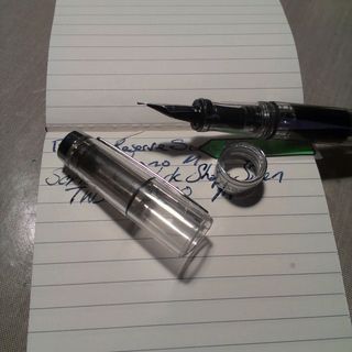
failure. (My TWSBI cap sheared off just above the cap band, so I may
have had some cracks that were allowing the nib to dry out.) After
leaving the pen capped for a few hours with my 540 cap on it, it starts
just fine. (Note: I've now been using this ink for about a week and I'm finding that it IS a hard starter in the AM. I added 2 drops of water to a full TWSBI and am now finding that the additional water solved the issue.)

image from www.flickr.comLubrication
is a spot where I would rank this ink lower than others. I tested
it across a variety of papers and it’s not as lubricating as many other
inks, even though my 530 is on the wet side. While an ink like
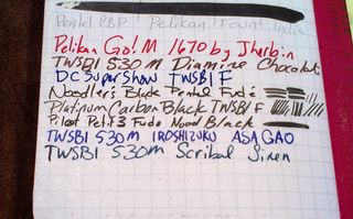
Iroshizuku Asa Gao could be described as ice skating across paper and
Noodler’s Heart of Darkness is akin to gliding, Siren is more like walking through mud. While it’s nice, it’s certainly not a highly
lubricated ink, it’s still not as dry as J Herbin Bleu Nuit.
IMAG0781I
can’t comment on it’s staining but it did clean off my hands with ease.
It doesn’t look to be particularly water resistant either. A few brush
strokes nearly removed it completely from the HP 24lb LaserJet. In the
significantly more absorbent Canson XL some of the ink moved around but
the writing was still legible and the color was retained.
IMAG0780I tested it on a variety of papers with my TWSBI 530 M nib:

  • HP Laserjet 24lb- No feathering, no bleed through, some show through
  • Field Notes Red Blooded Gridded- No feathering, little to no bleed through, some show through
  • Field Notes Standard Plain- No feathering, little bleed through, some show through
  • Picadilly Pocket Lined- No feathering, little bleed through, some show through
  • Moleskine lined, old- No feathering, little to no bleed through, some show through
  • Bandit Apple Carnet PeeWee- No feathering, no bleed through, no show through
  • Canson XL Pocket Blue Book- No feathering, no bleed through, no show through
  • Tops Composition Book- No feathering, some bleed through, show through
  • NEW Staples Sustainable Earth Comp Book- No feathering, bleed through, show through
  • OLD Staples Sustainable Earth Legal Pad- No feathering, no bleed through, some show through

I
found it to tbe surprisingly well behaved on dirt cheap paper and even
Moleskine paper. This makes it ideal for some of my uses- note taking in
my upcoming graduate classes and writing out ideas for papers.
IMAG0782It comes in a bottle that reminds me of 1980’s era cough syrup. It’s
brown glass with a white cap that tightens solidly. The label is an
address label that is clearly printed off as needed, lending to the
feeling that these inks are brewed in small batches. The design work is
simple and easily read.

Pricing
is great too, it’s $8 for 60ml of ink or 13 cents per ml; which is the
about the same as Noodler’s ink. Compared to Iroshizuklu at 56 cents per
ml. I purchased mine from Goulet Pens but it’s also available from
Zeller Writing Company
and as of this writing (6/20/13) it’s on sale for
50 cents off the regular price.

****After reading this review please go read my update!****

Continue reading

19 of 30 in June

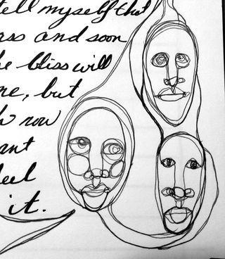
I'm working in my art journal but I'm done with 5×7 inch pages unless I feel like working small. Thisis a corner of an 11×14 art journal page. It's ball point pen and a Noodler's Ahab flex pen with some generic black ink in it.

The ballpoint pen was used for the automatic drawing and the Ahab for the writing.
IMAG0806

And, yes, I have a guide under the page so my writing is straight.

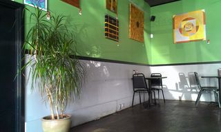
Also, I had breakfast at the cafe where I'll be hanging my show in September. Here's a pic of the wall.
IMAG0805
I am definately paying for spending all day outside yesterday and this AM, my allergies are beating me up. Had to take an allergy pill for the first time in a long time. I've been exposing myself to the various allergens in my area a little bit at a time over the last few months, and it seems to have made a huge difference in the severity of my symptoms. Especially, as I usually go all or nothing in yard work and outdoor activity. Yay!

18 of 30 in June

Today's page is a little different. I used just these following tools:

Mechanical Pencil

Zebra Sarasa 0.7 in black

Ruler

Eraser

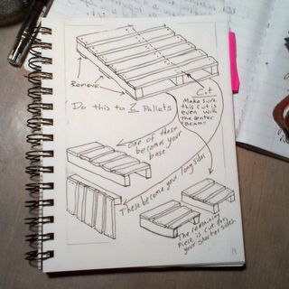
Because I think that an art journal isn't only pretty page but also ideas and thoughts, this is today's page:

IMAG0804
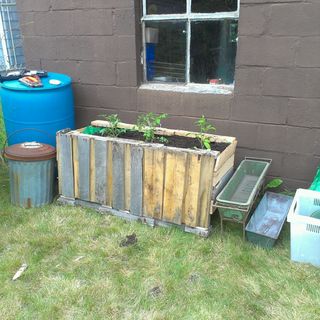
If you get 3 or 3 pallets it will lead you to build something like this:

Flickr_2013_06_18_02_01_00_MODE_1_1_ORIGINAL_2
It's my recycled pallet tomato planter. It holds 3 tomatoes that produce big fruit. It would probably hold 4 to 6 cherry tomatoes, if one wanted to fertilize super heavy.

17 of 30 in June

Today’s
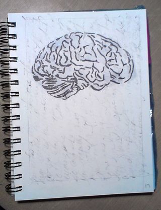
page started with me trying out the pencil then erase method I tried a
few days back. I really liked the destructive nature of the technique
and how it kind of wipes out the writing, this can be effective
mentally.  if you’re looking for that sort of thing. It was just the
thing for today’s writing.

IMAG0797
IMAG0797After
erasing much of the pencil leaving behind just a trace of texture I
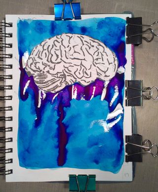
transferred a print of my brain drawing. I then layered turquoise
watercolor and while it was still wet used magenta on the underside of
the brain. This moved and blended with the turquoise and created a
vibrant purple.
IMAG0799
IMAG0799
IMAG0799I
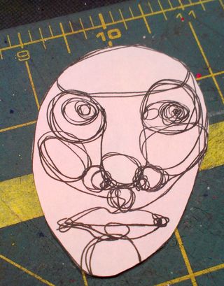
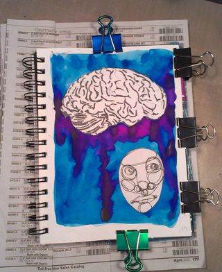
don’t know why I hadn’t thought to create automatic drawings and then
collage them onto a page. I love it. New favorite thing ever! In this
case I wanted to show a disconnect between the slightly confused looking
face and the brain. Yet it’s connected through the stormy
jellyfish-like tentacles.
IMAG0802
IMAG0802

This
page makes me really happy because it perfectly encompasses my thoughts
and feelings on this day. Our dishwasher is on the fritz, the washing
machine decided to fill, but not drain or agitate and it makes a nasty
electrical smell when it tries to agitate. The dishwasher I can
(probably) fix but sadly  the washing machine is beyond my capabilities.
With that negative there comes positive, my upside down tomatoes are
awesome and the slow drip fertilizer system I created works perfectly. I
turn it on for 5 minutes every day and the tomatoes each get just the
right amount of organic liquid fertilizer and none of it drips out and
is wasted. The plants have doubled in size over the last 2 weeks and are
looking strong. My hardy kiwi plants are covered in blossoms and are
gorgeous plants. Due to our cold and wet weather my pink lilies are a
few weeks behind their usual point but this means the blossoms will be
bigger and more amazing. See, lots of good stuff… Also I’ve been
making books like a mad woman, after all, washing machine repair bills
aren’t cheap, hell, a used washing machine on Craigslist isn’t cheap.

The finished image is 5×7 inches and is available matted and ready for framing on etsy here.

16 of 30 in June

I
started this page by writing with a watercolor pencil. I then traced
circles  in 3 colors and a pattern on the page. I scribbled in each
circle to fill it with color. I then wet the circles with a brush. I
sprayed over the whole page when the circles were still damp.

IMAG0787
IMAG0787
IMAG0787

I
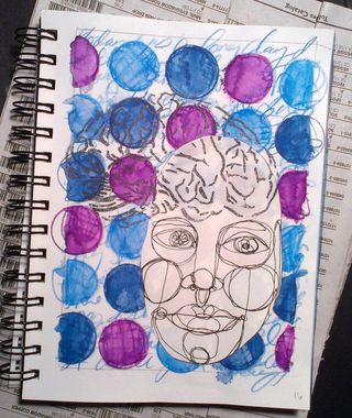
wanted to integrate another automatic drawing into the page, so I
grabbed another sheet of paper and started to draw. I then cut that out
of the page and adhered it with a glue stick.
IMAG0791
IMAG0791

After
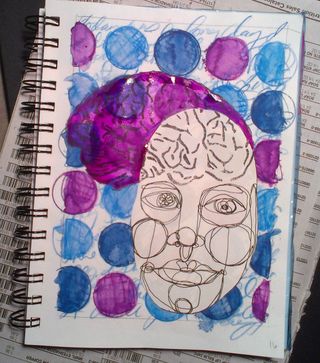
that I wanted to do a transfer of a brain on the page, so I grabbed my
chartpak ad marker and transferred the brain image. It transfered well
enough over the watercolor pencil. I wanted it to pop a bit so I added
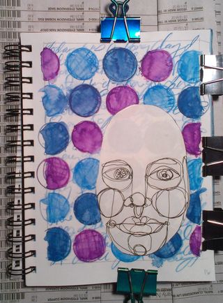
magenta watercolor to the brain.
IMAG0793
IMAG0793I’m really enjoying making the automatic drawings and then sticking them on a page, I really like how they look.

The finished image is 5×7 inches and is available matted and ready for framing on etsy here.

Hand Stitched Jotters

I
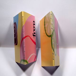
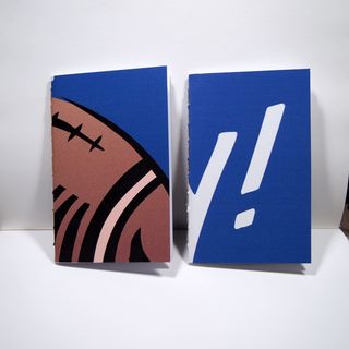
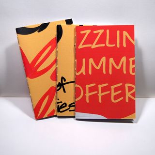
made a few hand stitched jotters. This is notable mainly because I usually use a machine to stitch my jotters. Since I've adjusted my machine for use on fabric and can't take a chance of messing it up with paper right now, I stitched these by hand.. All are hand stitched with sturdy hemp
cord. I omitted the beeswax so they are vegan. The covers are my usual
recycled advertising posters, these are made of heavy cardstock that has
been printed with various advertising images. I filled them up with 48
unlined pages of fountain pen friendly HP laserjet 24lb paper in bright
white. I’m totally digging this paper for all my pens, the ink and pens
do so well on it. (Review here.)

P6135012They
are sized like Field Notes, Moleskine Cahiers, or BanditApple Carnet
Peewee notebooks. They fit perfectly in GoodKarma*, Davis Leatherworks or
Pelle covers. Even without a cover these covers will wear perfectly and
look great throughout their lifetime of use.
P6135015
I’ve got a couple of sets up as well as offering random singles on etsy.

P6135019
*I supply GoodKarma with notebooks for her fabulous covers. Her's are fabric and handstiched. She encorporates lovely textures and colors into her work. I have one of her covers that doubles as a wallet, and it's perfectly lovely.

15 of 30 in June

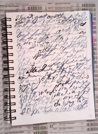
I
started by mixing a large puddle of Payne’s Gray watercolor. I used a
very fine liner brush to write. This gave me a large variety of
linewidth and was hard to control. I had to repeatedly dip the brush to
reload it for more writing. After this was dry I used a brush to flick
watercolor on the page in small droplets. I used a small spray bottle to
spray a fine mist over the page to spread the flicked paint. It also
blurred the writing more.

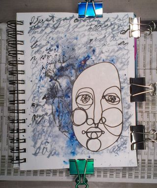
IMAG0767
IMAG0767After
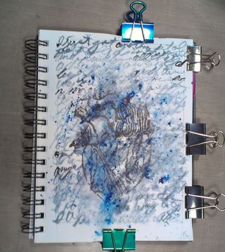
this dried I grabbed a print off of my heart drawing and my Chartpak AD
marker. I wanted to see how it would transfer over the dried
watercolored page. It gave an uneven transfer, much lighter than it
would usually transfer. Of course the background was much darker, might
try it with a layer of lighter watercolor and see how that works.
IMAG0773I
wanted to add a face to my page but I didn’t want to add a print out of
my face. I grabbed a spare sheet of paper and did a quick automatic
drawing with a Faber Castell PItt brush pen in black. I then cut that
from the sheet and adhered it with glue stick.
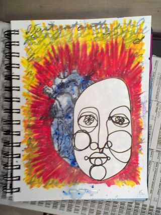
IMAG0774After
the face was adhered I wanted to make the heart more visible and the
face stand out. I grabbed my Prismacolor Art Stix and started to
scribble around the face and the heart with red and yellow. bingo! Both
stood out even more and they looked more unified as if they were part of
the while, the heart a shadow maybe?
IMAG0775

I’m
pretty happy with how this turned out, really dig the automatic
drawing. I need to remember to integrate it into my art journal more
often.

The finished image is 5×7 inches and is available matted and ready for framing on etsy here.

Halfway to 30

I’m at the halfway point for the 30 in June and I’ve learned a few things.

First,
I’m starting to feel constrained by the chosen size of the page, this
is causing me to work in my other art journal a lot more. I’ve been
working about 8×11 for the last year, up from my usual 6×9 or 4×6 inch
journal that i’ve always used.
IMAG0721I
find that because I’ve been working larger for about a year that I’m
working in a different style that I used to when working in the 5×7 inch
size. It’s much looser and free. I’m using big bold colors, big bold
brush strokes, and a lot of color opposites.
IMAG0766

I’m
content to stick with watercolors and my usual supplies. I thought that
after a week or so I’d be reaching for acrylics, but I’m not, which is
surprising to me.

Layers,
I’m loving layers more than ever. A layer of collage, a layer of
watercolor, layer of collage, a layer of writing, a layer of colored
pencils.
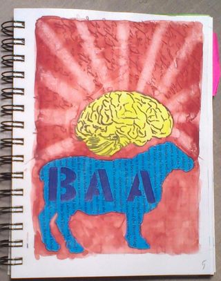
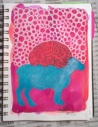
IMAG0691I
usually work on pages in my art journal over the course of several days
or weeks, adding watercolor and collage in layers, flipping back and
forth between pages and adding bits here and there. I can’t do this when
I’m posting a page a day on the blog and Etsy.
IMAG0709

I like that I’m forcing myself to work on just one page a day. It changes my methods and shakes me up a bit, in a good way.

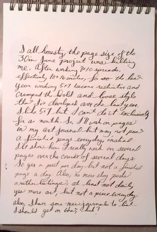
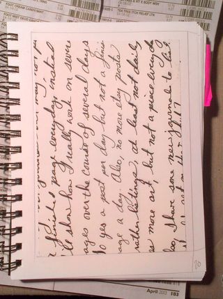
Things
I’ll change for next year? I’ll probably work larger. I’ll pick one
image per week as a minimum to load to etsy, this will allow me to work
on several pages at once and in my usual method.
14 of 30 in June

I
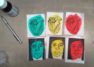
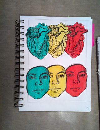
started this page by coloring  three each of my self portrait and heart
drawings that I’d printed off on a laser printer. I colored them with
watercolors. I played around with placement on the page before adding
color to the background.

IMAG0759
IMAG0759
IMAG0759I
then wrote my entry in light blue colored pencil. I used a big looping
cursive for the writing. I allowed the loops of my writing to pass over
the previous layer of writing. I also allowed the lower loops to go way
below the usual area of underhang. I washed over that with Payne’s Grey
watercolor. I allowed the color to pool in areas of the paper.
IMAG0763
IMAG0763
IMAG0763After the page was completely dried I used glue stick to adhere the colored collage pieces.
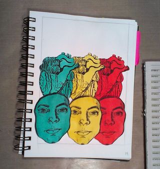
IMAG0766

While
this page is simple the writing is pretty heavy. I wanted to indicate
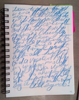
the heaviness of the writing by using the darker watercolor to create a
stormy looking background. The light blue of the writing shows through
to highlight the hope I feel surrounding this heavy subject.

The finished image is 5×7 inches and is available matted and ready for framing on etsy here.