Composition Book Round Up: Part 3 Walmart

I didn’t think I was going to make it into Walmart this year, and frankly I wish I hadn’t. That’s a whole other story. When I did finally make it to Wally World, well, it was nearly empty of school supplies. Generally this Walmart has a lot of stuff left over and has clearance shopping carts full of pencils and other items for 10 cents. Not this year. The school supplies looked as though they had done minimal ordering and what was left the week before school was not a lot.

Mostly they had a great deal of Norwood poly covered composition books. Which I didn’t purchase due to their paper being ideal for pencils, ballpoint, and okay with gel, but abysmal for fountain pen. Plus, that poly cover was against the rules for this year’s round up. I did some searching, and digging and walking into the regular office and stationery section of the store to find the only box of card covered college ruled composition notebooks.

This is less a round up and merely a single review.

Pen + Gear Marbled Composition Notebook

At a mere 50 cents these are on par with the cheapest pricing I found this year. At 100 sheets they are among the fatter composition notebooks. The marbling has a good visual balance of dark to light and the spine tape is perfectly proportioned. The branding is a tad large and not well integrated into the front label area, but not awful. The barcode area on the back is okay as well.

The cover is abysmally thin. The whole book is floppy. This is the first time I’ve wondered if a cover will actually hold up to regular use in a bag. I like a thick card cover but I’m okay with a thin cover IF I think it will hold up. I question this one. It’s that floppy and thin. If it catches on anything in a bag it will fold and crease. This might be a good excuse to get a nice cover for your comp books. Etsy is filled with them.

Inside the 100 sheets are smooth but toothy to the touch, letting me know without even testing this paper will be killer with pencil. And it was. I tested with a few pencils and they all performed really well. This paper feels as good with pencil as the Yoobi paper, if a touch smoother. It takes little effort to get a dark even line, pencil glides over the surface. Ballpoint does great as does gel ink.

Please note the spot of bleed through on the facing page. No good.

Things started to go downhill when I pulled out the fountain pens. Every nib showed some ink spread and the barest hint of feathering. The pens felt good on the page. Flipping the page showed a great deal of bleed on every nib except EF with well behaved inks. This is a composition notebook for pencils, ballpoint, and gel pens. While a fountain pen can be used, you’d be stuck using one side of the page only. Which, admittedly, is how I use a comp book, but I like to be able to use the verso of each page for notes on the facing page. I wish I were able to suggest this as a good comp book, but it just isn’t.

You are much better off looking for other brands at Target or other places. Wally World’s composition notebooks are a bust this year.

Continue reading

Composition Book Round Up: Part 2 Staples

Staples has often had composition notebooks that were stellar for fountain pens at 50 cents each. In years past you looked for those marked “Made in Brasil.” This year I looked through the stacks and stacks of books and found only “Made in Egypt.” In keeping with my usual purchases I only bought college ruled. This year I also stuck to card covers only. No poly covers. Though the Staples closest to me had many poly covers, they were $1 each. 

Staples has also changed up their branding on their store brand items. Nothing is marked “Staples;” it is now TruRed. Why? Who knows. Personally, I liked Staples branding with the single partially bent staple as an icon. The True Red branding leaves me a bit flat…Though I do like the dual open staples on each side.

Both comp books purchased at Staples are TruRed Brand and feature the same flimsy thin cardstock cover printed with wide blotchy marbling. The covers are too thin for writing out of hand. The taped spine is spot on and perfectly proportioned to the notebook. The covers were available in blue, purple, red, and black. All spine tapes were black.

TruRed Graph Ruled

These cost $1.29 and have 80 sheets of graph paper.

The stitching is wide but tightly done and feels secure. All the paper inside is tight and even in the center is perfectly folded.

The ruling is pale blue and 1/4inch, relatively wide for graph paper and my least favorite graph ruling. It is good for writing and bullet journaling. The paper is what I call “composition book thin” and is probably 15lb. It is smooth to the touch but has decent tooth for pencils. Fountain pens feel good on the surface but you won’t be confusing this with Tomoe River paper. Even wide wet pens don’t quite glide over the surface. They feel good, but not great.

The same, good but not great, goes for the performance of the paper as well. Because the paper is so thin there is plenty of show through, but no bleed through. Even a wide wet brush pen didn’t exhibit much in the way of bleed through. Further, there’s no feathering to be seen and just a bare hint of sheen.

These do not perform as well as a Unison graph from Target and at $1.29 they are a lesser value. But in a pinch you can get them at Staples at $1.29 year round. Well that is if you can find them on the shelf.

TruRed College Ruled

These are regularly $0.99 each and currently on sale for 50 cents. There is a purchase limit of 30 at 50 cents.

These feature the same tight well done binding as the graph paper. A little too widely stitched but satisfactorily done. I’ve purchased Staples branded comps in the past with terrible binding. This year’s offerings seemed to be all very well done. 

These books sport 100 sheets or 200 pages. The pages are roughly 15 pound, which is standard for composition notebooks. The paper feels smooth but not slick and fountain pens feel good on the page. Again they don’t glide but feel pretty nice. The paper doesn’t exhibit any feathering even with the wettest of my pens and brush pens. Though with the brush pen there is a tiny amount of bleed through at the wettest points. The ink shows a tiny amount of sheen.

Pencils feel pretty good on this paper too. It’s toothy but not sandpaper toothy. Points hold up pretty well but the line even from an HB is decently dark.

Overall if you are looking to stock up on a composition notebook this isn’t a bad choice. The paper feels very nice with most of my pens and pencils. It’s got 100 sheets and is stitched well. The major downside is the flimsy cover. Which will stand up relatively well in a bag, it just won’t allow for out of hand writing. I’m not sure you can get much better than this for 50 cents.

Staples seemed to have far fewer offerings than in the past. I wasn’t able to find other brands of comp books on the shelves or in their more decorative sections of back to school supplies. Overall the BTSS section was pretty disappointing and lacked the vigor found in previous years. Though, can anyone be surprised given last year and the questions many might have about this upcoming school year? After all, is BTS back to school or back to school at home? What does back to school even mean this year?

Continue reading

Review: Yoobi X Marvel HB Pencils

Yoobi HB pencil packs have been a solid Back to School Sale purchase for the last few years. They also have the distinction to have fun designs on them. This year’s batch of Yoobi goods have the usual fun patterns but also a fun Marvel lineup of child friendly Marvel Character imagery. I decided to get the Marvel patterned pencils so that after the review I can pass them to my Spider-Man obsessed nephew.

The 24 pack of triangular pencils has Yoobi x Marvel emblazoned on one side. You get 8 of each color or pattern of pencil. The white and gray pattern of child friendly Avengers icons is super cute. Fortunately they are printed and not plastic wrapped.

Like all the Yoobi pencils I’ve previously reviewed, they feature a smooth and moderately dark HB core. They hold a point for a while and don’t require frequent sharpening. The core responds well to most sharpeners, and I admit I usually subject them to a hacked Apsara long point or a KUM Masterpiece. I did not test them with the more finicky sharpeners and won’t.

The wood is likely linden or basswood. It is definitely not cedar. It sharpens well, especially in a crank style. I find them to be fairly narrow especially when compared to premium pencils. They feel to be a pretty standard 8mm but since I’ve been using mostly premium pencils lately, they feel narrow in my paws.

The lacquer, like most kid’s pencils, is thin, but evenly applied. It is satin with the Yoobi x Marvel logo in the same satin finish. The ferrule is nice and shiny silver aluminum wrapped around a nice black eraser that works really well.

The pencils are shipped in a sturdy card box printed in classic sedate Yoobi white that let’s the pencils stand out through the die cut window. I like this packaging. It’s 100% recyclable and keeps the cores from shattering.

In terms of quality control, it has fewer chips at the ferrule than most Blackwings shipped lately. There are a few cracks here and there in the lacquer and yes, around the ferrule. But at $3.99 for 24, I can forgive these issues.

Overall I like these pencils. I’m not a huge comics fan, but I appreciate them and I know my nephew will appreciate them more. I can feel good about giving him fun pencils knowing that they have a solid working core.

Continue reading

Review: Dabble Writing App

There’s a lot to like about Dabble. And very little to dislike. Let me start with what I like.
Dabble has an app that works offline and stores copies of your project locally, which automatically saves to the Dabble servers/cloud. It works pretty well too. I noticed very little functionality drop off when I wrote during my lunch breaks at my old DayJob. The wifi there was a joke and bumped me off repeatedly and often. It would save locally and once I was back in distraction mode, it would let me know that the project was saved locally, it would also let me know when it would update to the cloud. I have to admit that this feature really made me feel secure about the safety of my project. Though I admit that I’m someone who doesn’t trust software to be right all the time and I saved Word copies of my project to my machine pretty frequently.

Exporting a document to Word or Text file is as easy as clicking the right button. Once you click the button it gives you the option to change the file name and where to save it. Easy. From there it can be easily moved to another cloud service like Dropbox or Docs.

I also find the distraction free mode to work very well, especially when I’m out and about on my laptop and don’t have a second screen going. In full screen mode the Dabble interface obscures everything and then grays out. Though if you move your cursor via touchpad or mouse the window enters active mode again. This wasn’t much of an issue for me in my use.

A thing that I have found especially useful is the “Scene Notes” feature. At the start of each chapter and scene you are given a spot to write a short line about the scene. This shows up on the right hand side of the screen as you work and gives a good idea of what the current chapter and scene you are working on. I’ve found this a great way to keep myself focused on that particular scene. Adding a new scene is obscenely easy. You can add a new scene in the plot section by clicking the note card or by clicking on any chapter and selection “add new scene.”

Adding a new chapter is accomplished in much the same manner, though one must click the top most file- the project name and select add a chapter.


Let’s imaging that you have 12 chapters in a current project and while you are in Chapter 8 you realize that you will need a scene added back in chapter 2 to make your current scene make sense. So on the fly you add in a new scene, for chapter 2 but it lands in Chapter 8. Because you know what needs to be written, you write it right there, in Chapter 8. Yikes! Nope, not at all, simply click and drag that new scene into place. Then it will seamlessly drop into place.
Project settings are set by clicking the cleverly names “project settings” icon at the top left of the screen. This lets you decide the set up of your project as you work on it. I tend to just use the presets. Dabble let’s you customize your experience a bit, but this is set in the personal tab on the upper right. I prefer dark mode as it seems to work better for my eyes and working style over the default.

Dabble has dark mode as an offering for standard and premium subscribers and not their basic and I’ve complained before about other companies not adding it in as part of their basic package. I’ll make my standard complaint here- dark mode should be offered as standard on all platforms offering it. Why? from a user design standpoint it is friendly to offer a design feature as standard if it assists people with different abilities.

I use plot and story notes a bit differently than most people. I rarely touch the story notes section as much of my writing lacks characters or world building. But I do use Plot Notes. As you’ve seen in previous screen shots these work much like notecards. Though you can only move the cards around in their own line.

Getting rid of scenes and unused cards is easy, just click on the 3 dots at the end of each scene or card and “move to trash.” You can then click on trash to see them there. You can then change your mind and move them back.

Goals & Stats is easy to set up and use. With just a few spots to fill in the resulting bar graph on the right of the Dabble window allows you to mouse over that day’s bar and get a word count for that day. Also when in active mode, you can see the word count at the bottom of the text window. This number reflects what you’ve written in THAT scene that day and over all. It also give you a page count.

The only issues that I’ve stumbled upon is that on my former employer’s broken Wi-Fi sometimes spellcheck didn’t work properly, but for the most part Dabble just works. The other issue is that if you decide to move a 50K novel from say Google docs through cut an pasting into Dabble, well, expect there to be some issues. Even downloading from google to a word doc and then uploading produced a few errors. I suspect that using the local app on your computer for an upload of that size would cause fewer issues. But I had a heck of a time getting my NaNo novel into Dabble.

Pricing for Dabble isn’t bad at all, especially if you purchase a full year at once. If you win NaNoWriMo you can get an additional discount for a year’s subscription. This is pretty standard for any company that supports NaNoWriMo, though the discount changes from company to company.

Overall I find Dabble to be an incredibly useful tool for writing. It had fewer features than a few others out there, but it works smoothly and flawlessly most of the time. Learning it was easy since the structure mimics standard files structures and will look familiar to most people. If you plan to do NaNoWriMo this year consider their NaNo trial. It’s well worth the effort.

Continue reading

Composition Book Round Up 2021: Part 1 Target

I gave myself some rules for composition book round up 2021- NO POLY Covers. I struggled with it in the last few round ups. I hate poly covers. With a comp book there is little need for them. The card covers survive in a bag and take a beating, and look great as they get worn. Poly covers are simply unnecessary. Plus I really don’t want to add more plastic into the environment. I like the idea that my notebooks can be composted or burnt when I’m gone.

I picked up 3 composition books at Target this year. Many of the same offerings were available- from the awful Jalapeno Paper Company to Yoobi to Unison. I picked up a couple of books I hadn’t seen before and a stalwart companion.

Yoobi x Marvel $2.99

Yoobi is our steadfast comp book. Every year they introduce fun covers and they use the same great paper- if you use gel, ballpoint, or pencils. It’s not terrible for fountain pens though it does have bleeding issues. The Yoobi paper is stellar for pencils. It’s got just the right tooth and smoothness without being slick. It’s also got the gold standard of 100 sheets or 200 pages. Despite historically not being great with fountain pens this is a go to comp book for me. I just love the covers. The covers are sturdy, though not as sturdy as in past years. 

This year, my nephew is getting the Spidey Yoobi composition book. I picked out the red foil web on a red background with the white jagged info area. The Yoobi x Marvel has super cute covers with really cute stylized characters from Marvel.

Up & Up $0.69

Generally I’ve skipped over the pulpy textured Up & Up books because they sport poly covers. Imagine my surprise at finding them with card covers!

The card covers are thin and flexy. You won’t be writing out of hand with this book. The cover is subtly printed with narrow lines of a lighter tone than the background. In this case dark gray on dark blue. It’s a subtle pattern. It’s not a classic. That said, in the lighter colors, this would be a stellar notebook cover for doodles. I only saw black, red, and blue. Though to be fair the composition notebook section was a mess of piles and mashed together books. Customers had already thrashed the place.

The subtle design is where everything good ends in this book. The paper is thin and slick. Everything slides off it’s surface. There’s no tooth for pencil. Even my 4b NanoDia lead was pale gray and washed out looking. To get a decent mark from HB pencils I had to jam the point into the page. Ballpoint feels like crap. Gel feels okay but even a Pilot G2 bleeds through. Fountain pen feels okay but the paper soaks ink into it like blotter paper.

It’s 69 cents,  but you can only use half the book. Worse yet they only have 70 sheets. For those of you keeping track, that’s about a penny a sheet. These are as terrible as their poly covered counterparts, but at least you can compost it. 

Better Together $2.99

These are pricey, but the company partners with Classroom.org to donate money to schools in need. They also identify the designers by name and picture in the back of the book! Awesome. The cover is a bit thin and lacks spine tape, but the spine is carefully scored so it bends and folds better than most comp books!

I grabbed this for it’s bright colorful cover and THICK but smooth paper. The paper is incredibly thick, surprisingly so. At 148 pages or 70 sheets it’s a fat notebook. Especially when you compare it to the other 70 sheet comps out there. It’s at least twice as thick as the Up & Up.

I had low expectations going into this. After all, I’ve been historically disappointed by designer covered comps. In this case the paper is really nice. There isn’t any bleeding or show through and no feathering! It has nice tooth but fountain pens feel good on it. I only have one pen, a TWSBI Eco with a particularly sharp nib, that grabbed the surface. Even my other EF pens felt good. It also fared well with brush pens! No bleed and no show through at all.

For good measure I brought out my Pentel Color brush- a fat inky brush type pen that lays down an inch wide wet swath of ink. No problem. I’m not suggesting you go ahead and buy this for watercolor work, but if you decide to hit it up with some wet markers, it might not be awful.

The surface is also AMAZING for pencil, up there with Yoobi notebooks. It’s got an exceptional tooth that makes even a generic HB look nice and dark but isn’t like writing on rough sandpaper. 

To make this beauty even better, the stitching is exceptional. It’s tight and back tacked for exceptional sturdiness. The thread is color coordinated. In this case it’s neon PINK.

Overall this is a fantastic choice if you want something bright and colorful that accepts fountain pens, brush pens, pencils, and seemingly everything I tossed at it. The only downside is that the cover is thin and it lacks spine tape, which I honestly think is a necessary feature of comp books. At $2.99 it’s pretty pricey, especially when compared to other brands that sell for far less. That said, getting a comp book with thick paper that handles fountain pens and brush pens well is a bit surprising.

As far as winners at Target, the unison, which isn’t reviewed here, but was reviewed here, is always a solid choice. They tend to have them very cheap later in the BTSS season and at clearance time you can score a handful. The Yoobi is always a solid choice if you stick to ballpoint and pencil. As far as everything else? Well, the Better Together is solid, plus they have fun colorful covers and colored stitching. 

Limiting the comp round up to only card covers has made the selection pretty difficult. I’m not sure what the other places will have to offer.

Review: The Pen Post

If you’ve been enjoying the blog for any period of time you know how much I enjoy zines. What isn’t to like? Someone writes about something they are passionate about, so passionate about it that they then compile it into a booklet and self publish and sell it, often at a loss. Friend of the blog, Johnny of Pencil Revolution, is one such zinester.

His most recent zine project, The Pen Post is fantastic. There is a lot to love about it. I arrived folded like an old fashioned newspaper but smaller. The format reminds me of the free papers you can find in all those little boxes at train stations and outside grocery stores. 

Inside the zine is loaded with fun pen information and articles. Johnny has enlisted an assortment of friends to write for the zine. The intro is written by none other than the Pen Addict himself, Brad Dowdy. Andy Welfle details his search for the perfect green fountain pen ink.

Anyway, the zine is a lot of fun and looks really great, and I look forward to future issues. Get a copy on etsy soon.  Continue reading

Techniques: Tools and the Marks They Make

An aspect of learning any new art process it learning about your new tools and the marks they make. Each tool in a new material makes a different mark, add in something new and it alters the mark made. Learning these marks is a whole new visual language.

Enter in my exploration of drypoint via the use of recycled materials. each material responds to the tools of dry point- etching needles, needles, sand, grit, and other tools in a slightly different manner.

This plate is a good example of how the substrate changes how the coffee bag responds to my tools.small drypoint of a cabin in the woods

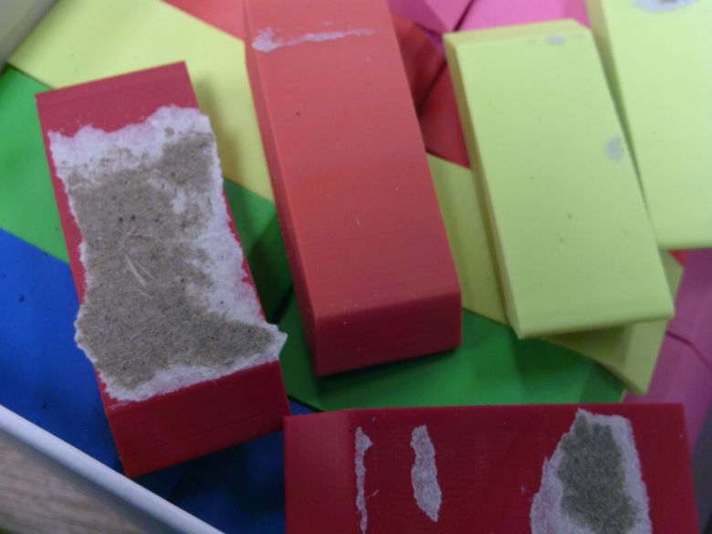
I glued the coffee bag to a piece of old binder board, one I never liked for books because it has what I can only describe as a “soft fluffy” texture. It indents wit a finger nail and though it cuts with ease, I’ve used it as a base for collagraphs in the past and hated it. But here, it works great. I did run it through the press a few times, each on successively increased pressure to compact the soft fluffy fibers.  It is still soft, but less fluffy.

This soft texture allowed me to press into the board with some decent pressure, giving nice bold lines. Light pressure allowed me to get the finest of fine line. I used some sandpaper with varying amounts of cross hatching to create some very fine lines that created a nice depth of texture and darkness. It really evokes the depth of the woods in that area. the plate for the previous print

The sandpaper wrapped around a finger and then with the plate spun under it gave the swirls of lines in the branches. I really like the look and hope to make a few texture tools with sandpaper to give more control.

Anyway, now that I I know I like the coffee bag on a substrate as a method of printmaking I’ve been able to experiment with the look that each tool makes as I use it in different manners. I’m having fun with it and developing a visual language of marks. I’m learning each and every tool.

Trash Printmaking More Coffee Bag Process

My previous post utilized coffee bags stuck to stiff card, from soda cartons and cereal boxes. I found a bunch of old soft binder board and decided to try that with my next batch. We got more coffee and as soon as I emptied the bags I was delighted to find that they were made with the mylar layered bags.image of the pickled onion

More results: The paper coated and mylar layered bags work great. The all plastic work well, but one must be very careful to use gentle pressure or the plastic will warp and stretch, creating a bulge and bubble between the coffee bag and card.

The mylar doesn’t seem to bulge or bubble, but the plastic does eventually peel away from the mylar. I was able to do 13 copies of one of my plates, but they aren’t all the same color, before the plates started to break down. I did notice that with the spray glue the coffee bag began to peel away in the middle of the plate around print nine. This seemed to happen around folds and wrinkles in the original coffee bag. I did not try to smooth these bags with a low iron, but may try that in the future.

Paper backed shows the texture of the paper

With spray glue I put the glue directly onto the back side of the coffee bag. I had an epiphany when I was working on the new plates with PVA- with those I put the glue on the card. I realized that doing so allows for an even coating all over the coffee bag once it is adhered. I realized that I could do the SAME thing with spray glue and if anything the card with spray glue would be easier to handle than sticky curled coffee bags.

The process for making a coffee bag plate with PVA

  • cut and clean a coffee bag, trim all seams away
  • coat a piece of stiff carton card larger than the coffee bag piece with PVA
  • apply the coffee bag to the card label side to the glue, shiny silver side up
  • allow the glue to partially dry
  • cover in waxed paper, and run through a press
  • allow the glue to dry, under weight or pressure
  • trim away excess card

I used soda carton, cereal box, and frozen pizza box card. This stuff tends to be thick, stiff, and a single layer of pulpy card. It absorbs a great deal of glue. I let it get tacky then checked to see if I needed to add more glue. Then applied the coffee bag.

Anyway, I’ve got a lot more to experiment with when it comes to these layered plates. They are pretty simple to make and I can make a bunch of them in a sitting.

Continue reading

Trash Print Making: Coffee Bags

My next experiment with printing with trash utilizes coffee bags. If you haven’t guessed from my art depicting coffee, I drink a lot of it. So I always have a variety of empty bags around the house.

I had the vague idea of gluing coffee bags to a backing then printing for a few days, but someone pointed me to this Curious Printmaker blog post. Which uses melted crisp (chips here in the US) bags, and suggested doing the same with coffee bags. Instead of melting them I wanted to stick them to a backing for added stability and then print them.

I started out by slicing and cleaning a bunch of bags, I then cleared off labels and glue, since everything will print. Then I used spray adhesive and stuck them, shiny side up to a piece of soda can carton. This worked really well, except when I slathered on too heavy a coating, the edges stuck but oddly the middle didn’t. This was remedied by using a light even coating.

After that I trimmed them to square and scratched into the soft plastic surface with a sharp needle, etching tools, exactos, sand, and sandpaper. It all worked really well. Every mark prints- from scuffs on the bag to the creases from the folds to the delicate lines I etches with the super fine sharp tapestry needle.Coffee bag print and plate

Because I have a wide variety of coffee bags I tested several different styles of bags- all plastic, plastic backed with paper fibers, and the standard layered plastic and metallic bags in shiny and matte. They each scored and scraped really well. Like many of the recycled plastic plates I’ve tried, a lot of etching in one area throws up a heavy burr that traps too much ink and the detail of the cross hatching is lost. With this the bur can be burnished back a bit to bring back the detail. The images below are of my test plates showing all 4 types of coffee bag.

My next experiment is to add in carborundum and sand through acrylic mediums and glue.

Continue reading

State of the Art: Trash Printmaking and Plastic Coated Everything

The great thing about trash printmaking is that you become hyper aware of plastic coatings on everything. I mean, okay, that’s not great. So many things in our world are coated in a thin film of plastic and that means they can be used for making prints.

At least I can reuse many of the plastic film coated things.

I picked up a meal at a fast food chain. (Don’t judge, we all have our weak moments.) The cups were made out of paper card and the ice cream pie I added on had a plastic coated card container. I decided to test them out to see if I could print with them.

Results were varied.

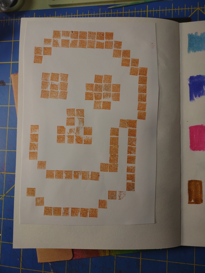
They had a super thin film of plastic, soft and pliable it feels more like a membrane than anything else. I washed and dried them then cut them into flats. Any glue layers were removed as was the cup rim and bottom seal for the cup. I should have taken pictures of this process but, alas, I wasn’t thinking of documenting the process.Skull etched into flatten hershey pie carton

I used a variety of tools- needle, needle scribe, and an Exacto knife to scrape and score into the surface. It was clear that all the tools were raising a burr and breaking through the surface of the plastic film. I could feel the paper fibers raising up through the scores. The plastic film began to peel a bit as I cross hatched lines. Peeling back the plastic film was surprisingly easy it revealed super smooth cardstock, peeling that back left a fiber-y ink soaking surface. Brain and blames etched into a paper drink cup from BK

Both stocks felt similar but the ice cream pie box felt softer and thicker.

I used Speedball Supergraphic black ink. A water soluble but oil based ink. It’s a favorite but relatively stiff and sticky. Even with the first print of each small thin slivers of the plastic from cross hatched areas peeled up during the wipe. The sticky ink pulled it up despite the warmth of the day and my studio.

The printing went well and the plate released from the paper well.

The second printing is where things got… rough. The soda cup survived the second print, loose slivers of plastic stopped peeling up* and the second print was as good as the first. The pie box, well not so much. The membrane started to peel even during the adding of ink.  I used a soft piece of waste cardboard and scraped the ink over, only to have the membrane peel of in some areas. When I began wiping, well larger areas peeled away. This lent an interesting effect to the print. Some areas that had had ink on them duding the previous print, printed deeply dark while newly revealed areas showed a paler area of dark- charcoal gray. And areas that peeled away entirely were fresh and white showing the etched in areas in great contrast.

Flattened hershey pie carton

You can see how the box started to break down in just warm water when I washed it.

This means that the box and the cup create monotypes with etched in details. Which is fun, but, I greatly prefer that if I’m going to go to the effort of etching in details that I get more than 2 prints were piece of trash. detail of the second skull and circles print

I do wonder if the oils in the ink broke down the plastic and if a loosened up waterbased ink would work better. I have some Speedball waterbased inks so I might try some of those with them. It is also tempting to mix up some paste and black watercolor to test these pieces of trash.

Anyway, even if it is a single print it’s better than just tossing the stuff in the trash. (This sort of packaging is not recyclable in my area.) The plate is also a work of art and can be mounted and framed. Some won’t be as successful.

With regards to using Akua inks. I know that a lot of blogs and sites call them “water-based.” They are not they are made of a modified soy oil that is water miscible, which means they are oil based and water soluble. If it is the oil that started the break down of the plastic film the same would happen with Akua inks.

Continue reading